Artistic Choices
Whatever the form of an image, the person who composes it considers its artistic effect, function, and connection to related text.
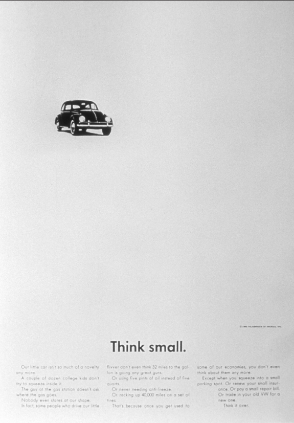
Composition Decisions. Aesthetic or artistic choices may vary with the designer’s preferences and the characteristics of the medium. A photographer might use a close-up, medium, or wide-angle shot — and also determine the angle of the shot, the lighting, and the use of color. Compare Figures 14.2 and 14.5 to see how a close-up may leave out context but accent detail, such as Batman’s white cup. On the other hand, in the Volkswagen ad (Figure 14.6), the white space creates the effect of a long shot taken from below with a telephoto lens. We see the car as it might appear through the wrong end of a pair of binoculars. This vantage point shrinks the car so that the small vehicle looks even smaller.
See sample presentation visuals. See a sample brochure. For sample tables and figures, see B in the Quick Format Guide. For sample photographs, turn to the images opening Chs. 4–12 and 25–29, as well as the e-Pages.
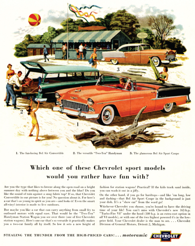
Function Decisions. An image that illustrates a point needs to serve the overall purpose of the document. In other words, form should follow function. Of the many illustrations available — photographs, drawings, charts, graphs, tables — certain types are especially suited to certain functions. For example, the 1955 Chevrolet ad, Figure 14.7, shows people having a good time enjoying a summer day near the shore. This illustration suggests that Chevrolet purchasers will enjoy life, a notion that undoubtedly suits the advertiser’s goals. Likewise, a pie chart effectively conveys parts of a whole, while a photograph captures the drama and intensity of the moment — a child’s rescue, a family’s grief, an earthquake’s toll. When you look at visuals in publications, consider how they function and why the writer might have chosen them.
Typeface Options. Many images, especially advertisements, combine image and text, using the typeface to set a mood and convey an impression. For example,  is a common typeface, easy to read and somewhat conservative, whereas
  is considered informal — almost playful — and looks handwritten. Any printed element in an image may be trendy or conservative, large or small, in relation to the image as a whole. Further, it may inform, evoke emotion, or decorate the page.
Look back at Figure 14.6, the 1959 Volkswagen ad. The words “Think small” are printed in a sans serif typeface, one “without serifs,” the small tails at the ends of the letters. This type is spare and unadorned, just like the VW itself. The ad also includes significant text across the bottom of the page. While this text is difficult to read in the reproduction in this book, it humorously points out the benefits of driving a small imported vehicle instead of one of the large, roomy cars common at the time.
In contrast to the VW ad campaign, the 1955 Chevrolet marketing strategy promoted big vehicles, as Figure 14.7 illustrates. Here the cars are shown in medium to close-up view to call attention to their length. Happy human figures in and beside the cars emphasize their size, and the cars are painted in bright colors, unlike the VW’s serviceable black. The primary text below the scene is large enough to be read in the reproduction here. It asks which sporty Chevy would be most fun for the reader — the Bel Air convertible, the Handyman Station Wagon, or the stylish Sport Coupe. Then some “fine print” — difficult to read in the reproduction — notes other features of each car, such as its top, interior, and power.
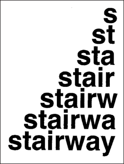
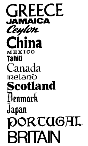
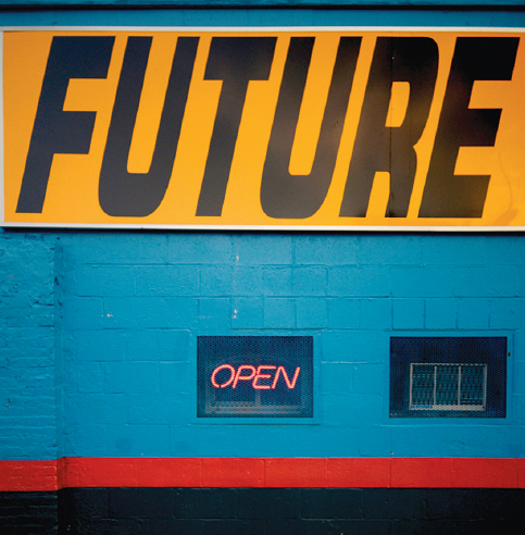
Other images besides ads use type to set a mood or convey feelings and ideas. Figure 14.8 is a design student’s response to an assignment that called for using letters to create an image. The simple typeface and stairlike arrangement help viewers “experience” the word stairway. Figure 14.9 illustrates how certain typefaces have become associated with countries — even to the point of becoming clichés. In fact, designers of travel posters and brochures often draw on predictable choices like these to suggest a mood — for example, boldness, tradition adventure, history. Similarly, the plain, slanted type in Figure 14.10 suggests movement toward the future, reinforcing the message of the words.
VISUAL ANALYSIS CHECKLIST
Observing the Characteristics of an Image
- What objects are included in the image?
- What figures (people or animals) appear in the image?
- What action takes place in the image? What is its “plot” or story?
- What is in the background? In what place does the action take place?
- What elements, colors, and shapes contribute to the design? How are they arranged or balanced? What feeling, memory, or association is evoked?
- How are the pictorial elements related to one another? How are they related to any written material? What do these relationships tell you as a viewer?
- Does the image include white space, fill its space, or seem busy?
- What composition decisions has the designer or artist made? What type of shot, shot angle, lighting, or color is used?
- What is the function of the image? How does form support function?
- What typefaces are used? What impressions do they convey?