Format for Presentation Visuals
Effective use of space is important in visuals — such as PowerPoint or other presentation slides. Providing sample space and limiting the text on each slide helps readers absorb your major points. The slide in Figure 17.8 for recruiting service learning participants has too much text, making it hard to read and potentially distracting. In contrast, Figure 17.9 has less text and more open space, making each point easier to read. Its bullets highlight the main points, meant only to summarize major issues and themes. The type sizes for the slides are large enough to be viewed: 44 points for the heading and 32 points for the body.
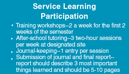

Finally, the “white space” without text in these slides is actually blue. Some public-speaking experts believe that black type on a white background can be too stark; instead, they recommend a dark blue background with yellow or white type. Others believe that black on white is fine and may be what the audience is used to. Presentation software makes it easy to experiment with these options or to use your employer’s templates.