Choosing visuals to suit your purpose
Pie chart
| Pie charts compare a part or parts to the whole. Segments of the pie represent percentages of the whole (and always total 100 percent). | 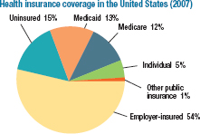 |
Bar graph (or line graph)
| Bar graphs highlight trends over a period of time or compare numerical data. Line graphs display the same data as bar graphs; the data are graphed as points, and the points are connected with lines. | 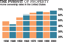 |
Infographic
| An infographic presents data in a visually engaging form. The data are usually numerical, as in bar graphs or line graphs, but they are represented by a graphic element instead of by bars or lines. | 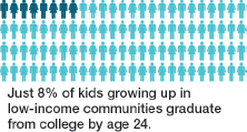 |
Table
| Tables display numbers and words in columns and rows. They can be used to organize complicated numerical information into an easily understood format. | 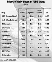 |
Photograph
| Photographs vividly depict people, scenes, or objects discussed in a text. |  |
Diagram
| Diagrams, useful in scientific and technical writing, concisely illustrate processes, structures, or interactions. | 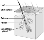 |
Flowchart
| Flowcharts show structures (the hierarchy of employees at a company, for example) or steps in a process and their relation to one another. (See also section 19 for another example.) | 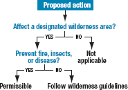 |
Map
| Maps illustrate distances, historical information, or demographics and often use symbols for geographic features and points of interest. | 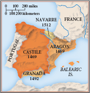 |