Background Texts
GRAPHIC IDENTITY DESIGNS
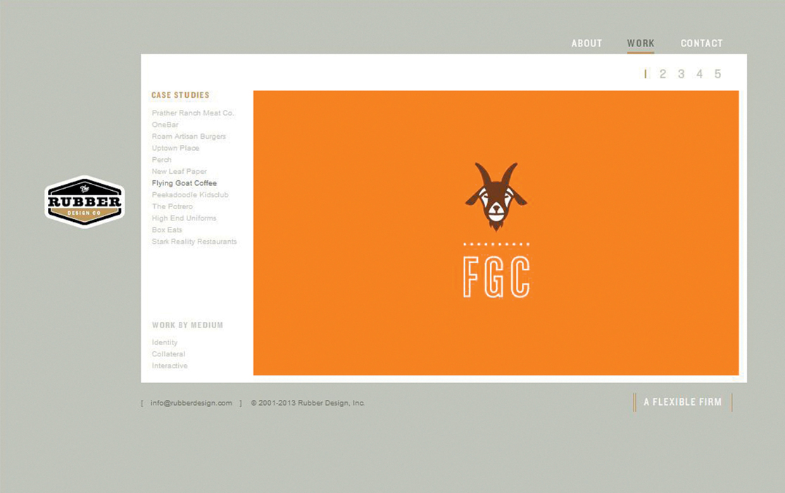
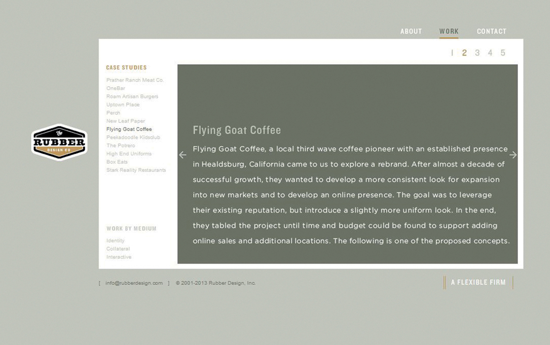
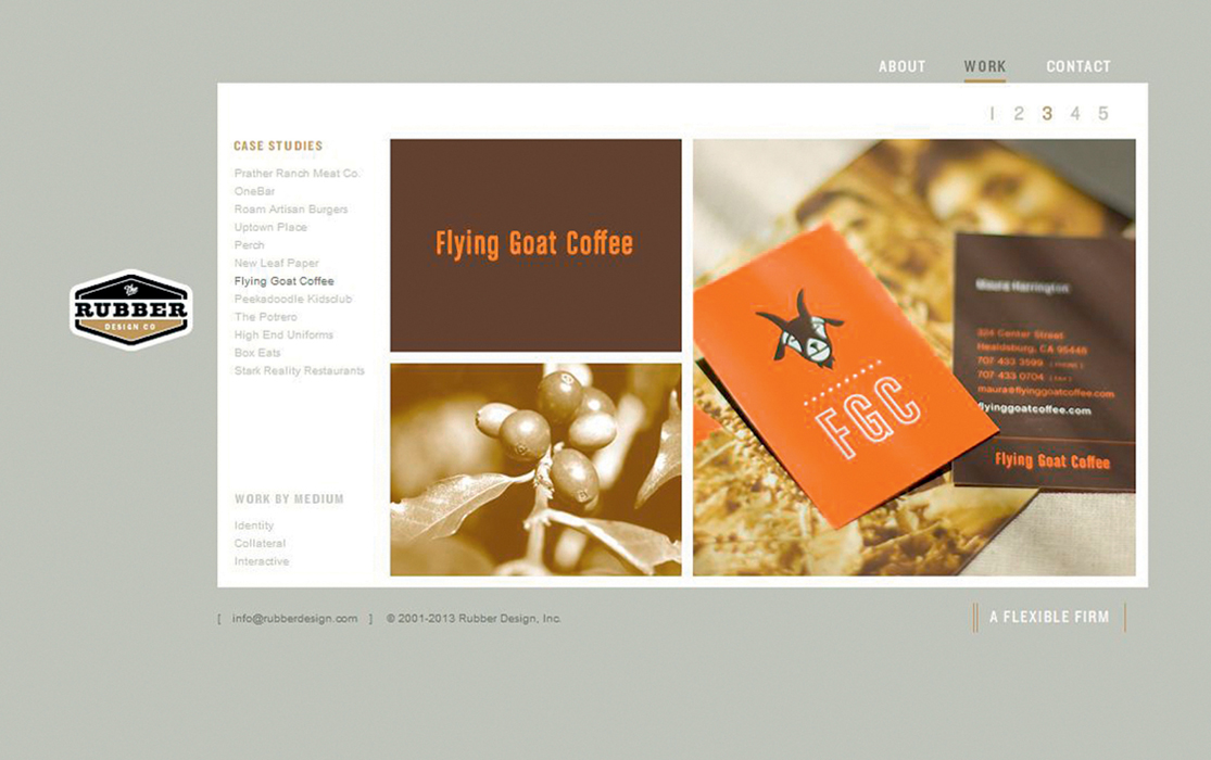
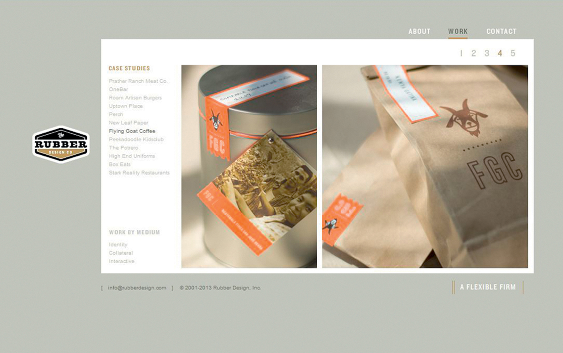
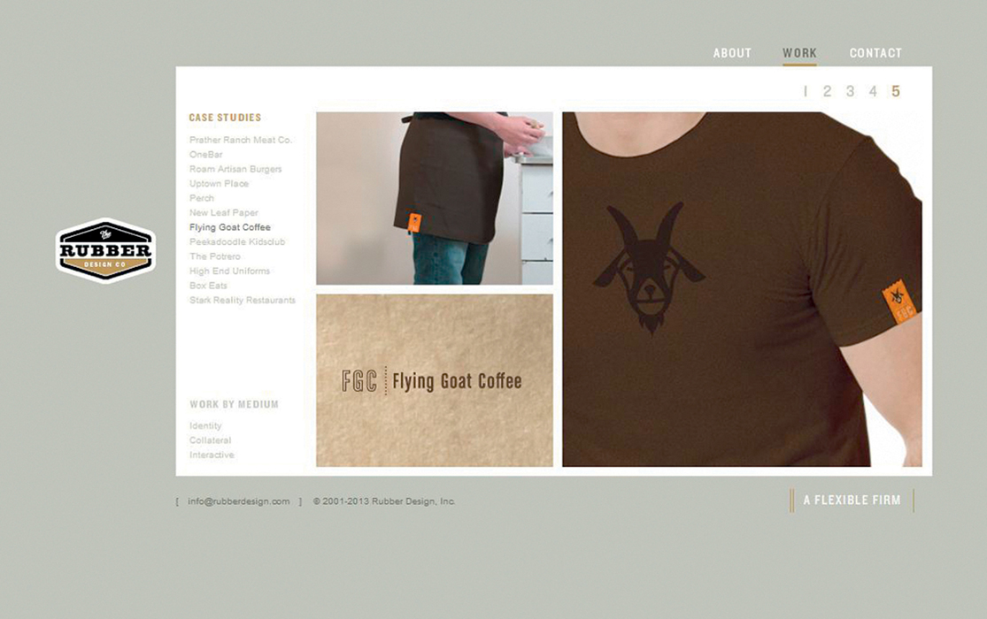
Rubber Design, Case Study: Flying Goat Coffee From rubberdesign.com
The logo system for Flying Goat Coffee shows how a set of design choices can help construct a coherent, consistent identity for an organization. The design firm Rubber Design used only a handful of contrasting colors — orange, brown, and white — repeated over all of the company’s texts to create a recognizable identity in viewers’ minds. (Think of how Coca-
GRAPHIC IDENTITY MANUAL
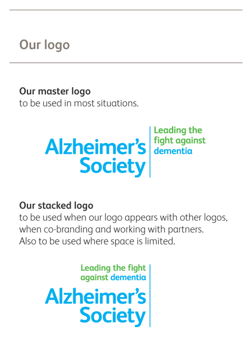
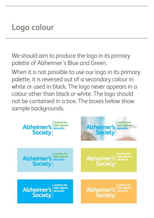
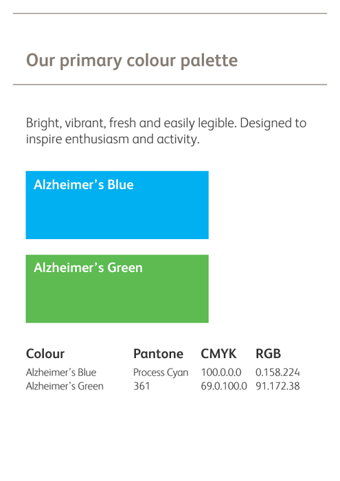
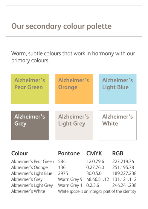
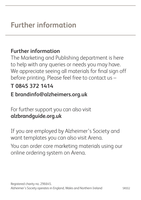
Alzheimer’s Society, “Bringing Our Brand to Life” From alzbrandguide.org.uk
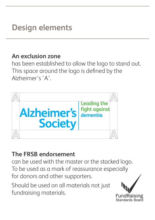
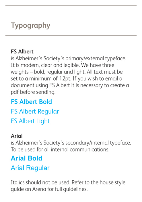
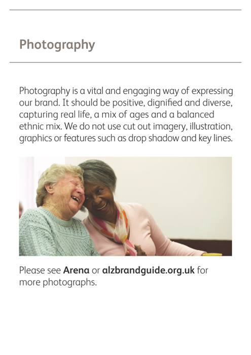
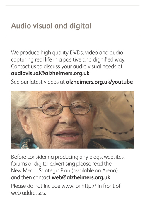
The Alzheimer’s Society is a nonprofit organization in the United Kingdom that works to advance research and care for people affected by Alzheimer’s disease and other forms of dementia. This booklet is just one of many documents on their brand guidelines website that helps staff and members consistently use the society’s logo and other aspects of its graphic identity.
Download the manual.