Overview
| SCENARIO | |
| Making Invisible Things Visible: Mapping Data | 4 |
• PURPOSE
To inform or make an argument about a geographical location, possibly to spur social action
• AUDIENCE
People with a stake in that location (residents, planners, politicians, social activists)
• CONTEXT
Varies: Whatever location you decide to map
• TEXT
Map and a short (1,000-
Overview
In this assignment, you’ll be creating a map of statistical data about groups of people in geographical regions. The groups and regions could be very local, at the level of a few square blocks in a city, to global, spanning multiple countries. The exact type of data is up to you, but it must reveal something interesting about people in geographical space. You’ll need to find a relatively trustworthy source of data (there’s a list of possible sources at the end of this case) and do the mapping yourself (either by using Google Maps or simply by taking an existing map and placing data on it in an image editor such as Photoshop). Then you’ll write a short essay about your mapping experience.
For most of us, maps seem like relatively straightforward things. They represent reality, right? They should be neutral and, as much as possible, transparent. Right?
Not so fast. Maps are representations and abstractions. As map makers work, they make decisions about what details to leave out and what to include. They remove elements from our view. Sometimes those abstractions are designed to make important features more visible, such as in road maps that leave out geographic detail. But sometimes decisions about abstraction are driven by less ethical interests; not mapping something suggests that it is unimportant.
In some cases, mapmakers make multiple overlays to find connections between occurrences of things. As Steven Johnson chronicles in Ghost Map, in 1854 John Snow was attempting to discover what was causing deadly outbreaks of cholera in a London community. Acting on a hunch, Snow mapped deaths due to cholera against the locations of water pumps where people drew water for their households. Although the complete story is slightly more complex, Snow’s map (see below) shows strong correlation between pump location and cholera deaths. Snow used this visual map in arguments that began convincing officials that the city’s sanitation systems needed to be overhauled.
Maps can also be read against each other, as in the case of the two U.S. Census maps below showing median ages and vacant homes across the United States. Notice how some areas with older populations also have high vacancy rates, such as in the northeast and northwest. Are these two indicators somehow connected? How? What do you make of areas that don’t show similar correlations, such as some of the plains states? Maps often suggest connections that require additional research.
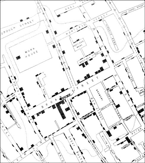
• A portion of Snow’s cholera map (black bars represent deaths)
John Snow Archive & Research Companion, johnsnow.matrix.msu.edu; Peter Vinten-
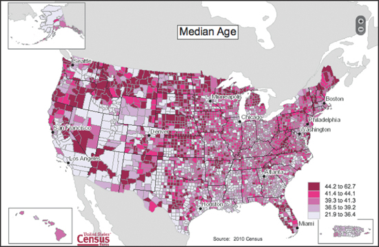
• U.S. Census data showing median ages across the United States
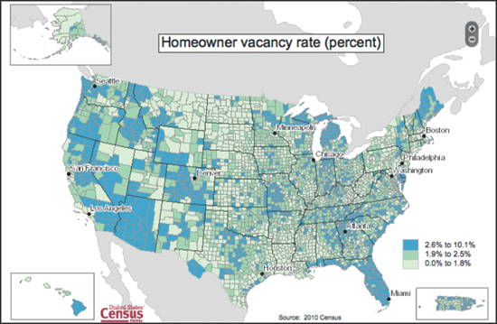
• U.S. Census data showing homeowner vacancy rates across the United States