The Distribution of Income and Wealth
income A flow measure reflecting the funds received by individuals or households over a period of time, usually a week, month, or year.
wealth A stock measure of an individual’s or family’s assets, net of liabilities, at a given point in time.
Income is a flow, wealth is a stock. Income measures the receipt of funds by individuals or households over time, usually a week, month, or year. Income is a flow of funds measure. Wealth, in contrast, measures a family’s assets and net liabilities at a given point in time. You may earn a certain income in 2014, but your net wealth is measured on a specific day, say, December 31, 2014. Many people were wealthy on January 1, 2007, but after suffering the ravages of a falling housing and stock market, they were considerably less wealthy on July 1, 2009.
You can be wealthy with low income if you do not work and your assets are in homes, stocks, and bonds that earn little to no interest or dividends. Alternatively, you can have little wealth, yet a high income, if you are like a rookie professional ballplayer who earns a seven-figure salary but has not yet accumulated assets.
Life Cycle Effects
Family and individual incomes vary significantly over the course of people’s lives. Young people just starting their careers and their families often earn only modest incomes. Over their working careers, they become more experienced and their salaries increase, with income peaking roughly between the ages of 45 and 55. At some point between ages 45 and 60, family size begins to decline as the kids grow up and leave home. As people are approaching 60, income also begins declining, although household saving rises as they prepare for retirement. Incomes decline with retirement, but then again, so do family responsibilities.
One result of this economic life cycle is that a society that is growing older can expect to see changes in income distribution as greater numbers of households fall into lower income brackets. The life cycle also has implications for the economic effects of immigration. Newcomers to the United States often possess limited skills, therefore when the country admits more immigrants, it can expect more low-income households. The children of immigrants, however, move up the income distribution ladder.
The Distribution of Income
functional distribution of income The distribution of income for resources or factors of production (land, labor, capital, and entrepreneurial ability).
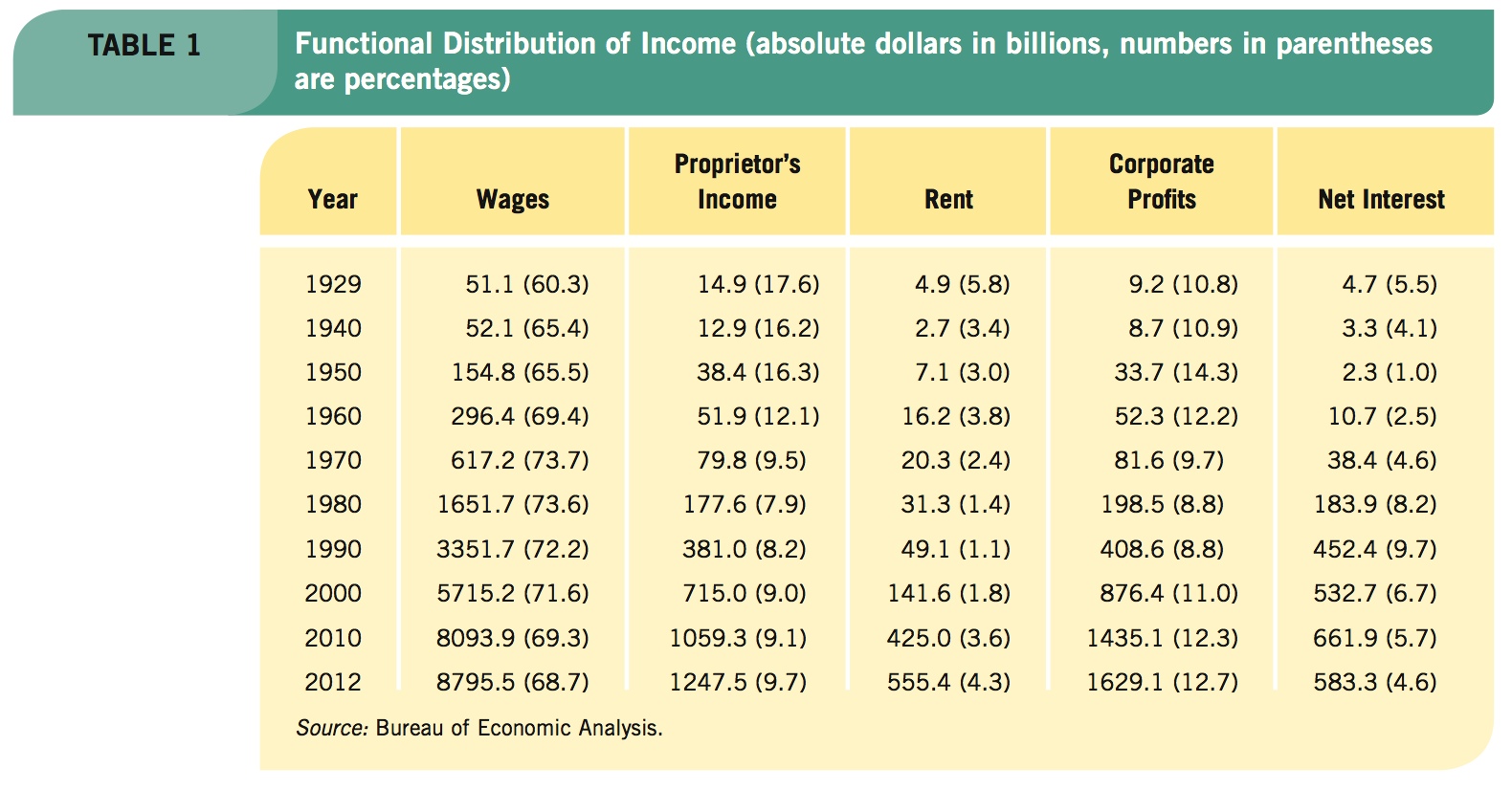
Income distribution can be considered from several different perspectives. First, we can look at the functional distribution of income, which splits income among the inputs (factors) of production. The functional distribution for the United States between 1929 and 2012 is shown in Table 1.
391
Labor’s share of national income rose from 1929 to become relatively stable from the 1970s onward, but fell each decade after. The share of income going to small businesses, called “proprietor’s income,” has declined over this period but has stabilized at slightly under 10%. Rental income’s share fell from 1960 to 1990, but has since grown back to over 4%. The share accruing to corporate profits has increased in recent years to over 12%.
As Table 1 illustrates, the biggest fluctuations in income share have been associated with income from interest earned by individuals and firms, and is caused largely by changes in interest rates. It declined into the 1960s, then rose in the 1980s and 1990s, before falling again in the last decade.
Personal or Family Distribution of Income
personal or family distribution of income The distribution of income to individuals or family groups (typically quintiles, or fifths, of the population).
When most people use the term “the distribution of income,” they typically mean personal or family distribution of income. This distributional measure is concerned with how much income, in percentage terms, goes to specific segments of the population.
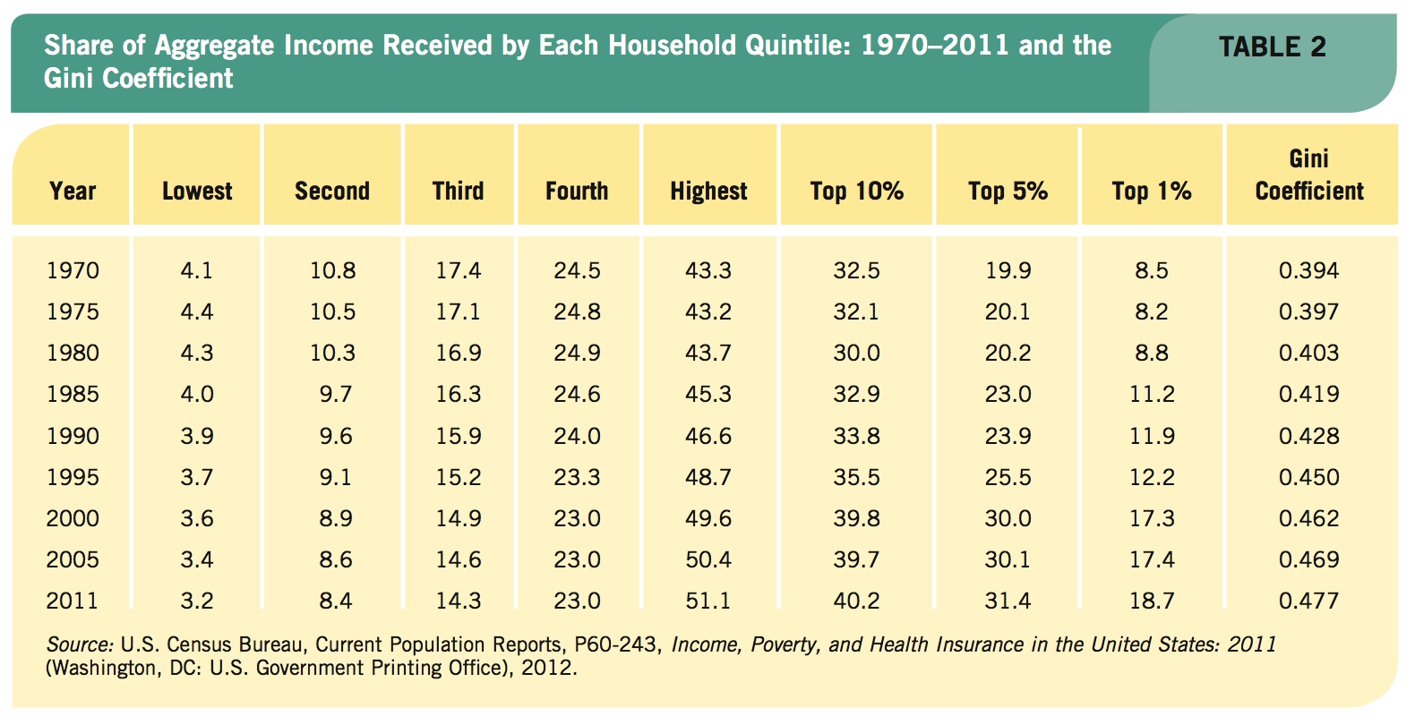
To analyze personal and family income distribution, the Census Bureau essentially arrays households from the lowest incomes to the highest. It then splits these households into quintiles, or fifths, from the lowest 20% of households to the highest 20%. After totaling and averaging household incomes for each quintile, the Census Bureau computes the percentage of income flowing to each quintile.
Today, the United States contains approximately 120 million households. Therefore the 24 million households with the lowest incomes compose the bottom quintile, and the 24 million households with the highest incomes compose the upper quintile. Because much of the country’s income is concentrated at the top, the Census Bureau breaks down the highest quintile further, showing the percentage of income flowing to the richest 10%, 5%, and 1% of the population.
Table 2 shows the official income distribution estimates for the United States since 1970. These estimates are based “solely on money income before taxes and do not include the value of noncash benefits, such as food stamps, Medicaid, public housing, or employer-provided fringe benefits.”1
392
Note that if the income distribution were perfectly equal, all quintiles would receive 20% of aggregate income. A quick look at these income distributions over the past four decades suggests that our distribution of income has been growing more unequal. Specifically, the share of income received by the highest quintile has steadily risen since 1970, while the share of income received by each of the four other quintiles has steadily fallen since 1970. Even more notable is how the income flowing to the top 1% has increased the most, with the share of income more than doubling since 1970. Keep in mind that these numbers ignore taxes and transfers (direct payment to households such as welfare and food stamps) that temper income inequality somewhat.
Still, incomes of the richest Americans have fared best over the last generation, and one piece of evidence has been the meteoric rise in CEO salaries. Controlling for inflation, the average salary of a CEO increased eight-fold since 1978, while real wages for workers have barely changed. Such stark differences in worker compensation contributed to the growth of the Occupy movement in recent years and its claims against the power held by the richest 1%.
Compressing distribution data into quintiles allows us to see how distribution has evolved. Economists have developed two primary measures that allow comparisons to be drawn with ease across time and between countries. These measures are Lorenz curves and the Gini coefficient.
Lorenz Curves
Lorenz curves A graphical method of showing the income distribution by cumulating families of various income levels on the horizontal axis and relating this to their cumulative share of total income on the vertical axis.
Lorenz curves cumulate households of various income levels on the horizontal axis, relating this to their cumulated share of total income on the vertical axis. Figure 1, for simplicity, shows a two-person economy. Assume that both people earn 50% of the total income, or that income is divided evenly. Point a in Figure 1 marks out this point, resulting in equal distribution curve 0ac.
The second curve in Figure 1 shows a two-person economy where the low-income person earns 25% of the total income and the upper income person receives 75% (point b). This graph is skewed to the right (curve 0bc), indicating an unequal distribution. If this two-person income distribution were as unequal as possible (0% and 100%), the Lorenz curve would be equal to curve 0dc.

Figure 2 and its accompanying table offer more realistic Lorenz curves for income and wealth data for the United States in the year 2011. The quintile income distribution in the second column of the table is cumulated in the third column and plotted in Figure 2. (To cumulate a quintile means to add its percentage of income to the percentages earned by all lower quintiles.)

393
In Figure 2, for instance, the share of income received by the lowest fifth is 3.2%; it is plotted as point a. Next, the lowest two quintiles are summed (3.2 + 8.4 = 11.6) and plotted as point b. The process continues until all quintiles have been plotted to create the Lorenz curve.
Figure 2 also plots the Lorenz curve for wealth; it shows how wealth is much more unequally distributed than income. The wealthiest 20% of Americans control nearly 90% of wealth, even though they earn only half of all income.
Gini Coefficient
Gini coefficient A precise method of measuring the position of the Lorenz curve, defined as the area between the Lorenz curve and the equal distribution line divided by the total area below the equal distribution line.
Lorenz curves give us a good graphical summation of income distributions, but they can be inconvenient to use when comparing distributions between different countries or across time. Economists would like one number that represents an economy’s income inequality. The Gini coefficient provides such a number.
The Gini coefficient provides a precise method of measuring the position of the Lorenz curve. It is defined as the ratio of the area between the Lorenz curve and the equal distribution line, in the numerator, and the total area below the equal distribution line, in the denominator. In Figure 3, the Gini coefficient is the ratio of area A to area (A + B).

If the distribution were equal, area A would disappear (equal zero), thus the Gini coefficient would be zero. If the distribution were as unequal as possible, with one individual or household earning all national income, area B would disappear, thus the Gini coefficient would be 1.
As a rule, the lower the coefficient, the more equal the distribution; the higher the coefficient, the more unequal. Looking back at the last column in Table 2, the Gini coefficient confirms that the basic income distribution has become more unequal since 1970. The Gini coefficient has risen from 0.394 in 1970 to 0.477 in 2011.
394
The Impact of Redistribution
In the United States, there is a vast array of income redistribution policies, including the progressive income tax (a tax that taxes higher incomes at a higher rate than lower incomes), housing subsidies, and other transfer payments such as Medicaid and Medicare, Social Security, and traditional welfare programs. Remember that the income distribution data in Table 2 excluded such government-provided cash and noncash benefits, and the effects of taxation.
Figure 4 provides an estimate of the impact progressive taxes and transfer payments (cash and in-kind) had on the income distribution in the United States. As we would expect, distribution became more equal: The Gini coefficient declined from 0.477 according to the official measure using gross income to 0.381 after adjusting for taxes and transfer payments.

395
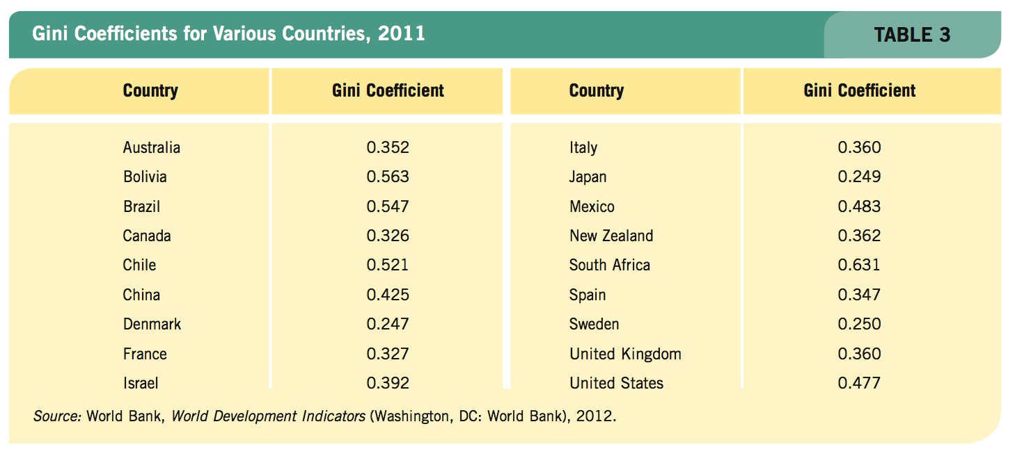
Table 3 provides some examples of how income distribution varies around the world. Income in European countries is generally more equally distributed than in the United States, while many South American countries have more unequal distributions.
David David Davis/Dreamstime.com
396
Redistribution policies are the subject of intense debates. Those on the political right argue that differences in income are the natural result of a market system in which different individuals possess different personal endowments, schooling, and ambition. They believe, moreover, that the incentives of the marketplace are needed to encourage people to work and produce. The opportunities that markets provide mean that some people will be winners and others will lose. These analysts are unconcerned about the distribution of income unless it becomes so unequal that it discourages incentives and reduces efficiency.
Those on the political left argue that public policy should ultimately be guided by human needs. They see personal wealth as being the product of community effort as much as individual effort, and therefore they favor greater government taxation of income and wealth. By and large, European nations have found this argument more compelling than has the United States. This is reflected in the breadth of European social welfare policies. Because there is no correct answer (except possibly keeping distribution away from the extremes), this debate continues.
Causes of Income Inequality
Many factors contribute to income inequality in our society. First, as just mentioned, people are born into different circumstances with differing natural abilities. Families take varying interest in the well-being of their children, with some kids receiving immense inputs of family time and capital, while others receive little. These family choices largely fall outside the realm of public policy.
Human Capital The guarantee of a free public education through high school and huge subsidies to public colleges and universities for all Americans are designed to even out some of the economic differences among families. Still, public education does not eliminate the disparities. Some parents plan their children’s education long before they are born, while other parents ignore education altogether.
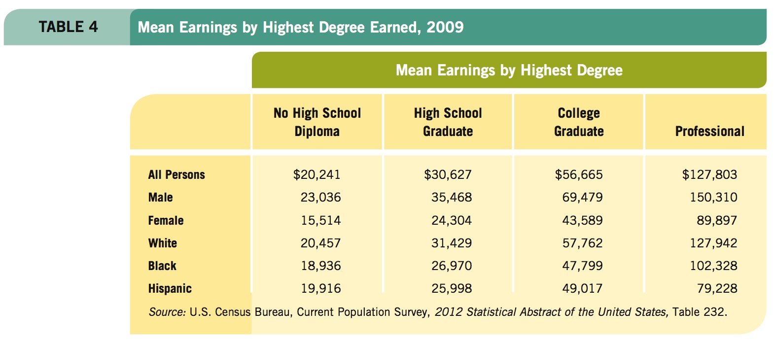
Table 4 provides evidence of the impact investments in education have on earnings. Those without high school diplomas earned the least, roughly a third less than high school graduates. A college degree resulted in mean earnings nearly 3 times higher than what individuals without high school diplomas earned.
The U.S. economy has become more technologically complex. Manufacturing jobs have dwindled, reducing the demand for these workers, reducing their real wages. Several decades ago, people with low education levels could find highly productive work in manufacturing, with good wages and benefits. Globalization and increased capital mobility, however, have caused many of these jobs to migrate to lower wage countries. The result: Real wages have declined for Americans in many manufacturing occupations.
397
Our economy is increasingly oriented toward service industries, making investments in human capital more important than ever. The service industry spans more than just burger flipping, maid service, and landscaping. The United States is still the world leader in the design and development of new products, basic scientific research and development, and other professional services. All these industries and occupations have one thing in common: the need for highly skilled and highly educated employees.
Other Factors In an earlier chapter, we saw that economic discrimination leads to an income distribution skewed against those subject to discrimination. Reduced wages then reduce an individual’s incentive to invest in human capital because the returns are lower, perpetuating a vicious cycle.
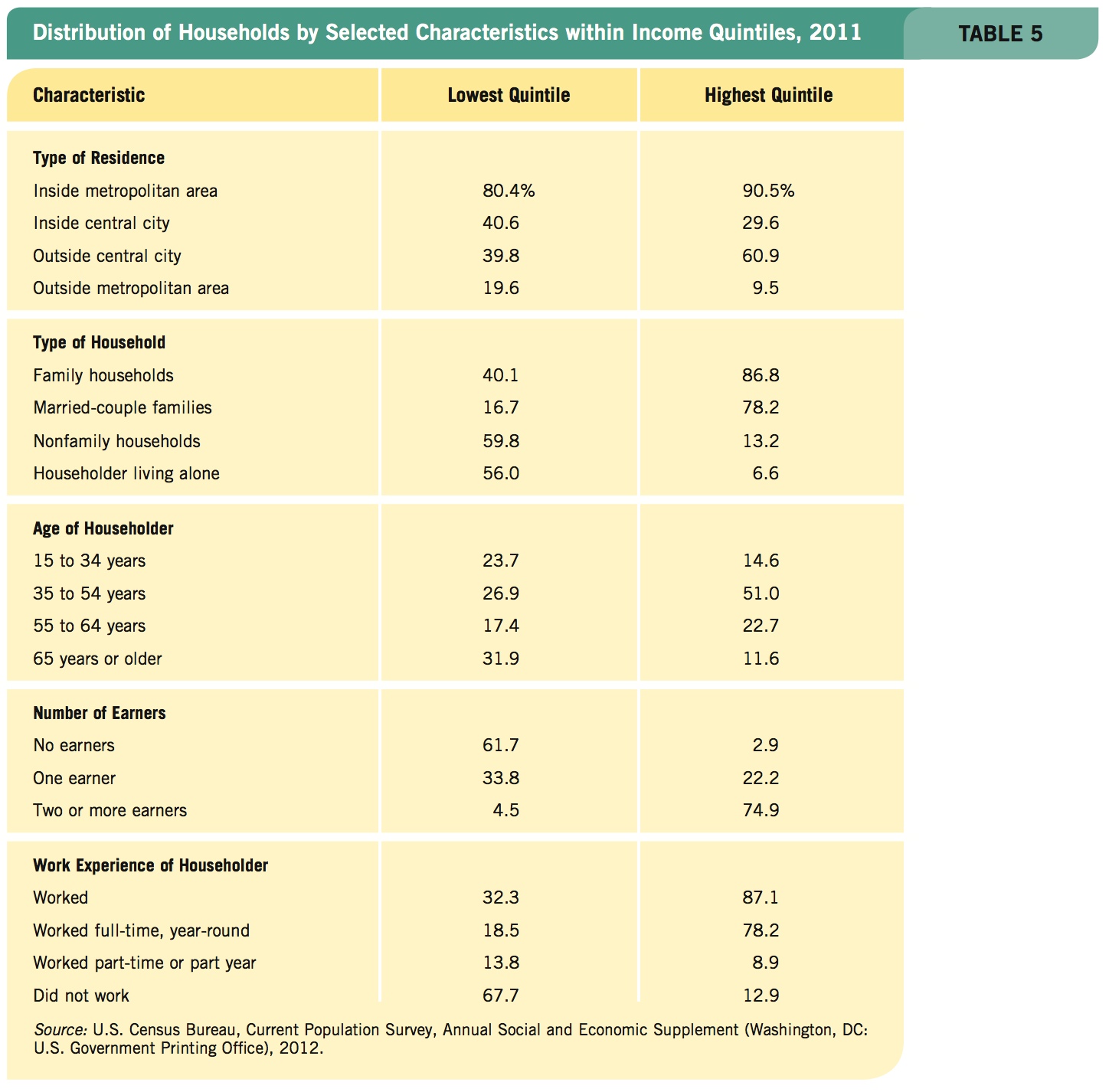
Table 5 outlines some characteristics of households occupying two different income quintiles. By comparing the lowest quintile with the highest, we can see some of the reasons for income inequality. As the Census Bureau summarizes these differences, “High-income households tended to be family households that included two or more earners, lived in the suburbs of a large city, and had a working householder between 35 and 54 years old. In contrast, low-income households tended to be in a city with an elderly householder who lived alone and did not work.”
398
The rise in two-earner households over the last two decades accounts for a large part of the growing inequality in income. Note in Table 5 that only 4.5% of the lowest quintile households had two earners, while 74.9% of the highest quintile did. Also, only 2.9% of top quintile householders did not work, but 61.7% of those in the bottom quintile were not working.
It is hardly surprising that households with two people working should tend to have higher incomes than households with only one person or none working. In most households, whether one or two people work represents a choice. Today, clearly more couples are opting for two incomes. This is significant, given that rising income inequality is often cited as evidence that the United States needs to change its public policies to reduce inequalities. Yet, if the rise in inequality is due largely to changes in household attitudes toward work and income, with more couples choosing dual-career households, changes in public policy may not be needed. Rising inequality may simply be a reflection of the changing personal choices of many households.
This overview of income distribution and inequality provides a broad foundation for the remainder of the chapter, which focuses on poverty, its causes, and possible cures.
THE DISTRIBUTION OF INCOME AND WEALTH
- The functional distribution of income splits income among factors of production.
- The family or personal distribution of income typically splits income into quintiles.
- Lorenz curves cumulate households of various income levels on the horizontal axis and their cumulative share of income on the vertical axis.
- The Gini coefficient is the ratio of the area between the Lorenz curve and the equal distribution line to the total area below the equal distribution line. It is used to compare income distribution across time and between countries.
- Income redistribution activities such as progressive taxes, Medicare, Medicaid, and other transfer and welfare programs reduce the Gini coefficient and reduce the inequality in the distribution of income.
- Income inequality is caused by a number of factors, including individual investment in human capital, natural abilities, and discrimination.
QUESTION: Economist Charles Murray suggested doing away with all social insurance, including Social Security, Medicare, Medicaid, and other welfare programs, and instead simply giving $10,000 a year to every citizen of the United States over 21 years of age. His purpose was to reduce bureaucracy and the government’s role in the decision making of families. Expand his idea slightly by eliminating the age restriction. Would this improve the income distribution in America? Why or why not?
It would clearly improve (make more equal) the before-tax and benefits distribution of income. The impact on the distribution of income after adjusting for current benefits of such a policy would depend on the explicit value of current benefits. Murray suggested that his proposal would cost more for a decade and then begin saving money.