Graphs and Data
The main forms of data graphs are time series, scatter plots, pie charts, and bar charts. Time series, as the name suggests, plot data over time. Most of the figures you will encounter in publications are time series graphs.
Time Series
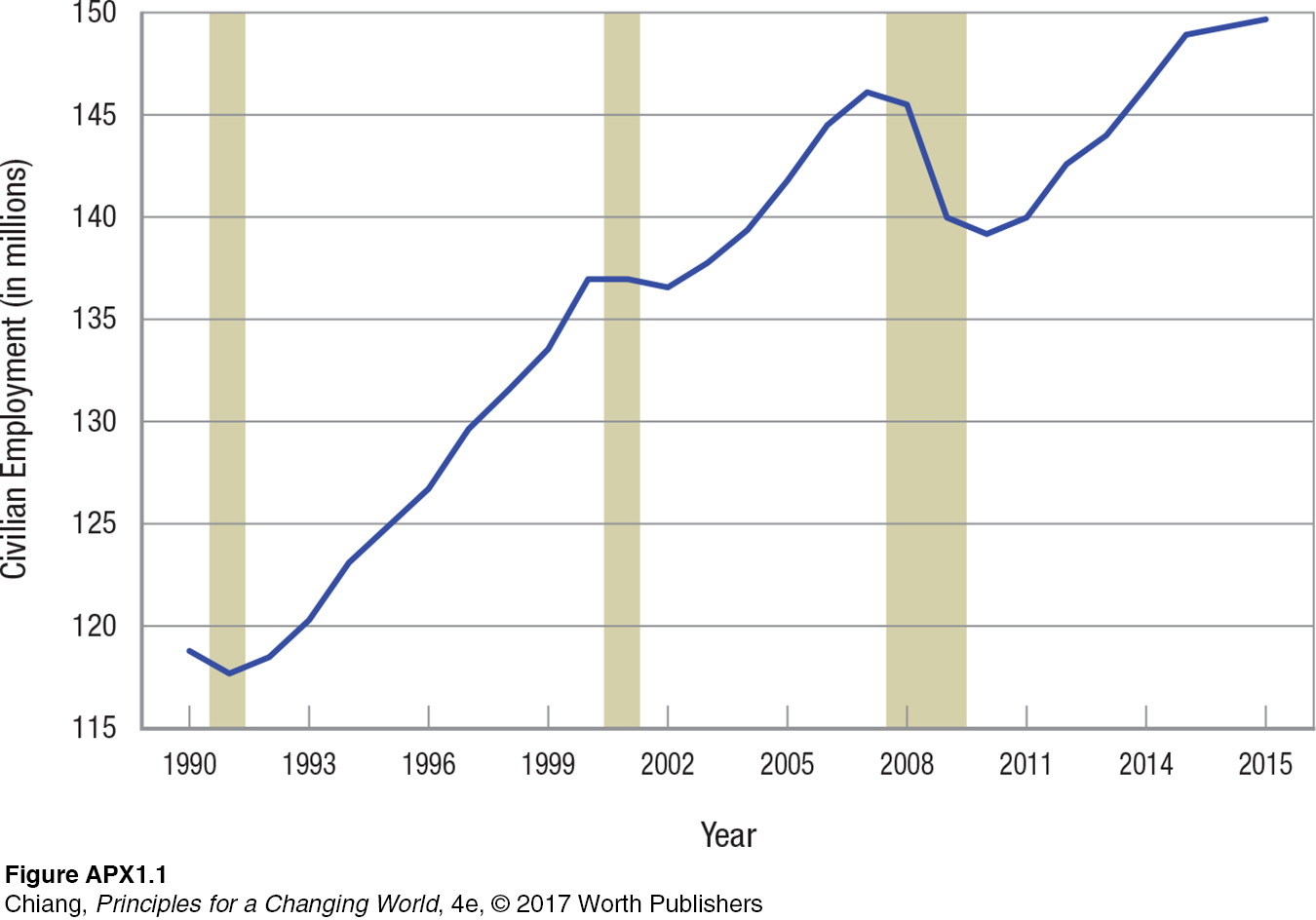
Time series graphs involve plotting time (minutes, hours, days, months, quarters, or years) on the horizontal axis and the value of some variable on the vertical axis. Figure APX-1 illustrates a time series plot for civilian employment of those 16 years and older. Notice that since the early 1990s, employment has grown by almost 25 million for this group. The vertical strips in the figure designate the last three recessions. Notice that in each case when the recession hit, employment fell, then rebounded after the recession ended.
Scatter Plots
Scatter plots are graphs in which two variables (neither variable being time) are plotted against each other. Scatter plots often give us a hint if the two variables are related to each other in some consistent way. Figure APX-2 plots one variable, median household income, against another variable, percentage of Americans holding a college degree.
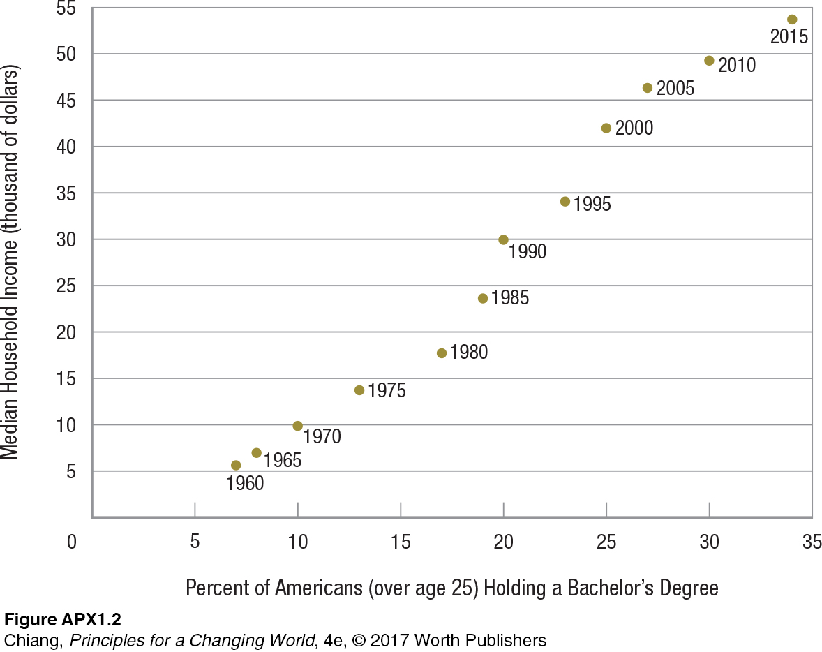
Two things can be seen in this figure. First, these two variables appear to be related to each other in a positive way. A rising percentage of college graduates leads to a higher median household income. It is not surprising that college degrees and earnings are related, because increased education leads to a more productive workforce, which translates into more income. Second, given that the years for the data are listed next to the dots, we can see that the percentage of the population with college degrees has risen significantly over the last half-
Pie Charts
21
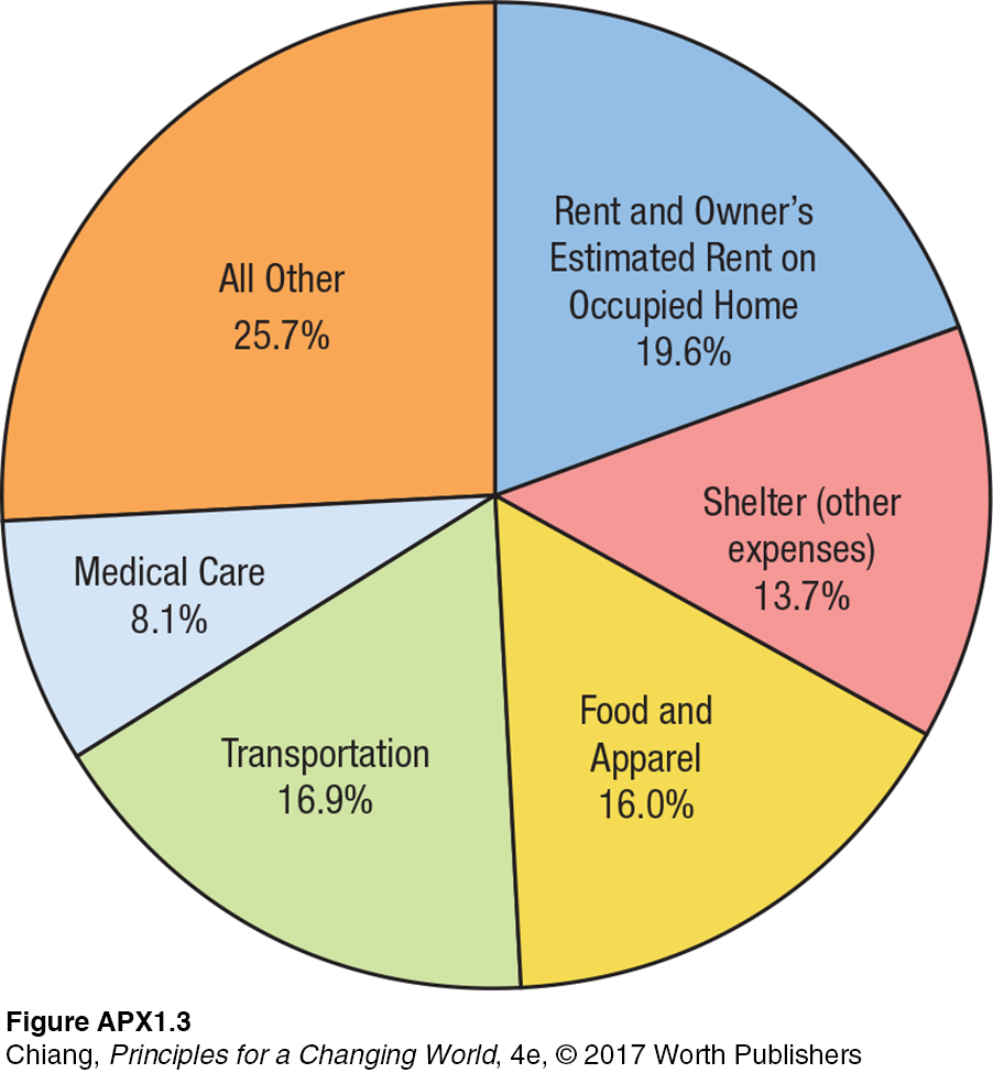
Pie charts are simple graphs showing data that can be split into percentage parts that combined make up the whole. A simple pie chart for the relative importance of components in the consumer price index (CPI) is shown in Figure APX-3. It reveals how the typical urban household budget is allocated. By looking at each slice of the pie, we see a picture of how typical families spend their income.
Bar Charts
22
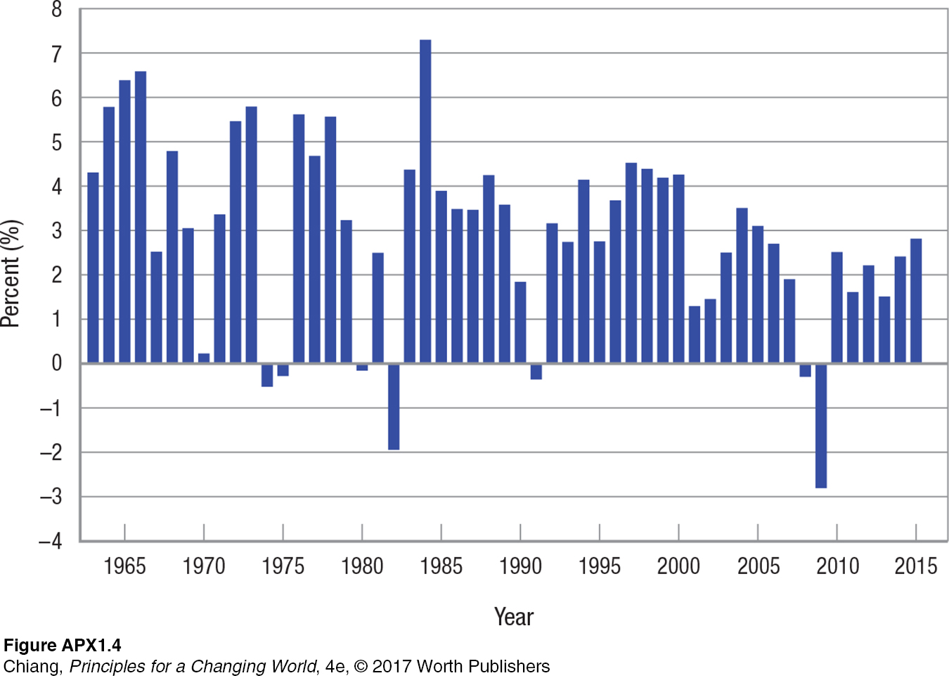
Bar charts use bars to show the value of specific data points. Figure APX-4 is a bar chart showing the annual changes in real (adjusted for inflation) gross domestic product (GDP). Notice that over the last 50 years, the United States has had only 7 years when GDP declined.
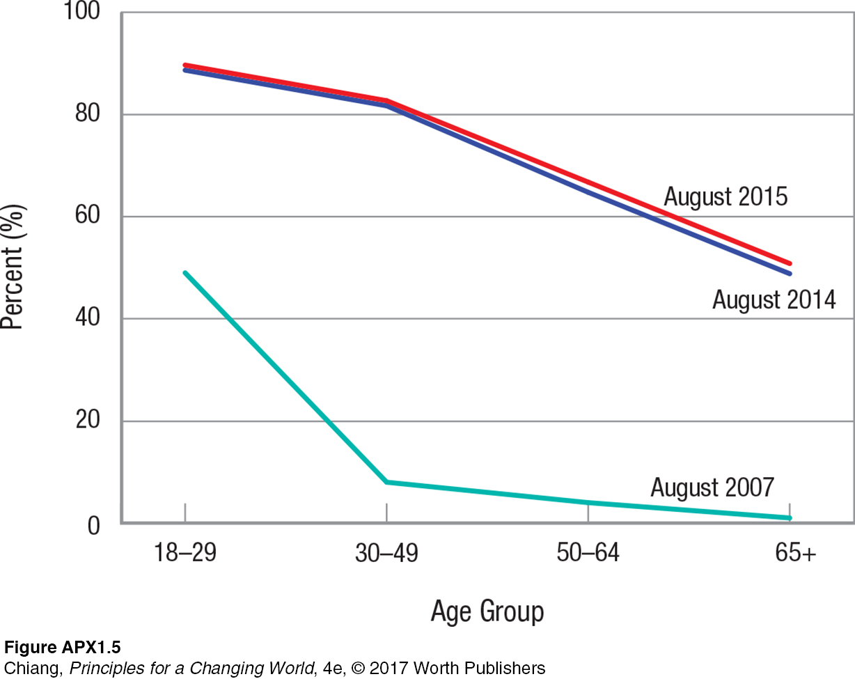
Simple Graphs Can Pack In a Lot of Information It is not unusual for graphs and figures to have several things going on at once. Look at Figure APX-5, illustrating the number of social media users as a percent of each age group. On the horizontal axis are the age groups in years. On the vertical axis is the percent of each age group that regularly used social media. Figure APX-5 shows the relationship between age and social media penetration for different periods. They include the most recent period shown (August 2015), a year previous (August 2014), and eight years ago (August 2007).
23
You should notice two things in this figure. First, the relationship between the variables slopes downward. This means that older Americans are less likely to use social media than younger Americans. Second, use of social media has increased across all ages over the three periods studied (from August 2007 to August 2014 to August 2015) as shown by the position of the curves. Each point on the August 2015 curve is above the corresponding point on the August 2014 curve, which is subsequently above each point on the August 2007 curve.
A Few Simple Rules for Reading Graphs Looking at graphs of data is relatively easy if you follow a few simple rules. First, read the title of the figure to get a sense of what is being presented. Second, look at the label for the horizontal axis (x axis) to see how the data are being presented. Make sure you know how the data are being measured. Is it months or years, hours worked or hundreds of hours worked? Third, examine the label for the vertical axis (y axis). This is the value of the variable being plotted on that axis; make sure you know what it is. Fourth, look at the graph itself to see if it makes logical sense. Are the curves (bars, dots) going in the right direction?
Look the graph over and see if you notice something interesting going on. This is really the fun part of looking closely at figures both in this text and in other books, magazines, and newspapers. Often, simple data graphs can reveal surprising relationships between variables. Keep this in mind as you examine graphs throughout this course.
One more thing. Graphs in this book are always accompanied by explanatory captions. Examine the graph first, making your preliminary assessment of what is going on. Then carefully read the caption, making sure it accurately reflects what is shown in the graph. If the caption refers to movement between points, follow this movement in the graph. If you think there is a discrepancy between the caption and the graph, reexamine the graph to make sure you have not missed anything.