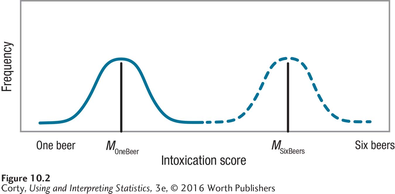
Figure 10.4: Figure 10.2 Distributions of Intoxication Scores for Participants Who Consumed Different Amounts of Alcohol The curve on the left is the distribution of intoxication scores for participants who consumed one beer. The curve on the right is the distribution of scores for participants who consumed six beers. Note that within each group there is variability in the intoxication level, variability due to individual differences. There is also variability between the two groups. The easiest way to see this is to observe that the two curves have different midpoints, with one group having a higher average score than the other.