2.4 Shapes of Frequency Distributions
There are three aspects of the shape of frequency distributions to focus on—modality, skewness, and kurtosis.
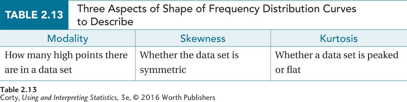
Now that frequency distributions are being graphed, it is time to look at the shapes that data sets can take. There are three aspects of the shape of frequency distributions to focus on—modality, skewness, and kurtosis—and they are summarized in Table 2.13.
It is important to know the shape of a distribution of data. The shape will determine whether certain statistics can be used. In the next chapter, for instance, it will be shown that it’s inappropriate to calculate a mean if a data set has certain irregular shapes.
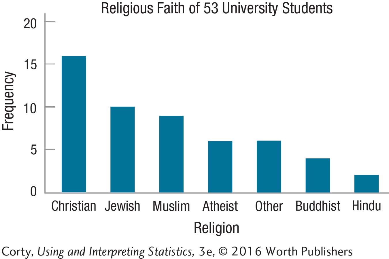
The shape of a data set only matters if the variable is measured at the ordinal, interval, or ratio level. With nominal variables, factors like race or religion, the order in which the categories are arranged is arbitrary. For example, Practice Problem 2.14 involved making a bar graph for the frequencies of different religions. The shape of this graph will vary, depending on whether one organizes the religions alphabetically, by ascending frequency, or by descending frequency. In contrast, one can’t legitimately alter the order of the depression variable, graphed with either a histogram or frequency polygon, in Practice Problem 2.15.
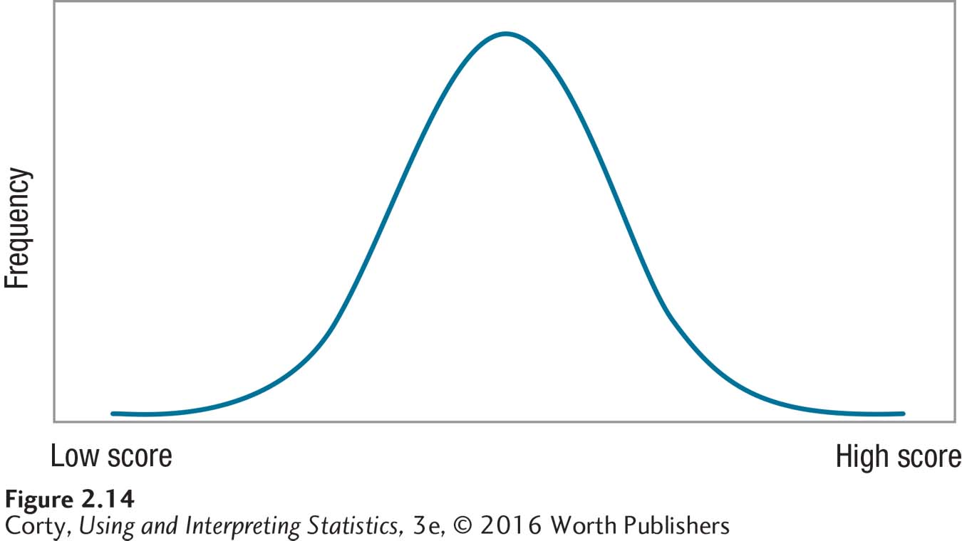
One example of a common shape is Figure 2.14. Many call this a bell-shaped curve, but statisticians call it a normal curve or normal distribution. This curve has one highest point, in the middle, and the frequencies decrease symmetrically as the values move away from the midpoint. (Being symmetrical means that the left side of the curve is a mirror image of the right.) The frequency polygon of the sixth-grade IQ data in Figure 2.12 has a “normalish” shape.
62
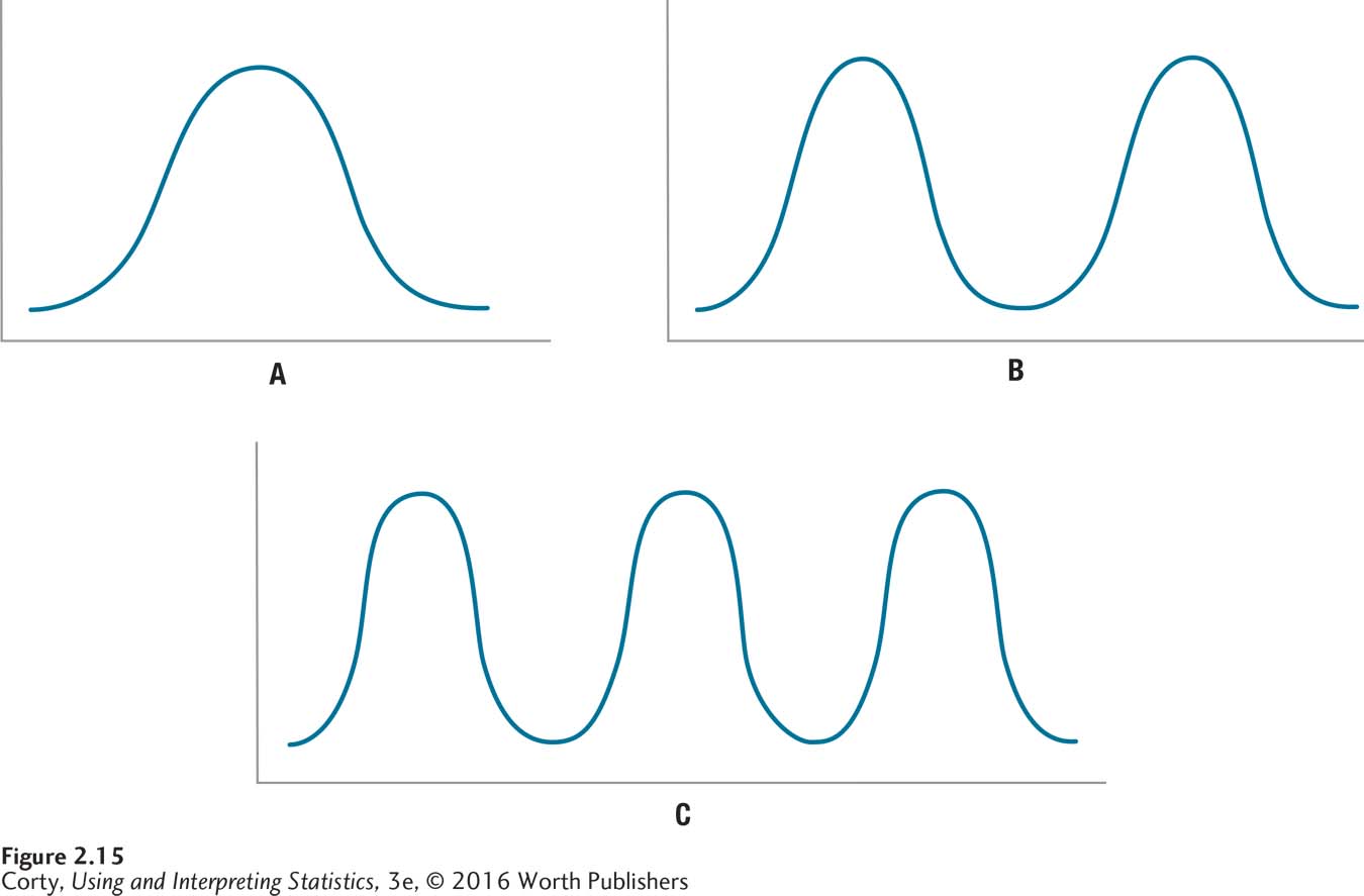
Modality, the first of the three aspects used to describe shape, refers to how many peaks exist in the curve of the frequency distribution. A peak is a high point, also called a mode, and it represents the score or interval with the largest frequency. The normal curve has one peak, in the center of the distribution, and is called unimodal. A distribution can have two peaks, in which case it is called bimodal. If a distribution has three or more peaks, it is called multimodal. Figure 2.15 shows what distributions with different modalities look like.
Another characteristic of the shape of frequency distributions is skewness, which is a measure of how symmetric they are. A distribution is considered skewed if it is not symmetric. The normal curve is perfectly symmetric, as the left side and right side are mirror images of each other. If there is asymmetry and the data tail off to the right, it is called positive skew. If the data tail off to the left, it is called negative skew. Positive and negative don’t have good and bad connotations here. Statisticians simply use positive and negative to describe which side of the X-axis the tail is on, the right side for positive numbers and the left side for negative numbers.
63
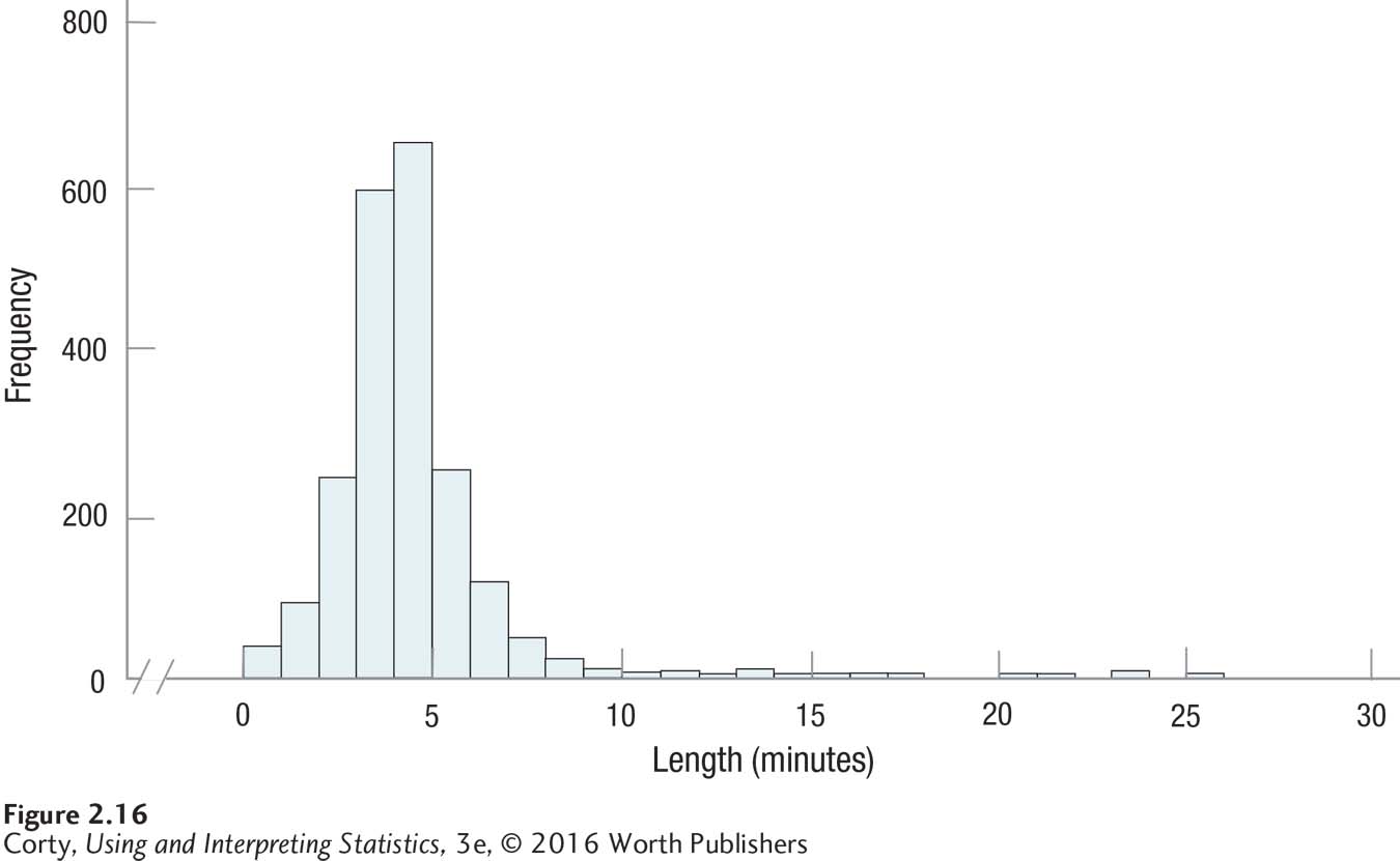
For a good example of skewness, look at Figure 2.16. It shows the length of all 2,132 songs in a student’s iTunes library. Most songs are around 3 or 4 minutes in length, but there are a few approximately 25 minutes long, giving this frequency distribution positive skew.
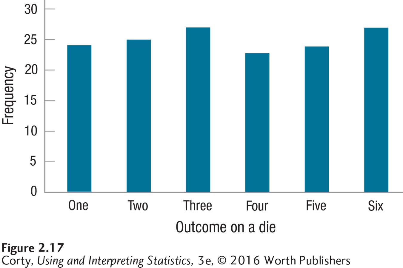
The third aspect of a frequency distribution is kurtosis, which is just a fancy term for how peaked or flat the distribution is. In Figure 2.14, the normal curve is neither too peaked nor too flat, so it has a normal level of kurtosis. Some sets of data have higher peaks, like the iTunes data in Figure 2.16. Other distributions are more flat, like the one shown in Figure 2.17 of the results from a single die rolled multiple times.
Stem-and-Leaf Displays
64
The final topic in this chapter, stem-and-leaf displays, is a wonderful way to summarize the whole chapter. A stem-and-leaf display is a combination of a table and a graph. It contains all the original data like an ungrouped frequency distribution table, summarizes them in intervals like a grouped frequency distribution, and “pictures” the data like a graph.
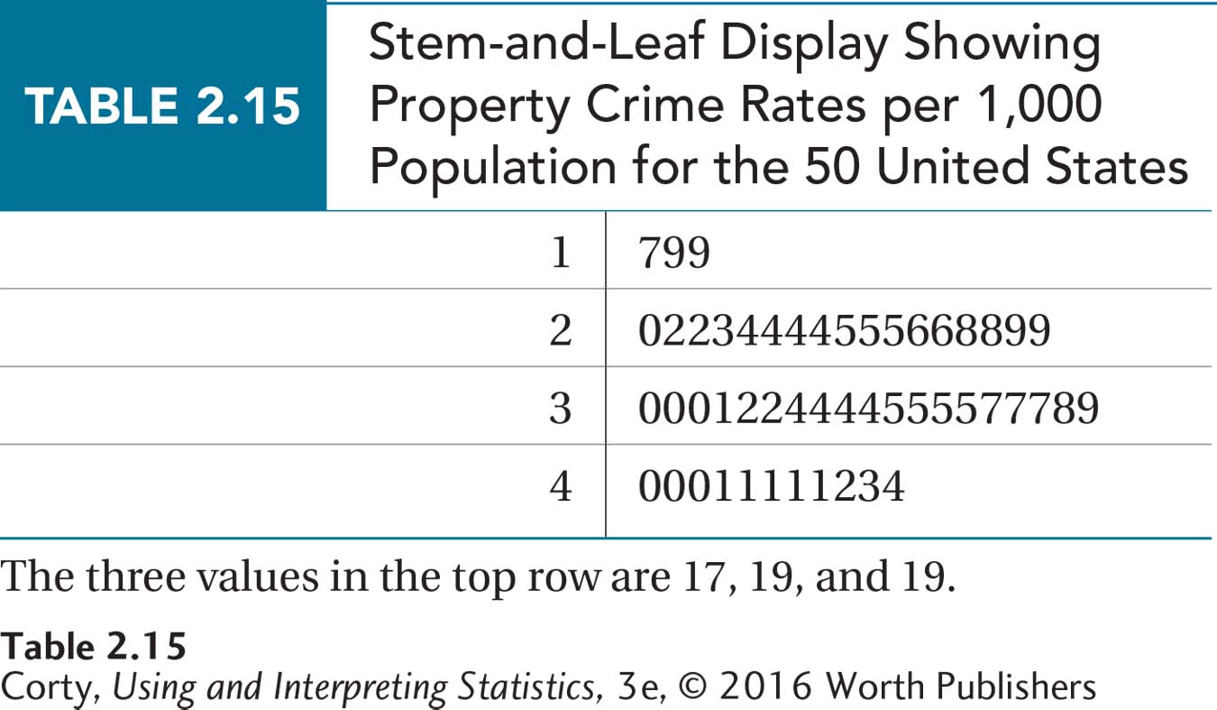
A stem-and-leaf display divides numbers into “stems” and “leaves.” The leaves are the last digit on the right of a number. The stems are all the preceding digits. For the data in Table 2.4, the stem for South Dakota, North Dakota, and New Hampshire would be the tens digit 1, and the leaves would be, respectively, the ones digits 7, 9, and 9. With New York, the stem changes to the tens digit 2 and the leaf would be 0. All the numbers in Table 2.4 are two-digit numbers, ranging from numbers in the teens to numbers in the 40s, so the leaves are 1, 2, 3, and 4. Table 2.14 shows the first step in making a stem-and-leaf display, listing all the possible stems, followed by a vertical line.
The next step is to start tallying the leaves for each stem. When the leaves for all 50 states have been added, the results will look like Table 2.15. Note that the leaves for each stem are in order from low to high. Stem-and-leaf displays are a great way to organize data in preparation for making a grouped frequency distribution.
Worked Example 2.4
For practice using a graph to figure out the shape of a data set, here are some data collected by a student, Neil Rufenacht. He took a ruler to a fast-food restaurant, bought several orders of french fries, and measured how long they were to the nearest tenth of a centimeter (cm). His results are shown as a stem-and-leaf display in Table 2.16 and as a histogram in Figure 2.18.
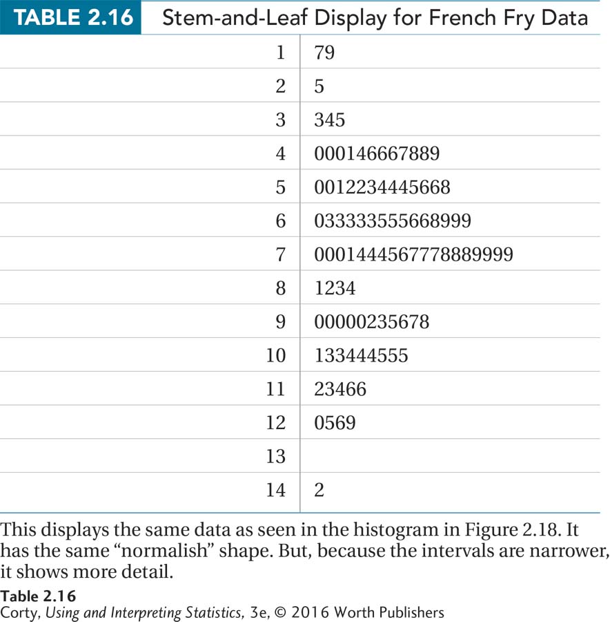
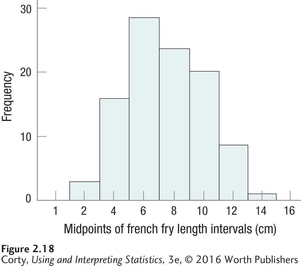
It is apparent in the histogram that the smallest french fries fell in the interval with a midpoint of 2 cm and the largest in the 14-cm interval. (That’s from about three quarters of an inch to five and a half inches for those who prefer the English system of measurement.)
65
The histogram has one mode, near the center, that doesn’t seem to go up unusually high. This means that the distribution is unimodal and neither too peaked nor flat. In addition, the frequencies tail off, in a somewhat symmetrical fashion, as the lengths move away from the mode. The shape is not a perfect normal distribution, but it is “normalish.” It seems reasonable to conclude that lengths of french fries, at least at this restaurant, resemble a normal distribution.
The stem-and-leaf display shows the same general shape, but offers more details. One can tell, for example, that the smallest french fry is 1.7 cm long.
DIY
66
Find something you can measure 100 times. Here are some ideas:
Light a match and time how long it takes to burn down. Get another match, light it, and time the burning. Do this 98 more times.
Find the prices of 100 stocks.
Find the length, in seconds, of 100 songs from your iTunes library.
Stick your tongue in a bowl of Cheerios and count how many stick to your tongue.
Dip a tablespoon into a bowl of change and tally the value of the coins you picked up.
Weigh, in grams, 100 eggs.
After you have collected your 100 data points, graph them and examine the shape. Given what you measured, does it make sense? For example, if you recorded the length of 100 songs from your music library and the distribution was positively skewed, does that, on reflection, seem reasonable?
Practice Problems 2.4
Review Your Knowledge
2.16 For what levels of measurement can one describe the shape of a frequency distribution?
2.17 Describe the normal curve in terms of symmetry, modality, and kurtosis.
2.18 What does it mean if a frequency distribution is positively skewed?
Apply Your Knowledge
2.19 Here is a graph for the religious affiliation of the 53 students surveyed in Practice Problem 2.14. Determine the shape of the data set.
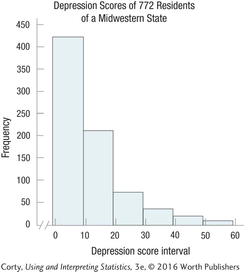
2.20 This graph shows the depression scores of the 772 residents surveyed in Practice Problem 2.15. Determine the shape of the data set.
2.21 Make a stem-and-leaf display and comment on the shape of the distribution for these data: 183, 192, 203, 203, 211, 219, 220, 227, 228, 228, 229, 230, 233, 234, 234, 248, 249, 254, and 266.
Application Demonstration
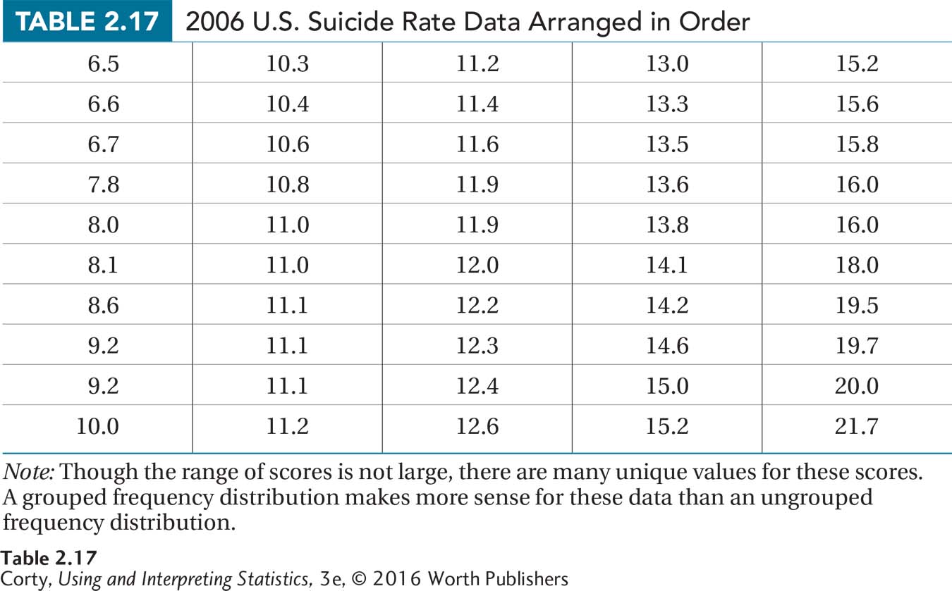
Data showing the suicide rates for all 50 U.S. states were obtained from the Statistical Abstract of the United States. The rates are expressed as the number of deaths per 100,000 population. The rates range from a low of 6.5 deaths per 100,000 population in New Jersey to a high of 21.7 per 100,000 population in Wyoming. To put that in perspective, 0.0065% of the population of New Jersey committed suicide in 2006 vs. a rate more than three times higher in Wyoming, 0.0217%.
67
The data are arranged in ascending order in Table 2.17 in preparation for making a frequency distribution. Note that the rates are reported to the nearest tenth, so that is the unit of measurement. There are a large number of unique values for the 50 states, but all values don’t need to be maintained. Instead, those close to each other can be grouped together into intervals without losing vital information. Following the flowchart in Figure 2.3, a grouped frequency distribution makes sense.
The next question is how many intervals to include. With a range of values from 6.5 to 21.7, the high score and low score are 15.2 points apart. An interval width of 2 points would mean having eight intervals. This fits in with the rule of thumb of including from five to nine intervals suggested in Table 2.5.
Intervals can’t overlap. If the bottom interval starts at 6 and is 2 points wide, then the next interval starts at 8. Suicide rates are reported to the nearest tenth, so the apparent limits of the first interval are from 6.0 to 7.9. The bottom interval starts at 6. The real limits of the interval run from half a unit of measurement below the apparent bottom of the interval to half a unit of measurement above the apparent top of the interval. That is, from 5.95 to 7.95. Note: The distance between the real limits is the interval width.
The midpoints of the intervals are the points halfway between the interval’s limits. The midpoint for the first interval, which ranges from 6.0 to 7.9, is calculated:
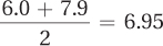
The next midpoint is one interval width higher:
6.95 + 2.00 = 8.95
After calculating the other midpoints, one finds the frequencies by counting the number of cases in each interval. These frequencies are placed in a grouped frequency distribution table, as shown in Table 2.18.
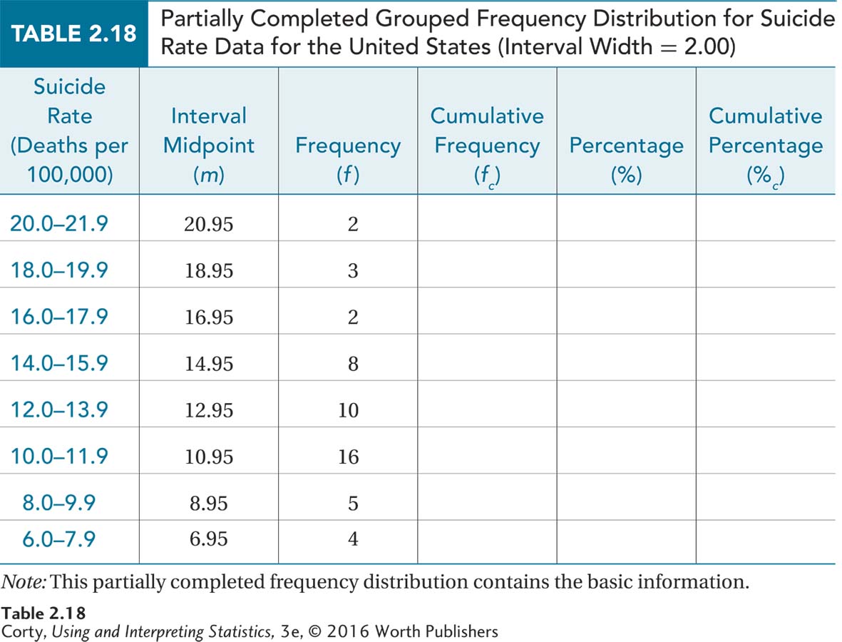
68
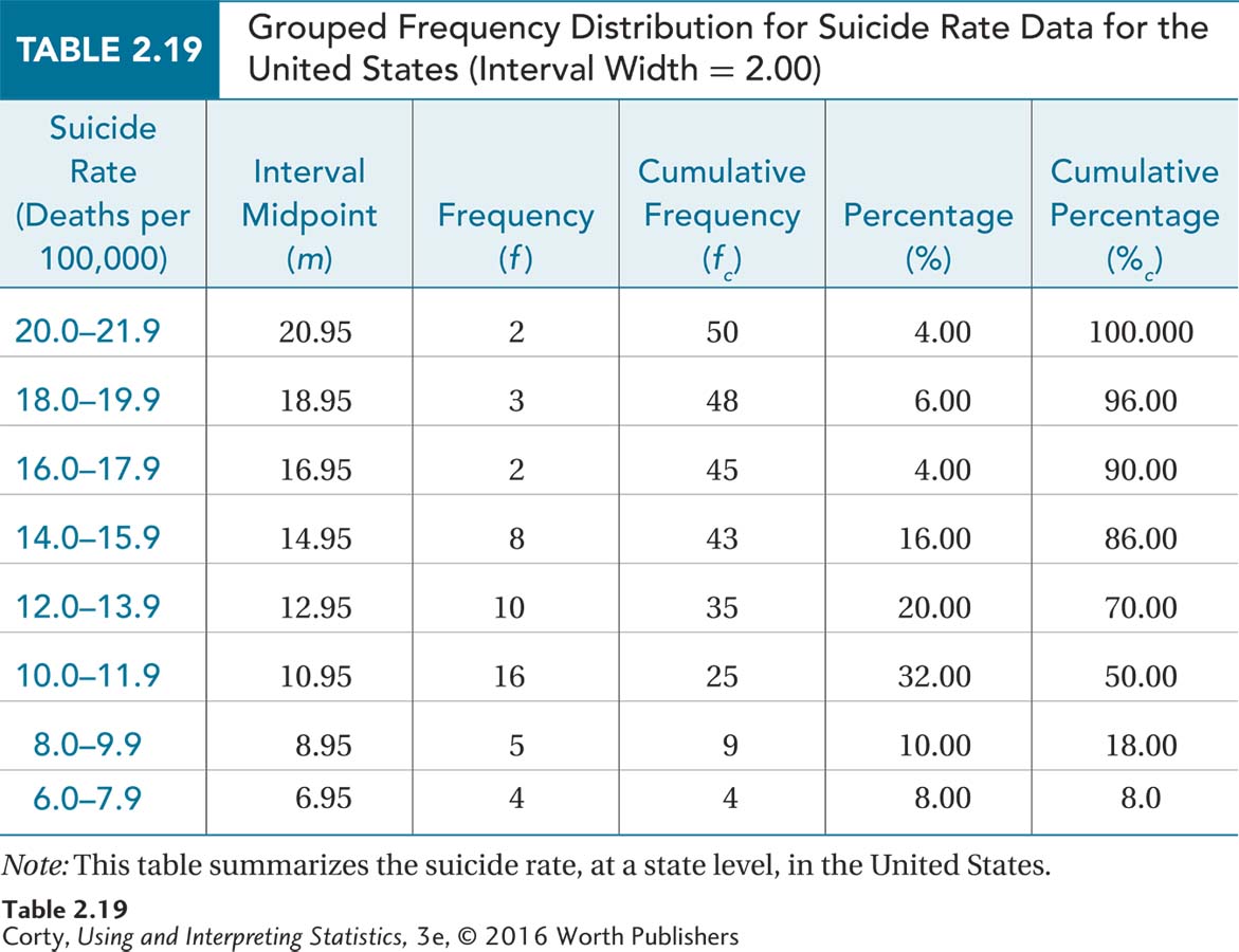
Table 2.18 contains only the intervals, the midpoints, and the frequencies. Using Figure 2.1 as a guide, stair-step up to find the cumulative frequencies. Then use Equation 2.1 to transform frequencies into percentages and Equation 2.2 to transform cumulative frequencies into cumulative percentages in order to complete the grouped frequency distribution (see Table 2.19).
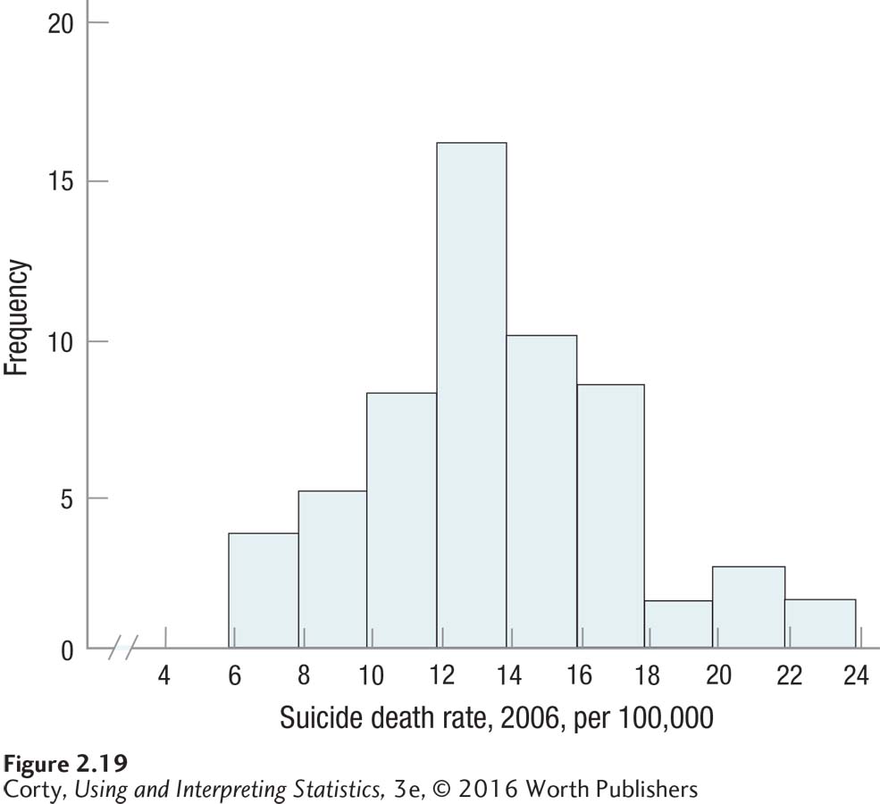
The next step is to make a graph of the data. Use Figure 2.4 to determine whether the data are continuous and Figure 2.6 to determine whether a histogram or frequency polygon should be made. Figure 2.19 displays a histogram.
69
This is a histogram, so the bars go up and come down at the real limits of the intervals, not the apparent limits. It may be hard to see, but the first bar goes up at 5.95, not 6.00, and comes down at 7.95, not 8.00.
DIY
Every year the U.S. Census Bureau used to publish a compendium of odd facts about America and Americans. Want to know the dollar value of all the crops and livestock produced in a state? The Statistical Abstract of the United States will tell you that it ranges from $32 million in Alaska to $35 billion in California. California also leads in the number of federal and state prisoners (171,000), while Hawaii has the longest life expectancy, 77 years.
Though the last Statistical Abstract was published in 2012, it is still available on the Web and in libraries. Make a reference librarian happy and ask to see a copy. Or Google the term and explore it online. Whatever approach you take, get hold of a copy, find a table that has data of interest to you, and reduce that data into a frequency distribution and graph. By doing so, what did you learn about your variable?