Graphs Express Ideas
In economics, graphs are used to express ideas. The most common graphs we use throughout this book plot two variables on a coordinate system. One variable is plotted on the vertical or y-axis, while the other variable is plotted on the horizontal or x-axis.
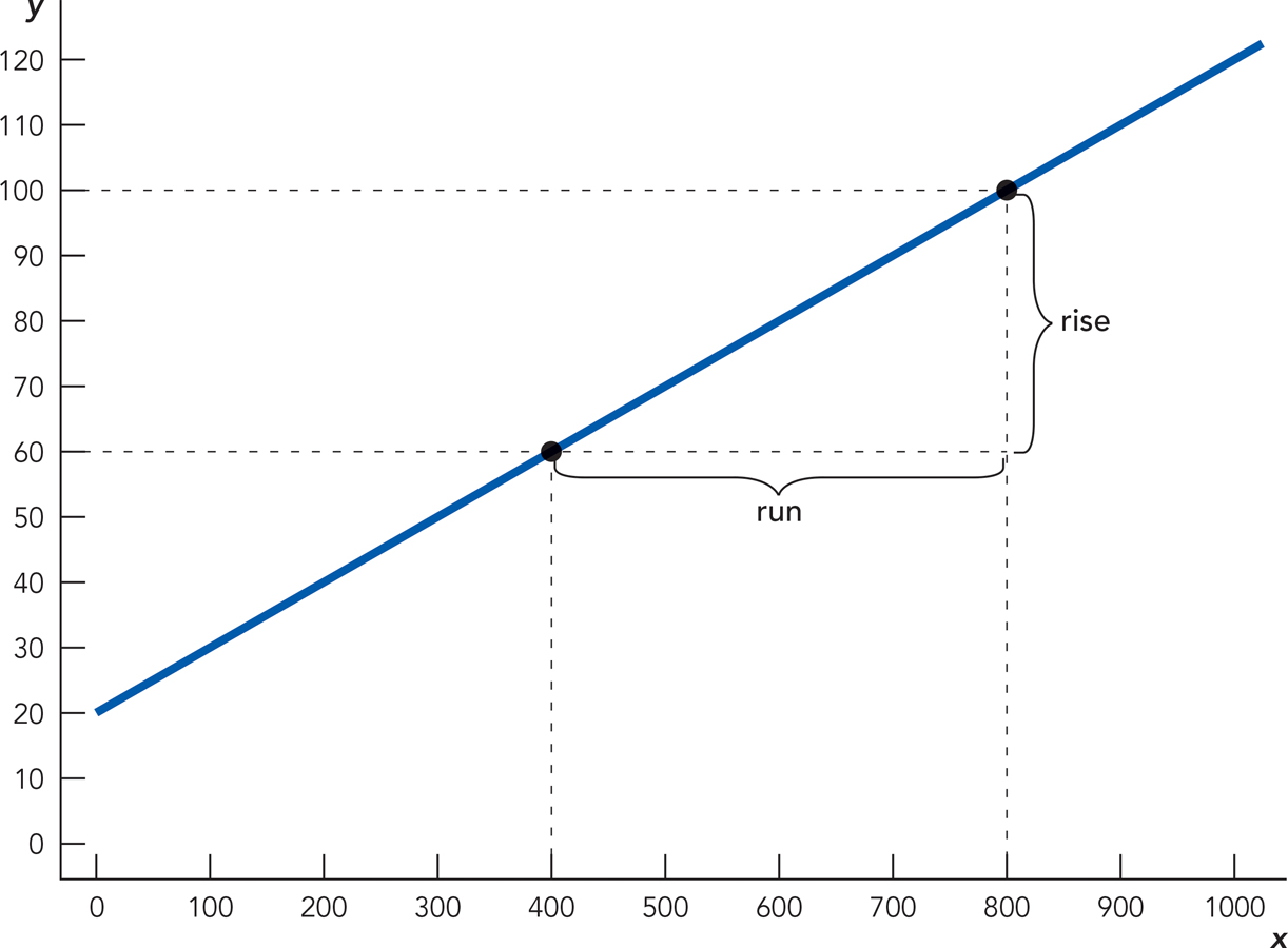
In Figure A.1, for example, we plot a very generic graph of variable Y against variable X. Starting on the vertical axis at Y = 100, you read across to the point at which you hit the graph and then down to find X = 800. Thus, when Y = 100, X = 800. In this case, you can also see that when X = 800, then Y = 100. Similarly, when Y = 60, you can read from the graph that X = 400, and vice versa. As you may recall, the slope of a straight line is defined as the rise over the run or rise/run. In this case, when Y rises from 60 to 100, a rise of 40, then X runs from 400 to 800, a run of 400, so the slope of the line is 40/400 = 0.1. The slope is positive, indicating that when Y increases so does X.

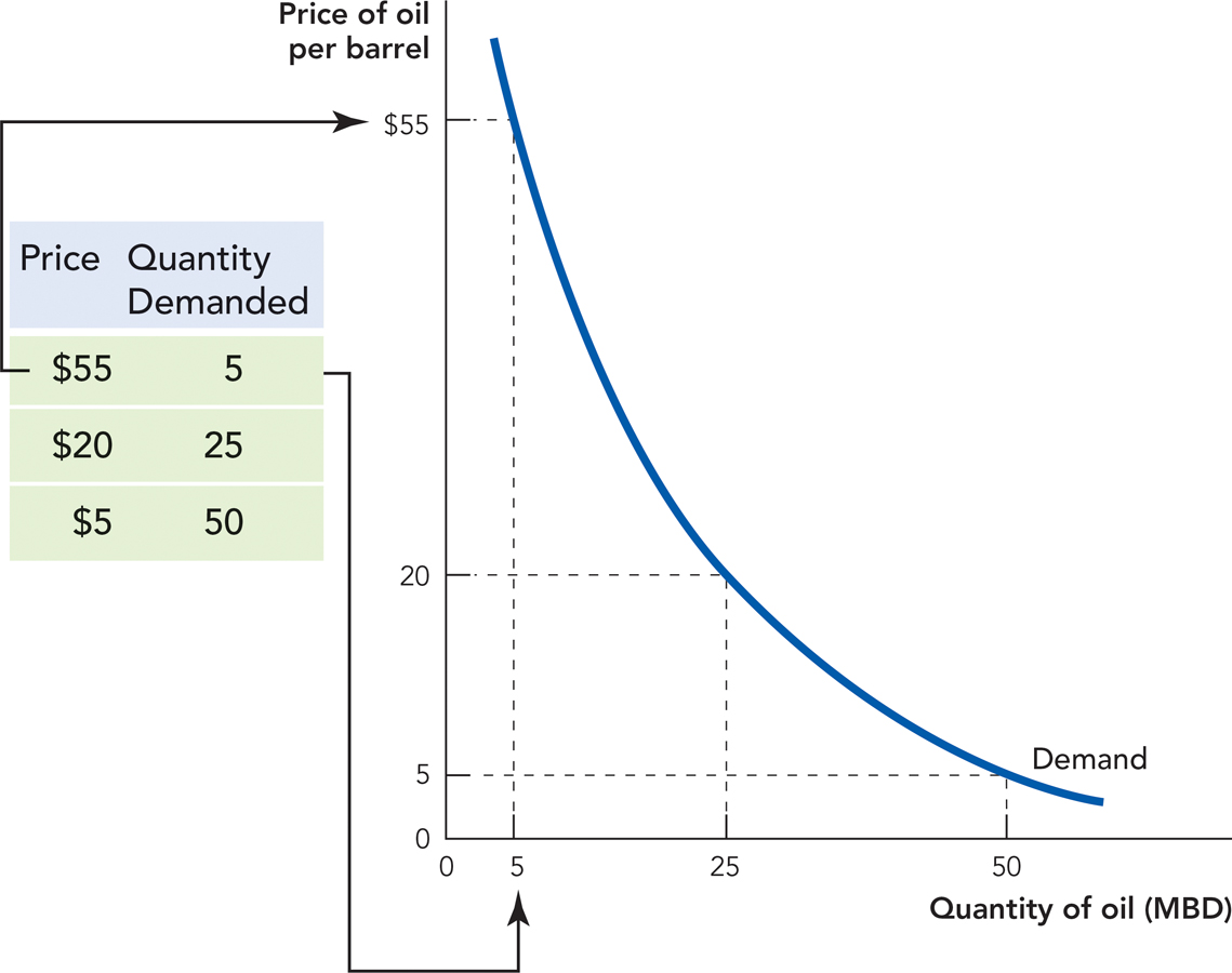
Let’s now apply the idea of a graph to some economic concepts. In Chapter 3, we show how a demand curve can be constructed from hypothetical data on the price and quantity demanded of oil. We show this here as Figure A.2.

The table on the left of the figure shows that at a price of $55 per barrel buyers are willing and able to buy 5 million barrels of oil a day (MBD), or more simply at a price of $55, the quantity demanded is 5 MBD. You can read this information off the graph in the following way. Starting on the vertical axis, locate the price of $55. Then look to the right for the point where the $55 price hits the demand curve: looking down from this point, you see that the quantity demanded is 5 million barrels of oil per day. How about at a lower price of $20 per day? Start at $20 on the vertical axis and read to the right until the price hits the demand curve, then read down. Can you see that the quantity demanded at this price of $20 per barrel is 25 million barrels of oil per day?
A-2
A-3
We said that graphs express ideas, so what is the idea being expressed here? The most important fact about a demand curve is that it has a negative slope, that is, it slopes downward. This tells us the important but simple idea that as the price of a good falls, the quantity demanded increases. This is key: as the price of a good such as oil falls, people demand more of it.
A demand curve is a description of what would happen to the quantity demanded as the price of a good changed holding fixed all other influences on the quantity of oil demanded. (In this sense, demand curves are hypothetical and we rarely observe them directly.)
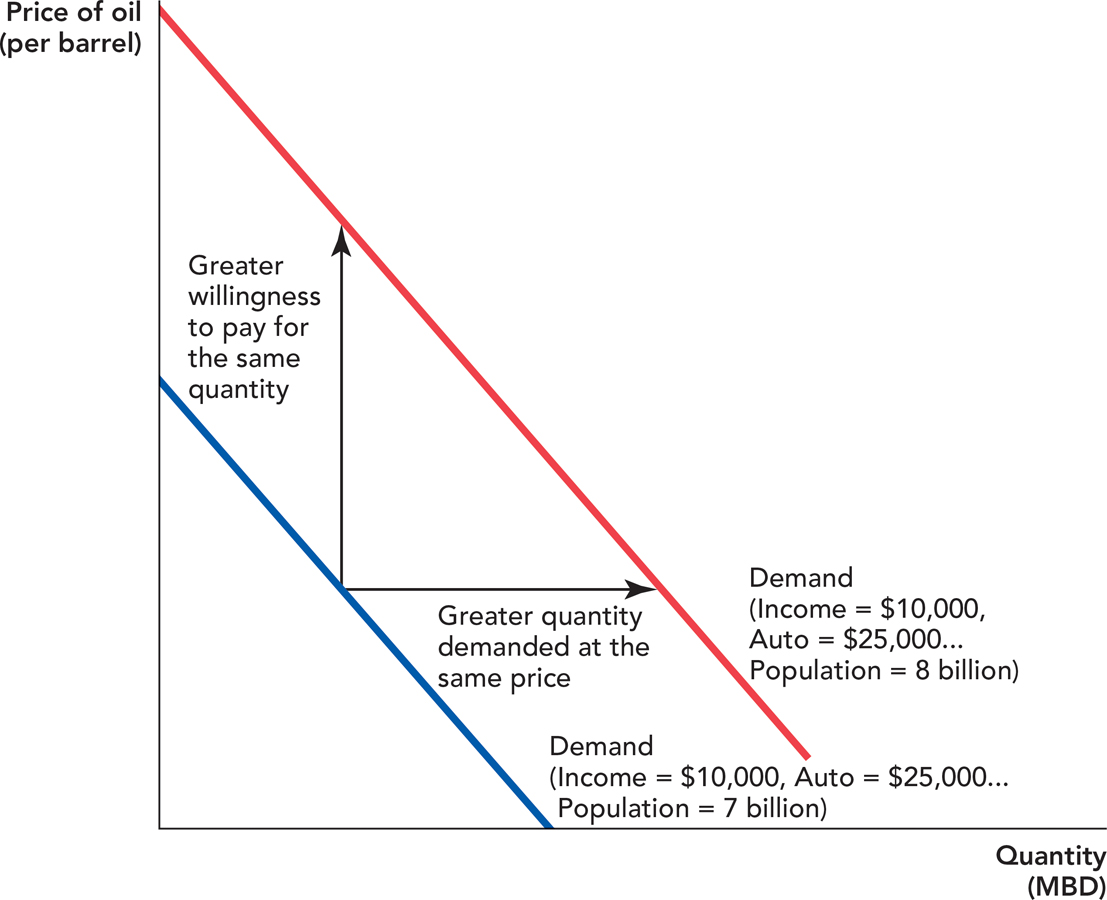
The quantity of oil demanded, for example, depends not just on the price of oil but on many other factors such as income or the price of other goods like automobiles and population, to name just a few of many influences. Today’s demand curve for oil, for example, depends on today’s income, price of automobiles and population. Imagine, for example, that average income today is $10,000, the price of an average automobile is $25,000 and world population is 7 billion. The blue curve in Figure A.3 shows the demand curve for oil under these conditions. Note that there are also many other influences on the demand for oil that we don’t list but that are also being held fixed. Most importantly, if any of these conditions changes then the demand curve for oil will shift.

A-4
If world population increases to 8 billion, for example, there will be a new demand curve for oil. With a greater population, there will be more barrels of oil demanded at every specific price so the demand curve will shift to the right. Equivalently, as the population increases, there will be a greater willingness to pay for any given quantity of oil so the demand curve will shift up. Thus, we say that an increase in demand is a shift in the curve up and to the right shown by the red curve in Figure A.3. Chapter 3 explains in greater detail how a demand curve shifts in response to changes in factors other than price.
What is important to emphasize here is that a demand curve is drawn holding fixed every influence on the quantity demanded other than price. Changes in any factor that influences the demand for oil other than price will produce a new demand curve.
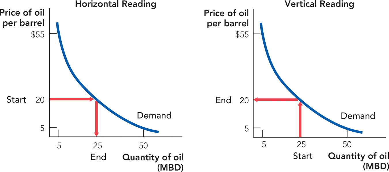
One more important feature of two variables graphed in a coordinate system is that these figures can be read in two different ways. For example, as we mention in Chapter 3, demand curves can be read both horizontally and vertically. Read “horizontally,” you can see from Figure A.4 that at a price of $20 per barrel demanders are willing and able to buy 25 million barrels of oil per day. Read “vertically,” you can see that the maximum price that demanders are willing to pay for 25 million barrels of oil a day is $20 per barrel. Thus, demand curves show the quantity demanded at any price or the maximum willingness to pay (per unit) for any quantity.

It may seem difficult at first to interpret these graphs, but as you will see, graphs are amazingly useful for thinking about difficult economic problems. It’s like learning to drive a car—at first it’s not easy and you will make some mistakes but once you learn how to drive your ability to do things and go places increases enormously. The same thing is true with graphs!