Profits and the Average Cost Curve
We have shown that the firm maximizes profits by producing the quantity such that P = MC, but a firm can maximize profits and still have low profits or even losses. Just because the firm is doing the best it can doesn’t mean that it is doing very well. We would like, therefore, to be able to show profits in a diagram. To do this, we need to introduce the average cost curve.
The average cost of production is the cost per barrel, that is, the total cost of producing Q barrels divided by Q:

The average cost of production is simply the cost per barrel, that is, the average cost of producing Q barrels of oil is the total cost of producing Q barrels divided by  . For example, in Figure 11.4, we can read from the table that the total cost of producing 6 barrels of oil per day is $120; thus, the cost per barrel is $120/6 = $20. Figure 11.4 computes average cost (in the last column) and graphs the average cost curve alongside the price and marginal cost curves.

203
With a little bit of work, we can now show profit on our graph. Recall that
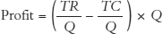
Profit = Total revenue – Total cost = TR – TC
so we can also write
or
Profit = (P – AC) x Q
(To get to the last statement, notice that we used the two definitions, TR = P × Q and  .)
.)
The last statement says that profit is equal to the average profit per barrel (P – AC) times the number of barrels sold Q.
We already know that 8 barrels is the profit-maximizing quantity when the price is $50, but now we can show profit on our graph. To illustrate profit, begin at a quantity of 8 barrels and move up to find the price of $50 at point a. Now reading down from point a, find the average cost from the AC curve at point b, which is $25.75. (You can also check this by examining the table below the diagram for the AC of producing 8 barrels.) The average profit per barrel, P – AC, is ($50 – $25.75) or $24.25 per barrel. Finally, since production is 8 barrels, the total profit is (P – AC) ×Q or $24.25 × 8 = $194 per day, the shaded area in the diagram.
As we said earlier, just because a firm is maximizing profits doesn’t mean that it is making profits. If the price of oil were to drop to $4 per barrel, what happens? The best the firm could do is produce at P = MC. Looking at the MC column in the table, MC = $4 at 1 barrel of oil produced. So at a price of $4, the firm produces 1 barrel of oil. But at this price, the firm is taking a loss because P < AC. Figure 11.5 illustrates.

204
What is the lowest price per barrel that will give the firm a profit (not take a loss)? Recall that profit is (P – AC) × Q, thus—assuming that the firm is profit-maximizing so P = MC at all times—when P > AC, the firm is making a profit, and when P < AC, the firm is making a loss. The minimum point of the AC curve is at $17, so at any price below $17 the firm must be taking a loss.
CHECK YOURSELF
Question 11.5
![]() Use average costs to define profit for the competitive firm.
Use average costs to define profit for the competitive firm.
Question 11.6
![]() Using average cost, describe all the prices at which the firm would make a profit and all the prices at which the firm would make a loss.
Using average cost, describe all the prices at which the firm would make a profit and all the prices at which the firm would make a loss.
One more technical point is worth noting. Take a look again at Figure 11.5 and notice that the marginal cost curve meets the average cost curve at the minimum of the average cost curve. This is not an accident but a mathematical necessity. We won’t delve into this in detail, but suppose that your average grade in a class is 75% and that on the next test, the marginal test, you earn a grade below your average, 60%. What happens to your average grade? It falls. So whenever your marginal grade is below your average grade, your average falls. Now suppose that your average grade is 75% and on the next test, the marginal test, you earn a grade above your average, 80%. What happens to your average? It rises. So whenever your marginal grade is above your average grade, your average rises. What is true for your average and marginal grade is equally true for average and marginal cost. So think about what must happen around the point where the MC and AC curves meet. When marginal cost is just below average cost, the average cost curve is falling, and when marginal cost is just above average cost, the average cost curve is rising, so AC and MC must meet at the minimum of the AC curve. Thus, on an exam be sure to draw the MC curve rising through the minimum point of the AC curve.
We are now ready to turn to our third question, when should the firm enter or exit the industry?