Chapter 3. Graphical and Numerical Data Descriptions
Introduction

Once we have collected data, either from a sample or a population, we have a listing of the values of one or more variables measured on those individuals. The following data give information about 8 of the 25 top-grossing movies in the United States in mid-November 2010.
| Some of the top-grossing movies of all time | ||||||
|---|---|---|---|---|---|---|
| E.T.: The Extra-Terrestrial | 1982 | 435 | Family | 115 | 4 | PG |
| Star Wars: Episode I - The Phantom Menace | 1999 | 431 | Sci-Fi | 133 | 0 | PG |
| Pirates of the Caribbean: Dead Man's Chest | 2006 | 423 | Adventure | 130 | 1 | PG13 |
| Toy Story 3 | 2010 | 415 | Animation | 103 | 2* | G |
| Spider-Man | 2002 | 404 | Action | 121 | 0 | PG13 |
| Transformers: Revenge of the Fallen | 2009 | 402 | Action | 150 | 0 | PG13 |
| Star Wars: Episode III - Revenge of the Sith | 2005 | 380 | Sci-Fi | 140 | 0 | PG13 |
| The Lord of the Rings: The Return of the King | 2003 | 377 | Fantasy | 201 | 11 | PG13 |
| *as of February 2011 | ||||||
Unless our sample or population is quite small, it is difficult to make much sense of such a list. Even when we know what the columns in this table represent—name, year of release, millions of dollars earned, genre, running time in minutes, number of Oscars won, and MPAA rating—it is difficult to draw any conclusions about these movies. In what year were the most top-grossing movies released? What was the running time of a typical movie? Were fantasy movies generally longer than animated ones? What was the average dollar amount earned? We need to summarize our data in order to get an overall picture of the data. Our data descriptions can be either graphical (creating a “picture” in the usual sense) or numerical (creating a “picture” in a more abstract sense).
3.1 Graphical Data Descriptions
When we describe a set of data like our movie data, we do so by focusing on individual variables. Sometimes our variables are categorical (such as genre); sometimes they are quantitative (such as running time). The type of graph that we use to describe a variable depends on what kind of variable we are describing.
3.1.1 Graphs of Categorical Variables: Bar Graphs
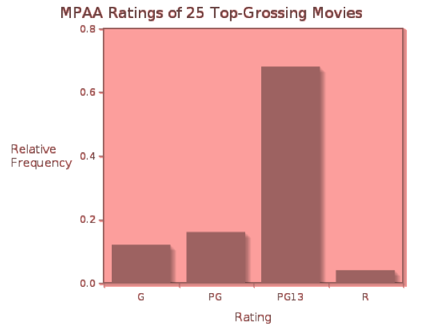
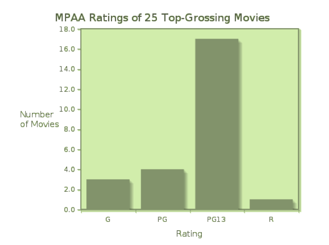
If the measurements we collect are categorical, we first organize them into a frequency distributionor a relative frequency distribution. A frequency distribution displays the counts (frequencies) of measurements falling in each category, while a relative frequency distribution shows the fraction or percent of measurements falling into each category. If we compile the MPAA ratings of the 25 top-grossing movies, we can organize the data into a table showing both frequencies (counts) and relative frequencies (as decimal fractions).
| Rating | Count | Relative Frequency |
|---|---|---|
| G | 3 | 0.12 |
| PG | 4 | 0.16 |
| PG13 | 17 | 0.68 |
| R | 1 | 0.04 |
A bar graph is the simplest way to display categorical data, and can be used with frequency or relative frequency distributions for any categorical variable. A bar graph uses the heights of bars to indicate the count or relative frequency of measurements that fall into each category. In this case, the heights of the bars indicate the number of movies of each rating in the list of top-25 grossing movies in the United States.
Click here to see the relative frequency bar graph for the movie ratings. Notice that the relative sizes of the bars remain the same, while the scale on the vertical axis changes.
Because the rating data are simple, we probably get a “picture” of this distribution just from the frequency table. However, when there are more categories, a bar graph is a convenient way to visualize the distribution of measurements.
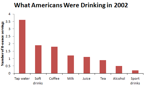
Consider the following data on the average daily consumption of various types of drinks by Americans in the year 2002:
| Type of Drink | Number of 8-ounce servings |
|---|---|
| Filtered or non-filtered tap water | 3.6 |
| Coffee | 1.8 |
| Soft drinks | 1.9 |
| Milk | 1.2 |
| Juice | 1.1 |
| Tea | 0.9 |
| Alcohol | 0.5 |
| Sport drinks | 0.2 |
Figure 3.2 displays these data.
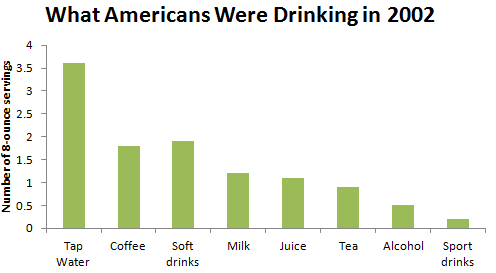
A bar graph in which the categories are displayed in order of decreasing frequencies is called a Pareto Chart. Click here to see the Pareto Chart for What Americans Were Drinking in 2002.
What are the essential features of a bar graph that are displayed here?
- The graph has a title that describes the variable being categorized.
- Categories are displayed on the horizontal axis.
- Categories may appear in any order. They are displayed so that there are spaces between the bars, and each bar has an equal width.
- The frequencies (in this case, the number of ounces) or relative frequencies for the categories are displayed on the vertical axis.
- The vertical axis is marked off uniformly—equal numerical differences correspond to equal spaces on the axis.
Question 3.1
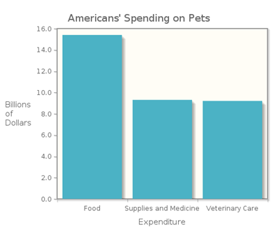
Americans spent $38.5 billion dollars on their pets in 2006, including spending in these categories:
| Expenditure | Billions of Dollars |
|---|---|
| Food | 15.4 |
| Supplies and Medicine | 9.3 |
| Veterinary Care | 9.2 |
Bar graphs are good vehicles for comparing the different values of a categorical variable, and are particularly useful when we want to compare these values over different time periods. In such a case, we can make side-by-side bar graphs, which show the count for each category in each time period.
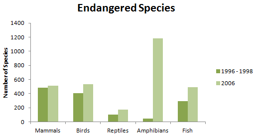
Throughout the world, animal species are threatened by climate change, deforestation, and hunting. Some species have suffered more from such forces than others; Figure 3.1.5 shows the numbers of endangered species in 1996-1998 and 2006 for several types of animals.
| Numbers of Endangered Species | ||
|---|---|---|
| 1996-1998 | 2006 | |
| Mammals | 484 | 510 |
| Birds | 403 | 532 |
| Reptiles | 100 | 174 |
| Amphibians | 49 | 1180 |
| Fish | 291 | 491 |
In order to compare the number of endangered animals of various types between the years 1996-1998 and 2006, we can construct a side-by-side bar graph, as shown in Figure 3.1.3. From the bar graph, it is easy to see that the numbers of endangered species in all these categories has increased, with a phenomenal increase in the number of endangered amphibians over this time period.
Side-by-side bar graphs allow us to compare two or more distributions. In this case, we have distributions from two different time periods. In other settings, the distributions may come from two different populations or samples; for example, distributions of the types of college degrees awarded to males and to females could be displayed with a side-by-side bar graph.
3.1.2 Graphs of Categorical Variables: Pie Charts
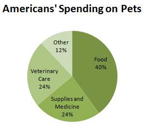
If the categorical data we have consist of all parts of a single whole, and each measurement falls into only one category, then we can also display the data in a pie chart. For the pet spending in the previous Try This! example, we can see that we do not have all parts of the whole. Americans’ pet spending in 2006 totaled $38.5 billion, but the spending on the three categories given totaled only $33.9 billion. Therefore, $4.6 billion were spent on other goods or services. If we wish to make a pie chart of these data, we can add an “Other” category to our table, and calculate the percentage of total expenditures that each category represents.
| Expenditure | Billions of Dollars | Percent of Total |
|---|---|---|
| Food | 15.4 | 40 |
| Supplies and Medicine | 9.3 | 24 |
| Veterinary Care | 9.2 | 24 |
| Other | 4.6 | 12 |
Figure 3.4 shows the pie chart for this distribution.
The video StatClips: Summaries and Pictures for Categorical Data compares bar graphs and pie charts, and provides examples of each.
How does this pie chart compare to the bar graph? Does it provide additional information, or give us a better picture of the spending? Because we calculated the percent for “Other” expenditures, we have, in a sense, the whole picture of expenditures. It is easy to see that this “Other” category represents only half the spending of either veterinary care or supplies and medicine, while food is by far the largest expense.
If a pie chart is better, why don’t we use one all the time? The pie chart is appropriate only when we have frequencies or relative frequencies for all values of a single categorical variable. Neither is it appropriate when we are given data that represents averages calculated from a group of individuals, such as the “What Americans Are Drinking” displayed earlier in a bar graph.
Question 3.2
The accompanying table shows the MPAA Ratings of the 25 Top-Grossing Movies (as of mid-November 2010).
| Rating | Frequency | Percent |
|---|---|---|
| G | 3 | 12 |
| PG | 4 | 16 |
| PG13 | 17 | 68 |
| R | 1 | 4 |
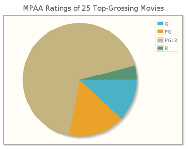
(b) The CrunchIt! pie chart shown here uses a legend to indicate the categories of the variable MPAA rating, but does not show the percentages corresponding to each segment. (c) The relative sizes of the segments of the pie chart correspond to the bars in the graph in Figure 3.1.2, so the relationships among the individual categories appear the same in both graphs. However, the pie chart shows the relation of each segment to the whole population more clearly than the bar graph does.
3.1.3 Graphs of Quantitative Data: Histograms
If the data we collect are quantitative rather than categorical, a bit more analysis is required before we create a graph of the data. We have more choices to make when we graph quantitative data, and these choices depend on the characteristics of the data themselves. Are the data discrete or continuous? Is the range of the data large or small? Let’s begin by looking at a set of discrete data, with a small range.
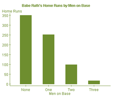
Babe Ruth hit 714 home runs in his career; each home run was hit with 0, 1, 2, or 3 runners on base, as indicated in the accompanying table.
| Men on Base | Home Runs |
|---|---|
| 0 | 349 |
| 1 | 251 |
| 2 | 98 |
| 3 | 16 |
Using a bar to indicate the frequency of each number of men on base gives the accompanying histogram.
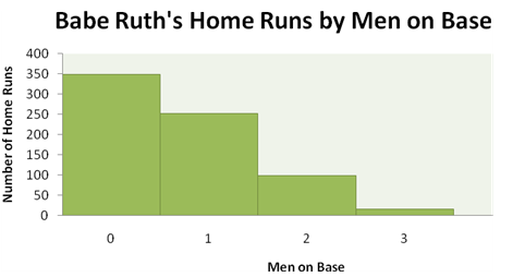
What are the essential features of a histogram that are displayed here?
- The graph has a title that describes the variable being analyzed.
- Values of the quantitative variable are displayed on the horizontal axis.
- The values appear on the horizontal axis in their natural numerical order, with each bar representing an interval of values of the variable. (Here each interval represents a single whole number.)
- Because each bar represents an interval of values, there are no spaces between the bars.
- Each measurement falls into only one interval.
- The counts for the intervals of values are displayed on the vertical axis.
- The vertical axis is marked off uniformly—equal numerical differences correspond to equal spaces on the axis.
Now let’s continue looking at some baseball data, but make things a little more complicated. The accompanying table gives the “winning percentage” for each American League baseball team at a certain point during a season. Even though this value is described as a “percentage,” it is really a decimal fraction of games won out of games played. These data are continuous, since this decimal fraction can be any value between 0 and 1, inclusive (though no team has either lost or won all of its games in a season).
| EAST | CENTRAL | WEST | |||
|---|---|---|---|---|---|
| Boston | .605 | Cleveland | .582 | Los Angeles | .593 |
| New York | .572 | Detroit | .544 | Seattle | .524 |
| Toronto | .497 | Minnesota | .493 | Oakland | .486 |
| Baltimore | .424 | Kansas City | .434 | Texas | .476 |
| Tampa Bay | .418 | Chicago | .425 | ||
The numbers in this data set range from a low of 0.418 to a high of 0.605. In order to “picture” them in a graph, we must decide on intervals by which to group them. These intervals are typically called “bins.” The trick in creating a good histogram is to find the bin width that is (as Goldilocks would say) “just right.” If the bin width is too small, very few measurements lie in each bin, and the histogram has many short, thin bars. If the bin width is too large, many measurements lie in each bin, and the histogram has only a few tall fat bars.
So let’s try some different widths, and display the resulting histograms. If we start our first bin and 0.400 and make the bin width 0.010, we get the histogram in Figure 3.6.
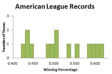
What we see here is the “too small” phenomenon. This is not a good picture of the distribution of team records, because many bins are empty (indicated by the spaces in the histogram), and most of the rest have only one measurement.
With the same starting point, 0.400, but a bin width of 0.075, we obtain Figure 3.7.

This is the “too big” phenomenon—not many boxes, and a similar number of values in each box. This is also not a good picture of the distribution of team records.
Finally, if we start our first bin at .400 and make the bin width .050, we get the histogram in Figure 3.8.
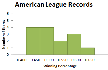
Perhaps not “just right,” but a pretty good picture of how the winning percentages are distributed. There are not a lot of empty bins (in fact, there are none here), nor are there just a few tall bins (the heights of the bars vary from 1 to 4). Would other bin widths work? Certainly. Is there a “magic” bin width that produces the “best” picture? Unfortunately not. Choosing a bin width requires practice. If you try several different bin widths, you will probably find a histogram that seems to give a good picture of your data. This is one of the situations in which statistics is more art than science.
It is important to note that we have to decide where we should display values that fall on a bin boundary, so that each measurement lies in only one bin. Because of our bin choices, none of the winning percentage data fell on a bin boundary. But it is common for this to happen. Each statistical software package handles this in a particular way, assigning a boundary value to either the bin to its left or the one to its right. While the choice may vary with your choice of software, each package handles boundary values in a consistent way. CrunchIt! counts a data value that falls on the boundary in the bin to its left; TI graphing calculators count such a value in the bin to its right.
Question 3.3
The accompanying table gives the average price per gallon of gasoline in the United States each month from 1999 through 2001. Make a histogram of this data.

3.1.4 Describing Histograms
Describing a histogram can give information about the distribution of data values even when the graph itself is not present. When we look at a histogram, we are interested in its shape, its center, and its spread, and whether there are any observations that seem unusual or separated from the rest of the data.
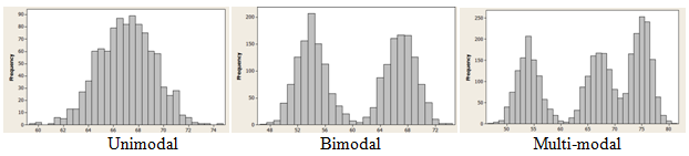
In terms of shape, we assess how many peaks the graph has, and how the graph falls away from these peaks. The peaks are the tall boxes in the histogram, and we call the histogram unimodal if there is one tall peak. The graph is bimodal if there are two non-adjacent tall peaks (of roughly equal height), and multi-modal if there are more than two such tall peaks. (These terms derive from the word mode, the measurement that occurs most frequently in the data set.)
If the graph can be divided in half so that the two halves are close to being mirror images, then we call the graph symmetric. If the peak of the graph occurs near the right-hand side, and the heights of the boxes decrease as we move to the left, we call the graph left-skewed. Similarly, if the peak of the graph occurs near the left-hand side, and the heights of the boxes decrease as we move to the right, we call the graph right-skewed.
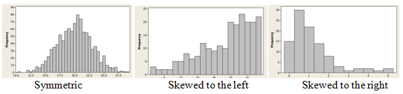
It is important to notice that, for statisticians, skewness describes not where the peak is, but rather the direction in which the graph “tails off.” This is different from (in fact, the opposite of) the way many people use the term “skewed” in every-day conversation.
In terms of center, we look for a value such that about half of the data falls below the value and half is above it. We use the heights of the boxes to determine what this value is.
To describe spread, we consider the minimum and maximum values as shown in the graph. We identify unusual data values as potential outliers if they seem outside the overall pattern of the graph. In order to be considered outliers, values should appear quite different from the rest of the data, not just separated by an interval or two from the others.
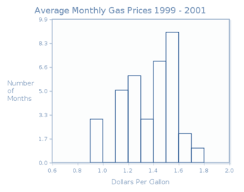
If we consider the histogram of gasoline prices that we created in CrunchIt! (shown here in Figure 3.11), we see that this distribution is unimodal, because it has one peak (occurring at the interval from 1.5 to less than 1.6). The distribution is left-skewed, because the graph falls away from this peak farther to the left than to the right.
To find the center, we look for the interval that contains the eighteenth or nineteenth measurements (in size order), because these are the middle measurements in this set of 36 observations. We consider the heights of the boxes, beginning on the left. While the scale is marked off using tenths, the number of months themselves are whole numbers. The first box is 3 units tall, the second one is 5 units tall, and the third one is 6 units tall. So the first three boxes represent the smallest 14 measurements. The fourth box is three units tall, so the fifteenth, sixteenth and seventeenth measurements lie in that interval. That means that the eighteenth and nineteenth measurements lie in the interval from 1.4 to less than 1.5. So we might say that the center of the distribution is about $1.45 (since these measurements are dollars and cents).
The spread of the distribution is from 0.9 ($0.90) to 1.8 ($1.80). While there is a gap between the first and second boxes, the data represented by the first box are not unusual enough to be called outliers.
We should note that the choice of bin width can alter the shape of a histogram somewhat, so these verbal descriptions are not precise characterizations of the distribution’s shape, center, and spread. Further, two people looking at the same histogram may have different descriptions of the histogram, particularly in regard to its shape. More often than not, statistics requires an interpretation of results that may legitimately vary from person to person.
Consider the histogram in Figure 3.12, which displays the distribution of petal length (in centimeters) for a sample of Setosa iris.
The data used to create this histogram is part of a famous data set, published in 1935 by Edgar Anderson. The data set was used by the pioneering statistician R. A. Fisher to develop a model for distinguishing between several Iris species.
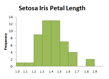
Is this distribution symmetric (two very similar “halves”) or slightly right-skewed (falling away from the peak farther to the right than to the left)? It depends entirely on your perspective. Such differences in interpretation happen frequently in statistics, a reality that is not necessarily comforting to a mathematics student trained to find a unique set of solutions to an algebraic equation. Ambiguity is a part of life, and a part of statistics as well. As you continue your study of statistics, keep an open mind about possible interpretations of your data, understanding that another individual may have chosen a different “best” interpretation. In this chapter we will also discuss numerical methods for describing data. These numerical measures can enhance our understanding of a distribution’s properties, even when they do not eliminate ambiguity.
3.1.5 Graphs of Quantitative Data: Stem and Leaf Plots
A stem and leaf plot is another graphical measure for displaying quantitative data. In a stem and leaf plot (often called a stem plot), each numerical value is broken into its “stem” and its “leaf.” The stem consists of all digits except the final digit; the leaf is the final digit. If we look at the average gas price data, and first round each value to the nearest cent, we get the data:

So for the first measurement, the stem would be “0.9” and the leaf would be “7.” Of course, the “7” is not the whole number 7, but rather .07, since the 7 occurs in the hundredths place of our decimal. Similarly, for the measurement 1.62, the stem would be “1.6,” and the leaf would be “2.”
We create a graph by putting all the stems to the left of a vertical line, and then placing each leaf in its appropriate row, producing the plot in Figure 3.14.
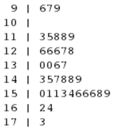
Notice that when we create a stem and leaf plot, we indicate all stems in order from the smallest to the largest, regardless of whether there are any leaves corresponding to that stem. In the plot above, the stem “10” has no leaves, because there are no gas prices between $1.00 and $1.09.
You can see that the stem and leaf plot looks very much like a histogram turned on its side. Thus, we can describe the shape, center, spread and possible outliers for a stem and leaf plot in the same fashion as we did for a histogram. All that is required is that we rotate the plot so that the stems are in numerical order from left to right, with the leaves stacked vertically above their stems.
Figure 3.1.19 shows the stem plot for the gas price data rotated in this fashion, along with a histogram of the same data. Based on this plot, we can see that the distribution of gas prices is skewed to the left. The center of the distribution is about $1.44, and it spread is from $0.96 to $1.73.
The video Snapshots: Visualizing Quantitative Data shows statisticians using stem and leaf plots and histograms to get a picture of research data.
Does a stem and leaf plot provide information that a histogram does not? In a histogram, once you create the graph, the data values are “gone”—they do not appear in the graph. On the other hand, in a stem and leaf plot, the data values used to construct the graph can be seen in the graph. Despite this useful feature, you will find that histograms are used more often than stem and leaf plots, particularly when data sets are quite large.
Question 3.4
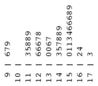
The heights in inches of 25 randomly selected adult females in the United States are shown in the table below.
| 63.1 | 61.1 | 62.6 | 64.1 | 63.8 | 63.7 | 62.9 | 65.5 | 68.2 | 64.1 |
| 62.9 | 60.8 | 66.9 | 69.6 | 62.9 | 61.8 | 62.9 | 66.0 | 64.9 | 63.7 |
| 61.4 | 63.4 | 66.8 | 65.4 | 70.2 |
When graphing a large data set, it is sometimes useful to “split” the stems to avoid having leaves with long strings of stems. Each stem then appears twice in the plot, once in a row displaying leaves from 0 to 4, and a second time in a row displaying leaves from 5 to 9. This technique corresponds to using more bins (and hence a smaller bin width) when making a histogram.
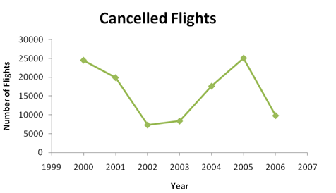
3.1.6 Graphs of Quantitative Data: Time Plots
The final graph that we consider is a time plot. A time plot shows how a quantitative variable changes over time. Typically, individual data points are plotted and then connected with either line segments or a smooth curve. Such plots are useful for displaying trends over a time period, particularly when investigating increases or decreases in a studied variable. The Bureau of Transportation Statistics reports the following numbers of cancelled flights over the calendar years 2000 to 2006:
| Year | 2000 | 2001 | 2002 | 2003 | 2004 | 2005 | 2006 |
|---|---|---|---|---|---|---|---|
| Number of Flights Cancelled | 24,515 | 19,891 | 7,301 | 8,341 | 17,611 | 25,084 | 9,787 |
Figure 3.16 shows a time plot for these data.
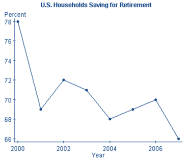
Question 3.5
Make a time plot for the data below, which show the percentage of U.S. Households saving for retirement in the indicated year. Use the graph to comment about the trend in retirement savings over this time period.
| Year | Percent |
|---|---|
| 2000 | 78 |
| 2001 | 69 |
| 2002 | 72 |
| 2003 | 71 |
| 2004 | 68 |
| 2005 | 69 |
| 2006 | 70 |
| 2007 | 66 |
3.1.7 Cautions about Making and Interpreting Graphs
Choosing the correct graph to display data is not always clear cut. Sometimes quantitative data are grouped in classes of unequal width; those data cannot be represented by a histogram. The data is then considered categorical, and a bar graph or pie chart must be used.
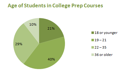
According to the Florida Department of Education, 105,977 students were enrolled in a developmental education or college preparatory course during 2006 – 2007. Figure 3.1.9 gives the distribution of those students by age.
| Age | Number of Students |
|---|---|
| 18 or younger | 21,877 |
| 19 - 21 | 42,115 |
| 22 - 35 | 31,003 |
| 36 or older | 10,982 |
Age is certainly a quantitative variable, but because the ages are grouped in unequal classes, we cannot use a histogram to display them. Because the data set is so large, a pie chart (Figure 3.17) is preferable to a bar graph.
When we looked at the data on Babe Ruth’s home runs by men on base, we treated the variable as quantitative, with whole number values 0, 1, 2, and 3. We constructed a histogram (Figure 3.5) to display the data. If we had considered the number of men on base as categories, we would have created the bar graph in Figure 3.18 rather than a histogram.
And because the categories “None, One, Two, Three” represent all the possibilities, we can also convert these data to percentages and display them in a pie chart (Figure 3.19).
| Men on Base | Home Runs | Percentage |
|---|---|---|
| None | 349 | 49 |
| One | 251 | 35 |
| Two | 98 | 14 |
| Three | 16 | 2 |
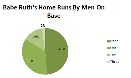
Do we get a different impression of Babe Ruth’s home runs when we use a histogram, a bar graph, or a pie chart? Probably not, so in this case any one of the graphs is acceptable.
When creating or interpreting a graph, it is important to pay attention to the graph’s axes. With a graph of an algebraic function, the axes are generally shown as the standard x- and y-axes (the lines y = 0 and x = 0). Real data can have values that are large enough that it is unreasonable to show all values beginning with 0. In such situations the axes should be clearly labeled (as in the CrunchIt! time plot in the answer above) to indicate actual data values near where the axes meet.
It is often particularly misleading when the vertical axis does not start at 0, because small changes in values can appear large when the scale is truncated. In the CrunchIt! time plot, the lowest percentage value is 66, while the highest is 78. The difference in these values seems exaggerated because the values from 0 to 66 do not appear on the axis. Figure 3.20 shows two time plots of the retirement savings data, one using the scale created automatically in CrunchIt!, and a second with a vertical axis starting at 0.
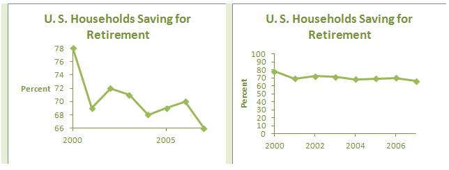
Do these two graphs give different impressions about how the percentage of households saving for retirement has changed? When you are creating a graph, try not to mislead your audience. When you are the viewer of a graph, think about how the data could have been presented differently.
A graph of a set of data can provide a good visual summary of important features of the data. In choosing an appropriate graph, you must first consider whether your data is categorical or quantitative.
Bar graphs and pie charts are used with data that is categorized. This includes not only data involving categorical variables (such as color or gender), but also quantitative data that has been sorted into unequal intervals.
Histograms, stem and leaf plots, and time plots are used with quantitative data. Histograms are commonly used to display frequencies or relative frequencies, and are used to approximate the shape, center and spread of the distribution. Like histograms, stem and leaf plots show the characteristics of the distribution, but they also retain the individual data values. They are best used with smaller data sets. Time plots display the changes in one or more quantitative variables over time.
In all use of graphical displays, the best advice is to keep the graph as simple as possible. While the media often display fancy graphs with 3-dimensional effects, statisticians prefer plain (if somewhat boring) 2-dimensional displays. Adding volume to boxes or pie segments distorts the proportions of the graph and can mislead the viewer. In all statistical presentations, giving an accurate picture of the data is the ultimate goal.
3.2 Numerical Data Descriptions: Mean and Standard Deviation
When the data we are interested in are quantitative, we commonly summarize the data not only graphically but also numerically. As with our graphical descriptions, we would like our numerical descriptions to address the important characteristics of the data set—its shape, center and spread. Consider once again the data table that gave information about some of the 25 top-grossing movies in the United States in November 2010.
| Some of the top-grossing movies of all time | ||||||
|---|---|---|---|---|---|---|
| Title | Year | Box Office (millions of dollars) | Genre | Running Time | Academy Awards | MPAA Rating |
| E.T.: The Extra-Terrestrial | 1982 | 435 | Family | 115 | 4 | PG |
| Star Wars: Episode I - The Phantom Menace | 1999 | 431 | Sci-Fi | 133 | 0 | PG |
| Pirates of the Caribbean: Dead Man's Chest | 2006 | 423 | Adventure | 130 | 1 | PG13 |
| Toy Story 3 | 2010 | 415 | Animation | 103 | 2* | G |
| Spider-Man | 2002 | 404 | Action | 121 | 0 | PG13 |
| Transformers: Revenge of the Fallen | 2009 | 402 | Action | 150 | 0 | PG13 |
| Star Wars: Episode III - Revenge of the Sith | 2005 | 380 | Sci-Fi | 140 | 0 | PG13 |
| The Lord of the Rings: The Return of the King | 2003 | 377 | Fantasy | 201 | 11 | PG13 |
| *as of February 2011 | ||||||
In reviewing this table we see, in particular, that the third column and the fifth column each contain values of a quantitative variable. In order to get a “picture” of these data, we might want to determine how much, on average, a top-grossing film earned, or whether the running time for The Lord of the Rings: The Return of the King was unusually long. These are questions that can be answered using numerical descriptive measures.
3.2.1 Locating the Center: Mean
We will begin our discussion by considering a numerical description with which you are probably familiar, the mean. The mean of a set of quantitative data is simply its arithmetic average, the very same average you learned to calculate in elementary school. The mean is found by summing all data values, then dividing the result by the number of values. We indicate this symbolically using formulas:
Sometimes the formulas for the mean are written using summation notation. Click here to see the formulas in summation form.
The summation formula for the population mean is .
The summation formula for the sample mean is .
(for a population) or
(for a sample),
where the subscripted x's indicated individual measurements.
You are probably thinking that these two formulas are remarkably similar; indeed, they are nearly identical. That is because what we do is exactly the same; what we say depends on whether we are working with a population or a sample.
In working with a population, we denote the mean by µ, the Greek letter mu. The upper case N is the population size (the number of values we are adding), and the x’s are the individual data values, labeled from 1 to N. If we are calculating the mean of a sample, we indicate the result by , which we call (not very creatively) x-bar, with the lower case n the sample size, and the x’s labeled from 1 to n.
While this might seem unnecessarily “picky” at first glance, the notation indicates two important distinctions that we must keep in mind:
- We denote the mean µ of a population of size N and the mean
of a sample of size n differently, because the information they provide is different in nature. A population has only one mean, and if we calculate it correctly, we have the mean. When we calculate a sample mean, we are generally interested in using it to estimate the population mean. So while each sample has only one mean, if we select a different sample, we are likely to get a different sample mean. Recall that when we calculate a numerical descriptive measure for a population, we are finding a parameter; if we calculate a numerical descriptive measure for a sample, we are finding a statistic. It is easy to remember which is which—calculating from a population, you have a parameter; calculating from a sample, you have a statistic. Further, we use Greek letters for parameters and English ones for statistics. So µ is a parameter, while
- We denote an individual data value as x and the mean of a sample as
3.2.2 Calculating the Mean
Now that we have talked a lot about means, let’s actually calculate one. Here are the national average retail prices ($/per gallon) of regular grade gasoline for a sample of ten months since 2000 according to the United States Department of Energy:
| National average retail prices ($/gallon) of regular grade gasoline | ||||||||||
|---|---|---|---|---|---|---|---|---|---|---|
| Month | Sept. 2000 | Feb. 2001 | Sept. 2002 | Aug. 2003 | Oct. 2004 | Feb. 2005 | Feb. 2006 | Jan. 2007 | Aug. 2010 | April 2011 |
| Price | 1.55 | 1.45 | 1.40 | 1.62 | 2.00 | 1.91 | 2.28 | 2.24 | 2.73 | 3.80 |
Calculating the sample mean, we find that
dollars per gallon. So while the average prices went up and down over the years, the average of these averages was about $2.10. We might further observe that 6 of the data values were less than the mean and 4 were greater than the mean.
Question 3.6 Finding the mean
On 8 randomly selected days in October 2011, the maximum temperatures in Fairbanks, Alaska were 34, 45, 44, 47, 49, 45, 48, 28 (degrees Fahrenheit).
The mean temperature for these 8 days was rPUO/Q/kPu8= degrees Fahrenheit.
This calculation was fairly simple, even by hand, given the whole number values and the small sample size. What happens when numbers are not so nice or we have a large data set? In that case, we use statistical software to do our calculation.
Question 3.7 Investigating means
Let’s consider our earlier question of how much, on average, a top-grossing film earned. The CrunchIt table below gives the earnings, in millions of dollars, for the 25 top-grossing films:

Use CrunchIt, or some other statistical software, to calculate the mean earnings for these films. (Note that since this is all the 25 top-grossing films, not a sample of them, you are calculating µ, the mean of this population of 25 values.)
The mean earnings for these 25 films is AjjfbGmtS2c= million dollars.
Titanic and Avatar had earnings far above all of the other movies. Remove the earnings for these two movies and recalculate the mean.
When the Titanic and Avatar earnings are removed from the set, the mean decreases by 7dfNq0tWt7c= million dollars.
It is interesting to compare the means for various subsets of the data. For example, did the movies made in the 20th century earn less, on average, than those made in the 21st century? Or did the action movies have higher mean earnings than animated movies? Find the answers these questions, or to other questions that interest you.
3.2.3 Determining Spread: Standard Deviation
Using the mean to locate the center of a distribution gives us one important piece of information, but it doesn’t tell us everything we might want to know. If your instructor reports that the class average on a statistics test is 75%, you wonder whether most students scored in the 70s, or whether anyone made 100% on the test. Knowing how the scores are spread out provides more information about the distribution of data. The range, the difference between the largest value and the smallest value, is the easiest way to describe the spread. For the gasoline data, the range of the sample of is $3.80 – $1.40=$2.40 per gallon.
The range tells us how far the maximum value is from the minimum value, but not how the values are distributed within the range. Are the values spread uniformly over this interval? Are most of the values clustered near the mean? To answer questions like these, we use the standard deviation, a number that describes, on average, how the data set is spread away from its center (as measured by the mean).
Let’s start with the formula for the standard deviation of a sample, which we denote by s, and then “de-construct” it.
Click here to see the sample standard deviation formula in summation form, along with the summation form for the population standard deviation. Note that for our purposes, we will be calculating the sample standard deviation s.
The standard deviation of a sample is given by .
The standard deviation of a population is given by .
The numerator of the fraction consists of a sum of squares; each term being squared is the difference between an individual measurement (an x) and the sample mean (). We call each of these differences the measurement’s deviation from the mean. We then divide this sum by n – 1, one less than the sample size. Finally, we take the principal (positive) square root of the resulting number.
To illustrate the procedure, we use a small sample with small whole number values: 1, 2, 2, 3, 4, 4, 5. The mean for this sample is 3. The accompanying table displays the measurements, the deviations and the squared deviations.
| Calculations for determining the standard deviation | ||
|---|---|---|
| Measurement xi | Deviation from the Mean (xi – 3) | Squared Deviation (xi − 3)2 |
| 1 | –2 | 4 |
| 2 | –1 | 1 |
| 2 | –1 | 1 |
| 3 | 0 | 0 |
| 4 | 1 | 1 |
| 4 | 1 | 1 |
| 5 | 2 | 4 |
Adding the values in the last column, dividing by n − 1, and taking the square root, we find that (correct to two decimal places).
Question 3.8 Finding the standard deviation
On 8 randomly selected days in January 2000, the amounts of snow on the ground in Fairbanks, Alaska were 16, 16, 17, 31, 32, 16, 16, and 16 (inches). Use the procedure in the example above to find the sample standard deviation for these amounts.
First, find the sample mean. Tu9IG1n3UyE=
Next, find the sum of the squared deviations. d00oSplPmmE=
Now find the sample standard deviation, and report your result rounded to the nearest hundredth of an inch: vTDfVwuS/n4=
3.2.4 Standard Deviation Calculation FAQ's
This calculation might raise several questions in your mind.
Q: If we are concerned about deviations from the mean, why don’t we just add the deviations rather than their squares?
A: If you check the sum of the deviations, you will see that it is 0. This is always the case (which is not very informative), so we square the deviations, making the resulting values all nonnegative. Further, if the deviations are small in absolute value, the squares are also small in absolute value. If the deviations are large in absolute value, the squares are even larger.
Q: If we want to know what is happening “on average,” why don’t we divide by n rather than n – 1?
A: When we have data from a sample rather than from the whole population, dividing by n underestimates how the data vary. Statisticians have determined that an appropriate correction for this error is to divide by the slightly smaller n – 1, which makes the result a bit larger.
Q: Once we have this “average,” why do we take its square root?
A: Before taking the square root, the quantity is measured in square units—the square of the units in which the data were originally measured. It is more helpful to our understanding to have the spread measured in the same units as the original measurements.
As with the mean, we generally use statistical software to calculate sample standard deviation.
Question 3.9 Standard deviation of gas prices
Our sample of gasoline prices is shown below in CrunchIt. Use CrunchIt or some other statistical software to calculate the standard deviation for these prices.
Enter the standard deviation here, rounded to three decimal places: xIQjvsZz6giBG0KZusYdxg==
3.2.5 Interpreting the Standard Deviation

Once we’ve calculated standard deviation, how should we interpret the number? Notice that the quantities involved in the standard deviation fraction are all non-negative. And the principal square root of a non-negative number is also non-negative. In fact, the standard deviation is only ever zero when all of the data values are identical. In that case, the mean is the same as each data value, so there is absolutely no deviation from the mean.
The more spread out that the data points are from the mean, the larger the standard deviation will be. Here is an example which illustrates this concept. The side-by-side dotplots in Figure 3.21 show four groups of data, A, B, C, and D, where each data set has ten values.
The mean for each of the four data sets is five. Although the mean is the same for each group, the spread in each data set varies considerably. It is easy to see, for instance, that the data values in group D are the most spread out from the mean, that group B has a very small amount of spread from the mean, and that there is no spread in group A. Using statistical software to compute the standard deviations we see numerically that groups A, B, C, and D have increasing standard deviations, as shown in the table below.
| Standard deviations of data plotted in Figure 3.21 | ||||
|---|---|---|---|---|
| Group | A | B | C | D |
| Standard Deviation | 0.00 | 0.47 | 1.56 | 2.58 |
In order to see how a restaurant chain uses the mean and standard deviation to characterize net sales in various locations, view the video Snapshots: Summarizing Quantitative Data below.
3.2.6 Empirical (68-95-99.7) Rule
Knowing the mean and standard deviation can give us a good idea of how our set of data is distributed. In particular, when our data is roughly bell-shaped, the Empirical Rule tells us that:
- about 68% of all measurements lie with 1 standard deviation of the mean;
- about 95% of measurements lie within 2 standard deviations of the mean;
- about 99.7% (nearly all) of the measurements are within 3 standard deviations of the mean.

The histogram in Figure 3.22 shows the margin of victory (in runs) for the regular season games played by the Boston Red Sox during the 2010 season.
From the histogram it is clear that for the majority of the Red Sox’s games, they either won or lost games by no more than 4 runs. It was very rare for them to lose by more than 12 runs (in fact it only happened once), as was it for them to win by more than 8 runs. Since the data set is roughly bell-shaped, the Empirical Rule allows us to say even more.
The mean margin of victory for the Red Sox in 2010 was 0.429 runs, with a standard deviation of 4.174 runs. Thus, according to the Empirical Rule,
- 68% of the margins of victory should lie within 4.174 runs of 0.429, that is, between 0.4259 – 4.174 and 0.4259 + 4.174 runs, so between –3.7481 and 4.5999 runs. It turns out that indeed this was approximately true. In 112 of the 162 games that the Red Sox played during the 2010 regular season, their margin of victory was between -3.7481 and 4.5999 runs. Therefore 69% of the margin of victories fell within this range.
- 95% of the margins of victory should lie within 2 × 4.174 runs of 0.4259, that is, between 0.4259 – 8.348 and 0.4259 + 8.348 runs, so between –7.064 and 8.7739 runs. Again, what “should have happened”, essentially happened. Their margin of victory was between -7.064 and 8.7739 runs in 92.59% (150 of their 162 games).
- 99.7% of the margins of victory should lie within 3 × 4.174 runs of 0.4259, that is, between 0.4259 – 12.552 and 0.4259 + 12.552 runs, so between –12.1261 and 16.696 runs. In 99.3% (161 out of 162) of the games, the Red Sox had a margin of victory between -12.1261 and 16.696 runs.
3.2.7 Bell-shaped Curves
What exactly do we mean by “bell-shaped”? The distribution should be roughly symmetric, with its peak near the center of its range, and the heights of the boxes decreasing as you move to left and to the right of the peak. To see this more clearly, consider the histogram in Figure 3.22. Although it is clearly not a perfect fit, the curve approximates the overall pattern of the distribution and resembles a bell, with its base sitting on the horizontal axis.
Analyzing petal lengths
Question 3.10 Analyzing petal lengths: calculate the mean

The graph at right is a histogram that we saw earlier in the chapter, displaying the distribution of petal lengths in centimeters for a sample of Setosa iris. We can see from the overlaid curve that this distribution is also bell-shaped.
The petal lengths graphed in this histogram are given in the table below:
Answer the following sequence of questions about this sample of data to make sure you've grasped all the concepts presented so far in this section.
First, find the mean of this sample of petal lengths, in centimeters, rounded to three decimal places: Fiu02hayGpBCejum
Question 3.11 Analyzing petal lengths: calculate the standard deviation
Now find the standard deviation of this sample, rounded to four decimal places: Kx4RcOQESOyFNQMOtfKFhQ==
Question 3.12 Analyzing petal lengths: using the empirical rule
Use the Empirical Rule to determine the intervals in which 68%, 95%, and 99.7% of measurements should lie (round all calculations to four decimal places):
- 68% of lengths should lie between 1.2283 and Nq8Al6snBYyK3/194N5WjSGrk5SVAokn cm
- 95% should lie between eBdWpTPmCxa/oSaZ and 1.8094 cm
- 99.7% should lie between 4SebcrQHvOv8AGs2 and 1tyunWYXkh4/4CFz cm
Question 3.13 Analyzing petal lengths: checking the empirical rule
Finally, use the petal length data to determine percentages actually lying in these intervals:
- 80% (uOEnwQL6qmKsNn3pa3DqMQ== out of 50) of lengths lie between 1.2283 and 1.6357 cm
- 4lMmYtZh9RY=% (46 of 50) lie between 1.1146 and 1.8094 cm
- 3JhXP9wN7DE=% (bDGqlNBwCCQ= of 50) lie between 0.9409 and 1.9831 cm.
Question 3.14 Analyzing petal lengths: how well did the empirical rule work?
boZa2/I51JyGPucfAaaZ1J60ls3iZCUY1onhqZ6uek7LRLZFxPq9Ffa+RD7k7+UY9aA8bNNduiJKUsvUYGNFcye06kWT0coIC3I9kQ==3.2.8 z-Scores
Frequently people are interested in comparing measurements not merely within a single distribution but between two different distributions. Perhaps the classic example of such a comparison is the argument among baseball fans about who is the greatest homerun hitter of all time. When baseball stars played in different eras and under different conditions, how can we compare their performances? One way to consider the question is to decide which player was more outstanding in his own era.
In order to do this, we use a statistical measure called a z-score. A z-score uses the standard deviation as a “ruler” to measure how far a measurement is away from the mean. The formula for calculating a z-score is
Because the z-score formula includes subtracting the mean from a measurement (the “deviation from the mean” once again), if a measurement is larger than the mean, its z-score will be positive; if the measurement is smaller than the mean, its z-score will be negative. Thus, the z-score tells us both the number of standard deviations the measurement is from the mean, and the side of the mean on which it lies. Further, the more standard deviations a measurement is away from the mean, regardless of direction, the more unusual that measurement is with respect to the rest of the data. Thus, a z-score of –2.1 indicates a more unusual measurement than a z-score of 0.85.
3.2.9 Using z-Scores
Suppose we want to determine if Babe Ruth or Hank Aaron was more outstanding, given the time that they played baseball. From 1914-1935 Babe Ruth played almost exclusively for the Red Sox and the Yankees, while Hank Aaron played for the Milwaukee (later Atlanta) Braves and the Milwaukee Brewers between 1954 and 1976.
We’ll compare the yearly homerun production of Babe Ruth and Hank Aaron by looking at how each player’s “at bats” per homerun compared to his contemporaries. For the years Babe Ruth played, from 1914-1935, the league average AB/HR was 123.49, with a standard deviation of 87.78. Babe Ruth’s AB/HR career average value was 17.00. (These calculations omit Ruth’s first year of play since he only played five games that year.) For the years Hank Aaron played, from 1954-1976, the league average AB/HR was 42.14, with a standard deviation of 6.92. Hank Aaron’s AB/HR career average value was 18.51. Calculating z-scores, we find that
while
.
So Ruth’s AB/HR value was 1.21 standard deviations below the mean for his era, and Aaron’s AB/HR value was 3.42 standard deviations below the mean for his era. The negative values in this case indicating fewer at bats required per home run hit than the average for the era. Thus, we conclude that Aaron’s performance was more outstanding compared to his contemporaries, and, by this measure, he was the better homerun hitter.
Question 3.15 Boston Marathon winners
For all men running a marathon in 2005, the average finishing time was 4.47 hours, with a standard deviation of 1.02 hours. The average finishing time for all women was 5.02 hours, with a standard deviation of 1.12 hours. The 2005 Boston Marathon Men’s Open winner was Hailu Negussie of Ethiopia, with a time of 2.20 hours, while the Women’s Open winner was Catherine Ndereba of Kenya, with a time of 2.42 hours. Use z-scores (calculate to two decimal places) to determine which individual was faster compared to his or her own peers. (All values are converted from hour-minute-second times given at www.marathonguide.com and www.bostonmarathon.org, and are correct to two decimal places.)
- z-score for Mr. Negussie: njlRRtBkBQoNfJuH
- z-score for Ms. Ndereba: 2VYsiEahL0tAIyGN
3.2.10 How Do Outliers Affect the Mean and Standard Deviation
The Cleveland Cavalier total players’ payroll exceeded $51,000,000 in 2010-2011. Although the majority of players’ salaries were between roughly ½ million and 4 million dollars, there were a few exceptions. In particular, Antawn Jamison collected an incredible $13.35 million dollars, not too bad for a year’s work. Figure 3.2.4 shows a dotplot of the annual salary for each of the 14 players on the Cavs’ roster.

Using software, we find that the mean salary for a Cav’s player was $3.68 million with a standard deviation of $3.77 million. Do these values change much if we delete the high outlier, $13.35 million? The answer is yes. The revised mean and standard deviation, based on the remaining players’ salaries, are considerably lowered. The mean is now $2.93 million and the standard deviation is $2.64 million. Deleting one high salary resulted in having the mean players’ salary decrease by almost $1 million, which is substantial. If you think about how the mean and the standard deviation are computed, it might not be so surprising since both formulas take into account the value of every data measurement.
A measure is called resistant if is not influenced by extremely high or low data values. Both the mean and standard deviation are not resistant to outliers. When describing a data set, the moral of the story is to graph your data first. If the graphs are severely skewed or have outliers, the mean and standard deviation might not reflect an accurate description of the data set’s center and spread. In the next section we look at another measure of center and spread which are, in general, resistant to outliers.
3.3 Quantitative Data Descriptions: Median and Quartiles
We began Section 3.2 by looking once again at the top-grossing film data, and asking two questions. First, how much, on average, did a top-grossing film earn, and second, whether the running time for The Lord of the Rings: The Return of the King was unusually long. We answered the first question using the mean; on average, a top-grossing film earned $405 million. We now turn to numerical descriptive measures that will help us answer the second question.
3.3.1 Locating the Center: Median
Finding the average, or mean, of a data set is one way to locate the center of the distribution of values. The median, the middle value when the data are arranged in size order, is another measure of the distribution’s center. If the number of measurements is odd, there is exactly one measurement in the middle; the median is this measurement. If the number of measurements is even, there are two measurements in the middle, and the median is the mean (average) of these two measurements.
Consider once again the January gasoline price data we examined previously. Arranging the values from smallest to largest we have 1.09, 1.11, 1.26, 1.38, 1.41, 1.49, 1.75, 2.24, 2.30, 3.09. If we attempt to locate the middle number here, we see that there is not a single value in the middle, but rather, the two values 1.41 and 1.49. The median is then the mean of these two values or $1.45 per gallon.
The pth percentile is a number such that p% of the measurements fall at or below that number so the median is always the 50th percentile since 50% of the measurements fall below that number. In the January gasoline price data, the number 1.75 is the 70% percentile since 70% of the measurements fall at or below 1.75.
When we use the median as the measure of center, we use quartiles to describe the spread of the data. The median divides the data into its lower 50% and its upper 50%. We call the median of the lower 50% of the data Q1 and the median of the upper 50% of the data Q3. (What happened to Q2? Q2 is actually the median.) Q1, the median, and Q3 divide the set of data values into fourths, or quartiles. Therefore Q1 is the 25th percentile and Q3 is the 75% percentile. Along with the minimum and maximum values, Q1, the median, and Q3 constitute the five-number summary.
When we look at the five-number summary graphically, as indicated in Figure 3.25, we can see various ways to describe how the data is spread out:
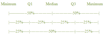
Here is the five-number summary for the gasoline data:
Minimum: 0.91
Q1: 1.26
Median: 1.45
Q3: 2.24
Maximum: 3.09
So we can conclude that
- 50% of the average January gas prices were less than $1.45 per gallon, while 50% were more than $1.45 per gallon;
- 25% of the average January gas prices were less than $1.26 per gallon, while another 25% were more than $2.24 per gallon.
- the middle 50% of the average January gas prices were between $1.26 per gallon and $2.24 per gallon.
Question 3.16
Use statistical software to find the five-number summary for the running times of the 25 top-grossing films. Between what two values does the middle 50% of running times lie?
AIMf15PROwh/unW6/Xr/RG1c93jhYd3VaAd7BKV5zJrY4RdHovieGWOqiEmg/BqlJ2/+gqP0qWTTbGiPUlbSIjFt4MnDBdpVVSE/zY+lPS+oZ9rKnXDuP4N/h4pubcPcn/YuyNSQiV7xaqpD0meMo2kr2YcVJA938YFd1FZtyKsjD6hf/1ZzutpaGWURGkxqQSE2H9apJQ/TuRWtPFs4kOYvvxBcuKTeXmA61lRMDWx487jZ/WDZUtlXvd5Q9UHo09rV8hSgmEdhpSLDCEAnbvlFY9TDSqitsKqD/53EEJwERMXMPvFSzEkD8gzw6kzqWs7LK4UbJLQZtrAPhlgSMfsvjSkygPHrU3h2JXPA8fZwafT2CrunchIt! reports the statistics for Running Time in the accompanying table. Notice that the values reported include sample size n, sample mean , and sample standard deviation s, in addition to the five-number summary values we want.
| n | Sample Mean |
Median | Standard Deviation |
Max | Min | Q1 | Q3 | |
| Running Time (minutes) |
25 | 132.6 | 127 | 29.41 | 201 | 89 | 111.5 | 147 |
The five-number summary is
- Minimum: 89
- Q1: 111.5
- Median: 127
- Q3: 147
- Maximum: 201
Thus, the middle 50% of running times lie between 111.5 and 147 minutes.
3.3.2 Outliers
Let’s return now to the question we asked earlier—was the running time for The Lord of the Rings: The Return of the King unusually long? When we looked at histograms and stem plots, we attempted to identify outliers, data values that were unusual compared to the rest of the data. We looked for gaps at the left-hand or right-hand side in these graphical displays, and tried to judge whether these gaps were significant enough to make us question any data values lying beyond those points. Now we are ready to establish a numerical criterion by which we can determine outliers, and we will illustrate the procedure using the running times of the 25 top-grossing movies.
The procedure statisticians have agreed upon to find outliers is:
- Calculate the interquartile range (IQR), which is Q3 – Q1.
- Multiply the IQR by 1.5.
- Calculate the lower fence, which is Q1 – 1.5IQR.
- Calculate the upper fence, which is Q3 + 1.5IQR.
- Outliers are any data values that lie outside the fences; that is, below the lower fence or above the upper fence.
Following these steps for the movie data, we find the fences.
- IQR = Q3 – Q1 = 147 – 111.5 = 35.5.
- IQR × 1.5 = 1.5 × 35.5 = 53.25.
- Lower fence = Q1 – 1.5IQR = 111.5 – 53.25 = 58.25.
- Upper fence = Q3 + 1.5IQR = 147 + 53.35 = 200.25.
Figure 3.26 shows these values on a number line—the lower fence lies 53.25 units below Q1, while the upper fence is 53.25 units above Q3.

Since the minimum running time of 89 minutes is not outside the lower fence, there are no low outliers. The data value 201 lies above the upper fence (although just barely), so the running time of 201 minutes is a high outlier. This example makes clear how the criterion works; if a data value lies outside the fences, we will call it an outlier. Having a strict rule allows us to agree on outliers, rather than having to take differences in opinion into account.
Hence, we see that the 201-minute running time for The Lord of the Rings: The Return of the King was indeed unusually long compared to the rest of these films. On a revenue-per-running-minute basis, Shrek 2, which had a running time of 93 minutes and earned $436 million was a better bargain than The Lord of the Rings: The Return of the King, which generated $377 million dollars. However, fans of The Lord of the Rings trilogy might argue that The Return of the King had more artistic merit, as evidenced by its earning 11 Academy Awards, as compared to none for Shrek 2.
Why do we care about outliers? Often, they are interesting just because they are different. A person who is 7 feet tall is much more likely to be noticed than one who is 6 feet tall. Like such a person, an outlier “stands out” from the crowd. If we are sure that the data values are correct (as in the movie running times), an outlier is a curiosity that may help or hinder the point we are trying to make. (Just for the record, it is not valid to remove an outlier from the data just because we don’t like what it does to our results.)
On the other hand, outliers sometimes occur as the result of data collection or data entry errors. If it can be determined that an outlier is the result of such an error, the error should be noted, and the value eliminated from statistical calculations. In a statistics class, the instructor collected student height data, asking for the value in inches. One student reported a height of “6.” Since no one in the class was only 6 inches tall, the error was pointed out, and that value was not used in analyzing the data set. While we might guess that the student was actually 6 feet tall, we cannot assume that this was the mistake and substitute the equivalent 72 inches. The best we can do is to explain why we have chosen to ignore the value in our calculations.
3.3.3 Box Plots
A handy way to display the information from the five-number summary is in a box plot (sometimes called a box-and-whisker plot). A box plot consists of two parts:
- a rectangle (the “box”) whose left-hand edge occurs at Q1 and right-hand edge occurs at Q3, with the median indicated by a vertical line at the appropriate value, and
- two line segments (the “whiskers”), one extending from the left-hand edge of the box to the minimum value and the other extending from the right-hand edge of the box to the maximum value.
Does this sound confusing? A look at the TI-84 calculator box plot for the running times of the movies (in Figure 3.26) will assure you that it is a graph of the five-number summary.
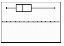
With a horizontal axis starting at 80 and marked off by tens, the box indicates that the median lies between 120 and 130, with Q1 close to 110, and Q3 between 140 and 150. The whiskers extend to about 90 on the left and 200 on the right. This indeed corresponds to the five-number summary we found previously: minimum 89, Q1 111.5, median 127, Q3 147, and maximum 201.
Recall that we used the information from the five-number summary to determine outliers. Most statistical software allows us to use the fences to determine outliers, and to identify them as separate points beyond the whiskers. This type of box plot is sometimes called a modified box plot. CrunchIt! displays modified box plots; in Figure 3.28 we see the CrunchIt! plot for the running time of the movies, showing the outlier we found previously, 201 minutes. Note also that CrunchIt! displays the plot vertically, rather than horizontally.
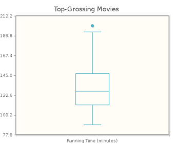
While different software packages display box plots in different ways, they are all show the same “box,” which indicates where the middle 50% of the data lie. For the movie data, the middle 50% of the running times lie between 111.5 and 147. While these values (Q1 and Q3) are not labeled on the graph, we can see that the bottom and top of the box are at these values, respectively
Question 3.17
Use a modified boxplot to determine whether there are any outliers in the
January gas price data.
Verify your result using the 1.5IQR criterion.
This is a fill-in-the-odUUwJR8n9a9EShm query. This is a ioSyxwBaqAfwJg7DU4J1p9B7JjBJc90snBvbXJCst6c= query.
AIMf15PROwh/unW6/Xr/RG1c93jhYd3VaAd7BKV5zJrY4RdHovieGWOqiEmg/BqlJ2/+gqP0qWTTbGiPUlbSIjFt4MnDBdpVVSE/zY+lPS+oZ9rKnXDuP4N/h4pubcPcn/YuyNSQiV7xaqpD0meMo2kr2YcVJA938YFd1FZtyKsjD6hf/1ZzutpaGWURGkxqQSE2H9apJQ/TuRWtPFs4kOYvvxBcuKTeXmA61lRMDWx487jZ/WDZUtlXvd5Q9UHo09rV8hSgmEdhpSLDCEAnbvlFY9TDSqitsKqD/53EEJwERMXMPvFSzEkD8gzw6kzqWs7LK4UbJLQZtrAPhlgSMfsvjSkygPHrU3h2JXPA8fZwafT2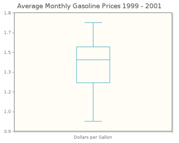
Using the descriptive statistics calculated by CrunchIt!, IQR = 1.538 – 1.257 = 0.281, so 1.5IQR = 0.4215. The lower fence is 1.257 – 0.4215 = 0.8355; since the smallest gas price ($0.955) is larger than the lower fence, there are no low outliers. The upper fence is 1.538 + 0.4215 = 1.9595. Since the highest gas price ($1.729) is smaller than the upper fence, there are no high outliers. Thus the 1.5IQR criterion confirms what we see in the modified box plot—that none of the average gas prices was unusually small or large with respect to the rest of the data set.
3.3.4 Mean or Median?
How do we decide which measure of center is more appropriate for a given data set? Let’s consider a couple of examples.
Figure 3.29 shows the distribution of normal body temperatures for 134 individuals, as both a histogram and a box plot.
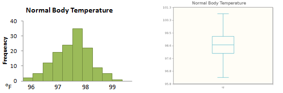
We notice that the distribution is very symmetric; the mean for this data set is 98.55, and its median is 98.60. In this situation, you would probably agree that it does not matter whether we use the mean or the median to measure the center of the distribution.
The accompanying table gives the total compensation in millions of dollars for a simple random sample of heads of America’s 500 biggest companies.
| 31,825 | 3.203 | 6.301 | 1.750 | 21.903 | 19.706 | 6.979 | 1.046 | 3.234 | 1.158 |
| 9.458 | 1.882 | 11.007 | 1.200 | 1.996 | 4.810 | 10.312 | 6.504 | 3.946 | 5.944 |
Figure 3.30 shows a histogram and a box plot of these data. In this case, we see that the distribution is skewed to the right, with an upper outlier.
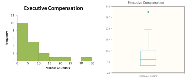
When we calculate the mean and the median, we find that the mean (7.708 million dollars) is quite a bit larger than the median (5.377 million dollars). Which value better represents the center of the distribution? The three largest values (including the outlier) are much larger than the rest, and they cause the mean to be larger than a “typical” measurement. In fact, the mean is larger than 14 of the 20 measurements—not exactly what you would think of as the “center.” So we conclude that here the median is the better measure of the center.
Income distributions, like the one for the sample of executive compensations, are frequently right-skewed. The NPR Story The Income of the “Average American” looks at the relationship between mean and median incomes.
Click here to discuss this story.
For a skewed distribution such as this, we say that the mean is “pulled away” from the median in the direction of the skewness. So here, the mean is to the right of—that is, larger than—the median. In a left-skewed distribution, the mean is influenced by low values (whether or not they are outliers), and thus is pulled to the left of the median.
When a distribution is symmetric, the mean is a good measure of the center. When we use the mean to measure the center, we typically use the standard deviation to measure the spread. We recall that the standard deviation, which measures spread by considering deviations from the mean, is also affected by extreme values. So like the mean, it is not very useful when the data are skewed. For a skewed distribution, the median is the preferred measure of the center, and we then use the quartiles to measure spread.
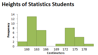
One additional measure of center that is sometimes used is the mode, the measurement (or measurements) that occur most frequently. Recall that we referred to the mode in Section 3.1 when we were describing the shape of histograms. If all data values occur the same number of times, we say that the distribution has no mode. A distribution in which two data values occur the same number of time is called bimodal. Bimodal distributions occur more frequently than you might think. A histogram showing the distribution of heights for a class of students (like Figure 3.31) might well be bimodal, with one peak reflecting a common height of females, and the second indicating a common height of males.
The videos StatClips: Summaries of Quantitative Data and StatClips: Exploratory Pictures for Quantitative Data provide examples and comparisons of numerical and graphical measures to describe quantitative data.
Reporting the center and the spread of a set of numerical data gives important information about a distribution. Before choosing a particular combination of center and spread, it is useful to graph the data set, using a histogram, a stem-and-leaf plot, or a box plot.
If the distribution is symmetric, we typically choose the mean to measure center, and the standard deviation to measure spread. If the distribution is not symmetric, the median is the preferred measure of center, with quartiles used to measure spread.
We also use quartiles in the procedure for determining outliers. Outliers can occur because of natural variation in data, or as a result of data collection or entry errors. When it is possible to characterize an outlier as a genuine error, it can be removed from the data set prior to any numerical analysis. However, such removal (and the reason for it) must be noted.
While it may seem that we concentrate on numerical techniques as we proceed with statistical analysis, it is important to remember that graphs can help us select the numerical measures and techniques that are most appropriate for a particular data set.
Chapter 3 Summary
In this chapter we studied several graphical and numerical methods to summarize both categorical and quantitative variables. Remember that depending on whether the data comes from a categorical or quantitative variable, different numerical and graphical methods are applied.
Data that arises from categorical variables is summarized numerically with a frequency table or a relative frequency table. This table contains the possible measurements of the categorical variable along with the corresponding frequency (or relative frequency) of each measurement. The two most common types of graphs appropriate for a categorical variable are a bar graph and a pie chart. A bar graph uses the heights of the bars to indicate the frequency or relative frequency of measurements that fall into each category. A pie chart is a circle graph that is used when the categorical data consists of all parts of a single whole and when each measurement belongs to only one category.
Histograms, stem and leaf plots, boxplots and time plots are graphs which are used to display quantitative data. A histogram displays the possible values of the quantitative variable in intervals along the horizontal axis in numerical order. The frequencies (or relative frequencies) of the values are displayed on the vertical axis. A stem and leaf plot separates each data point into two pieces: “the stem” which consists of all digits except the final digit and “the leaf” which is the final digit. A time plot shows how a numeric variable changes over time. The horizontal axis displays the time period in intervals and the vertical axis displays the possible values of the numeric variable. Typically we will want to describe the distribution of numeric data according to characteristics such as shape,center, spread and whether or not there appear to be unusual values. A graph’s shape is often described as symmetric, left-skewed, or right-skewed and we can further describe its shape by how many peaks it has: unimodal, bimodal or multi-modal. Finally, if there are any outliers they should be noted. Outliers are data values that are quite different from the rest of the data values.
When we summarize numerical data we should include a measure of center and a measure of spread. The center is the value of the numeric variable such that roughly half of the data is smaller than this value. One common measure of center is the mean which is the arithmetic average. When we talk about the spread of a data set we are simply measuring how far the data values are spread out. One measure of spread is range which is the difference between the maximum and minimum data values. A more commonly used measure of spread is standard deviation which is a number that describes, on average, how the data is spread away from its mean. A statistic is resistant to outliers if it is not influence by extremely low or high data values. Both the mean and median are not resistant to outliers.
The Empirical Rule tells us that when our data is roughly bell-shaped, about 68% of all measurements lie within 1 standard deviation of the mean, about 95% of the measurements lie within 2 standard deviations of the mean, and about 99.7% of all of the measurements lie within three standard deviations. In practice we often want to compare measurements between two different distributions to determine which measurement is more unusual with respect to its distribution. A z-score measures how far away an observation is from its mean in standard deviation units.
For additional help with topics presented in this chapter, check out the following white-board examples:
[All are StatClips]
Summaries and Pictures for Categorical Data Example B [insert link]
Exploratory Pictures for Quantitative Data Example B [insert link]
Exploratory Pictures for Quantitative Data Example C [insert link]
If there are outliers or severe skewness in the data set, instead of reporting the mean and standard deviation, we commonly report the median as a measure of center and the IQR (interquartile range) as a measure of spread, which are both resistant to outliers. The median is the middle data value in an ordered list and the pth percentile is the number such that p% of the measurements fall at or below that number. Q1 is therefore the 25th percentile and Q3 is the 75% percentile. The IQR (interquartile range) is the difference between the third and first quartiles, Q3 and Q1. A boxplot is an additional type of graph which displays the 5-number summary: minimum, Q1, median, Q3, and maximum. Outliers can be identified by looking for measurements that are either less than 1.5*IQR of the third quartile or for measurements that are greater than 1.5*IQR of the first quartile. One additional measure of center that is sometimes used is the mode, the measurement (or measurements) that occur most frequently.