4.1 Scatterplots
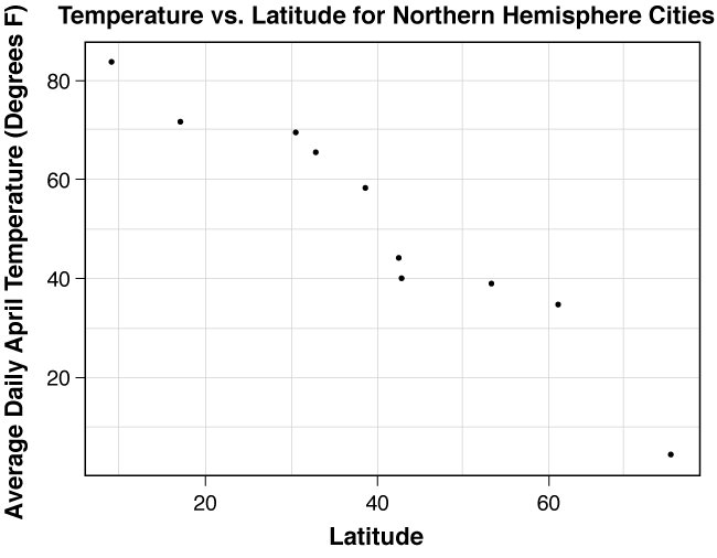
Is it possible to predict a city’s average daily temperature based on its latitude? Do cities in the northern hemisphere at higher latitudes tend to have lower or higher average temperatures than cities at lower latitudes? Is there a relationship, in general, between average April temperatures and a city’s latitude? Table 4.1 displays data for ten cities in the northern hemisphere.
| City | Latitude | Average April Temperature (°F) |
|---|---|---|
| Ithaca, NY | 42.440 N | 45 |
| Pensacola, FL | 30.467 N | 70 |
| Sacramento, CA | 38.517 N | 59 |
| Cayuga, Ontario | 42.803 N | 41 |
| Edmonton, Alberta | 53.300 N | 40 |
| Anchorage, Alaska | 61.167 N | 36 |
| Oaxaca, Mexico | 16.983 N | 72 |
| Panama City, Panama | 08.983 N | 84 |
| Dallas, TX | 32.818 N | 66 |
| Daneborg, Greenland | 74.300 N | 06 |
Source: www.weatherbase.com
Based on this small data set, we see a not-so-surprising fact: Cities closer to the equator tend to have warmer average daily April temperatures than cities closer to the North Pole. Because this data set is small, it is pretty easy to see this type of trend solely by viewing the data table. But what if the table had measurements for lots of cities or if a pattern was not obvious? In either situation it is difficult to get a general sense of any relationship between latitude and temperature only by looking at the table. As we saw in Chapter 3, graphing data often gives a nice picture, and allows us to see patterns and relationships when they exist.
4.1.1 Creating a Scatterplot
The appropriate graph to use in the latitude/temperature situation is called a scatterplot. A scatterplot is a graph used to display bivariate quantitative data (in this case, latitude and temperature) when each variable is collected on the same set of individuals. One variable is placed on the horizontal (\({x}\)) axis and the other is placed on the vertical (\({y}\)) axis. Each individual has a measurement value for \({x}\) and \({y}\). The individual’s information is plotted in the \({x}\)-\({y}\) plane as an ordered pair (\({x}\),\({y}\)). As with every other graph that we have encountered so far, we want to make sure that we clearly label the variables and include units on the graph.
Recall that in Chapter 2 we studied explanatory and response variables. A response variable is the outcome that we are investigating and the explanatory variable is the variable that explains or predicts the values of the response variable. With quantitative bivariate data, often one of the two variables is more sensibly the explanatory variable, while the other is the response variable. If this is the case, the explanatory variable is graphed on the horizontal axis and the response variable is graphed on the vertical axis.
In practice, we usually let statistical software such as CrunchIt! construct the scatterplot. In our example, we are hoping to predict a city’s average April temperature based on its latitude. Therefore, with latitude as the explanatory variable and average April temperature as the response variable, we obtain the scatterplot shown in Figure 4.1.
Question 4.1
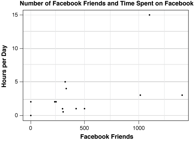
The data set given here shows the number of hours per day spent on social network sites and the number of Facebook friends for a sample of statistics students at a university.

4.1.2 Describing the Scatterplot
Once we’ve constructed the scatterplot, we look for a relationship between the variables. For example, do larger values of one variable tend to appear with larger values of the other variable? If we examine the scatterplot of temperature versus latitude Figure 4.1, we notice that there is a very clear association between latitude and temperature. In such a setting, we attempt to describe the relationship we see in terms of its direction, form, and strength.
- Direction is positive if smaller values of x tend to correspond with smaller values of y and also if larger values of x tend to correspond with larger values of y. Similarly, direction is negative if smaller values of x tend to correspond with larger values of y and if larger values of x tend to correspond with smaller values of y.
- Form describes the general shape of the graph, typically linear or curved. The form is said to have a linear trend if the data points appear to cluster around a line. For the remainder of this chapter, we’ll focus on identifying linear trends.
- Strength refers to how much (or how little) scatter there is about the form. The relationship is said to be strong if there is very little scatter about the line (or curve). If there is a lot of scatter, we say that the relationship is weak. Arguably, in some cases, this is a subjective call.
In order to get a better sense of exactly what these terms are describing, let’s describe the direction, form, and strength of the association for the latitude-temperature plot.
- Direction: Since small latitude values tend to correspond with high temperature values and likewise large latitude values tend to correspond with low temperatures, the direction is negative. Notice that we use the word “tend” to indicate that this relationship happens much more often than it does not.
- Form: Because the points cluster around a line, we say that the form is linear.
- Strength: Because most of the points in the scatterplot are close to the line we visualize, we say that there is not much scatter in the form of the graph. Thus, we conclude that the strength of the relationship is strong.
In short, we conclude by saying that there is a strong, negative, linear association between latitude and temperature. Now you may be thinking that the strength was only moderate and not strong. Certainly, subjectivity comes into play when describing the strength of the association based on observing the scatterplot. What one person considers strong, another may consider only moderate. In the next section we will develop guidelines to help make this process more precise.
Figure 4.2 shows a scatterplot of the population of a city for various years between 1980 and 2010. A typical goal for local governments and city planners is to predict a city’s population for future years, so it is logical to regard population as the response variable and year as the explanatory variable.
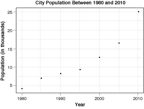
We can see clearly that population is increasing from 1980-2010, so the direction is positive. The trend of the data seems to be curved and since there is very little scatter in the form of the graph, we say that the relationship is strong.
Question 4.2
Explore your understanding of relationships between variables and characteristics of scatterplots.
1. Based on your knowledge of the variables described in a. – d., determine if the association is positive or negative.
a. The number of miles on a Honda Civic’s odometer and its current value (in dollars): nrNXTqqEy6FwsggG392YDMuqjHKME1OI
b. The height and weight of an adult female: gtUZBLQup2iYmLlSgnftfUt9F0BMzFzO
c. The number of miles that a taxi-driver drives per week and his weekly gasoline bill: gtUZBLQup2iYmLlSgnftfUt9F0BMzFzO
d. The number of absences a student has in a class during the semester and her grade on the final exam: nrNXTqqEy6FwsggG392YDMuqjHKME1OI
2. Consider the following two graphs:

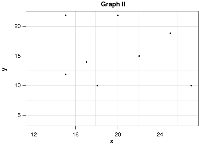
a. Graph ASiLCpg1l6xR+s6q exhibits association between x and y.
b. In Graph I there is a gtUZBLQup2iYmLlSgnftfUt9F0BMzFzO association between x and y.
c. The form of the data in Graph I WY9pJVAVD/FRwMNtTJbM2w== approximately linear.
d. In Graph I the relationship is best described as BDoUEs6O6TRbWiz2npVPSfZ4T2quU2ggvdMk0AXaC4mBdCCc8+0oYVMIe8bJ01uKLAjA1a+cqe3fI7DmTUuvnVQXx6lllFyk/PBcWw==.
The following table gives HIV rates (% aged 15-49 with HIV) and fertility rates (number of children/woman) for twenty countries throughout the world. Does there appear to be an association between a country’s HIV rate and its fertility rate?
| Country | HIV Rate | Fertility Rate |
|---|---|---|
| Iceland | 0.2 | 2.0 |
| Australia | 0.1 | 1.8 |
| Canada | 0.3 | 1.5 |
| Switzerland | 0.4 | 1.4 |
| Spain | 0.6 | 1.3 |
| United States | 0.6 | 2.0 |
| Italy | 0.5 | 1.3 |
| Germany | 0.1 | 1.3 |
| Barbados | 1.5 | 1.5 |
| Poland | 0.1 | 1.3 |
| Costa Rica | 0.3 | 2.3 |
| Bahamas | 3.3 | 2.1 |
| Panama | 0.9 | 2.7 |
| Thailand | 1.4 | 1.8 |
| Iran | 0.2 | 2.1 |
| South Africa | 18.8 | 2.8 |
| Botswana | 24.1 | 3.2 |
| Niger | 1.1 | 5.8 |
| Venezuela | 0.7 | 2.7 |
| Belize | 2.5 | 3.4 |
Source: United Nations Development Programme
To see if there is an association between the two variables, we’ll use CrunchIt! to make a scatterplot of the data. Notice that in this situation there is not a clear choice for the explanatory variable (and thus the response variable) so we will arbitrarily place fertility rate on the horizontal axis and HIV rate on the vertical axis. Figure 4.3 shows the result.
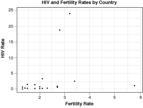
Based on the graph, it seems that there is a weak, positive, linear association between the two variables. An important feature of this data set is that it contains outliers, points that fall outside the overall pattern of the plot. Niger is an outlier in the \({x}\)-direction because, although its HIV rate is consistent with the other countries, its fertility rate (5.8 children/woman) is much higher than any of the other countries in the data set. South Africa and Botswana are both outliers in the \({y}\)-direction since their HIV rates for 15-49 year olds (18.8% and 24.1%) are much higher than those of the other countries.
In this case, the outliers, particularly those in the y-direction, affect the strength of the linear association. Without these outliers, the linear association would appear stronger. The presence of the outliers draws our eyes upward, away from the more linear appearance of the remainder of the points.
Question 4.3
The graph below is the scatterplot of the data set of hours spent on social network sites and number of Facebook friends that you investigated previously.
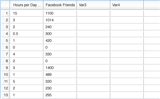
1. The direction of the relationship is hlVmYgsKXBnSePzTwswJlYUTVaMPYXah.
2. Identify the number of hours per day spent on social network sites for the student who is an outlier in the y-direction. U1syIiEJmco=.
3. How many Facebook friends does this person have? Foe/WE2YSd8=.
Many sets of bivariate data that we encounter in our daily lives are either strongly positive or strongly negative. For instance, there is a strong positive linear relationship between the number of flights that you take and the number of frequent flier miles that you’ve accumulated in a year. Likewise, there is a strong negative linear association between the outside temperature and your monthly home heating bill.
If we have data that displays a fairly strong positive (or fairly strong negative) linear association, then a natural next step is to find an equation to model the data. This model can then be used to make predictions. For instance, knowing (based on the ten cities in Table 4.1) that there is a strong negative linear trend between latitude and temperature, we would like to find an equation that relates latitude to temperature. Why? Because then we can use the model to predict the average daily April temperature for cities not in our collected data set. For example, we could use the model to predict (with pretty good accuracy) the average April temperature for Toronto, Canada, whose latitude is 43.667 N.
We’ll explore this idea in much greater detail in Section 4.3, but before doing so we need to consider a less subjective way to describe the strength and direction of the linear association between two quantitative variables. In Section 4.2, we will develop a numerical measure of such an association.