4.2 Correlation
In Section 4.1 we saw a scatterplot can be used to graph bivariate quantitative data. A scatterplot provides us with a good visual representation to begin investigating whether or not an association exists between the two variables under consideration.
When an association does exist, we typically describe its form, direction, and strength. When reporting the strength of a linear association solely based on a scatterplot, subjectivity can be a hindrance. The following example illustrates this point.
Take a look at the two graphs shown in Figure 4.4. In which case is the association between x and y more strongly linear?
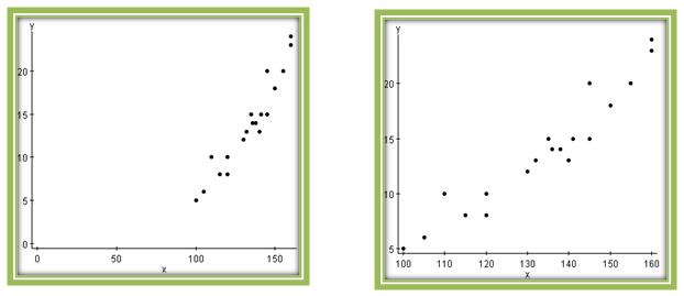
By examining the graphs, you might (at first glance) say that there is less scatter in the graph on the left. In this case you would conclude that the linear association is stronger in this graph. It turns out that the strength of association is exactly the same for the two graphs because they are plots of the same data.
The scatterplot on the left appears more linear because it uses a different x-axis scale than the graph on the right. Changing the scale here distorts the image. Whether intended or not, such differences in perspective can be misleading.
To find a more objective way to describe a linear association between two variables, we’ll introduce a numerical calculation (called the correlation coefficient). Once we have determined graphically that a linear association exists, this value should confirm our assessment of the association’s strength and direction. Note that we proceeded in a similar fashion when identifying outliers—first looking at a graph, and then using a numerical outlier criterion.
4.2.1 Interpreting the Correlation Coefficient
The correlation coefficient, r, is a measure of the strength and direction of the linear association between two quantitative variables. Its formula is a bit complicated, so for now we’ll let software such as CrunchIt! compute it.
Instead we’ll concentrate on interpreting what the value of r tells us about the linear association between the quantitative variables. Here are some facts about r:
- r is always a number between –1 and 1, inclusive.
- There are three extreme cases for the values of r.
- r = +1:The points in the scatterplot fall on a line with positive slope. This indicates a perfect positive linear association between x and y.
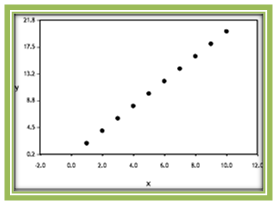 Figure 4.5: A Linear Relationship where r = 1
 - r = -1: points in the scatterplot fall on a line with negative slope. This indicates a perfect negative linear association between x and y.
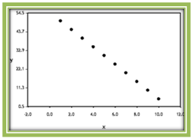 Figure 4.6: A Linear Relationship where r = -1
 - r = 0: There is no linear association between the two variables. The scatterplot shows data points that are widely scattered or a strong nonlinear pattern.
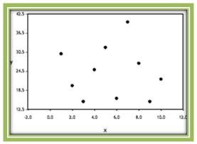 Figure 4.7: A Linear Relationship where r = 0
- r = +1:The points in the scatterplot fall on a line with positive slope. This indicates a perfect positive linear association between x and y.
In most situations involving real data, r is never exactly equal to –1, 0, or 1. If r >0, then there is a positive association between the two variables. When r is close to 1, the relationship is said to be strong. The farther the value of r is from 1, the weaker the positive linear relationship is said to be.
If r < 0, then there is a negative association between the two variables. When r is close to –1, the relationship is said to be strong. The farther the value of r is from –1, the weaker the negative linear relationship is said to be.
Let’s take a look at a few examples of scatterplots and their corresponding values of r.
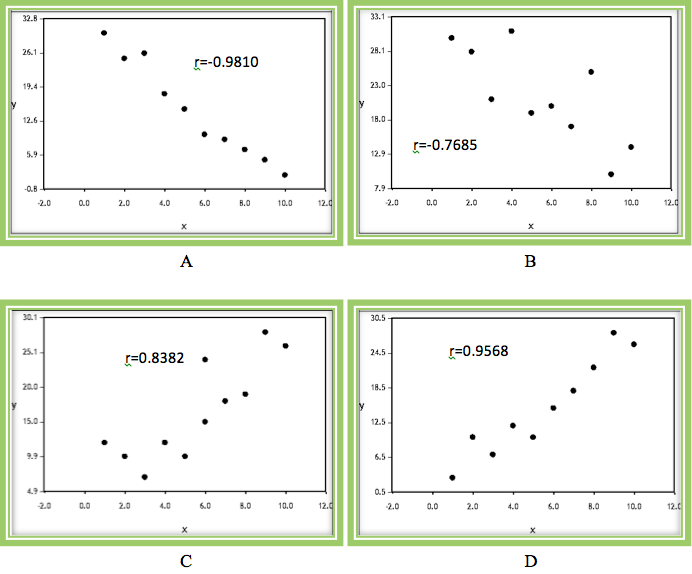
Notice that in all four graphs some sort of linear relationship is present, but to varying degrees, and in different directions. These two characteristics (direction and strength) are reflected in the value of the correlation coefficient.
Graphs A and B display a negative trend whereas graphs C and D show a positive trend. Although A and B both have a negative trend, there is more scatter in graph B than A. Therefore the correlation coefficient for A is closer to –1 than it is for graph B.
Similarly, although graphs C and D both have a positive trend, there is more scatter in graph C than D. Therefore the correlation coefficient is closer to +1 in graph D than it is in graph C.
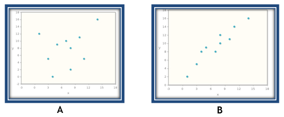
Question 4.5
For each of the scatterplots shown below, choose the answer which best describes the correlation coefficient (r).
Scatterplot A: dvKgMa1mjF19IdLzdydRUoQz8Ofns3jdPsD1ouv8S7i4uBibrV8XQHUHP/v+DjSGHJAWFidOOWPL9fDg6NSBOb8ms7bMHyPyanDl4BplR7ovFLfQit6V/wSJDlBmVONT7MfY3CXGq6Rk/OZUyqwCB34xp+UqLFj6UT0hYmpPMwst3CxrJAMzq6dZih0z9jxYaRN15pkNt51PtsGefdHEh7Q8YPRKhaM7mRehsg==
Scatterplot B: VPufyK8vh9mMpcUtkkVv3P9KkNSlFb+M7jCnF40Gz1c9PLiIZM0d+uKF+HFcAbv/s/5Y7GNBRapRopejjvCuBikEa/pgP5Gu5purZkVRghVNoy+g87TeVJvN0kkObD58R6N/CCfBwpkd7qAVnHx2plZHYz40OxlUYy+V/yihkXYk0TpMkKAUH9/QTUqxlF1kYaSxah9L5uLZsLaIciSA2ehRfoULkiltUpUrfA==
Now that we are getting a better idea about how the value of r tells us something about strength and direction of the linear association, let’s take a look at several other facts about r.
- A correlation coefficient value of 0 does not imply that there is no association between x and y. Rather, it means that there is no linear association between x and y. The following graph has a correlation coefficient of 0. Although there is a very clear (and strong) association between x and y, the association is not linear. In fact, you may recognize that the association in this case is quadratic.
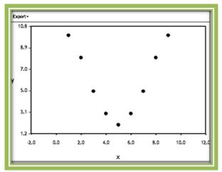 Figure 4.9: A Very Strong Nonlinear Relationship
The moral of this story is to always plot the data first. It is difficult to determine from the data itself whether a linear relationship exists, but a graph provides strong evidence either for or against such a relationship. If a linear relationship is not present, it does not make sense to compute r.
- The value of r does not depend on each variable’s units. If we are interested in measuring the correlation between the heights (in inches) and the weights (in pounds) of a group of college students, the correlation coefficient will be exactly the same number if instead we measured the heights in centimeters and the weights in kilograms.
- The value of r does not depend on which variable is selected as the explanatory variable and which is selected as the response variable. The correlation coefficient r measures the strength and direction of the linear relationship between the two variables. While the scatterplot looks different if you interchange the explanatory and response variables, the strength and direction of the linear relationship between the variables remains the same, and r does not change.

Question 4.6
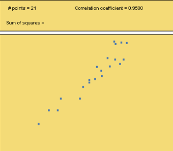
Use the Correlation and Regression applet to create a data set that has the following correlation coefficients:
a. r = 0.95
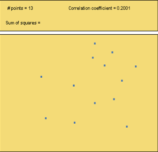
b. r = 0.20
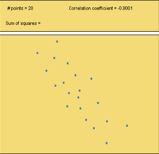
c. r = -0.80
When you are done, click here to display sample graphs of data sets that show the correlation coefficients and then respond below.
4.2.2 Correlation in Practice

The following contains data collected based on several variables for the ten countries in the world with the largest population in 2005. Variables measured include population estimates, percentage of the population below 15 years old, percentage of the population above age 65, average life expectancy, percentage who live in urban areas (cities), and the percentage of residents living in urban and rural areas with access to an adequate amount of water.
| Country | Population (millions) | % < 15 years | % 65+ years | Life Expectancy | Urban % | % Urban Water | % Rural Water |
|---|---|---|---|---|---|---|---|
| China | 1304 | 22 | 8 | 72 | 37 | 92 | 68 |
| India | 1104 | 36 | 4 | 62 | 28 | 96 | 82 |
| USA | 296 | 21 | 12 | 78 | 79 | 100 | 100 |
| Indonesia | 222 | 30 | 5 | 68 | 42 | 89 | 69 |
| Brazil | 184 | 29 | 6 | 71 | 81 | 96 | 58 |
| Pakistan | 162 | 42 | 4 | 62 | 34 | 95 | 87 |
| Bangladesh | 144 | 35 | 6 | 61 | 23 | 82 | 72 |
| Russia | 143 | 16 | 13 | 66 | 73 | 99 | 88 |
| Nigeria | 132 | 48 | 2 | 43 | 21 | 80 | 36 |
| Japan | 128 | 14 | 20 | 82 | 79 | 100 | 100 |
There are several quantitative variables contained in this data set. Perhaps you are interested in seeing if population size is related to the percentage of residents who are senior citizens. Maybe you’d like to see if there is an association between the percentage of people living in urban areas and the percentage of residents in urban areas who have access to an adequate amount of water.
Graph the data using a scatterplot. If a linear trend is apparent, use statistical software to determine the correlation coefficient.
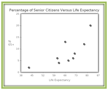
Let’s try an example. Is there an association between the life expectancy of a country and the percentage of senior citizens living in that country? Since we’d like to see if "percentage of people 65+ years old" depends on the “life expectancy” of a country, we’ll let “percentage of people 65+ years old” be the response variable and "life expectancy" be the explanatory variable. Here is the scatterplot of the data for the 10 most populous countries in 2005:
In a plot such as this one, we can imagine a line drawn roughly through the middle of this set of points, such as the one shown below.
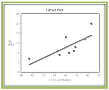
You may have imagined a slightly different line, but whatever line you imagine should go uphill from left to right, and have the data points "close" to the line. We will talk more about what "close" means in Section 4.3.
Because there is a moderate amount of scatter around this line and the slope of the line is positive, we say that the scatterplot shows a moderate positive linear association between the two variables. Using software such as CrunchIt! we find that the correlation coefficient is r = 0.7593. This confirms our theory that there is a moderate positive association between a country’s life expectancy and its percentage of residents who are senior citizens.
Is there association between life expectancy and population for the ten most populous countries in 2005? We’ll let population be the explanatory variable and life expectancy be the response variable.
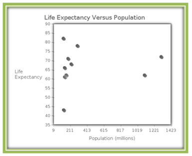
In this plot, it is much more difficult to imagine a line going through the "middle" of these points. Should the line go uphill or downhill? Our inability to visualize an appropriate line leads us to believe that the relationship between these variables is not linear. Indeed, the value of the correlation coefficient is r = 0.0952. This indicates that there is (at best) a very weak linear relationship between life expectancy and population for these countries.
Here is another example to consider. Figure 4.13 contains the fat grams(g) and calories for a large sample of grande (16 oz) cups of hot espresso-based drinks offered by Starbucks.

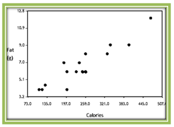
It is easy to imagine a line through the middle of this scatterplot. The plot displays a strong positive linear association between fat grams and calories in grande-sized drinks made with hot espresso at Starbucks. Those that are high in fat tend to have a large number of calories and those that have lower fat amounts tend to have fewer calories. Because there appears to be a linear trend, we compute the correlation and find that r = 0.873, again confirming a strong positive linear association between fat grams and calories.
4.2.3 How outliers affect r
In Table 4.3 we looked at several variables measured on the top ten most populated countries in 2005. Here again is the scatterplot showing the relationship between population and life expectancy, with potential outliers circled.
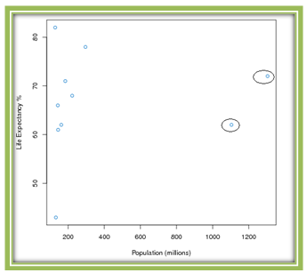
In a scatterplot, an outlier is a point outside the overall pattern of the plot. On the left of this plot we see a roughly linear pattern, with the two points on the right falling far outside that pattern. Although the life expectancies of China and India are in the range of the other countries, their population numbers are about four times the size of the other countries. Therefore both counties are certainly outliers in the x-direction. Let’s remove these data points, re-examine the scatterplot, and recalculate the correlation coefficient.
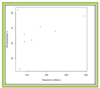
This scatterplot looks different (more clearly showing a positive association), and the correlation coefficient also changed significantly. The recalculated correlation coefficient is 0.4427. This example illustrates that the correlation coefficient is not resistant to outliers. This means that removing outliers from a data set will significantly alter the correlation coefficient’s value.
However, you should not remove outliers from your data set merely to improve the strength of the linear association between your variables. As we pointed out in Section 3.1, when you suspect problems with data values, you should report that. You may remove outliers if you are certain that they have occurred because of data collection or entry errors. In the case of the population/life expectancy data, the reported values are correct. China and India represent outliers because their populations are very much larger than those of other populous countries.
The question then becomes, what do you intend to do with a proposed model? If your goal is to make predictions about countries with populations similar to the remainder of the data, then removing the values for China and India is reasonable. If you are looking for a model to describe the whole set of data, you should not remove the outliers. In this case, however, the scatterplot provides ample warning that even the best linear model is unlikely to yield reasonable predictions.
Question 4.7
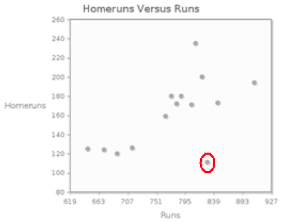
The following table shows the number of runs and the number of homeruns for each team in the American League during the 2008 season.
Source: sports.espn.go.com
a) The scatterplot shows homeruns versus runs.
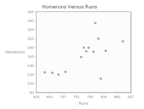
The form of the association between a team’s number of runs and number of homeruns is linear; the direction of the association is XNDr7Ctn99bLfJdLiVC+Q9WagYziSXOk; the strength of the association is qkJx7M8072lhvL3hErk9JDiSlsi9FDTA.
b) Calculate the correlation coefficient. Round the value to two decimal places. W3f3FtuuSDw=
c) There is an outlier in this plot, representing a team with a large number of runs, but a small number of homeruns. Remove this outlier, and recalculate the correlation coefficient. Round the value to two decimal places. FcUvNteKoxI=
4.2.4 The Formula for r
We have seen so far that the correlation coefficient, r, is a measure of the strength and direction of the linear association between two quantitative variables, x and y, but up to this point we have not introduced its mathematical formula. For those of you who are curious to know how r is calculated, read on. The formula for r is the following:
\[r = \frac{1}{n-1}\sum{\left(\frac{x-\overline{x}}{s_x} \right)}\left(\frac{y-\overline{y}}{s_y} \right )\]
Although this formula might look mysterious at first glance, let’s take a closer look and try to make sense of all of its parts. The formula for r is an average of products.
Recall that for each individual, two measurements are taken, one designated the x-value and the other designated the y-value. To compute r,
- First, we calculate the z-score for each of the x-values \(\left(\frac{x-\overline{x}}{s_x}\right)\) .
- Second, we calculate a z-score for each of the observed y-values \(\left(\frac{y-\overline{y}}{s_y}\right)\) . (Recall that a z-score measures how many standard deviations an observation is from its mean.)
- Third, for each ordered pair (x, y), we multiply the corresponding z-scores for the x- and y-values.
- Finally, we add these products and then divide by n – 1.
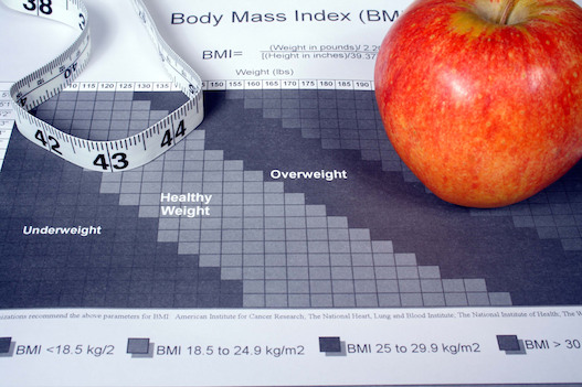
Here’s a small example to illustrate the steps that are part of this calculation. Here are waist and body mass index (BMI) data for four men.
| Individual | Waist in inches (x) | BMI (y) |
|---|---|---|
| 1 | 34 | 21.6 |
| 2 | 40 | 25.9 |
| 3 | 42 | 28.8 |
| 4 | 38 | 25.2 |
Source: www.news-medical.net
Let’s compute the correlation coefficient for this data set.
Before we can begin to use the formula, we need to find the mean and standard deviation for the x's and the mean and standard deviation for the y's. These summary statistics are presented in Table 4.5.
| Column | Mean | Std. Dev. |
|---|---|---|
| Waist (x) | 38.5 | 3.4156504 |
| BMI (y) | 25.375 | 2.960152 |
The following table shows the calculations for the z-scores for the x's (Step 1), the z-scores for the y's (Step 2), as well as the product of each pair's z-scores (Step 3).
| Row | Waist (x) | BMI (y) | z-score (x) | z-score (y) | Product |
|---|---|---|---|---|---|
| 1 | 34 | 21.6 | \(\frac{34 - 38.5}{3.4157}= -1.317\) | \(\frac{21.6 - 25.375}{2.9602}= - 1.275\) | \(- 1.317 \times - 1.275 = 1.6801\) |
| 2 | 40 | 25.9 | \(\frac{40 - 38.5}{3.4157}= 0.439\) | \(\frac{25.9 - 25.375}{2.9602}= 0.1774\) | \(0.439 \times 0.1774 = 0.0779\) |
| 3 | 42 | 28.8 | \(\frac{42 - 38.5}{3.4157}= 1.025\) | \(\frac{28.8 - 25.375}{2.9602}= 1.157\) | \(1.025 \times 1.157 = 1.1856\) |
| 4 | 38 | 25.2 | \(\frac{38 - 38.5}{3.4157}= -0.1464\) | \(\frac{25.2 - 25.375}{2.9602}= -0.0591\) | \(-0.1464 \times -0.0591 = 0.0087\) |
Our final step requires summing the products and dividing by n – 1. Therefore, the correlation coeffecient
\[r = \frac{1}{3}(1.6801 + 0.0779 + 1.1856 + 0.0087) = 0.9841\]
For the remainder of this chapter we will not calculate r by hand. You shouldn’t either. Use software such as CrunchIt! to calculate it for you. Focus your energy on interpreting and understanding the meaning of r.
4.2.5 Some Further Thoughts About r
In English "correlation" is a synonym for association or relationship. In statistics, "correlation" refers to the correlation coefficient r, which measures the strength and direction of the linear relationship between two quantitative variables. To us, correlation is a number. You should not say that there is a correlation between two variables, but rather that there is an association or a relationship between them.
Further, correlation is a calculation based on the numerical values of the variables observed. We cannot calculate a correlation coefficient if either (or both) of the variables studied are categorical, so it makes no sense at all to use the word "correlation" in these settings. (Later in this course we will study a way to determine whether an association exists between two categorical variables.)
Even when we can calculate a correlation coefficient, whether a particular association is moderate or strong is open to interpretation. Researchers are often quite delighted with an r of 0.5, which might not seem very strong to us.
To see examples of real-world variables with strong linear associations, view the video Snapshots: Correlation and Causation.
To give us a common vocabulary for describing the strength of an association, we will use the following guidelines:
- if \(\lvert r \rvert \geq 0.8\)000, we will say that the linear association is strong;
- if 000\(0.5 \leq \lvert r \rvert\ < 0.8\)000, we will say that the linear association is moderate;
- if 000\(0.2 \leq \lvert r \rvert < 0.5\)000, we will say that the linear association is weak, and
- if \(\lvert r \rvert < 0.2\), we will say that there is no linear association between the two variables
Remember that the sign of the correlation coefficient always indicates the direction of the linear association rather than its strength. Thus, we would say that an r = –0.6 represents a moderate negative linear association, while an r of 0.3 represents a weak positive linear association.
This correspondence between values of r and adjectives describing the strength of the relationship represents neither a universal standard nor an unbreakable rule. It is presented merely to give you some guidance as you begin to work with correlation. Should you be collecting and analyzing your own data in the future, or evaluating the analysis of others, keep in mind that interpretations of r can be subjective.
And most importantly, do not confuse correlation with causation. The fact that an explanatory variable and a response variable have a strong association does not indicate that the explanatory variable causes the response. In the example above, waist size and BMI show a strong (indeed, a very strong) linear relationship, but large waist sizes do not cause high BMI numbers. Similarly, if we were to make a scatterplot of the shoe size and reading level for several elementary-school students we would no doubt see a strong, positive association between these two variables. Here it should be clear that having bigger feet doesn't make you a better reader. Rather, both variables are responding to the lurking variable age.
This warning bears repeating. Correlation does not imply causation. The clearest way to establish a cause-and-effect relationship, as we discussed in Chapter 2, is to conduct a randomized, comparative experiment. In such a situation, subjects are randomized into treatment groups so that differences in outcomes are most likely caused by differences in treatments.
However, when human subjects are involved, researchers often cannot conduct experiments because of practical or ethical considerations. In attempting to establish smoking as a cause of lung cancer, it was not possible to divide subjects into two groups, forcing one group to smoke and one to abstain from cigarettes. The link between smoking and lung cancer was confirmed only because many, many observational studies over dozens of years showed a very strong association between cigarette smoking and lung cancer.
The article Correlation, causation, and association - What does it all mean??? provides additional discussion of the challenges involved in establishing causation.
Now that we have both graphical and numerical measures available to assess the association between two quantitative variables, we’ll continue on to finding models to describe the relationship between the variables. In the next section we’ll look at bivariate quantitative data sets that exhibit a moderate to strong linear association, and we will develop methods to find appropriate models for the data. These models will allow us to predict values of the response variable, given an explanatory variable value.