1.1 Data Stories: The People Behind the Numbers
2
OBJECTIVES By the end of this section, I will be able to …
- Realize that behind each data set lies a story about real people undergoing real-life experiences.
We begin Discovering Statistics by sharing some data stories. We start with some good news.
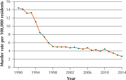
EXAMPLE 1 Declining murder rate in New York City
Our Chapter 2 Case Study, Criminal Justice in New York City, examines a wide range of criminal behavior throughout the police precincts of the five boroughs of New York City, from misdemeanors to murder. In this chapter, we briefly preview these data by looking at Figure 1. This figure is a time series plot of the murder rate (number of murders per year per 100,000 residents) for New York City for the years 1990–2014 (Source: New York City Police Department, www.nyc.gov). Note the steep decline from 1993 to 1998, followed by a flattening until 2010, when another slow descent began. Think about what this means: Thousands of men and women are living their lives who would not be alive today had the high murder rates of the early 1990s continued. And this heartening pattern is not restricted to New York City. Major cities across the country are seeing their crime rates drop over this same period (Source: FBI Uniform Crime Reports).
In the Chapter 2 Case Study, we examine other types of crime in New York City and look to see if further good news is available. We learn how to construct a time series plot similar to Figure 1 in Section 2.3.
EXAMPLE 2 UFO sightings
Have you or any of your friends sighted any unidentified flying objects (UFOs)? Americans in each of the 50 states have reported seeing UFOs. Figure 2 represents a scatter-plot of the number of UFO sightings versus state population, for each of the 50 states. Each dot represents a state. The straight line is a regression line that approximates the relationship between UFO sightings and state population. As the state population increases, the number of UFO sightings also tends to increase, which is not surprising.
3
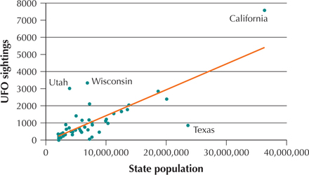
What may be surprising is that the UFOs seem to be attracted to certain states, while avoiding others. States considerably above the regression line have a larger than expected number of UFO sightings for their population size, whereas states below the line have a smaller than expected number of UFO sightings for their population size. So, there are more sightings than expected in California, Wisconsin, and Utah, given their population size, and fewer than expected in Texas. Why this might occur is open to discussion. Perhaps people in California are more likely to attribute unusual sightings to UFOs than most Americans; perhaps people in Texas are more pragmatic than most Americans. But if the sightings are valid (a big if!), it sure looks like the UFOs don't want to mess with Texas. We will learn how to construct and interpret scatterplots in Chapter 4, “Correlation and Regression,” and we will learn how to quantify the relationship between two numerical variables in Chapter 4 and Chapter 13, “Inference in Regression.”
EXAMPLE 3 California wildfires
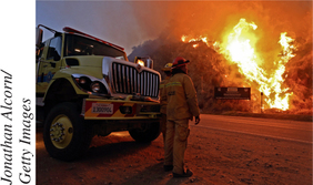
In 2014, severe drought continued to batter the state of California and large areas of the western United States. The drought contributed to a series of wildfires that consumed hundreds of thousands of acres across the region. Table 1 contains a data set, which includes a listing of the uncontrolled wildfires raging around the state of California as of August 22, 2014. We will learn in Section 1.2 about how data sets are structured. Meanwhile, this is the first data set we look at, which gives us a chance to think about how these fires affected the lives of ordinary Californians: the lives lost, the homes destroyed, the forests and wildlife burned. As statisticians, we should always remember that behind the data lie the stories of real people. As statisticians, we will learn to apply the power of statistical analysis to improve the lives of the people behind the data. Let's get started.
| Fire | Location | Size (acres) | Percent contained |
|---|---|---|---|
| Eiler | Lassen National Forest | 32,416 | 97 |
| Happy Camp Complex |
Klamath National Forest | 9,844 | 10 |
| July Complex | Klamath National Forest | 31,945 | 25 |
| Junction | Merced-Mariposa Unit, Cal Fire | 612 | 65 |
| KNF Beaver | Klamath National Forest | 32,307 | 93 |
| Lodge Complex |
Mendocino National Forest | 12,535 | 95 |
| Log | Klamath National Forest | 3,629 | 95 |
| Way | Central California District | 3,858 | 48 |