2.3 Further Graphs and Tables for Quantitative Data
87
OBJECTIVES By the end of this section, I will be able to …
- Build cumulative frequency distributions and cumulative relative frequency distributions.
- Create frequency ogives and relative frequency ogives.
- Construct and interpret time series graphs.
1 Cumulative Frequency Distributions and Cumulative relative Frequency Distributions
Quantitative data can be put in ascending order, so we can keep track of the accumulated counts at or below a certain value using a cumulative frequency distribution or cumulative relative frequency distribution. For example, if we list the prices of homes for sale in a neighborhood, a cumulative frequency distribution tells us how many homes are priced at $300,000 or less.
For a discrete variable, a cumulative frequency distribution shows the total number of observations less than or equal to the category value. For a continuous variable, a cumulative frequency distribution shows the total number of observations less than or equal to the upper class limit.
A cumulative relative frequency distribution shows the proportion of observations less than or equal to the category value (for a discrete variable) or the proportion of observations less than or equal to the upper class limit (for a continuous variable).
EXAMPLE 22 Constructing cumulative frequency and cumulative relative frequency distributions
Table 35 contains the total 2013 attendance for 25 Major League Baseball teams.
| 1.5 | 1.6 | 1.6 | 1.7 | 1.8 |
| 1.8 | 1.8 | 1.8 | 2.1 | 2.1 |
| 2.3 | 2.4 | 2.5 | 2.5 | 2.5 |
| 2.6 | 2.6 | 2.8 | 2.8 | 3.0 |
| 3.0 | 3.1 | 3.2 | 3.3 | 3.7 |
The first three columns in Table 36 below contain the frequency distribution and relative frequency distribution for the attendance data. Construct a cumulative frequency distribution and a cumulative relative frequency distribution for the attendance figures.
88
Solution
To find the cumulative frequency for a class, add the frequencies of the classes equal to or below the upper class limit of that class. For example, the cumulative frequency for the class is the sum of the frequency for this class and for the class . The procedure for the cumulative relative frequencies is similar. The results are shown in the last two columns of Table 36, where we can see that more than three-quarters (0.76) of these teams had attendance of less than 3 million.
| Attendance | Frequency | Relative frequency |
Cumulative frequency |
Cumulative relative frequency |
|---|---|---|---|---|
| 8 | 0.32 | 8 | 0.32 | |
| 4 | 0.16 | |||
| 7 | 0.28 | |||
| 5 | 0.20 | |||
| 1 | 0.04 | |||
| Total | 25 | 1.00 |
NOW YOU CAN DO
Exercises 9–12.
YOUR TURN #13
Using the unemployment rate data from Table 22 on page 65, construct a cumulative frequency distribution and cumulative relative frequency distribution of the unemployment rates.
(The solution is shown in Appendix A.)
2 Ogives
Just as histograms and frequency polygons are the graphical equivalent of frequency distributions, we have the following graphical equivalent of a cumulative frequency distribution.
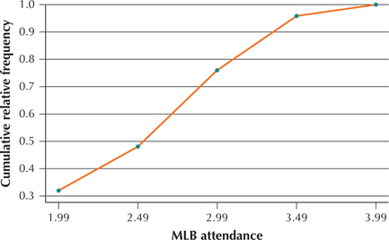
An ogive (pronounced “oh jive”) is the graphical equivalent of a cumulative frequency distribution or a cumulative relative frequency distribution. Similar to a frequency polygon, an ogive consists of a set of plotted points connected by line segments. The x coordinates of these points are the upper class limits; the y coordinates are the cumulative frequencies or cumulative relative frequencies.
EXAMPLE 23 Constructing an ogive
ballattend
Construct a relative frequency ogive for the attendance data in Table 36.
Solution
For the x coordinates, we use the upper class limits for attendance, and for the y coordinates, we use the cumulative relative frequencies. The result is shown in Figure 47.
89
NOW YOU CAN DO
Exercises 13–16.
YOUR TURN #14
Using the unemployment data in Table 22 on page 65, construct a frequency ogive of the unemployment rates.
(The solution is shown in Appendix A.)
What Does This Graph Mean?
The ogive is a graphical representation of a cumulative relative frequency distribution. Thus, the first point (1.99, 0.32) indicates that 32% of the teams had total attendance at or below 1.99 million. The cumulative nature of the graph means that it can never decrease from left to right. The cumulative attendance increases until the rightmost point (3.99, 1.0) indicates that 100% (all) of the teams had total attendance at or below 3.99 million.
3 Time Series Graphs
Data analysts are often interested in how the value of a variable changes over time. Data that are analyzed with respect to time are called time series data.
A graph of time series data is called a time series plot. The horizontal axis of a time series plot represents time (for example, hours, days, months, years). The values of the time series data are plotted on the vertical axis, and line segments are drawn to connect the points.
EXAMPLE 24 Constructing a time series plot
murderrate
 Table 37 contains the murder rate per 100,000 residents for New York City, from 1990 to 2014.
- Construct a time series plot of the data.
- Describe any patterns you see.
Solution
- We indicate the years 1990–2014 on the horizontal axis of the time series plot (Figure 48). Then, for each year, we plot the murder rate per 100,000 residents. Finally, we join the points using line segments.Table 2.85: TABLE 37 Murder rate in New York City, 1990–2014
Year Rate Year Rate Year Rate 1990 14.5 1999 5 2008 4.3 1991 14.2 2000 5 2009 4 1992 13.2 2001 5 2010 4.5 1993 13.3 2002 4.8 2011 3.9 1994 11.1 2003 4.9 2012 3.5 1995 8.5 2004 4.6 2013 3 1996 7.4 2005 4.5 2014 2.7 1997 6 2006 4.8 1998 5.1 2007 4.2 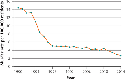 Figure 2.48: FIGURE 48 Time series plot. Murder rate in New York City, 1990–2014.
 - Note that the murder rate fell quickly from 1993 to 1998 and then tended to flatten out until 2010, when it began a slow descent until 2014. In the Step-by-Step Technology Guide, we illustrate how to construct this time series graph using technology.
NOW YOU CAN DO
Exercises 17 and 18.
90
EXAMPLE 25 Constructing a time series plot using technology
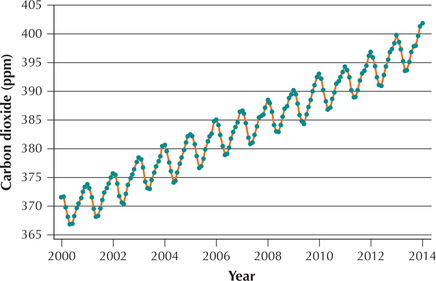
maunaloa1
The data set Mauna Loa 1 contains the carbon dioxide levels at Mauna Loa from May 2000 to May 2014. Use technology to construct a time series plot of the data.
Solution
We use the instructions provided in the Step-by-Step Technology Guide at the end of this section. The resulting Minitab time series plot is shown in Figure 49. (The year on the horizontal axis indicates the month of May of each year. For example “2014” refers to May 2014.)
In Figure 49, we observe both a seasonal pattern and a long-term trend. Every autumn and winter, the carbon dioxide level increases, and every summer it decreases. In autumn and winter, leaves and other deciduous vegetation decay, releasing their store of carbon back into the atmosphere. In the spring and summer, the new year's leaves require carbon to grow and extract it from the atmosphere, thereby reducing the atmosphere's carbon dioxide level. Thus, the biosphere “inhales” carbon each summer and “exhales” it each winter. However, the low point of each successive cycle does not quite reach the level of the previous cycle before heading up again. This leads to an overall increasing trend in the amount of carbon dioxide in the atmosphere as we move from 2000 to 2014.
91