2.4 Graphical Misrepresentations of Data
OBJECTIVE By the end of this section, I will be able to …
- Avoid eight common practices that can make a graph misleading, confusing, or deceptive.
In the Information Age, when our world is awash in data, it is important for citizens to understand how graphics may be made misleading, confusing, or deceptive. Such an understanding enhances our statistical literacy and makes us less prone to being deceived by misleading graphics.
96
Eight Common Methods for Making a Graph Misleading
- Graphing/selecting an inappropriate statistic.
- Omitting the zero on the relevant scale.
- Manipulating the scale.
- Using two dimensions (area) to emphasize a one-dimensional difference.
- Careless combination of categories in a bar graph.
- Inaccuracy in relative lengths of bars in a bar graph.
- Biased distortion or embellishment.
- Unclear labeling
EXAMPLE 26 Inappropriate choice of statistic
The United Nations Office on Drugs and Crime reports the statistics, given in Table 44, on the top five nations in the world ranked by numbers of cars stolen in 2012. The car thieves seem to be preying on cars in the United States, which has endured more than the next four highest countries put together. (See also the bar graph in Figure 54.) However, the United States has a much greater population than these other countries. Is it possible that, per capita (per person), the car theft rate in the United States is not so bad?
| Country | Cars stolen |
|---|---|
| United States | 532,900 |
| Italy | 126,627 |
| France | 111,305 |
| Spain | 35,131 |
| Netherlands | 12,575 |
Solution
In this case, the total number of cars stolen is an inappropriate statistic because the population of the United States is greater than the populations of the other countries.
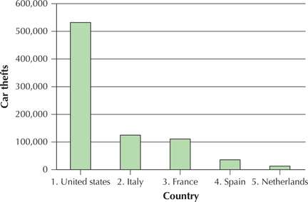
To find the per capita car theft rate, divide the number of cars stolen in a country by that country's population. The resulting list in Table 45 of the top five countries for per capita car theft contains a few surprises. Note that the United States has dropped to third on the revised list.
97
| Country | Cars stolen per capita |
|---|---|
| Italy | 0.00208 |
| France | 0.00174 |
| United States of America | 0.00168 |
| Sweden | 0.00117 |
| Belgium | 0.00106 |
Developing Your Statistical Sense
Choose the Appropriate Statistic
The bottom line is that we need to be careful how we use statistics. Put in an extreme form, “Figures don't lie, but liars figure.” One table of statistics tells us the car theft epidemic is striking the United States with special vehemence. The other table asserts the contrary. An American insurance company looking to increase car insurance rates could point to the first table to support its rate request. A citizens group opposing the request could cite the second table. Which table of statistics is true? They both are! We need to be careful how we phrase our research questions and how we choose the types of statistical evidence we use to investigate research questions.
NOW YOU CAN DO
Exercises 3–5.
EXAMPLE 27 Omitting the zero
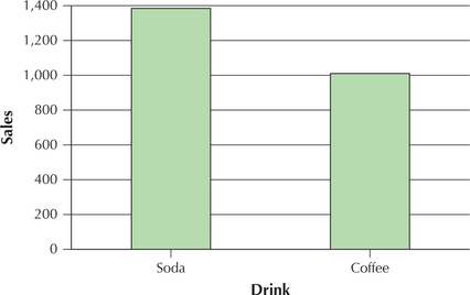
Student-Run Café Business
Suppose someone wanted to make the point that the students at the university with the Student-Run café business are drinking too much soda, and he or she produced Figure 55 to support this argument. Figure 55 is a bar graph of the total number of sodas sold over the 47 days compared with the total number of coffees sold. However, Figure 55 is misleading because it exaggerates the difference. Explain how Figure 55 is misleading, and produce the proper bar graph.
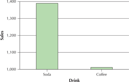
Solution
Figure 55 is misleading because the vertical scale does not begin at zero. Instead, as we see in Figure 56, when zero is included on the vertical scale, the difference between the numbers of soda and coffee sold is not so dramatic.
98
EXAMPLE 28 Manipulating the scale
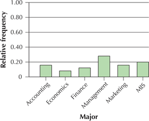
Figure 57 shows a relative frequency bar graph of the majors chosen by 25 business school students. Explain how we could manipulate the scale to de-emphasize the differences.
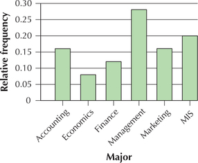
Solution
If we wanted to de-emphasize the differences, we could extend the vertical scale up to its maximum, , to produce the graph in Figure 58.
99
EXAMPLE 29 Using two dimensions for a one-dimensional difference and unclear labeling
Figure 59 compares the leaders in career playoff points scored in the NBA playoffs, as of June 2014. Explain how this graph may be misleading.
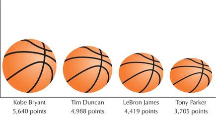
Solution
The height of the balls is supposed to represent the total points, but this is not clearly labeled. Points should be indicated using a vertical axis, but the vertical axis is not labeled at all. Further, note that the ball for Kobe Bryant is larger both in height and in width. This is misleading because it overemphasizes the difference in points scored between Kobe Bryant and Tim Duncan. In a bar graph, the bars for all four players should have the same width.
EXAMPLE 30 Careless combination of categories in a bar graph and biased embellishment
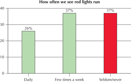
Figure 60 shows a bar graph of how often people have observed drivers running red lights. Explain how this bar graph may be considered both confusing and biased.
Solution
One problem with this bar graph is that the categories of seldom and never have been combined, which may not be appropriate. Also, as we learned in Chapter 1, what is “seldom” to one person may not be “seldom” to someone else. A third problem is that the bar of the Seldom/never category is highlighted in a different color, which may be evidence of bias on the part of the designer of the bar graph.
100
EXAMPLE 31 Inaccuracy in relative lengths of bars in a bar graph and unclear labeling
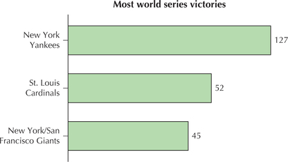
Figure 61 is a horizontal bar graph of the three teams with the most World Series victories in baseball history. Explain what is unclear or misleading about this graph.
Solution
Note that 127 is more than twice as many as 52, and so the Yankees' bar should be more than twice as long as the Cardinals' bar, which it is not. Finally, note the absence of a horizontal axis.
When constructing a histogram, changing the number of classes or the width of the interval can sometimes lead to a completely different-looking distribution. Thus, we need to exercise care when someone shows us a histogram because it presents, not the data themselves, but one of many ways of classifying the data.
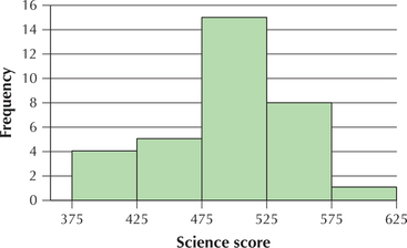
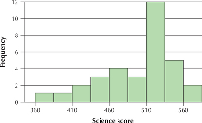
EXAMPLE 32 Presenting the same data set as both symmetric and left-skewed
The National Center for Education Statistics sponsors the Trends in International Mathematics and Science Study (TIMSS). Science tests were administered to eighth-grade students in countries around the world (see Table 46). Construct two different histograms: one that shows the data as almost symmetric and one that shows the data as left-skewed.
| Country | Score | Country | Score | Country | Score |
|---|---|---|---|---|---|
| Singapore | 578 | New Zealand | 520 | Bulgaria | 479 |
| Taiwan | 571 | Lithuania | 519 | Jordan | 475 |
| South Korea | 558 | Slovak Republic | 517 | Moldova | 472 |
| Hong Kong | 556 | Belgium | 516 | Romania | 470 |
| Japan | 552 | Russian Federation | 514 | Iran | 453 |
| Hungary | 543 | Latvia | 513 | Macedonia | 449 |
| Netherlands | 536 | Scotland | 512 | Cyprus | 441 |
| United States | 527 | Malaysia | 510 | Indonesia | 420 |
| Australia | 527 | Norway | 494 | Chile | 413 |
| Sweden | 524 | Italy | 491 | Tunisia | 404 |
| Slovenia | 520 | Israel | 488 | Philippines | 377 |
101
Solution
Figure 62 is nearly symmetric, but Figure 63 is clearly left-skewed. It is important to realize that both figures are histograms of the very same data set. Clever choices for the number of classes and the class limits can affect how a histogram presents the data. The reader must therefore beware! The histogram represents a summarization of the data set, not the data set itself. Analysts may wish to supplement the histogram with other graphical methods, such as dotplots and stem-and-leaf displays, in order to gain a better understanding of the distribution of the data.
![]() The One Variable Statistics and Graphs applet allows you to experiment with the class width and number of classes when constructing a histogram.
The One Variable Statistics and Graphs applet allows you to experiment with the class width and number of classes when constructing a histogram.