Section 2.4 Exercises
CLARIFYING THE CONCEPTS
Question 2.315
1. Explain in your own words why it is important to be aware of the methods that can be used to make graphics misleading. (p. 95)
2.4.1
Answers will vary.
Question 2.316
2. True or false: What we have learned in this chapter proves that all statistics are misleading.
PRACTICING THE TECHNIQUES
Refer to Example 26 for the following exercises.
Question 2.317
3. Which do you think is more effective at convincing the American public that a problem exists, Table 44 or Figure 54?
2.4.3
Figure 54 visually reinforces the magnitude of the differences.
Question 2.318
4. How would factoring in the number of cars per country affect the rankings, in your view?
Question 2.319
5. If you were an insurance claims adjuster arguing for higher car insurance rates in the United States, would you prefer Table 44 or Table 45? Why?
2.4.5
Table 44 gives the actual number of cars stolen.
APPLYING THE CONCEPTS
Question 2.320
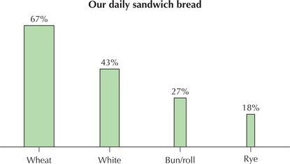
6. Eating bread. Consider the accompanying graphic of the types of bread people eat.
- What type of graph is it supposed to represent, among the graphs that we have learned in this chapter?
- Consider how the wheat category dominates the graph. Which of the eight common methods for misrepresenting data is present here?
- Construct a graphic that is not misleading in this way.
102
Question 2.321
7. Child-rearing Costs. Consider the accompanying graphic of child-rearing costs by type of cost.
- Identify one problem with the graphic that makes it misleading.
- Construct a graphic that is not misleading in this way.
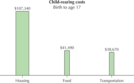
2.4.7
(a) Biased distortion or embellishment; omitting the zero on the relevant scales; inaccuracy in relative lengths of bars in a bar chart. (b) A Pareto chart or pie chart can be used.
Question 2.322
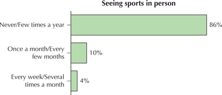
8. Going to the Game. Consider the accompanying graphic of the proportions of people who go to see professional sports events.
- Identify two problems with the graphic that make it misleading.
- Construct a graphic that is not misleading in these ways.
Question 2.323
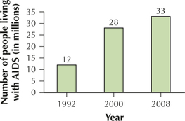
9. Living with AIDS. Consider the accompanying graphic.
- What point is the graphic trying to make?
- Which of the eight common problems is most obviously present here?
- Construct a graphic that is not misleading in this way.
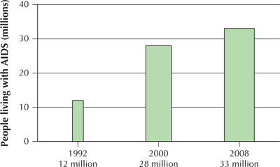
2.4.9
(a) The number of people living with AIDS is increasing.
(b) Using two dimensions (area) to emphasize a one-dimensional difference.
(c)
Question 2.324
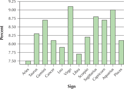
10. What's your Sign? The General Social Survey collects data on social aspects of life in America. Consider the accompanying bar graph of the results of asking 1464 people what their astrological sign is.
- Which of the eight common problems is most obviously present here?
- Construct a graphic that is not misleading in this way.
Question 2.325
11. Apps. Refer to the app type data in Table 2 on page 41.
- Construct a bar graph that overemphasizes the difference among the app types.
- Which of the common methods for making graphics misleading are you using in (a)?
- Construct a bar graph that underemphasizes the difference among the app types.
- Which of the common methods for making graphics misleading are you using in (c)?
2.4.11
(a)
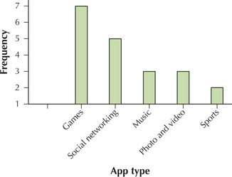
(b) Manipulating the scale, omitting the 0 on the vertical scale
(c)
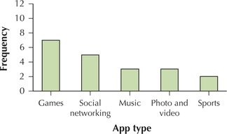
(d) Manipulating the scale
Question 2.326
12. Music and Violence. USA Weekend conducted a poll that asked, “Do you think shock rock and gangsta rap are partly to blame for violence such as school shootings or physical abuse?” The results are shown in the following table.
| Yes | 31% |
| No | 45% |
| I've never thought about it | 24% |
- Construct a bar graph that overemphasizes the difference among the responses.
- Construct a bar graph that underemphasizes the difference among the responses.
- Construct a bar graph that fairly represents the data.
Question 2.327
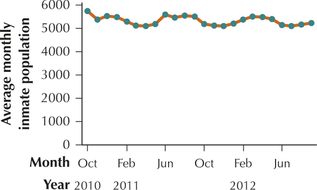
13. Inmate Population. Refer to Table 43 on page 95, which contains the average monthly inmate population for Miami-Dade Department of Corrections. There seems to have been a moderate drop in the monthly average inmate population over the two years.
- Alter the vertical axis so as to overemphasize this drop.
- Change the vertical axis so as to de-emphasize this drop.
2.4.13
(a)
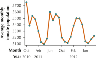
(b)
103
![]() Use the One Variable Statistics and Graphs applet for Exercises 14–16. Work with the TIMSS scores from Example 32.
Use the One Variable Statistics and Graphs applet for Exercises 14–16. Work with the TIMSS scores from Example 32.
Question 2.328
14. Click on the histogram tab. Experiment with the class widths by clicking and dragging on the number line. Produce a histogram that is nearly symmetric, like Figure 62.
Question 2.329
15. Produce a histogram that is somewhat left-skewed, like Figure 63.
2.4.15
Answers will vary.
Question 2.330
16. Click on the Stem-and-leaf tab. The previous two exercises left us with two different ideas as to the shape of the distribution.
- Now produce a stem-and-leaf display of the TIMSS scores.
- Compare the regular stem-and-leaf display with the split-stem stem-and-leaf display. Which is preferable for this data set?
- Use your preferred stem-and-leaf display from (b) to describe the shape of the distribution.
- Which of the two histograms does your description in (c) support?