2.1 Graphs and Tables for Categorical Data
40
OBJECTIVES By the end of this section, I will be able to …
- Construct and interpret a frequency distribution and a relative frequency distribution for qualitative data.
- Build and interpret bar graphs and Pareto charts.
- Construct and interpret pie charts.
- Build crosstabulations to describe the relationship between two variables.
- Work with tabular data to construct graphs and distributions.
- Construct a clustered bar graph to describe the relationship between two variables.
In Chapter 2, we apply the adage “A picture is worth a thousand words.” The human mind can assess information presented in a graph or table better than it can through words and numbers alone. Psychologists sometimes call this innate ability pattern recognition. Statistical graphs and tables take advantage of this ability to quickly summarize data.
1 Frequency Distributions and Relative Frequency Distributions
Recall from Chapter 1 that categorical (qualitative) data take values that are nonnumeric and are usually classified into categories. In this section, we learn graphical and tabular methods for handling categorical data. Let us begin with an example.
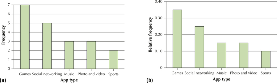
Table 1 shows the 20 most downloaded free apps for the IOS platform, as reported by Apple.com, along with the app type, for June 2014. We will analyze the variable app type, which is a qualitative, not quantitative, variable.
| Rank | App | App type | Rank | App | App type |
|---|---|---|---|---|---|
| 1 | Two Dots | Games | 11 | Social networking | |
| 2 | The Line | Games | 12 | NBC Sports Live | Sports |
| 3 | Traffic Racer | Games | 13 | Social networking | |
| 4 | Rival Knights | Games | 14 | FIFA Official App | Sports |
| 5 | Piano Tiles | Games | 15 | Pandora | Music |
| 6 | Snap Chat | Photo and video | 16 | Spotify | Music |
| 7 | Photo and video | 17 | Social networking | ||
| 8 | The Test | Games | 18 | Emoji Keyboard 2 | Social networking |
| 9 | Republique | Games | 19 | Social networking | |
| 10 | YouTube | Photo and video | 20 | SoundCloud | Music |
From this data set, it is not immediately clear which app type is the most popular choice among the 20 apps in the sample. That is why we need ways to summarize the values in a data set. One popular method used to summarize the values in a data set is the frequency distribution (or frequency table).
41
The frequency, or count, of a category refers to the number of observations in each category. A frequency distribution for a qualitative variable is a listing of all the values (for example, categories) that the variable can take, together with the frequencies for each value.
EXAMPLE 1 Frequency distributions

Create a frequency distribution for the variable app type from Table 1.
Solution
For each app type, we compute the frequency; that is, we count (or tally) how many apps were of that particular app type. Table 2 shows the frequency distribution for the variable app type. For example, five of the apps were social networking apps. The frequency distribution summarizes the data set so that quick observations can be made, such as “The most popular app type in the Apple.com top 20 list of the most downloaded free apps is the Games app type.”
Note: Check that the sum of the frequencies equals the sample size, .
| App type | Tally | Frequency |
|---|---|---|
| Games |

|
7 |
| Social networking |

|
5 |
| Music | ||| | 3 |
| Photo and video | ||| | 3 |
| Sports | || | 2 |
YOUR TURN #1
 The New York City Police Department tracks the number and type of traffic violations. Table 3 contains a random sample of 12 traffic violations and the borough in which they occurred (Manhattan or Brooklyn).
- Build a frequency distribution of Borough.
- Construct a frequency distribution of Violation type.
| Violation type | Borough | Violation type | Borough |
|---|---|---|---|
| Cell phone | Brooklyn | Disobey sign | Manhattan |
| Safety belt | Manhattan | Speeding | Brooklyn |
| Cell phone | Brooklyn | Safety belt | Manhattan |
| Cell phone | Manhattan | Disobey sign | Manhattan |
| Speeding | Brooklyn | Disobey sign | Brooklyn |
| Safety belt | Manhattan | Cell phone | Manhattan |
(The solutions are shown in Appendix A.)
As the data set gets larger, the need for summarization gets more and more acute. (Imagine if the Apple.com listing consisted of 1000 apps instead of 20.) Take a moment to add up the frequencies in Table 2. What do they add up to? This number is the sample size: . Now, is this just a coincidence, or does this happen every time?
42
Actually, this happens every time: the sum of the frequencies equals the sample size, . One way to check if you made a mistake in forming your frequency distribution table is to add up the frequencies and see if the sum equals the sample size.
Relative Frequency Distributions
Next, suppose you didn't know the size of the sample in the survey. Suppose you were told only that seven apps were games. The logical question is “Is that a lot?” If our sample size was only 10 apps, then 7 of those apps being games is certainly a lot. However, if our sample size was 1000 apps, then only 7 of those apps being games is not a lot. So, the number's significance depends on what you compare the seven apps to—that is, “relative to what?” or “compared to what?” In statistics, we compare the frequency of a category with the total sample size to get the relative frequency.
The relative frequency of a particular category of a qualitative variable is its frequency divided by the sample size. A relative frequency distribution for a qualitative variable is a listing of all values that the variable can take, together with the relative frequencies for each value.
EXAMPLE 2 Relative frequency distributions
Create a relative frequency distribution for the variable app type using Table 2.
Solution
The relative frequency of the games app type is the frequency 7 divided by the sample size 20:
The relative frequency of games apps is 0.35, or 35%. So, if someone told you that 35% of the apps were games, without telling you the sample size, you would have a better idea of the relative popularity of that app type. To construct the relative frequency distribution in Table 4, divide each frequency in the frequency distribution in Table 2 by the sample size 20.
| App type | Relative frequency |
|---|---|
| Games | |
| Social networking | |
| Music | |
| Photo and video | |
| Sports |
Note: The relative frequencies always add up to 1.00, which represents 100%.
NOW YOU CAN DO
Exercises 11–14 and 23–28.
YOUR TURN #2
Use Table 3 to construct relative frequency distributions for the following categorical variables.
- Borough
- Violation type
(The solutions are shown in Appendix A.)
2 Bar Graphs and Pareto Charts
43
Frequency distributions and relative frequency distributions are tabular and thus useful for summarizing data sets. The graphical equivalent of a frequency distribution or a relative frequency distribution is called a bar graph (or bar chart).
A bar graph is used to represent the frequencies or relative frequencies for categorical data. It is constructed as follows:
- On the horizontal axis, provide a label for each category.
- Draw rectangles (bars) of equal width for each category. The height of each rectangle represents the frequency or relative frequency for that category. Ensure that the bars are not touching each other.
EXAMPLE 3 Constructing bar graphs
Construct a frequency bar graph and a relative frequency bar graph for the distributions of app type in Tables 2 and 4.
Solution
The bar graphs are provided in Figure 1a and 1b. Across the horizontal axis are the five app type categories. Next, draw rectangles, the heights of which represent either the frequency or the relative frequency for that category represented on the vertical axis. For example, in Figure 1a, the first rectangle (Games) reaches a height of 7, while the second rectangle reaches only to 5. Note that the rectangles are of equal width, and none of them touch each other. Also notice that the two bar graphs are exactly alike, except for the scale indicated on the vertical axis. This is because we divide each frequency by the same number, the sample size, to get the relative frequency.
NOW YOU CAN DO
Exercises 15–18 and 29–34.
YOUR TURN #3
Use Table 3 to construct the following graphs.
- Frequency bar graph for Borough
- Relative frequency bar graph for Borough
- Frequency bar graph for Violation type
- Relative frequency bar graph for Violation type
(The solutions are shown in Appendix A.)
44
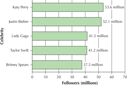
The bars in a bar graph may be presented horizontally, especially when the category names are long. Figure 2 contains a horizontal bar chart of the top celebrities with the most Twitter followers, as of June 8, 2014.
A Pareto chart is a bar graph in which the rectangles are presented in decreasing order from left to right.
Figures 1a and 1b are both examples of Pareto charts. Had the bars for Games and Social networking switched places, then those figures would no longer have been Pareto charts because they would no longer have been in decreasing order.
3 Pie Charts
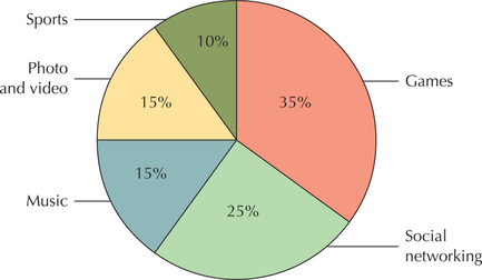
Pie charts are a common graphical device for displaying the relative frequencies of a categorical variable.
A pie chart is a circle divided into sections (that is, slices or wedges), with each section representing a particular category. The size of the section is proportional to the relative frequency of the category.
Pie charts are typically made using technology. However, one can construct a pie chart using a protractor and a compass. A circle contains 360 degrees; therefore, we need to multiply the relative frequency for each category by 360°. This will tell us how large a slice to make for each category, in terms of degrees.
EXAMPLE 4 Constructing a pie chart
Construct a pie chart for the app type data from Example 2.
Solution
The relative frequencies from Example 2 are shown in Table 5. We multiply each relative frequency by 360° to get the number of degrees for that section (slice) of the pie chart.
45
| Variable: app type | Relative frequency | Multiply by 360° | Degrees for that section |
|---|---|---|---|
| Games | |||
| Social networking | |||
| Music | |||
| Photo and video | |||
| Sports | |||
| Total |
Our pie chart will have five slices—one for each app type category. Use the compass to draw a circle. Then, use the protractor to construct the appropriate angles for each section. From the center of the circle, draw a line to the top of the circle. Measure your first angle using this line. For the Games app type, we need an angle of 126°. This angle is shown in Figure 3. Then, from there, measure your second angle—in this case, the 90° right angle for Social networking apps. Continue until your circle is complete.
NOW YOU CAN DO
Exercises 19, 20, 35, and 36.
4 Crosstabulations
So far, we have analyzed only one variable at a time. Crosstabulation is a tabular method for simultaneously summarizing the data for two categorical (qualitative) variables.
Steps for Constructing a Crosstabulation
- Step 1 Put the categories of one variable at the top of each column and the categories of the other variable at the beginning of each row.
- Step 2 For each row and column combination, enter the number of observations that fall in the two categories.
- Step 3 The bottom of the table gives the column totals, and the right-hand column gives the row totals.
Crosstabulations are also known as two-way tables or contingency tables. We will introduce crosstabulations using an example.
EXAMPLE 5 Constructing a crosstabulation
Table 6 contains information about the size (compact, midsize, or large) and the recommended gasoline (regular or premium) for a sample of ten 2014 automobiles.
46
- Construct a crosstabulation of the variables size and gasoline.
- Identify any patterns.
| Car | Car size | Recommended gasoline |
|---|---|---|
| BMW 328i | Compact | Premium |
| Chevrolet Camaro | Compact | Regular |
| Honda Accord | Compact | Regular |
| Cadillac CTS | Midsize | Premium |
| Nissan Sentra | Midsize | Regular |
| Subaru Legacy AWD | Midsize | Premium |
| Toyota Camry | Midsize | Regular |
| Ford Taurus | Large | Regular |
| Hyundai Genesis | Large | Premium |
| Rolls-Royce | Large | Premium |
Solution
- Step 1 We use the values of the two variables to create the crosstabulation given in Table 7. Note that the categories for the variable gasoline are shown at the top, whereas the categories for the variable size are shown on the left. Each car in the sample is associated with a certain cell in the crosstabulation, in the appropriate row and column. For example, the Chevrolet Camaro is one of the two cars that appear in the “Compact” car size row and the “Regular” gasoline column.
- Step 2 For each row and column combination in the crosstabulation, enter the number of observations that fall in the two categories.
- Step 3 The “Total” column contains the sum of the counts of the cells in each row (category) of the size variable and represents the frequency distribution for this variable. Similarly, the “Total” row along the bottom sums the counts of the cells in each column (category) of the gasoline variable and represents the frequency distribution for this variable. In the lower right-hand corner we have the grand total, which should equal the sample size.
carsizegas
Table 2.7: Table 7 Crosstabulation of car size and recommended gasolineRecommended gasoline Car size Regular Premium Total Compact 2 1 3 Midsize 2 2 4 Large 1 2 3 Total 5 5 10 - We can use the crosstabulation to look for patterns in the data set. One possible pattern is the following: Compact cars tend to use regular gasoline, whereas large cars tend to use premium gasoline. Of course, this sample size is too small to form any conclusions about such a relationship.
NOW YOU CAN DO
Exercises 21, 37, 41, and 45.
47
YOUR TURN #4
Use Table 3 to construct a crosstabulation for Borough and Violation type.
(The solution is shown in Appendix A.)
5 Working with Tabular Data
In earlier examples, we worked with raw data, such as the automobiles in Table 6, and developed graphs and distributions using the raw data. However, data often comes to us already summarized in a table. Here we show how to use tabular data to construct graphs and distributions.
EXAMPLE 6 Working with tabular data
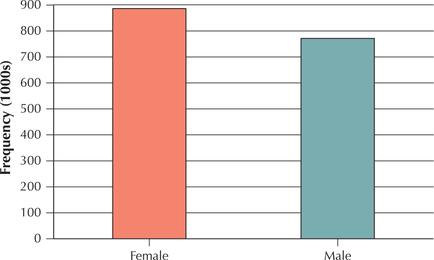
Table 8 is a crosstabulation showing the SAT Writing exam score for females and males in 2014. Note that the data are not presented in raw form, such as the automobiles in Table 6. Instead, the frequencies for each cell have been presented. Use Table 8 to construct the following:
- Frequency distribution of the Gender of SAT Writing exam takers, for females and males
- Frequency bar graph of the Gender of SAT Writing exam takers, for females and males

| SAT Writing score | ||||
|---|---|---|---|---|
| Gender | 200–390 | 400–590 | 600–800 | Total |
| Female | 169,314 | 550,172 | 164,469 | 883,955 |
| Male | 178,606 | 464,949 | 132,537 | 776,092 |
| Total | 347,920 | 1,015,121 | 297,006 | 1,660,047 |
Solution
- The total column on the right-hand side of Table 8 provides us with the frequency distribution, which is shown in Table 9.Table 2.9: Table 9 Frequency distribution of SAT Writing exam takers across the genders
Gender Frequency Female 883,955 Male 776,092 Total 1,660,047 - We use the frequency distribution in Table 9 to produce the bar graph shown in Figure 4.
48
We work with the tabular data in Table 8 to construct further graphs and distributions in the exercises.
NOW YOU CAN DO
Exercises 22, 38–40, 42–44, and 46–56.
YOUR TURN #5
Use Table 8 to construct the following:
- Frequency distribution of the Score of SAT Writing exam takers, for the three score categories
- Frequency bar graph of the Score of SAT Writing exam takers, for the three score categories
(The solutions are shown in Appendix A.)
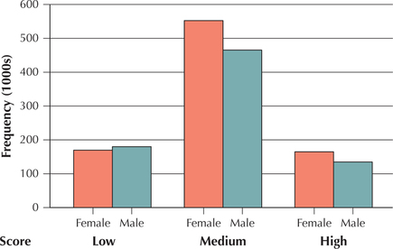
6 Clustered bar Graphs
Clustered bar graphs are useful for comparing two categorical variables and are often used in conjunction with crosstabulations. Each set of bars in a clustered bar graph represents a single category of one variable across all the categories of the other categorical variable (see Figure 5). This allows the analyst to make comparisons easily. One can construct clustered bar graphs using either frequencies or relative frequencies. To construct a clustered bar graph, identify which of the two categorical variables will define the cluster of bars. Then, for each category of the other variable, draw bars for each category of the clustering variable.
EXAMPLE 7 Clustered bar graphs
Use the tabular data in Table 8 to construct a clustered bar chart of SAT Writing exam scores clustered by gender.
Solution
Gender is given as the clustering variable. Thus, for each category of the variable SAT Writing exam score, we will draw two bars: one representing females and the other representing males. For the first category, Low = SAT score between 200 and 390, we draw the female rectangle going up to 169.314 (because Figure 5 is given in 1000s), and we draw the male rectangle going up to 178.606. These two rectangles should touch each other but should not touch any other rectangles. Continue to draw two rectangles for each SAT score category: one for each of the females' and males' frequencies. The resulting clustered bar graph is shown here as Figure 5. We say that the Writing exam scores are clustered by gender. (Note: .)
49
NOW YOU CAN DO
Exercises 57–60.
YOUR TURN #6
Use Table 3 (page 41) to construct the following graphs:
- Clustered bar graph of Violation type clustered by Borough
- Clustered bar graph of Borough clustered by Violation type
(The solutions are shown in Appendix A.)
EXAMPLE 8 Comparison bar charts
Student-Run Café Business
Have you ever thought what it must be like to run a business? Business students at a Midwestern public university found out because they volunteered to manage a Student-Run café in the business school, which replaced a for-profit vendor that closed. In this chapter, we examine sales data from the Student-Run café, such as the number of coffees sold and the number of sodas sold, to help us learn about how to describe data using graphs and tables. The data set is called Café, a brief excerpt of which is shown in Table 10.
café
| Month | Time period |
Day of week |
… | Sodas | Coffees | Sales | Max. daily temperature (°F) |
|---|---|---|---|---|---|---|---|
| Jan | 1 | 2 - Tue | … | 20 | 41 | 199.95 | 36 |
| Jan | 1 | 3 - Wed | … | 13 | 33 | 195.74 | 34 |
| Jan | 1 | 4 - Thu | … | 23 | 34 | 102.68 | 39 |
| Jan | 1 | 5 - Fri | … | 13 | 27 | 162.88 | 40 |
| Jan | 1 | 1 - Mon | … | 13 | 20 | 101.76 | 36 |
| Jan | 1 | 2 - Tue | … | 33 | 23 | 186.94 | 26 |
| Jan | 1 | 3 - Wed | … | 15 | 32 | 120.18 | 34 |
| Jan | 1 | 4 - Thu | … | 27 | 31 | 228.78 | 33 |
| Jan | 1 | 5 - Fri | … | 12 | 30 | 88.02 | 20 |
| Feb | 1 | 1 - Mon | … | 19 | 27 | 119.57 | 37 |
| ⋮ | ⋮ | ⋮ | ⋮ | ⋮ | ⋮ | ⋮ | ⋮ |
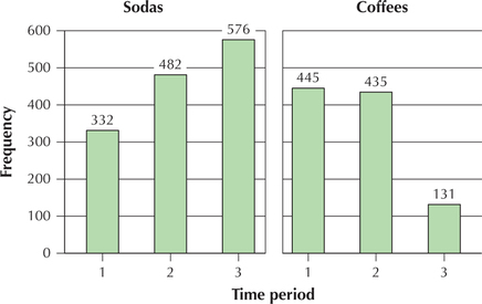
There are 47 days of sales data. The variable time period is a categorical variable that equals 1 for the first 16 days (late January to early February), 2 for the second 16 days (late February to early March), and 3 for the last 15 days (late March to early April). This variable allows us to examine changes in sales behavior over time. Construct a comparison bar chart of the number of sodas sold and the number of coffees sold, over the three time periods, and comment on the change in customer purchasing behavior as the winter months turned to spring.
50
Solution
Figure 6 shows the comparison bar chart of the number of sodas sold and the number of coffees sold, over the three time periods. As winter turned to spring, soda sales increased from 332 to 576, while coffee sales decreased from 445 to 131.