STEP-BY-STEP TECHNOLOGY GUIDE: Frequency Distributions, Bar Graphs, and Pie Charts
If you enjoy statistics, you may want to become a statistician! resulted in 20 hits. Table 11 contains the section of the country Demand is high and you get to work with lots of interesting where the available jobs were located. We use the data set in data. A job search conducted on the job site Monster.com on Table 11 to demonstrate how to use technology to construct a August 21, 2014, using the keyword statistics, and restricting frequency distribution, relative frequency distribution, bar the search to bachelor's degree and posted in the past week, graph, and pie chart.
countrysections
| Northeast | South | Midwest | Midwest | West |
| Midwest | Northeast | Northeast | West | Northeast |
| Midwest | West | West | West | South |
| South | Northeast | Midwest | Northeast | Northeast |
EXCEL
Frequency Distributions
- Step 1 Enter the data in column A, with the topmost cell indicating the variable name, Section.
- Step 2 Select cells A1–A21, click Insert > PivotTable, and click OK.
- Step 3 Under Choose fields to add to report, select Section.
- Step 4 Click on Section and drag to the Values box at the lower right of the screen. The resulting frequency distribution is shown in Figure 7. In Excel, this takes the form of a pivot table, which is an interactive tabular format.
Bar Graphs and Pie Charts
Note: Excel can make bar graphs or pie charts using frequency distributions but not from the raw data.
- Step 1 Enter the frequency distribution as shown in Figure 8.
- Step 2 Select cells A1 to B5. For a bar graph, click Insert > Insert ColumnChart > Clustered Column. For a pie chart, click Insert > Insert Pie or Doughnut Chart > Pie.
- Step 3 The resulting frequency bar graph and pie chart are shown in Figures 9 and 10.
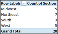 Figure 2.7: FIGURE 7 Excel pivot table
51
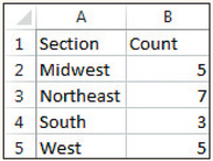 Figure 2.8: FIGURE 8 Excel frequency distribution.
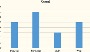 Figure 2.9: FIGURE 9 Excel frequency bar graph
Crosstabulation of Car Size Data
- Step 1 Enter the data from Table 6 (page 46) into two columns, with the topmost cell indicating the variable names Size and Gasoline.
- Step 2 Highlight cells A1 to B11, click Insert > Pivot Table, and click OK.
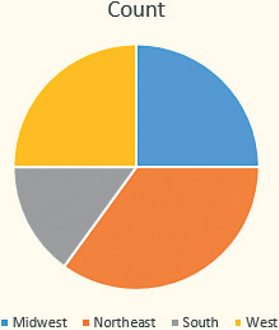 Figure 2.10: FIGURE 10 Excel pie chart.
 - Step 3 Under Pivot Table Fields, click and drag Size to Rows, Gasoline to Columns, and Gasoline to Values.
Clustered Bar Graph for Car Size Data
- Step 1 Enter the data from Table 6 (page 46) into two columns, with the topmost cell indicating the variable names Size and Gasoline.
- Step 2 Obtain the crosstabulation of the data. Select the three rows and two columns in the crosstabulation.
- Step 3 Click Insert > Insert Column Chart (in the Chart section). Click Clustered Column, which is the first option.
MINITAB
Frequency Distributions
- Step 1 Name your variable Section and enter the data into the C1 column.
- Step 2 Click Stat > Tables > Tally Individual Variables.
- Step 3 Under Display, select Counts and Percents.
- Step 4 Click inside the Variables box. Select the variable C1 Section, and click Select. Then click OK.
Bar Graphs
- Step 1 Name your variable Section and enter the data into the C1 column.
- Step 2 Click Graph > Bar Chart. For raw data select Bars Represent: Counts of unique values, select Simple, and click OK. (For summarized data such as a frequency distribution, select Bars Represent: Values from a table, and select Simple. Then click OK.)
- Step 3 Click inside the Categorical variables box, click on the Section variable, and click Select. Then click OK.
Pie Charts
- Step 1 Name your variable Section and enter the data into the C1 column.
- Step 2 Click Graph > Pie Chart. For raw data, select Chart counts of unique values. Then click in the Categorical variables box, select the variable Section, click Select, and click OK. (For summarized data such as a frequency distribution, select Chart values from a table. Then select the category variable for Categorical variable, and select the variable with the frequencies or relative frequencies for the Summary variable. Then click OK.)
Crosstabulation of Car Size Data
- Step 1 Enter the data from Table 6 (page 46) into two columns, named Size and Gasoline.
- Step 2 Click Stat > Tables > Crosstabulation and Chi-Square…
- Step 3 Select Raw data (categorical variables). For Rows, select Size; for Columns, select Gasoline. Select Counts under Display. Then click OK.
- Step 4 The resulting crosstabulation is shown in Figure 11. The rows and columns are in alphabetical order.
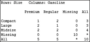 Figure 2.11: FIGURE 11 Minitab crosstabulation.
52
Clustered Bar Graphs
If you have the original data set:
- Step 1 Click Graph > Bar Chart.
- Step 2 Select Bars Represent: Counts of unique values, and select Cluster. Then click OK.
- Step 3 Select your two categorical variables, and click OK.
If you have only the crosstabulation and not the original data:
- Step 1 Click Graph > Bar Chart.
- Step 2 Select Bars Represent: Values from a Table, and select Cluster under Two-way table. Then click OK.
- Step 3 For Graph variables, select the variables that contain the frequencies or relative frequencies. For Row labels, select the variable that holds the row names of your crosstabulation. Then click OK.
SPSS
Frequency Distributions
- Step 1 Enter the data from Table 11 into the first column. Rename the column Section.
- Step 2 Click Analyze > Descriptive Statistics > Frequencies…
- Step 3 Select Section, click the arrow to move it to Variable(s):, then click OK.
Bar Graphs and Pie Charts
- Step 1 Enter the data from Table 11 into the first column. Rename the column Section.
- Step 2 Click Analyze > Descriptive Statistics > Frequencies…
- Step 3 Select Section, click the arrow to move it to Variable(s):, then click OK.
- Step 4 Click Charts…, and select Bar charts (or Pie Charts) under Chart Type. Choose Frequencies (or Percentages) under Chart Values. Click Continue and then OK.
Crosstabulation and Clustered Bar Graphs of Car Size data
- Step 1 Enter the data from Table 6 (page 46) into two columns. Rename the columns Size and Gasoline.
- Step 2 Click Analyze > Descriptive Statistics > Crosstabs…
- Step 3 Select the variable for the rows (Size), and click the first arrow to move it to the Row(s) box. Select the variable for the columns (Gasoline), and click the second arrow to move it to the Column(s) box.
- Step 4 Select Display clustered bar charts, and click OK. The resulting graph is shown in Figure 12.
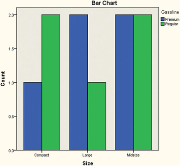 Figure 2.12: FIGURE 12 SPSS clustered bar chart.
JMP
Frequency Distributions
- Step 1 Select File > New > Data Table. Enter the data from Table 11 into Column 1. Rename Column 1 Section.
- Step 2 Click Analyze > Distribution.
- Step 3 Select Section from Select Columns and click Y, Columns. Click OK. The result is shown in Figure 13.
Bar Graphs and Pie Charts
- Step 1 Select File > New > Data Table. Enter the data from Table 11 into Column 1. Rename Column 1 Section.
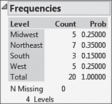 Figure 2.13: FIGURE 13 JMP frequency distribution.
 - Step 2 Click Graph > Graph Builder. Drag Section, under Variables, to where Drag variables into drop zones is shown.
- Step 3 For a bar graph, select Bar from the series of options above the graph. For a pie chart, select Pie. Click Done.
Crosstabulation
- Step 1 Select File > New > Data Table. Enter the data from Table 6 (page 46) into two columns. Name the columns Size and Gasoline.
- Step 2 Click Analyze > Tabulate.
- Step 3 Drag Gasoline from the list on the left to Drop zone for columns. A frequency table appears. Drag Size from the list to the first column of the third row of the table. The result is the crosstabulation.
Clustered Bar Graphs
- Step 1 Select File > New > Data Table. Enter the data from Table 6 (page 46) into two columns. Name the columns Size and Gasoline.
- Step 2 Click Graph > Graph Builder. Drag both variables from Variables to the x axis.
- Step 3 Select Bar from the graph options shown above the graph. Click Done.
53
CRUNCHIT!
Frequency Distributions
- Step 1 Click File, highlight Load from Larose, Discostat3e > Chapter 2, and click on Table 01_11.
- Step 2 Click Statistics, and select Frequency Table. For Sample, select Section. Then click Calculate.
Bar Graphs and Pie Charts
- Step 1 Click File, highlight Load from Larose, Discostat3e > Chapter 2, and click on Table 01_11.
- Step 2 Click Graphics and select Bar Chart with Raw Data. For a pie chart, select Pie Chart with Raw Data.
- Step 3 For Sample, select Section. Then click Calculate.
Crosstabulation of Car Size Data
- Step 1 Click File, then highlight Load from Larose, Discostat3e > Chapter 2, and click on Example 01_05.
- Step 2 Click Statistics, highlight Contingency Table, and select get frequencies.
- Step 3 For Row Variable, select Car size, and for Column variable, select Recommended gasoline. Then click Calculate.