Section 2.1 Exercises
CLARIFYING THE CONCEPTS
Question 2.1
1. Why do we use graphical and tabular methods to summarize data? What's wrong with simply reporting the raw data? (p. 40)
2.1.1
We use graphical and tabular form to summarize data in order to organize it in a format where we can better assess the information. If we just report the raw data, it may be extremely difficult to extract the information contained in the data.
Question 2.2
2. What's the difference between a frequency distribution and a relative frequency distribution? (p. 42)
Question 2.3
3. True or false: For a given data set, a frequency bar graph and a relative frequency bar graph look alike, except for the scale on the vertical axis. (p. 43)
2.1.3
True.
Question 2.4
4. True or false: A pie chart is used to represent quantitative data. (p. 44)
Question 2.5
5. What should be the sum of the frequencies in a frequency distribution? (p. 41)
2.1.5
The sample size, .
Question 2.6
6. What should be the sum of the relative frequencies in a relative frequency distribution? (p. 42)
Question 2.7
7. In a crosstabulation, the “Total” column represents what? How about the “Total” row? (p. 46)
2.1.7
The row totals; the column totals
Question 2.8
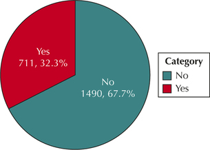
8. What does the number in the lower right corner of the crosstabulation represent? What should this number be equal to? (p. 48)
Question 2.9
9. True or false: Each set of bars in a clustered bar graph represents a single category of one variable across all the categories of the other categorical variable. (p. 48)
2.1.9
True
Question 2.10
10. True or false: A clustered bar graph cannot be constructed for relative frequency data. (p. 48)
PRACTICING THE TECHNIQUES
 CHECK IT OUT!
| To do | Check out | Topic |
|---|---|---|
| Exercises 11–14 and 23–28 |
Examples 1 and 2 |
Frequency distributions and relative frequency distributions. |
| Exercises 15–18 and 29–34 |
Example 3 | Bar graphs |
| Exercises 19–20 and 35–36 |
Example 4 | Pie charts |
| Exercises 21, 37, 41, and 45 |
Example 5 | Constructing crosstabulations |
| Exercises 22, 38–40, 42–44, and 46–56 |
Example 6 | Working with tabular data |
| Exercises 57–60 | Example 7 | Clustered bar graphs |
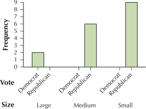
Table 12 contains data regarding how all the counties in Nevada voted in the 2012 presidential election (Dem = Democrat, Rep = Republican), as well as the size of the county in terms of number of voters (Small = at most 10,000; Medium = 10,001 to 100,000; Large = over 100,000). Use Table 12 to construct the indicated distribution or graph for Exercises 11–22.
| County | Vote | Size | County | Vote | Size |
|---|---|---|---|---|---|
| Carson City | Rep | Medium | Lincoln | Rep | Small |
| Churchill | Rep | Medium | Lyon | Rep | Medium |
| Clark | Dem | Large | Mineral | Rep | Small |
| Douglas | Rep | Medium | Nye | Rep | Medium |
| Elko | Rep | Medium | Pershing | Rep | Small |
| Esmerelda | Rep | Small | Storey | Rep | Small |
| Eureka | Rep | Small | Washoe | Dem | Large |
| Humboldt | Rep | Small | White Pine | Rep | Small |
| Lander | Rep | Small |
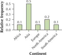
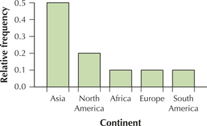
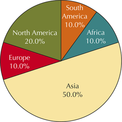
54
Question 2.11
nevadacounties
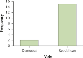
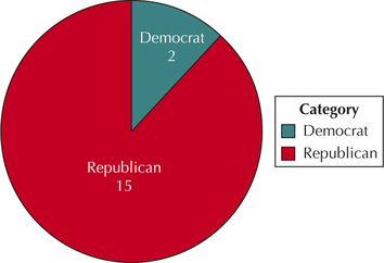
11. Frequency distribution of the variable vote.
2.1.11
| Vote | Frequency |
|---|---|
| Republican | 15 |
| Democrat | 2 |
Question 2.12
nevadacounties
12. Relative frequency distribution of the variable vote.
Question 2.13
nevadacounties
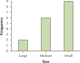
13. Frequency distribution of the variable size.
2.1.13
| Size | Frequency |
|---|---|
| Small | 9 |
| Medium | 6 |
| Large | 2 |
Question 2.14
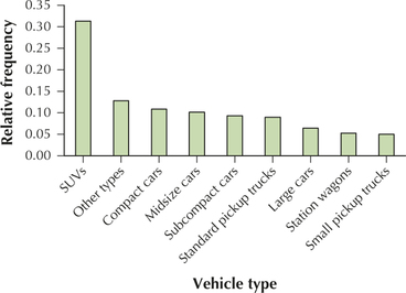
nevadacounties
14. Relative frequency distribution of the variable size.
Question 2.15
nevadacounties
15. Frequency bar graph of vote.
2.1.15
Question 2.16
nevadacounties
16. Relative frequency bar graph of vote.
Question 2.17
nevadacounties
17. Frequency bar graph of size.
2.1.17
Question 2.18
nevadacounties
18. Relative frequency bar graph of size.
Question 2.19
nevadacounties
19. Pie chart for vote.
2.1.19
Question 2.20
nevadacounties
20. Pie chart for size.
Question 2.21
nevadacounties
21. Crosstabulation of the variables vote and size.
2.1.21
| Large | Medium | Small | Total | |
|---|---|---|---|---|
| Democrat | 2 | 0 | 0 | 2 |
| Republican | 0 | 6 | 9 | 15 |
| Total | 2 | 6 | 9 | 17 |
Question 2.22
nevadacounties
22. Nevada's electoral votes actually went to the Democratic candidate in 2012. Use the crosstabulation from the previous exercise to explain how this might have happened, even though the Republican candidate carried all but two of the counties.
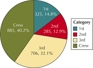
The sinking of the Titanic was one of the greatest disasters in maritime history. The data set Titanic contains information on 2202 passengers and crew, including their class (1st class, 2nd class, 3rd class, or crew), their gender, and whether they survived. Table 13 contains a random sample of size 20 from this data set. Use Table 13 for Exercises 23–48. For Exercises 23–37, construct the indicated distribution or graph.
| Class | Gender | Survived | Class | Gender | Survived |
|---|---|---|---|---|---|
| 3rd | Female | No | 1st | Female | Yes |
| Crew | Male | No | 1st | Male | Yes |
| 3rd | Female | Yes | Crew | Male | No |
| Crew | Male | No | 3rd | Male | Yes |
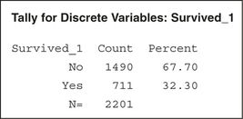
| Crew | Male | Yes | Crew | Male | No |
| 3rd | Male | Yes | 2nd | Male | Yes |
| Crew | Male | No | 3rd | Male | No |
| Crew | Male | No | Crew | Male | No |
| 2nd | Male | No | 2nd | Female | Yes |
| Crew | Male | Yes | 2nd | Male | No |
Question 2.23
titanicsample
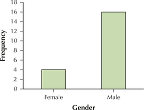
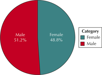
23. Frequency distribution of the variable gender.
2.1.23
| Gender | Frequency |
|---|---|
| Male | 16 |
| Female | 4 |
Question 2.24
titanicsample
24. Relative frequency distribution of the variable gender.
Question 2.25
titanicsample
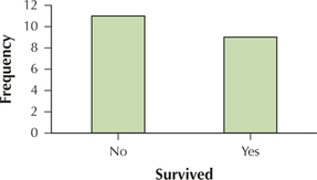
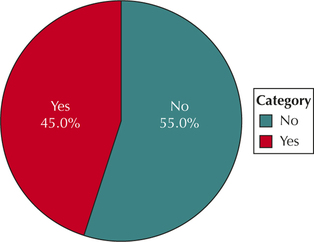
25. Frequency distribution of the variable survived.
2.1.25
| Survived | Frequency |
|---|---|
| Yes | 9 |
| No | 11 |
Question 2.26
titanicsample
26. Relative frequency distribution of the variable survived.
Question 2.27
titanicsample
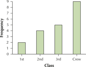
27. Frequency distribution of the variable class.
2.1.27
| Class | Frequency |
|---|---|
| 1st class | 2 |
| 2nd class | 4 |
| 3rd class | 5 |
| Crew | 9 |
Question 2.28
titanicsample
28. Relative frequency distribution of the variable class.
Question 2.29
titanicsample
29. Frequency bar graph of gender.
2.1.29
Question 2.30
titanicsample
30. Relative frequency bar graph of gender.
Question 2.31
titanicsample
31. Frequency bar graph of survived.
2.1.31
Question 2.32
titanicsample
32. Relative frequency bar graph of survived.
Question 2.33
titanicsample
33. Frequency bar graph of class.
2.1.33
Question 2.34
titanicsample
34. Relative frequency bar graph of class.
Question 2.35
titanicsample
35. Pie chart for survived.
2.1.35
Question 2.36
titanicsample
36. Pie chart for class.
Question 2.37
titanicsample
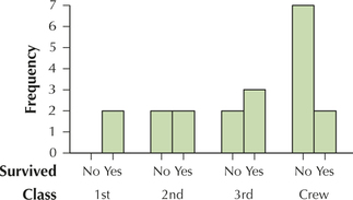
37. Crosstabulation of the variables gender and class.
2.1.37
| 1st | 2nd | 3rd | Crew | Total | |
|---|---|---|---|---|---|
| Female | 1 | 1 | 2 | 0 | 4 |
| Male | 1 | 3 | 3 | 9 | 16 |
| Total | 2 | 4 | 5 | 9 | 20 |
Use the crosstabulation in Exercise 37 for Exercises 38–41.
Question 2.38
titanicsample
38. For which categories of class did females outnumber males?
Question 2.39
titanicsample
39. For which category of class did males most outnumber females? Explain how this might make sense.
2.1.39
Crew. In 1912 women did not work as crew members on a ship. Only the people who could afford first class bought tickets for both men and women.
Question 2.40
titanicsample
40. For which category of class did the number of females come closest to the number of males?
Question 2.41
titanicsample
41. Build a crosstabulation of the variables gender and survived.
2.1.41
| No | Yes | Total | |
|---|---|---|---|
| Female | 1 | 3 | 4 |
| Male | 10 | 6 | 16 |
| Total | 11 | 9 | 20 |
Use the crosstabulation in Exercise 41 for Exercises 42–45.
Question 2.42
titanicsample
42. What is the proportion of females who survived?
Question 2.43
titanicsample
43. Find the proportion of males who survived.
2.1.43
0.375
Question 2.44
titanicsample
44. It turns out that a greater proportion of females survived than males. Would we have been able to uncover this fact using only frequency distributions of the variables gender and survived, and not using a crosstabulation? Explain.
Question 2.45
titanicsample
45. Construct a crosstabulation of the variables class and survived.
2.1.45
| No | Yes | Total | |
|---|---|---|---|
| 1st | 0 | 2 | 2 |
| 2nd | 2 | 2 | 4 |
| 3rd | 2 | 3 | 5 |
| Crew | 7 | 2 | 9 |
| Total | 11 | 9 | 20 |
Use the crosstabulation in Exercise 45 for Exercises 46–48.
Question 2.46
titanicsample
46. What is the proportion of 1st class passengers who survived?
Question 2.47
titanicsample
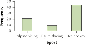
47. Find the proportion of 2nd class passengers, 3rd class passengers, and crew who survived.
2.1.47
0.5, 0.6, 0.22
Question 2.48
titanicsample
48. Compare the proportions you found in the previous two exercises, and comment on the results.
Table 14 shows the number of injuries in various winter sports to occur to females and males at the 2010 Winter Olympics.2 Use Table 14 to construct the graph or distribution indicated in Exercises 49–52, for the number of alpine skiing injuries, for female and male athletes.
Question 2.49
49. Frequency distribution
2.1.49
| Gender | Frequency |
|---|---|
| Female | 20 |
| Male | 21 |
Question 2.50
50. Relative frequency distribution
Question 2.51
51. Pie chart
2.1.51
Question 2.52
52. Relative frequency bar graph
Use Table 14 to construct the graph or distribution indicated in Exercises 53–56, for the number of Olympic injuries, for male athletes only.
Question 2.53
53. Frequency distribution
2.1.53
| Sport | Frequency |
|---|---|
| Alpine skiing | 21 |
| Figure skating | 9 |
| Ice hockey | 44 |
Question 2.54
54. Relative frequency distribution
Question 2.55
55. Frequency bar graph
2.1.55
Question 2.56
winterolympics
56. Relative frequency bar graph
55
| Sport | ||||
|---|---|---|---|---|
| Gender | Alpine skiing |
Figure skating |
Ice hockey |
Total |
| Female | 20 | 12 | 38 | 70 |
| Male | 21 | 9 | 44 | 74 |
| Total | 41 | 21 | 82 | 144 |
Question 2.57
57. Use Table 12 to produce a clustered bar graph of size, clustered by vote.
2.1.57
Use Table 13 to produce clustered bar graphs for the variables indicated in Exercises 58–60.
Question 2.58
58. Clustered bar graph of gender, clustered by survived
Question 2.59
59. Clustered bar graph of class, clustered by survived
2.1.59
Question 2.60
60. Clustered bar graph of survived, clustered by gender
APPLYING THE CONCEPTS
World Water Usage. See Table 15 for Exercises 61–64. For the indicated variable, construct the following:
- Frequency distribution
- Relative frequency distribution
- Frequency bar graph
- Relative frequency bar graph
- Pareto chart, using relative frequencies
- Pie chart
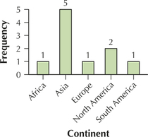
| Country | Continent | Climate | Main use |
|---|---|---|---|
| Iraq | Asia | Arid | Irrigation |
| United States | North America | Temperate | Industry |
| Pakistan | Asia | Arid | Irrigation |
| Canada | North America | Temperate | Industry |
| Madagascar | Africa | Tropical | Irrigation |
| North Korea | Asia | Temperate | Not reported |
| Chile | South America | Arid | Irrigation |
| Bulgaria | Europe | Temperate | Not reported |
| Afghanistan | Asia | Arid | Irrigation |
| Iran | Asia | Arid | Irrigation |
Question 2.61
worldwater
61. The variable continent
2.1.61
(a)–(b)
| Continent | Frequency | Relative frequency |
|---|---|---|
| Africa | 1 | 0.10 |
| Asia | 5 | 0.50 |
| Europe | 1 | 0.10 |
| North America | 2 | 0.20 |
| South America | 1 | 0.10 |
(c)
(d)
(e)
(f)
Question 2.62
worldwater
62. The variable climate
Question 2.63
worldwater
63. The variable main use
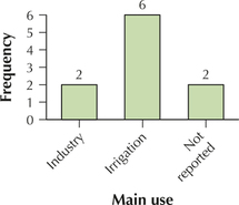
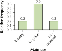
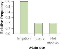
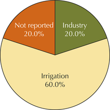
2.1.63
(a)–(b)
| Main use | Frequency | Relative frequency |
|---|---|---|
| Industry | 2 | 0.20 |
| Irrigation | 6 | 0.60 |
| Not reported | 2 | 0.20 |
(c)
(d)
(e)
(f)
Question 2.64
worldwater
64. Explain why it is not appropriate to construct a frequency distribution for country.
Use Table 15 for Exercises 65–70.
Question 2.65
65. Construct a crosstabulation of the variables continent and climate.
2.1.65
| Arid | Temperate | Tropical | Total | |
| Africa | 0 | 0 | 1 | 1 |
| Asia | 4 | 1 | 0 | 5 |
| Europe | 0 | 1 | 0 | 1 |
| North America | 0 | 2 | 0 | 2 |
| South America | 1 | 0 | 0 | 1 |
| Total | 5 | 4 | 1 | 10 |
Question 2.66
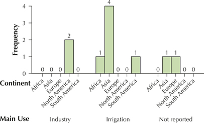
66. Construct a crosstabulation of the variables continent and main use.
Question 2.67
67. Construct a crosstabulation of the variables climate and main use.
2.1.67
| Industry | Irrigation | Not reported | Total | |
|---|---|---|---|---|
| Arid | 0 | 5 | 0 | 5 |
| Temperate | 2 | 0 | 2 | 4 |
| Tropical | 0 | 1 | 0 | 1 |
| Total | 2 | 6 | 2 | 10 |
Question 2.68
68. Construct a clustered bar graph of the variable continent clustered by climate.
Question 2.69
69. Construct a clustered bar graph of the variable main use clustered by continent.
2.1.69
Question 2.70
70. Construct a clustered bar graph of the variable main use clustered by climate.
Video Game Sales. Open the VideoGameSales data set that we used for the Chapter 1 Case Study. See Table 3 on page 8 in Chapter 1. Recall that this data set contains the top 30 best-selling video games in the United States for the week of May 17, 2014, along with the game platform, publishing studio, type of game, sales that week, total sales, and how many weeks the game has been on the list. Use the data set to answer Exercises 71–76.
Question 2.71
videogamesales
71. Construct a frequency distribution and a relative frequency distribution for the variable type. Which is the most common game type? The least common?
2.1.71
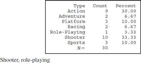
Question 2.72
videogamesales
72. Build a frequency bar graph of the variable platform. Which is the most popular platform?
Question 2.73
videogamesales
73. Make a relative frequency bar graph of the variable platform. What percentage of platforms is the PS4?
2.1.73
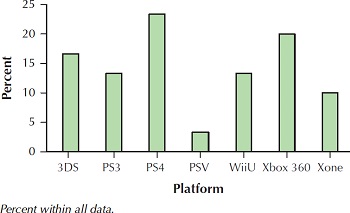
23%
Question 2.74
videogamesales
74. Construct a pie chart for the variable type.
Question 2.75
videogamesales
75. Build a crosstabulation of type and platform.
2.1.75
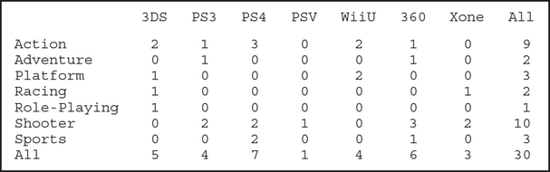
Question 2.76
videogamesales
76. Refer to the crosstabulation. Which platform has the most action games? The most shooter games?
Cell Phone Ownership. Figure 14 shows the percentage of cell phone ownership categorized by level of education.3 Use Figure 14 to answer Exercises 77 and 78.
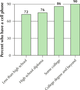
Question 2.77
77. Can we use the information in Figure 14 to construct a pie chart? Explain why or why not.
2.1.77
No. There are actually two categorical variables—level of education and whether or not the person owns a cell phone. The percents are percents of each category of level of education who own cell phones and not the percent of the whole group who own cell phones.
Question 2.78
78. Is Figure 14 a Pareto chart? Explain why or why not.
Cell Phones and the Internet. Figure 15 is a pie chart representing the percentage of Americans who access the Internet or email using their cell phones. Use Figure 15 to answer Exercises 79 and 80.
Question 2.79
79. According to this survey:
- What is the most common response? What percentage does this represent?
- What is the least common response? What percentage does this represent?
56
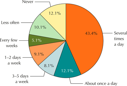 Figure 2.15: FIGURE 15 Percentage using cell phones for Internet or email.4
2.1.79
(a) Several times a day; 43.4% (b) Every few weeks; 5.1%
Question 2.80
80. According to this survey:
- What percentage uses the cell phone to access the Internet or email about once a day?
- What percentage never uses the cell phone to access the Internet or email?
- If 1000 adults were surveyed, how many never use their cell phones for email or Internet?
Sledding injuries. Every year, about 20,000 children and teenagers visit the emergency room with injuries sustained from snow sledding.5 Use the horizontal bar graph in Figure 16 to answer Exercises 81 and 82.
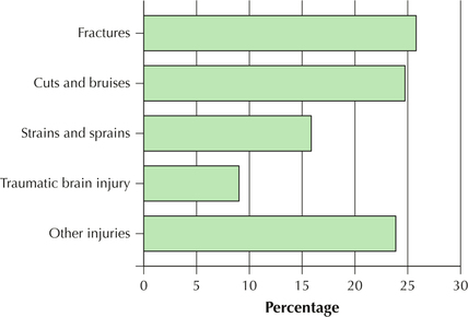
Question 2.81
81. According to this study:
- What is the most common category of injury? Estimate the percentage.
- Of the specific injuries shown, what is the least common category of injury? What is the percentage?
- Is it possible for there to be an injury type that has a lower percentage than traumatic brain injury? Explain.
2.1.81
(a) Fractures; 26% (b) Traumatic brain injury; 9% (c) Yes. It would have to be one of the injuries included in the category “Other injuries.”
Question 2.82
82. According to this study:
- What is the percentage for cuts and bruises?
- What is the percentage for strains and sprains?
Question 2.83
cartypemodel
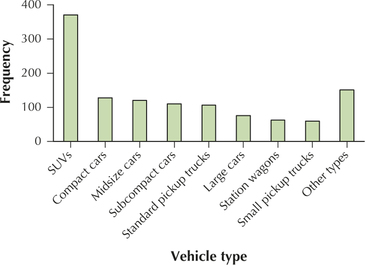
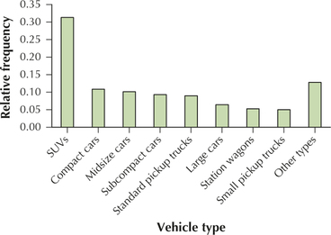
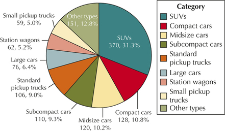
83. Table 16 shows the numbers of vehicle models, which are categorized by vehicle type, examined each year by the U.S. Department of Energy to determine vehicle gas mileage. Use Table 16 to construct the following:
- Relative frequency distribution
- Frequency bar graph
- Relative frequency bar graph
- Pareto chart, using relative frequencies
- Pie chart of the relative frequencies
| Vehicle type | Number of models |
|---|---|
| SUVs | 370 |
| Compact cars | 128 |
| Midsize cars | 120 |
| Subcompact cars | 110 |
| Standard pickup trucks | 106 |
| Large cars | 76 |
| Station wagons | 62 |
| Small pickup trucks | 59 |
| Other types | 151 |
| Total | 1182 |
2.1.83
(a) Relative frequency distribution of vehicle type
| Vehicle type | Relative frequency |
|---|---|
| SUVs | 0.3130 |
| Compact cars | 0.1083 |
| Midsize cars | 0.1015 |
| Subcompact cars | 0.0931 |
| Standard pickup trucks | 0.0897 |
| Large cars | 0.0643 |
| Station wagons | 0.0525 |
| Small pickup trucks | 0.0499 |
| Other types | 0.1277 |
| Total | 1.0000 |
(b)
(c)
(d)
(e)
Musical activities. Use the following information for Exercises 84 and 85. USA Weekend conducted a survey of the nation's teenagers, asking them various questions about lifestyle and music. Nearly 60,000 teenagers responded to the poll, which was conducted in part through USA Weekend's Web site. One question was, “Do you listen to music while you are … ?” and listed several options. Respondents were asked to select all that apply. The most common responses are shown in the table below.
| Doing chores | 79% |
| On the computer | 73% |
| Doing homework | 72% |
| Eating meals at home | 33% |
| In the classroom | 18% |
Question 2.84
84. Do you think that the sample is representative of all U.S. teenagers? How might the sample systematically introduce bias?
Question 2.85
85. Can you construct a pie chart of the five activities listed in the table? Explain precisely why or why not.
2.1.85
A pie chart cannot be constructed for the data since the percentages for the different classes do not add up to 100%. Respondents could select more than one category.
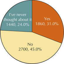
Music and Violence. Another poll question asked by USA Weekend was “Do you think shock rock and gangsta rap are partly to blame for violence such as school shootings or physical abuse?” The results are shown in the table below. Use this information to answer Exercises 86–89.
57
| Yes | 31% |
| No | 45% |
| I've never thought about it | 24% |
Question 2.86
86. Assuming the sample size is 6000, construct a frequency distribution of the responses.
Question 2.87
87. Make a relative frequency distribution of the responses.
2.1.87
| Response | Relative frequency |
|---|---|
| Yes | 0.31 |
| No | 0.45 |
| I've never thought about it | 0.24 |
Question 2.88
88. Construct a frequency bar graph of the responses.
Question 2.89
89. Construct a relative frequency pie chart of the responses.
2.1.89
Relative frequencies are expressed as percentages.
Astrological Signs. Use the following information for Exercises 90–92. The General Social Survey collects data on social aspects of life in America. Here, 1464 respondents reported their astrological signs. A pie chart of the results is shown below.
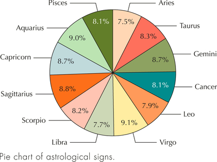
Question 2.90
90. Answer the following:
- What is the most common astrological sign?
- What is the least common astrological sign?
Question 2.91
91. Use the percentages in the pie chart to do the following:
- Construct a relative frequency bar graph of the astrological signs.
- Construct a relative frequency bar graph, but, this time, have the y axis begin at 7% instead of zero. Describe the difference between the two bar graphs. When would this one be used as opposed to the earlier bar graph?
2.1.91
(a)
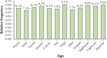
(b)
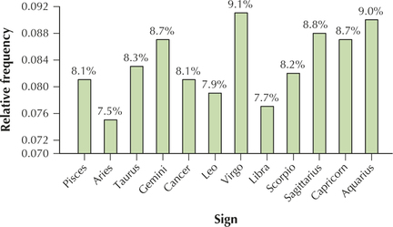
The graph in (b) uses an adjusted scale, which is misleading. Use this graph to magnify the small variability in percentages.
Question 2.92
92. Construct a frequency distribution of the astrological signs. Which sign occurs the least? The most?
Satisfaction with Family life. Use the following information for Exercises 93–95. The General Social Survey also asked respondents about their amount of satisfaction with family life. Here, 1002 respondents reported their satisfaction levels with family life, as shown in the frequency distribution below.
| Satisfaction | Frequency |
|---|---|
| Very great deal | 415 |
| Great deal | 329 |
| Quite a bit | 99 |
| A fair amount | 90 |
| Some | 27 |
| A little | 25 |
| None | 17 |
| Total | 1002 |
Question 2.93
satisfaction
93. Construct a Pareto graph of the categories. Do you think that, overall, people are happy with their family lives?
2.1.93
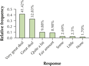
Categories are qualitative; interpretation will vary.
Question 2.94
satisfaction
94. Construct a frequency or a relative frequency bar graph of the categories. Do you think that this bar graph reinforces the positive message in the data?
Question 2.95
satisfaction
95. What is your opinion of the categories? Do you think that everyone interprets these phrases in the same way? For example, what is the difference between “quite a bit” and “great deal”?
2.1.95
No.
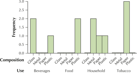
Litter. Don't Mess with Texas (http://dontmesswithtexas.org) is a Texas statewide anti-littering organization that identified paper, plastic, metals, and glass as the top four categories of litter by composition. The report also identified tobacco, household, food, and beverages as the top four categories of litter by use. A sample of 12 items of litter had the following characteristics. Use the table to answer Exercises 96–98.
| Litter item | Composition | Use |
|---|---|---|
| 1 | Paper | Tobacco |
| 2 | Plastic | Household |
| 3 | Glass | Beverages |
| 4 | Paper | Tobacco |
| 5 | Metal | Household |
| 6 | Plastic | Food |
| 7 | Glass | Beverages |
| 8 | Paper | Household |
| 9 | Metal | Household |
| 10 | Plastic | Beverages |
| 11 | Paper | Tobacco |
| 12 | Plastic | Food |
Question 2.96
litter
96. Construct a crosstabulation of litter composition by litter use.
Question 2.97
litter
97. Construct a clustered bar graph of litter composition and litter use. Cluster by use.
2.1.97
Question 2.98
litter
98. Identify any patterns you discover.
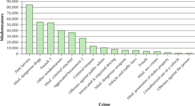
 Misdemeanors in New York City.
For Exercises 99–101, refer to Figure 17, a bar chart of the total number of misdemeanor crimes committed in New York City in 2013 categorized by misdemeanor type.
Question 2.99
99. Which category leads all categories of misdemeanor crime in New York City?
2.1.99
Petit larceny
Question 2.100
100. About how many petit larceny cases were there in 2013?
Question 2.101
101. Is Figure 17 in the form of a Pareto graph? Explain why or why not.
2.1.101
Yes. The categories are arranged in order from highest frequency to lowest frequency.
58
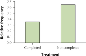
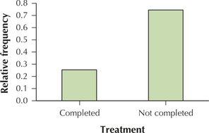
Comparison Pie Chart. The Centers for Disease Control and Prevention (CDC) recommends routine vaccination with Gardasil for boys and girls ages 11 and 12, in order to combat the HPV virus. For example, it has been shown that 99.7% of cervical cancer patients have been infected with the HPV virus.6 The large data set Gardasil (Source: Journal of Statistics Education)7 contains information regarding 1414 young women who underwent vaccination treatment. To complete the vaccination, a series of three shots must be undertaken. Researchers were interested in whether the location of the clinic was related to the proportion of patients who completed treatment. Figure 18 shows a comparison pie chart—a pair of pie charts of the proportion of patients completing the vaccine treatment, with one pie chart for suburban locations and one pie chart for urban locations.
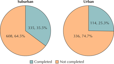
Question 2.102
102. What proportion of females from suburban locations completed the treatment? From urban locations?
Question 2.103
103. Use the data from the comparison pie chart to make the following relative frequency bar charts.
- Treatment status for suburban females
- Treatment status for urban females
2.1.103
(a)
(b)
Question 2.104
104. Do you think that the 35.5% to 25.3% difference in vaccine completion is just due to chance, or do you think that it represents a real disparity between the two groups?
BRINGING IT ALL TOGETHER
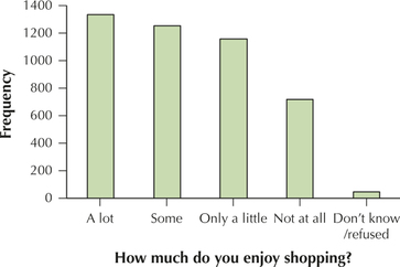
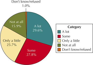
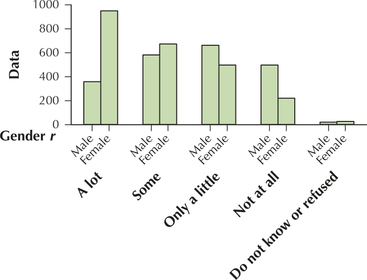
Shopping Enjoyment and Gender. Use the information in the crosstabulation for Exercises 105–119. The Pew Internet and American Life Project surveyed 4514 American men and women and asked them, “How much, if at all, do you enjoy shopping?” The results shown in the crosstabulation are missing some entries.
| Gender | |||
|---|---|---|---|
| Male | Female | Total | |
| A lot | — | 950 | 1338 |
| Some | 582 | — | 1255 |
| Only a little | 662 | 497 | — |
| Not at all | 497 | — | 717 |
| Don't know/refused | — | 25 | 45 |
| Total | 2149 | 4514 | |
Question 2.105
105. Fill in the missing entries.
2.1.105
Missing values are in red
| “How much do you enjoy shopping?” | Gender | Total | |
|---|---|---|---|
| Male | Female | ||
| A lot | 388 | 950 | 1338 |
| Some | 582 | 673 | 1255 |
| Only a little | 662 | 497 | 1159 |
| Not at all | 497 | 220 | 717 |
| Don't know/refused | 20 | 25 | 45 |
| Total | 2149 | 2365 | 4514 |
Question 2.106
106. Convert the table to a relative frequency crosstabulation. Make it so that the “Male” and “Female” proportions in each row add up to 1.0.
Question 2.107
107. Did men or women have the higher proportion of respondents who enjoy shopping
- a lot?
- some?
- only a little?
- not at all?
2.1.107
(a) Women (b) Women (c) Men (d) Men
59
Question 2.108
108. Construct a frequency distribution of gender.
Question 2.109
109. Build a frequency distribution of response.
2.1.109
| How much do you enjoy shopping? | Frequency |
|---|---|
| A lot | 1338 |
| Some | 1255 |
| Only a little | 1159 |
| Not at all | 717 |
| Don't know | 45 |
Question 2.110
110. Make a relative frequency distribution of gender.
Question 2.111
111. Construct a relative frequency distribution of response.
2.1.111
| How much do you enjoy shopping? | Relative frequency |
|---|---|
| A lot | 0.2964 |
| Some | 0.2780 |
| Only a little | 0.2568 |
| Not at all | 0.1588 |
| Don't know | 0.0100 |
Question 2.112
112. Build a bar graph of gender.
Question 2.113
113. Make a bar graph of response.
2.1.113
Question 2.114
114. Construct a pie chart of gender.
Question 2.115
115. Build a pie chart of response.
2.1.115
Question 2.116
116. Construct a clustered bar graph of gender clustered by response.
Question 2.117
117. Build a clustered bar graph of response clustered by gender.
2.1.117
Question 2.118
118. What proportion of the respondents is female?
Question 2.119
 119. What if we doubled each cell count? How would that affect the following?
- Frequency distribution of gender
- Relative frequency of gender
- Pie chart of gender
2.1.119
(a) Frequencies would double (b) Stay the same (c) Stay the same
WORKING WITH LARGE DATA SETS
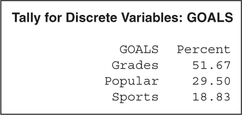
Educational Goals in Sports. Use your knowledge of technology to solve Exercises 120 and 121. Open the Goals data set. The subjects are students in grades four, five, and six from three school districts in Michigan. The students were asked which of the following was most important to them: good grades, sports, or popularity. Information about the students' ages, genders, races, and grades was also gathered, as well as whether their schools were in an urban, suburban, or rural setting.8
Question 2.120
goals
120. Generate bar graphs for the following variables.
- Gender. Estimate the relative frequency of girls, and boys, in the sample.
- Goals. About what percentage of the students chose “grades” as most important? About what percentage chose “popular”? About what percentage chose “sports”?
Question 2.121
goals
121. Generate relative frequency distributions for the following variables.
- Gender. How close were your estimates in the previous exercise?
- Goals. How close were your estimates in the previous exercise?
2.1.121
(a)
(b)
WORKING WITH LARGE DATA SETS
Analysis of Households. For Exercises 122–124, use your knowledge of technology. Open the data set household.
Question 2.122
household
122. How many observations are in this data set? How many variables?
Question 2.123
household
123. Which of the variables are qualitative? Which of the variables are quantitative?
2.1.123
Qualitative: State; Quantitative: Tot_hhld, Fam_tpc, Fam_mpc, Fam_fpc, Nfm_tpc, Nfm_lpc, and Ave_size.
Question 2.124
household
124. What would a relative frequency distribution of the variable state look like? A pie chart? A bar graph?
WORKING WITH LARGE DATA SETS
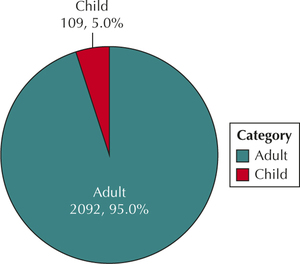
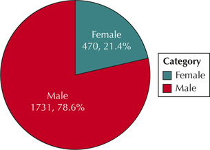
Open the data set Titanic. Use technology for Exercises 125–130.
Question 2.125
titanic
125. Construct (i) a frequency distribution and (ii) a relative frequency distribution of each of the following variables:
- Class
- Age
- Sex
- Survived
2.1.125
(a)
(b)
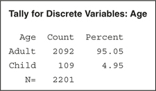
(c)
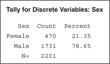
(d)
Question 2.126
titanic
126. Build (i) a frequency bar graph and (ii) a relative frequency bar graph of each of the following variables:
- Class
- Age
- Sex
- Survived
Question 2.127
titanic
127. Construct pie charts of each variable in the previous exercise.
2.1.127
(a)
(b)
(c)
(d)
Question 2.128
titanic
128. Construct a clustered bar graph of the variable survived clustered by gender. What does this graph tell us about the relative proportions of females and males who survived?
Question 2.129
titanic
129. Construct a clustered bar graph of the variable survived clustered by age. Did you stand a better chance of surviving as an adult or a child?
2.1.129
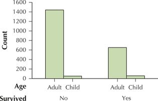
A child.
Question 2.130
titanic
130. Construct a clustered bar graph of the variable survived clustered by class. Which class had the best chance of surviving? (Hint: For each class, compare the heights of the “Yes” rectangles to the heights of the “No” rectangles.)
CONSTRUCT YOUR OWN DATA SETS
Environmental Club. Use the following information for Exercises 131–133. You are the president of the College Environmental Club, which has members among all four classes: freshmen, sophomores, juniors, and seniors. The total number of members in the club is 20.
Question 2.131
131. Set the frequency of each class so that each class has an equal number of members.
- Construct a frequency distribution of the variable class.
- Construct a relative frequency distribution of the variable class.
2.1.131
(a) and (b)
| Class | Frequency | Relative frequency |
|---|---|---|
| Freshman | 5 | 0.25 |
| Sophomore | 5 | 0.25 |
| Junior | 5 | 0.25 |
| Senior | 5 | 0.25 |
Question 2.132
132. Set the frequency of each class so that there are more sophomores than freshmen, more juniors than sophomores, and more seniors than juniors.
- Construct a Pareto chart of the variable class.
- Construct a pie chart of the variable class.
Question 2.133
133. Set the frequency of each class so that there are more seniors than any other class, while the other three classes have equal numbers.
- Construct a frequency bar graph of the variable class.
- Construct a relative frequency bar graph of the variable class.
2.1.133
Answers will vary.
petitlarceny
WORKING WITH LARGE DATA SETS
Open the data set Petit larceny, which contains the number of petit larceny misdemeanors, per precinct, for the years 2000–2013. For the years 2000 and 2013, these frequencies have been categorized into four categories: 1 – Low: 800 or less, 2 – Medium: 800 to less than 1050, 3 – High: 1050 to less than 1500, and 4 – Very High: 1500 or more. Use technology to answer the following:
60
Question 2.134
petitlarceny
134. Construct bar graphs of “2000 categorized” and “2013 categorized.”
Question 2.135
petitlarceny
135. Discuss the differences between the bar graphs. Which categories are larger or smaller? On the whole, do you think this represents good news or bad news?
2.1.135
In 2000 there were more precincts that had category 3 and 4 numbers of petit larcenies than in 2013. In 2000 there were fewer precincts that had category 1 and 2 numbers of petit larcenies than in 2013. Good news.
Question 2.136
petitlarceny
136. Construct pie charts of “2000 categorized” and “2013 categorized.”
Question 2.137
petitlarceny
137. Discuss whether the bar graphs or the pie charts express the results more clearly in this case.
2.1.137
Pie charts, since they show each category as a percent of the whole.