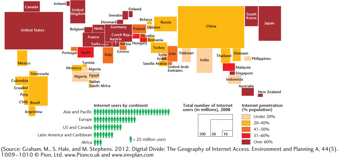
Figure 9.11 The digital divide. This map is a cartogram, whereby the size of the country is scaled to the size of its Internet user base. Large countries with relatively low Internet penetration—India, for example—appear much smaller than they really are. By the same token, countries that are geographically small but have high Internet penetration— such as Japan—appear large on this map. (Source: Graham, M., S. Hale, and M. Stephens. 2012. Digital Divide: The Geography of Internet Access. Environment and Planning A, 44(5). 1009-1010 © Pion, Ltd. http://www.pion.co.uk/ and www.envplan.com.)