Appendix B: Guidelines for Solving Math Problems and Reading Graphs
Astronomy relies on mathematics. Although we have distilled the concepts into words, you can gain further insights into the distances, intensities, and other astronomical quantities from the equations presented in this book. In addition, much scientific information is presented in the form of graphs, a technique that presents data very compactly and often provides a good way to see the trends that the data reveal. This appendix thus provides guidance on three things: setting up problems to be solved analytically (using equations), solving algebra equations, and reading graphs.
A-2
Setting Up and Solving Analytical Problems
At the end of most chapters, there are questions, indicated by an asterisk (*), that require mathematical solutions. You will need to translate the question into an equation or two in order to solve for some value. This is best done systematically. In what follows, we will work a question, appropriate to Chapter 2: How fast does a meteoroid (small piece of rocky space debris) of mass 5 kg (kilograms) move if it has a kinetic energy of 10 J (1 J = 1 kg × m2/s2)? This approach should work for most of the questions in the book.
Step 1. Write down all the information you are given in terms of the variable names used in the book. For example, denoting mass by m and kinetic energy by KE, write: mass m = 5 kg, kinetic energy KE = 10 J.
Step 2. Identify and write down the thing you are trying to find in terms of its variable name. In this case: speed, v = ?.
Step 3. Find (usually) one or (sometimes) two equations that are needed to solve for the unknown. All the equations presented in the book are listed in Appendix C. For our problem, use the kinetic energy equation KE = ½mv2, because this equation has the unknown, v, along with only variables and constants that are given, namely KE and m. (As in this case, you will often need only one equation, but sometimes you will have to solve first one equation and then another to get the answer. As an example, you might be given the information above but asked for the value of a momentum, p, of the meteoroid. The equation for momentum, also in Chapter 2, is p = mv. First you would solve for the speed, as we are now doing, and then use that v with the given mass in this last equation.)
Step 4. Manipulate the equation(s) until you have the unknown variable on one side and all the other variables and constants on the other side. Variables can be added, subtracted, multiplied, and divided in the same way that numbers are combined. For our example, we want to find v, so we start with KE = ½mv2, multiply by 2, and divide by m. This gives v2 = 2 KE/m. Because we want v, we now take the square root of both sides or 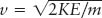 .
.
Step 5. Make sure that all the units match up. Units on both sides of the equation must be identical. Period. If you have one value in kilometers (km) and another value in meters (m), then the result you will get by combining numbers is not meaningful. If you end up with inconsistent units on opposite sides of an equation, convert one unit to the other. For example, change kilometers into meters or vice versa. In this case, use the fact that 1 km = 103 m.
Step 6: Plug in all the numbers and solve for the unknown. In our case, 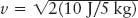 or v = 2 m/s.
Reading Graphs
The graphs you will encounter in this book are compact ways of displaying patterns of information relating two variables, like the temperature and luminosity of stars or the temperature of an atmosphere at different altitudes. The relevant values of one of the variables are presented along the horizontal or x axis, and the relevant values of the other variable are presented along the vertical or y axis. The word “relevant” here indicates that often graphs do not start at 0. Consider three examples. First is data presented in Chapter 7 concerning the temperature of Venus’s atmosphere at different altitudes (Figure 1).
The horizontal axis of the graph indicates the temperature in kelvins (K). (Unlike degrees Celsius or degrees Fahrenheit, temperature using the Kelvin scale is simply noted as kelvins.)
The vertical axis denotes the altitude above Venus’s surface in kilometers (km). Note that both axes are always labeled with a name (temperature or altitude, here) and units (K or km, respectively). Bear in mind that some variables in graphs you will see in this book increase to the right or upward (these are more common), but some variables will increase in the opposite directions.
A-3
To read a graph, note that a value on the horizontal axis is transferred directly upward through the graph. For example, all points on the blue line in Figure 1 (which extends upward from 400 K) have a temperature of 400 K. Equivalently, the value given on the vertical axis is transferred to all points horizontally across from this value. All the points on the black line in Figure 1 are at an altitude of about 43 km above Venus’s surface. We have interpolated between 40 and 45 to get this value (Figure 2).

A curve or a set of points on the graph presents the relationship between the variable represented on the horizontal axis and the variable on the vertical axis. Each point on a curve or each separate point relates the two variables. Choose a point, say the dot on Figure 1. It represents the temperature at a certain altitude above Venus’s surface. To find the temperature at that point, you slide directly down (along the blue line in this example) from the point and read the value of the horizontal variable under it. To find the altitude for that point, you slide directly over to the side (along the black line) and read the value of the vertical variable there. In our example, sliding along the blue line leads to 400 K on the temperature line. Therefore, this point corresponds to a temperature of 400 K. Moving horizontally from the point, you encounter, by interpolation, the 43 km indicator. Combining the data, you conclude that the temperature of Venus’s atmosphere 43 km above its surface is 400 K.
The red curve in Figure 1 provides the relationship between altitude and temperature for a wide range of locations above Venus in a representation that is much more informative than a table of heights and temperatures. Specifically, this curve shows you the trend of temperature with altitude.
Try these questions: What is the temperature at 20 km? What is the altitude at which the temperature is 300 K? For most of this graph, what is the general trend of the temperature with height? (Answers appear at the end of the book.)
Sometimes, the known information is not a curve, but rather a set of points, as in our second example (Figure 3), from Chapter 13. In this case, the graph connects the apparent magnitude of a nova (how bright it appears to be as seen from Earth regardless of its distance or other factors) and time. Each dot indicates how bright the nova (an explosion on the surface of certain stars) was at different times. For example, the peak brightness of the nova was an apparent magnitude of about +2 and it occurred on September 2. Noting that time passes to the right, you can immediately see that the trend of the nova’s brightness is to increase rapidly and decrease more slowly.
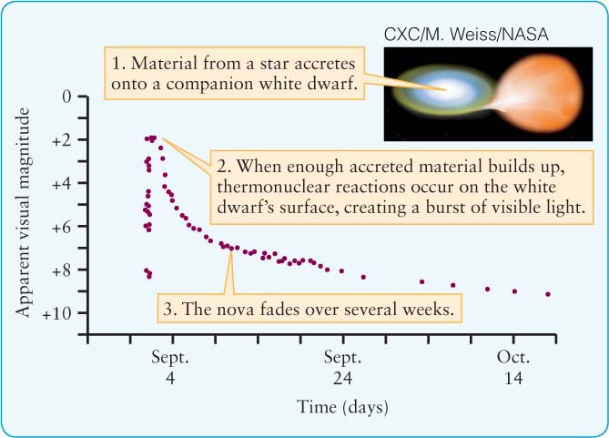
Try these questions: What is the apparent magnitude on September 24? October 9? On what two days was the apparent magnitude +6? (Answers appear at the end of the book.)
The graphs so far have shown variables that change uniformly along the axes. For example, the distance on Figure 1 from 300 K to 400 K is the same as the distance from 400 K to 500 K, and so on. Many graphs you will encounter have variables that do not change uniformly (that is, linearly) along the axes. That means that the change in value going along each axis varies—there is not the same amount of change per centimeter along the axis. In Figure 4, from Chapter 12, for example, the luminosity (total energy emitted per second) increases upward logarithmically, while the temperature decreases going from left to right in a more complex, nonuniform way.
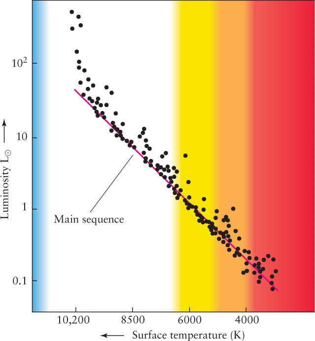
The purpose of logarithmic and other nonlinear axes is to present in compact form data that varies very widely in values. For example, the dimmest star represented in Figure 4 is just less than 0.1 times as luminous as the Sun, while the brightest star is nearly 1000 times as luminous. The process of getting information from logarithmic graphs is the same as linear graphs. You must just be careful not to think of values as doubling or tripling when you go over or up two or three intervals. Figure 5 shows how a logarithmic scale varies over one decade of values on both the vertical and horizontal axes. The same numbering intervals apply for any decade of values, for example, 1 to 10 or 105 to 106. As you can see, the numbers bunch up near the highest value, so you need to interpolate these graphs more carefully than linear graphs.

A-4
Referring to Figure 4, the luminosity of a star with surface temperature of 4000 K is about 0.1 L⊙. Note, also, that some graphs are linear on one axis and logarithmic on the other axis!
Try these questions: Approximately what is the luminosity of a star with surface temperature 8500 K? What is the surface temperature of a star with the same luminosity as the Sun (1 L⊙)?
(Answers appear at the end of the book.)