Chapter 1. Graphing Skills Tutorial
Line Graphs
Line graphs are used when the independent variable is represented by a numerical sequence (1, 2, 3…) rather than discrete categories (red, yellow, blue…). The dependent variable is always a numerical sequence.
Question 1.1
Question 1.2
Graph these data relating seedling numbers of American Basswood to latitude:
| Latitude | Seedlings/hectare |
|---|---|
| <34 | 0 |
| 34-36 | 0.2 |
| 36-38 | 0.4 |
| 38-40 | 0.35 |
| 40-42 | 0.51 |
| 42-44 | 1.4 |
| 44-46 | 2.2 |
| 46-48 | 2.35 |
| 48+ | 0.2 |
Question 1.3
Graph these data relating seedling numbers of American Basswood to latitude:
| Latitude | Seedlings/hectare |
|---|---|
| <34 | 0 |
| 34-36 | 0.2 |
| 36-38 | 0.4 |
| 38-40 | 0.35 |
| 40-42 | 0.51 |
| 42-44 | 1.4 |
| 44-46 | 2.2 |
| 46-48 | 2.35 |
| 48+ | 0.2 |
Correct. The most seedlings are found between 46 and 48 degrees north.
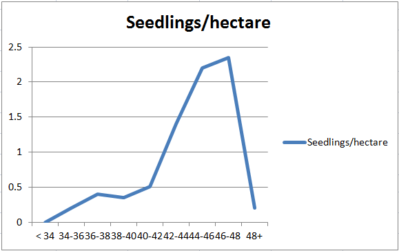
Incorrect. A is incorrect because it is not the highest number of seedlings. C is incorrect because the latitude is north, not south. D is incorrect because latitude is measured north and south, not east and west.
Scatterplots
Scatterplots (with or without a trendline) are used when any x-value could have multiple y-values.
Question 1.4
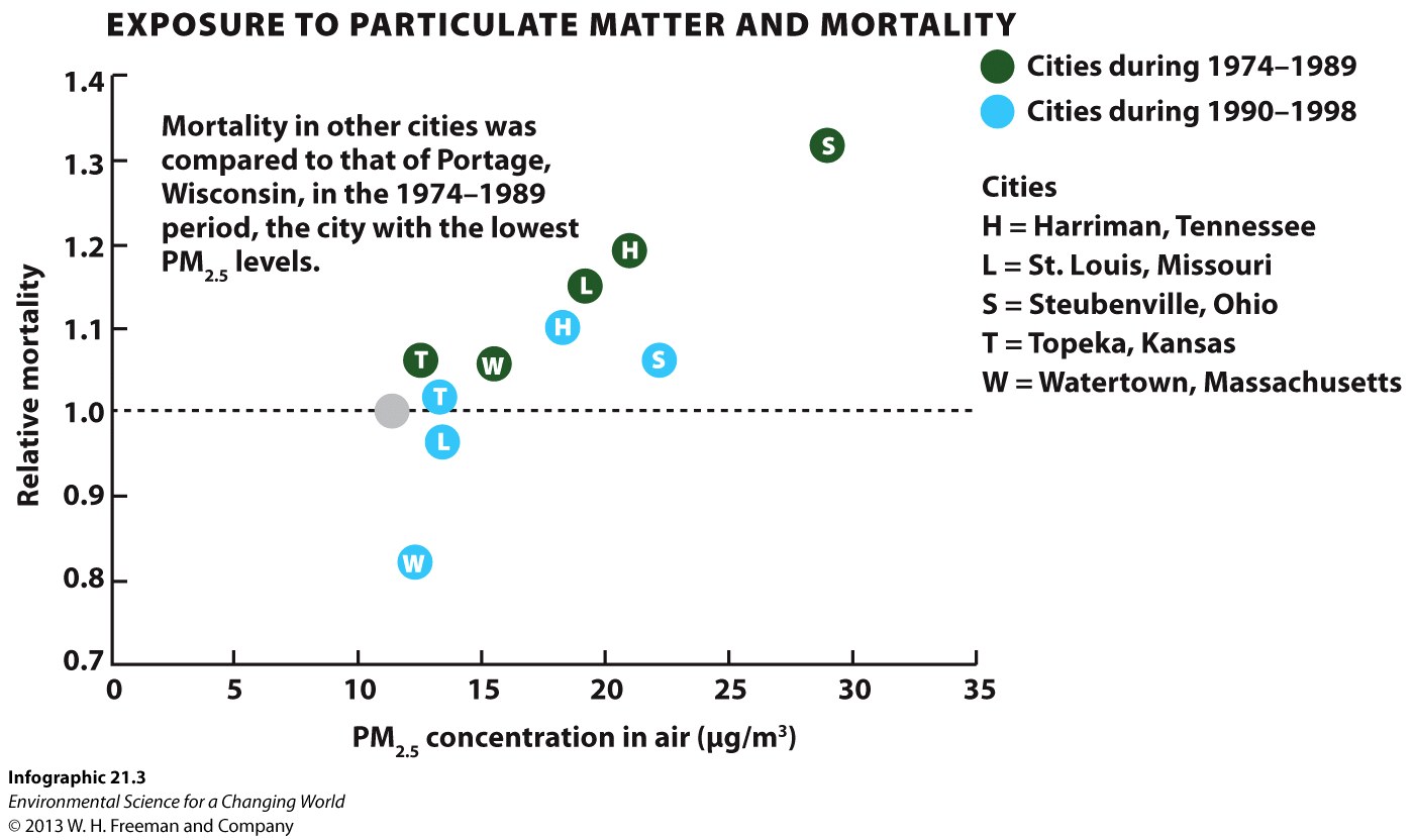
Correct. The green dots represent the years 1974-1989, and the “S” in the dot stands for Steubenville.
Incorrect. A is incorrect; Harriman did not have 30 ug/m3 of particulate matter in those years. B is incorrect; 22 ug/m3 is Steubenville’s value for the years 1990-1998. D Is incorrect; Portage served as the comparison city, but its levels of particulate matter pollution were never 1 ug/m3.
Question 1.5
Use the following data to create a scatterplot comparing the % coral reef area located in Marine Protected Areas (MPAs) to % of reef area of the global total.
| Reef Area in MPA's | Reef Area % of Global |
|---|---|
| 30 | 10 |
| 75 | 17 |
| 19 | 13 |
| 12 | 6 |
| 13 | 26 |
| 17 | 28 |
Correct. The highest reef area that is found in MPA's is not where the highest fraction of coral reefs of the global total is found.
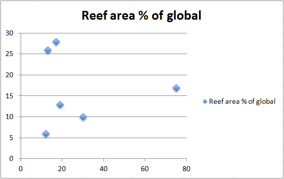
Incorrect. The highest reef area that is found in MPA's is not where the highest fraction of coral reefs of the global total is found.
Pie Charts
Pie charts are useful when the groups represented by the independent variable are all discrete categories (e.g., red, yellow, blue…) rather than a numerical sequence (e.g., 1, 2, 3…). In addition, the categories also represent all the subsets of a whole—all the category values add up to 100%.
Question 1.6
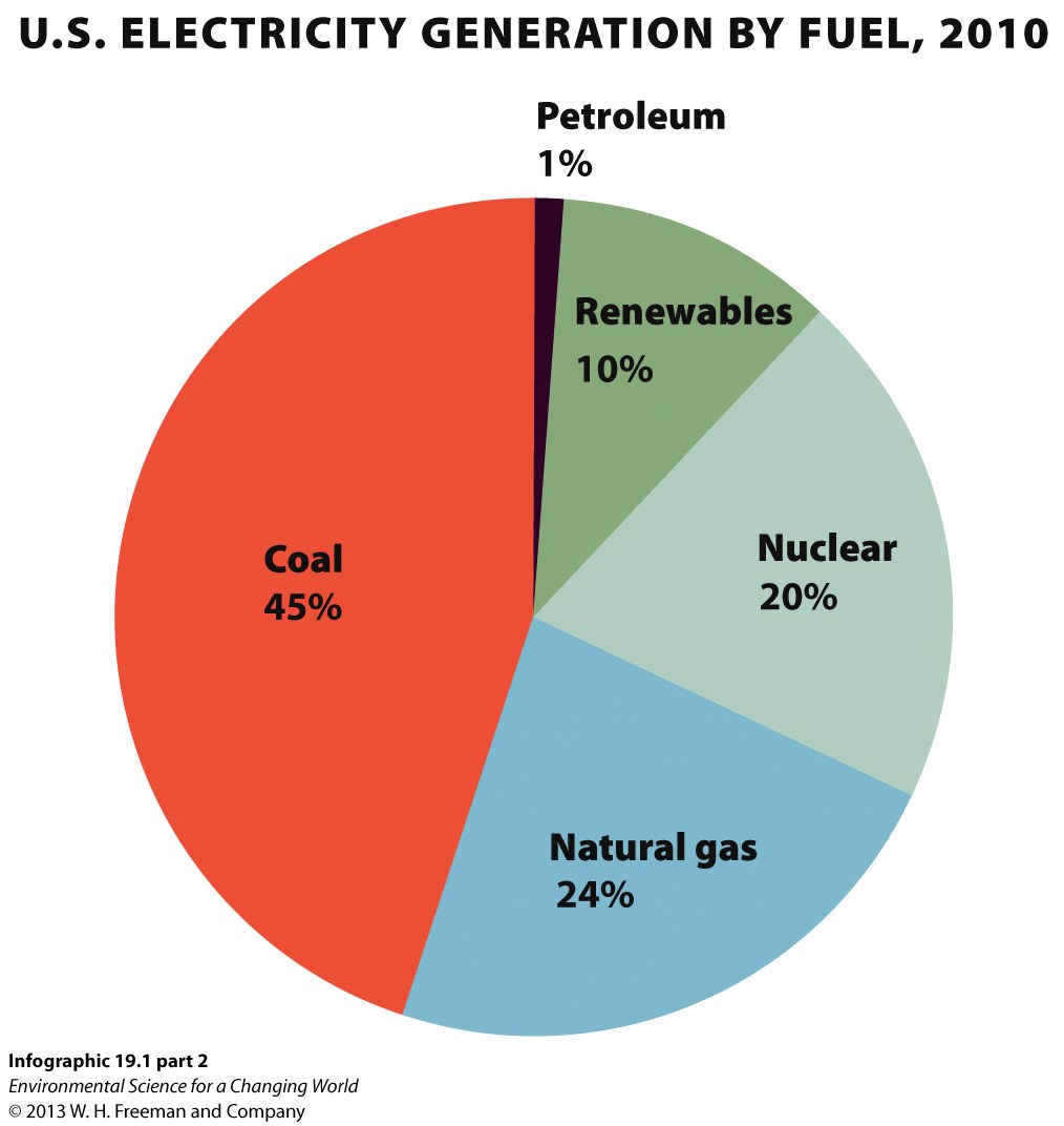
Correct. This is represented by the green slice of the pie labeled renewables.
Incorrect. A is the amount from coal, B is the amount from natural gas, and D is the amount from petroleum.
Question 1.7
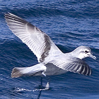
Use the following data to create a pie chart depicting the number of immature prions, a type of seabird, found with plastic pellets in their guts. Then, make a second pie chart using the numbers for adult birds.
Birds were found dead on beaches entangled in nets and were necropsied. The values presented include only birds found with plastic pellets in the gut. Values represent % for a species of an age class.
| Prion Species | Immatures | Adults |
|---|---|---|
| Broad-billed prion | 7.1 | 70.2 |
| Salvin's prion | 52.5 | 0 |
| Antarctic prion | 1.5 | 2.12 |
| Thin-billed prion | 3.9 | 0 |
| Fairy prion | 34.7 | 27.65 |
Correct. More immature birds were found with plastic pellets than adult birds.
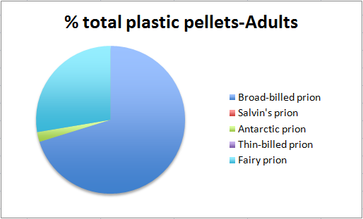
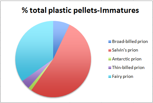
Incorrect. More immature birds were found with plastic pellets than adult birds.
Bar Graphs
Bar graphs are appropriate when the values for the independent variable represents discrete, separate groups. The independent variable goes on the x-axis and the dependent variable goes on the y-axis.
Question 1.8
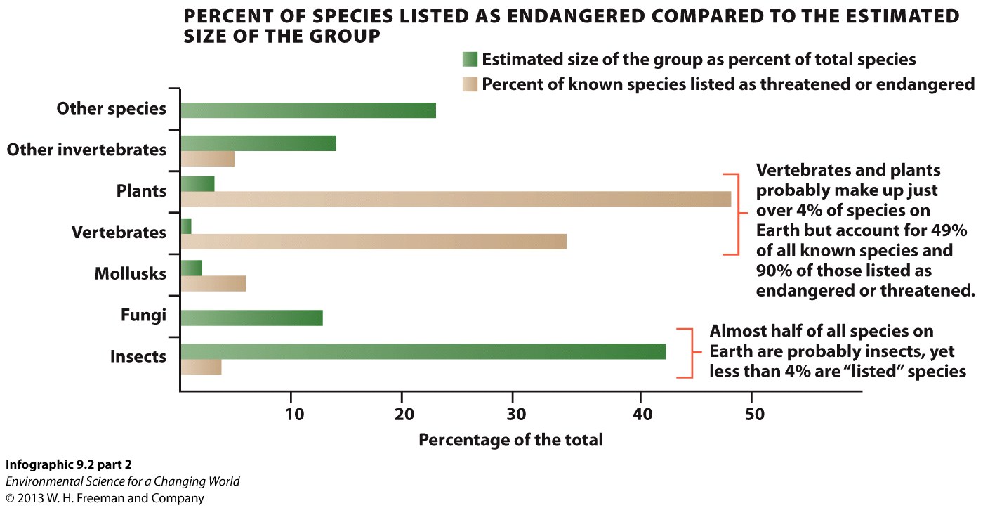
Correct. According to this graph, no species of fungus is listed as threatened or endangered.
Incorrect. According to this graph, no species of fungus is listed as threatened or endangered.
Question 1.9
Using the following data, create a bar graph that depicts the amount of forest designated for protection of soil and water in 2010 on each land area.
| Area (1000 ha) | |
|---|---|
| Total Africa | 19540 |
| Total Asia | 135889 |
| Total Europe | 92995 |
| Total North and Central America | 1517 |
| Total Oceania | 588 |
| Total South America | 48549 |
| World | 299378 |
Correct. The numbers for Asia are higher than any other area, by an order of magnitude.
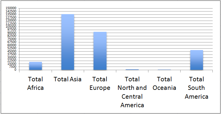
Incorrect. The numbers for Asia are higher than any other area, by an order of magnitude.
Area Graphs
Area graphs are used when we want to view the relative proportion of each group and the independent variable is a numerical sequence.
Question 1.10
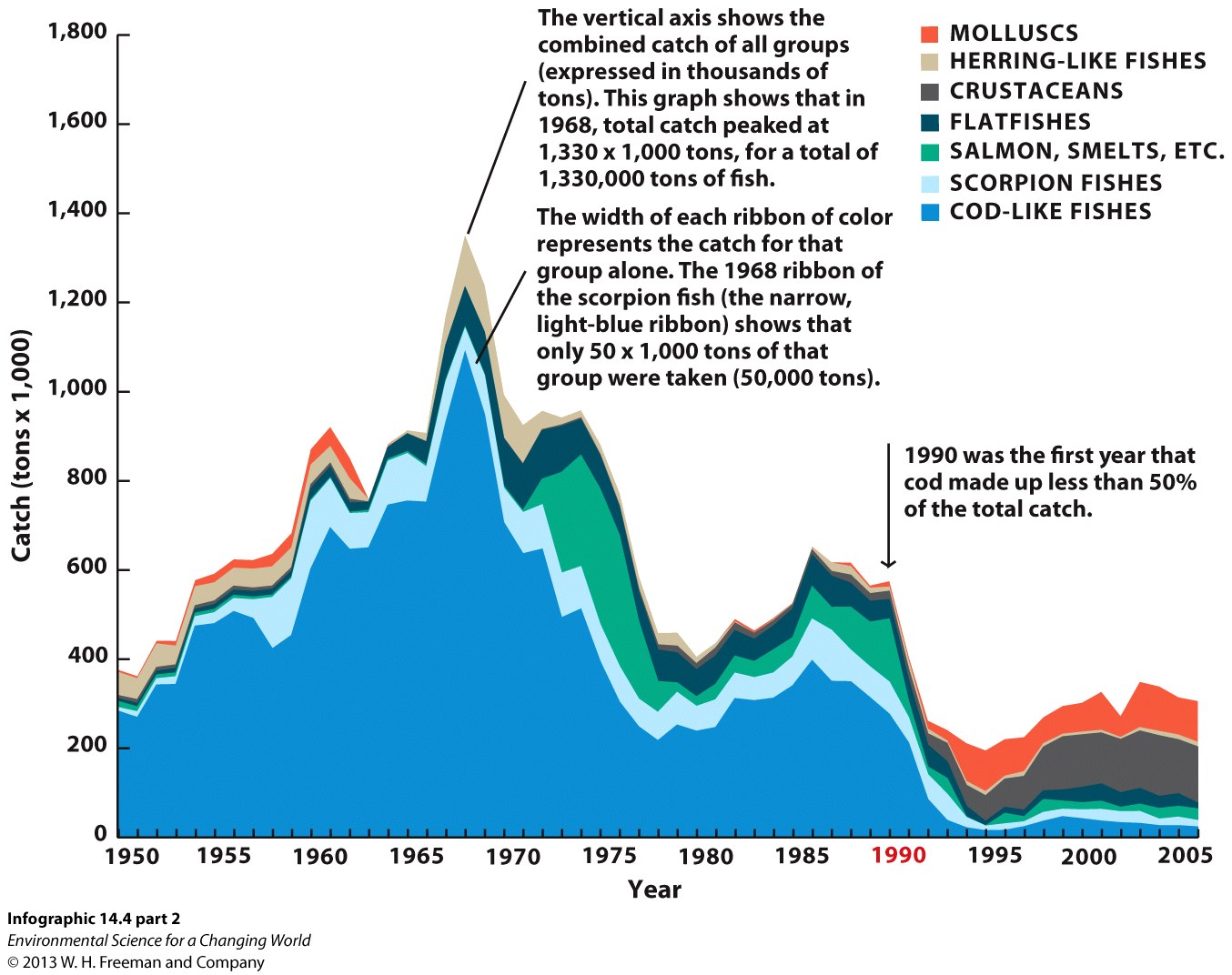
Correct. Even after the initial decline in the early 70’s, cod remained the most caught fish.
Incorrect. A, C, and D are all incorrect. Salmon were abundant between 1970-1990, but they were not captured more than cod. Herring were never a huge fraction of the catch, even though they too were more common prior to 1980. Molluscs have become a more commonly captured species since 1991, but they are still not the most common type of seafood captured.
Question 1.11
Use these data to create an area graph. Numbers are proportion of each group in the fish community (%).
| Year | Sharks/rays | Bottom-feeders | Large fish | Early Maturity |
|---|---|---|---|---|
| 1800-1825 | 17.3 | 27 | 17.5 | 5.9 |
| 1826-1850 | 16.5 | 24 | 15 | 4 |
| 1851-1875 | 12 | 31 | 16 | 10 |
| 1876-1900 | 14.5 | 15 | 12 | 16.5 |
| 1901-1925 | 7 | 21 | 12 | 14 |
| 1926-1950 | 11.4 | 20.4 | 13 | 17.8 |
Correct. The proportion of early maturing fish increased, from 5.9% to 17.8%. The proportion of each of the other types shown declined.
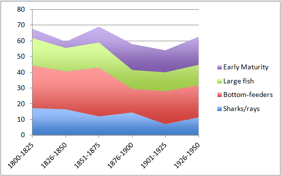
Incorrect. The proportion of early maturing fish increased, from 5.9% to 17.8 %. The proportion of each of the other types shown declined.