9a Plan a visual structure.
Effective writers consider the visual structure of any text they create. Their design decisions guide readers by making texts easier on the eyes and easier to understand.
Print and electronic options
One of your first design decisions will be choosing between print delivery and electronic delivery. In general, print documents are easily portable, easy to read without technical assistance, and relatively fast to produce. In addition, the tools for producing print texts are highly developed and stable. Electronic texts, on the other hand, can include sound, animation, and video; updates are easy to make; distribution is fast and efficient; and feedback can be swift. In many writing situations, the assignment will tell you whether to create a print document or an electronic text. Whether you are working to produce a text to be read in print or on a screen (or both), however, you should rely on some basic design principles.
Design principles
Designer Robin Williams, in her Non-Designer’s Design Book, points out several very simple principles for designing effective texts—contrast, alignment, repetition, and proximity. These principles are illustrated in the examples shown below.
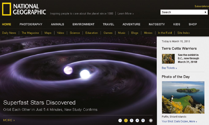
CONTRAST
Contrast attracts your eye to elements on a page and guides you around it, helping you follow an argument or find information. You may achieve contrast through the use of color, icons, boldface or large type size, headings, and so on. Begin with a focus point—the dominant point, image, or words where you want your reader’s eye to go first—and structure the flow of your visual information from this point.
ALIGNMENT
Alignment refers to the way visuals and text on a page are lined up, both horizontally and vertically. The overall guideline is not to mix alignments arbitrarily. That is, if you begin with a left alignment, stick with it for the major parts of your page. The result will be a cleaner and more organized look. In this book, for example, headings always align with the left margin.
REPETITION
Readers are guided by the repetition of key words and elements. Use a consistent design throughout your document for such elements as color, typeface, and images.
PROXIMITY
Parts of a text that are closely related should appear together (proximate to one another). Your goal is to position related points, text, and visuals near one another and to use clear headings to identify these clusters.
CONSISTENT OVERALL IMPRESSION
Aim for a design that creates the appropriate overall impression or mood for your text. For an academic essay, you will probably make conservative choices that strike a serious scholarly note. In a newsletter for a campus group, you might choose attention-getting images.