5.2 5.1 Displaying Distributions: Histograms
Any set of data contains information about some group of individuals. The information is organized in variables. We will briefly note some basics about data before we learn tools for exploring and summarizing.
Individuals DEFINITION
Individuals are the entities about which information (data) is collected. Individuals may be people, but they may also be groups, animals, or things.
Variable DEFINITION
A variable is a characteristic or trait that can take on different values for different individuals. A particular variable may be either qualitative (e.g., gender) or quantitative (e.g., age).
EXAMPLE 1 Data from a Student Questionnaire
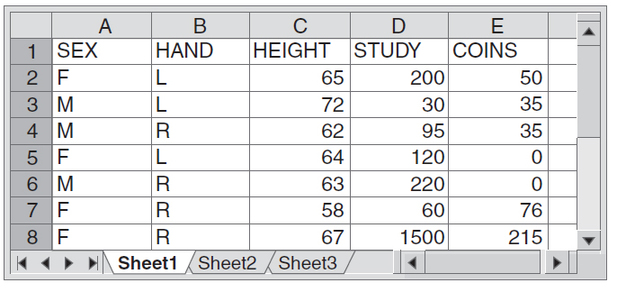
Table 5.1 shows a partial dataset that describes the students in a statistics class. The data come from anonymous responses to a class questionnaire. Most data tables follow this format: Each row records data on one individual (in this case, one student) and each column contains values of one variable for all the individuals. This dataset appears in a spreadsheet program that has rows and columns ready for your use. Spreadsheets are commonly used to enter and transmit data, and spreadsheet programs also have functions for basic statistics.
183
|
The partial spreadsheet shows information on seven individuals in rows 2-8. The questionnaire consisted of five questions, which are represented by the five columns in the spreadsheet. Sex (female or male) and handedness (left-handed or right-handed) are variables that are usually described as qualitative or categorical because they categorize individuals by traits and do not take numerical values. The remaining three variables are quantitative or measurement variables because they do take numerical values. They are height (inches), time spent studying (in minutes) on a typical weeknight, and the amount of money in coins (cents) students are carrying. Our main focus in this chapter will be on variables involving quantitative or numerical data, because you probably have already had much experience with the usual ways to summarize categorical data (proportions, pie charts, and bar charts).
Knowing the context of the data—that these are student responses to a class questionnaire—helps us make sense of them. For example, one student claimed to study 1500 minutes on a typical night. We know that this is impossible! (Perhaps the student miscalculated when converting from hours to minutes or it was a typographical error.)
Self Check 1
Here are the first few rows of a professor’s dataset at the end of a mathematics course:
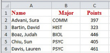
- Are the individuals for this dataset the students, total points, or majors?
The individuals are the students.
- Identify each of the variables as qualitative or quantitative.
"Major" is a qualitative variable and "points" is a quantitative variable.
Statistical tools and ideas help us examine data and describe their main features. This examination is called exploratory data analysis (EDA). Like an explorer crossing unknown lands, we first want to describe simply what we see so that we can start to draft our map of the terrain. In this chapter and the next, we use both numbers and graphs to explore data. As we learn from Spotlight 5.1, the use of EDA to explore and analyze data was promoted by John Wilder Tukey. Here is a process for exploratory analysis of data.
184
John Wilder Tukey, Champion of Exploratory Data Analysis Spotlight 5.1
Mathematician John Wilder Tukey (1915-2000) directed Princeton University’s Statistical Research Group when it was set up in 1956 and was the first chairman of Princeton’s Department of Statistics after it was formed in 1965. He divided his time between Princeton and AT&T Bell Laboratories, where his work involved developing statistical methods for computers. In the field of computer science, Tukey is credited with introducing the terms bit (contraction for binary digit) and software.
Tukey led the way in the field of exploratory data analysis (EDA). EDA is an approach for data analysis that focuses heavily on graphical techniques. The goal is to tease out information from datasets in order to unlock their stories. Stemplots and boxplots (graphic displays that appear later in this chapter) became popular after the publication of Tukey’s 1977 book Exploratory Data Analysis.
Exploring Data PROCEDURE
- Begin by examining each variable by itself. Start with one or more graphs, and then add numerical summaries of specific aspects of the data.
- Explore possible relationships among variables, using graphical displays and then numerical summaries.
These principles also organize the material in Chapters 5 and 6. In this chapter, we look at data on a single variable. Chapter 6 moves on to relationships among two or more variables.
Data analysis begins with graphical displays of the values of a single variable. For example, universities may want information about their students’ study times. Because individual study times vary so much, we are interested in the distribution of study times.
Distribution DEFINITION
The distribution of a variable gives information (as a table, graph, or formula) about how often the variable takes certain values or intervals of values.
This definition has several different manifestations. The simplest one is a "tally chart" called a frequency distribution.
185
Frequency Distribution DEFINITION
A frequency distribution classifies data on a single variable into non-overlapping classes or intervals (class intervals) and records how many times data values are in each class.
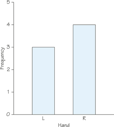
A frequency distribution can be displayed in a table such as this one for the variable HAND in the dataset excerpt of Table 5.1 (page 183):
| Class | R | L |
| Frequency | 4 | 3 |
Here, the classes are the possible outcomes of the qualitative variable HAND. The bar chart in Figure 5.1 is one way to represent this frequency distribution graphically.
The variable COINS in Table 5.1 is a quantitative variable. In Table 5.2, we construct a frequency distribution in which each outcome is its own class, similar to what was done for HAND. In addition to listing the raw frequencies or counts in each category, we have added the relative frequency distribution, which gives the fraction of the time that each value occurs. Since there are seven data values, we obtain the relative frequencies by dividing the frequencies by 7.
| Class | 0 | 35 | 50 | 76 | 215 |
| Frequency | 2 | 2 | 1 | 1 | 1 |
| Relative Frequency |
186
Relative Frequency Distribution DEFINITION
A relative frequency distribution classifies data on a single variable into non-overlapping classes or intervals and records what fraction (or percentage) of the data values are in each class.
Table 5.3 gives the complete dataset for the variable COINS, which would appear in column E of Table 5.1 (page 183). To save space, we have listed these data in four rows rather than a single column.
| 50 | 35 | 35 | 0 | 0 | 76 | 215 | 77 | 62 | 175 |
| 189 | 120 | 54 | 26 | 145 | 0 | 0 | 35 | 47 | 125 |
| 55 | 35 | 78 | 157 | 225 | 92 | 85 | 35 | 59 | 145 |
| 137 | 142 | 62 |
Self Check 2
Construct a frequency distribution for the data in Table 5.3. Use the data values as the classes.
| Class | 0 | 26 | 35 | 47 | 50 | 54 | 55 | 59 |
| Frequency | 4 | 1 | 5 | 1 | 1 | 1 | 1 | 1 |
| Class | 62 | 76 | 77 | 78 | 85 | 92 | 120 | 125 |
| Frequency | 2 | 1 | 1 | 1 | 1 | 1 | 1 | 1 |
| Class | 137 | 142 | 145 | 157 | 175 | 189 | 215 | 225 |
| Frequency | 1 | 1 | 2 | 1 | 1 | 1 | 1 | 1 |
Although the frequency distribution that you constructed for Self Check 2 contains complete detail on the COINS data, it provides little useful information since most of the frequencies are 1. Instead of using distinct data values as classes, we can partition the data into non-overlapping, consecutive intervals called class intervals. This provides a means of summarizing the data and often reveals patterns that are obscured when too much detail is visible.
EXAMPLE 2 Constructing a Frequency Distribution and Histogram
Instead of using the individual data values from Table 5.3 for the classes, we set up class intervals for the COINS data and construct a frequency distribution based on the class intervals. We then display the frequency distribution graphically in a histogram.
Constructing a Frequency Distribution
Step 1: Choose the classes. Determine an interval that is wide enough to contain all the data. Subdivide this interval into a reasonable number of class intervals of equal width. Be sure to specify the classes precisely so that each individual falls into exactly one class.
The data in Table 5.3 range from 0 to 225. So here’s one way to choose the class intervals. All the data are between 0 and 250. We subdivide this interval into five class intervals of equal width:
187
Step 2: Setting up the table. Set up a table with three columns for the following: class interval, tally, and frequency. (Remove the tally column in the final table.)
Step 3: To complete the table, determine the frequency with which data values fall into each class interval.
Step 4: If desired, add a fourth column for relative frequency. The entries in this column should be the frequencies divided by the number of data values.
Table 5.4 shows the construction of a frequency and relative frequency table for the COINS data (Table 5.3). Since there were 33 data values, the relative frequencies were determined by dividing the frequencies by 33.
| Class Interval | Tally | Frequency | Relative Frequency |
|---|---|---|---|

|
11 | ||

|
11 | ||

|
6 | ||

|
3 | ||

|
2 |
Making a Histogram
The best way to represent a frequency distribution graphically is with a histogram. Here are the steps for making a histogram.
- Step 1: Draw a set of axes. On the horizontal axis, mark the boundaries of the class intervals. On the vertical axis, set up a scale appropriate for the frequencies (or relative frequencies).
- Step 2: Label the horizontal axis with the name of the variable being measured and the units. Label the vertical axis as "Frequency" (or "Relative Frequency").
- Step 3: Over each class interval, draw a rectangle with the interval as its base. The height of the rectangle should match the frequency (or relative frequency) of data contained in that interval.
In the case of the coin data, we draw a horizontal axis with tick marks every 50 units from 0 to 250 to mark the class intervals. On the vertical axis, we place tick marks every two units from 0 to 12 for the frequencies. We then add the rectangular bars to make the histogram shown in Figure 5.2.
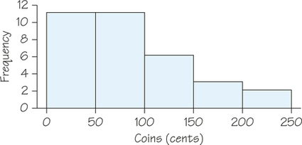
Our eyes respond to the area of the bars in a histogram. Because the classes are all the same width, area is determined by height and all classes are fairly represented. While something between 5 and 20 classes works for most real-world datasets, there is no one right choice for the number of the classes in a histogram.
188
Histogram DEFINITION
A histogram is a graphical representation of a frequency distribution for a single numerical variable. Bars are drawn over each class interval on a number line. The areas of the bars are proportional to the frequencies (or relative frequencies) with which data fall into the class intervals.
Although a histogram (e.g., Figure 5.2) and a bar chart (e.g., Figure 5.1 on page 185) both use rectangular bars, they are different because they display one quantitative variable and one qualitative variable, respectively. Only a histogram’s bars start from an axis that represents a numerical scale. Notice also that in a bar chart the bars are separated whereas in a histogram there is no horizontal space between the bars unless a class is empty so that the bar has height 0.