5.3 5.2 Interpreting Histograms
Making a statistical graph is not an end in itself. The purpose of the graph is to help us understand the data. After you make a graph, always ask, "What do I see?" Once you have displayed a distribution, you can see its important features as follows.
Outlier DEFINITION
In any graph of data, look for the overall pattern and for striking deviations from that pattern. You can describe the overall pattern of a distribution by its shape, center, and variability. An important kind of deviation is an outlier, an individual value that falls outside the overall pattern.
We now explore Example 3, which focuses on the percentage of each state’s Hispanic population. The data appear in Table 5.5.
EXAMPLE 3 Describing a Distribution
Every 10 years, the Census Bureau (www.census.gov) tries to contact every household in the United States. One finding of the 2010 Census was that the Hispanic population (which is now over 50 million) accounted for most of the nation’s growth in the past decade. Table 5.5 presents the percentage of adult residents (age 18 and over) in each of the 50 states who identified themselves in the 2010 Census as "Hispanic, Latino, or Spanish origin." Because we are interested in patterns at the state level, the individuals in this dataset are not the millions of Americans but the 50 states. The variable is the percentage of Hispanics in a state’s adult population.
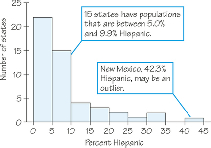
Table 5.5 contains too much detail to find patterns and trends easily. Again, we begin by grouping the data into convenient intervals (or "classes") to make a frequency distribution. Since no more than 45% of the residents of any state identified as Hispanic, we subdivide the interval from 0% to 45% into nine class intervals of width 5% and then classify the data into these intervals. The resulting frequency distribution is given in Table 5.6.
189
| State | Percent | State | Percent | State | Percent |
|---|---|---|---|---|---|
| Alabama | 3.2 | Louisiana | 4.0 | Ohio | 2.5 |
| Alaska | 4.7 | Maine | 1.0 | Oklahoma | 7.1 |
| Arizona | 25.0 | Maryland | 7.3 | Oregon | 9.1 |
| Arkansas | 5.0 | Massachusetts | 8.1 | Pennsylvania | 4.6 |
| California | 33.1 | Michigan | 3.5 | Rhode Island | 10.2 |
| Colorado | 17.5 | Minnesota | 3.7 | South Carolina | 4.3 |
| Connecticut | 11.6 | Mississippi | 2.5 | South Dakota | 2.1 |
| Delaware | 6.7 | Missouri | 2.9 | Tennessee | 3.8 |
| Florida | 21.1 | Montana | 2.3 | Texas | 33.6 |
| Georgia | 7.5 | Nebraska | 7.2 | Utah | 11.3 |
| Hawaii | 7.2 | Nevada | 22.3 | Vermont | 1.3 |
| Idaho | 9.0 | New Hampshire | 2.2 | Virginia | 6.9 |
| Illinois | 13.4 | New Jersey | 16.3 | Washington | 8.9 |
| Indiana | 4.8 | New Mexico | 42.3 | West Virginia | 1.0 |
| Iowa | 3.8 | New York | 16.2 | Wisconsin | 4.6 |
| Kansas | 8.4 | North Carolina | 6.8 | Wyoming | 7.5 |
| Kentucky | 2.5 | North Dakota | 1.5 |
| Class | Frequency | Class | Frequency | Class | Frequency |
|---|---|---|---|---|---|
| 0.0 to 4.9 | 22 | 15.0 to 19.9 | 3 | 30.0 to 34.9 | 2 |
| 5.0 to 9.9 | 15 | 20.0 to 24.9 | 2 | 35.0 to 39.9 | 0 |
| 10.0 to 14.9 | 4 | 25.0 to 29.9 | 1 | 40.0 to 44.9 | 1 |
Now we can draw a histogram to represent the information from Table 5.6. Although the histogram contains the same information as the table, a graphic display often helps us identify patterns more easily.
190
Next, we use all the information we have gathered so far to describe features of this dataset.
- Shape: The distribution has a single peak, which represents states in which less than 5% of adults are Hispanic. Most states have no more than 10% Hispanics, but some states have much higher percentages, so the graph trails off to the right.
- Center: From the frequency distribution, we know that 22 of the 50 states had a Hispanic adult population of less than 5%. The middle point for the data is somewhere between 5% and 10%. From Table 5.5 we find that about half the states have less than 7% Hispanics among their adult residents and the rest have more. So the middle of the distribution is around 7%.
- Variability: The data’s span is from about 1% to 42% (a difference of 41%), but only six states exceed 20%.
- Outliers: New Mexico stands out. Whether this is an outlier or just part of the long right tail of the distribution is a matter of judgment.
Some statistical software packages "flag" outlier values using methods such as those in Exercises 35 or 62, but there is no one universal rule for calling an observation an outlier. Once you have spotted possible outliers, look for an explanation. Some outliers are due to mistakes, such as the student who studied 1500 minutes on a typical weekday (Table 5.1 on page 183), when perhaps it should have been 150 minutes. Other outliers point to the special nature of some observations—such as the high percentage of Hispanics in New Mexico, territory which was under the control of Spain and Mexico before it became part of the United States.
When you describe a distribution, concentrate on the main features. Look for major peaks, not for minor ups and downs, in the bars of the histogram. Look for clear outliers, not just for the smallest and largest observations. Look for rough symmetry or clear departures from it.
Distributions come in a variety of shapes. Some distributions have a shape in which the bulk of the values form a heap on one side, close to the distribution’s balance point, and the rest of the values stretch out into a long tail on the other side of the balance point. This trait is known as skewness, and the direction of skewness may be either to the right or to the left as described in following definitions.
Right-Skewed Distribution DEFINITION
A right-skewed distribution is a distribution in which the longer tail of the histogram is on the right side. (Because positive numbers lie on the right side of a number line, such a distribution is also called "positively skewed.")
Both Figures 5.2 (page 187) and 5.3 (page 189), the COINS and Hispanic percentage distribution, respectively, are examples of right-skewed distributions.
Left-Skewed Distribution DEFINITION
A left-skewed distribution is a distribution in which the longer tail of the histogram is on the left side. (Because negative numbers lie on the left side of a number line, such a distribution is also called "negatively skewed.")
191
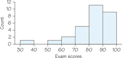
For example, an easy exam may yield a left-skewed distribution because most students will cluster together with high scores, but there are usually still a few students who perform low (possibly due to lack of attendance or effort) and give the distribution a tail stretching out to the left. Figure 5.4 illustrates this situation.
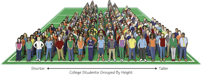
Other distributions may have little or no skewness. For example, the distribution of heights in an adult population may look like two hills of equal size, as is the case in Figure 5.5, which depicts Brian Joiner’s living histogram of Penn State students grouped by height. (See Suggested Readings for more information on Joiner’s living histograms.)
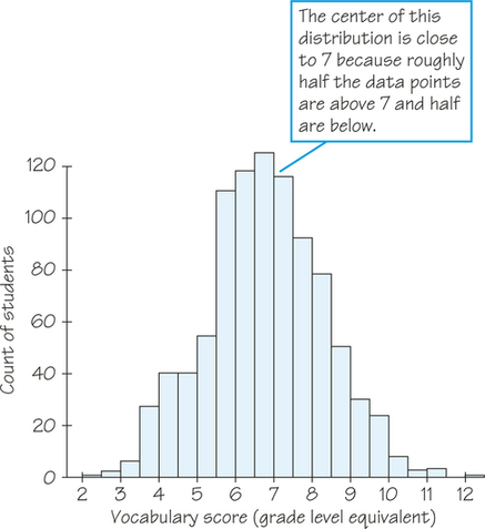
A more common and more important shape without skewness is the bell-shaped histogram, the subject of Section 5.8. Many biological measurements (such as height, length of thigh bone, and so on) on specimens from the same species and sex have a bell shape. So do scores on most standardized tests, the subject of Example 4 (see Figure 5.6.). Distributions without much skewness where values are distributed similarly on both sides of the distribution can typically be described as symmetric.
Symmetric Distribution DEFINITION
A symmetric distribution is one in which a vertical line could be superimposed on the histogram and the left and right sides are approximate mirror images of each other.
192
EXAMPLE 4 Iowa Test Scores
Figure 5.6 displays the scores of all 947 seventh-grade students in the public schools of Gary, Indiana, on the vocabulary part of the Iowa Test of Basic Skills. The distribution is single-peaked and symmetric. In mathematics, the two sides of symmetric patterns are exact mirror images, but real-life data are almost never exactly symmetric. We are content to describe Figure 5.6 as symmetric. The center (half above, half below) is close to 7. This is a seventh-grade reading level. The scores range from 2.0 (second-grade level) to 12.1 (twelfth-grade level).
EXAMPLE 5 College Tuition
Jeanna plans to attend college in her home state of Massachusetts. She looks up the annual tuition and fees for all 64 four-year colleges in Massachusetts (omitting art schools and other special colleges). The data for the 2014/2015 academic year are displayed in the histogram in Figure 5.7. Notice that there are three bars tied for the tallest bar, representing 12 colleges charging between $30,000 and $35,000, $40,000 and $45,000, and $45,000 and $50,000, respectively. As is often the case, we can’t call this irregular distribution either symmetric or skewed. It does show two separate clusters of colleges, 12 with tuition and fees less than $15,000 and the remaining 52 costing more than $20,000. More generally, clusters suggest that different types of individuals are mixed in a dataset. In fact, the histogram in Figure 5.7 distinguishes 12 state colleges in Massachusetts from 52 private colleges, which charge much more.
193
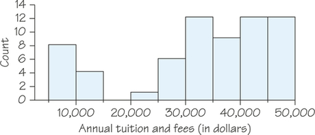
Self Check 3
Which of the statements below can be concluded from the histogram in Figure 5.7?
- There is at least one college with tuition and fee charges between $7500 and $12,500.
- There are no colleges with tuition and fee charges between $12,500 and $22,500.
- There are no colleges with tuition and fee charges between $16,000 and $18,000.
Based on Figure 5.7, only part (c) is guaranteed to be true. The values $16,000 and $18,000 fall within the class interval from $15,000 to $20,000, which contains no data. For part (a), it could be the case that all data values that fell into the first class interval were less than $7500 and all data values that fell into the second class interval were greater than $12,500. This would make part (a) false. The interval from part (b), between $12,500 and $22,500, is wider than the third class interval that contains no data. It is possible that one or more of the data values that fell into the second class interval was between $12,500 and $15,000, which would make part (b) false.
Up to this point, we have not investigated how changing the class intervals might change the look of a histogram. We return to our map analogy—too much detail can obscure patterns but too little detail can miss important information. In Example 6, we see how changing the class interval widths on histograms can change the shape of histograms and reveal new information.
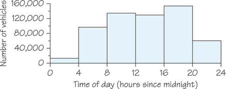
EXAMPLE 6 Patterns in Traffic Density
Consider the distribution of the weekday traffic density on a portion of the Massachusetts Turnpike. The histogram shown in Figure 5.8 is based on class intervals of 4 hours. Other than showing that peak traffic density is between 4 p.m. and 8 p.m. (16 hours after midnight to 20 hours after midnight) and that traffic density is very low between 12 A.M. and 4 A.M., the histogram is not very informative.
In Figure 5.9, the class interval widths have been reduced to 1 hour each. In this histogram, the increased traffic densities during morning rush hour (about 7 A.M. to 9 A.M.) and evening rush hour (about 3 P.M. to 7 P.M.) are clearly visible.
194
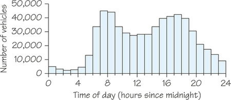
As Figures 5.8 and 5.9 illustrate, when looking for patterns in data, experiment with using different class intervals. Changing the class-interval widths may help you tease out more information from the data.