5.9 5.8 Normal Distributions
209
We now have a kit of graphical and numerical tools for describing distributions. What’s more, we have a clear strategy for exploring data on a single numerical variable:
- Always plot your data: Make a graph, usually a histogram, a dotplot, or a stemplot.
- Look for the overall pattern (shape, center, variability) and for striking deviations such as outliers.
- Calculate a numerical summary to give some description of center and variability.
Here is one more step to add to this strategy:
- If the overall pattern of a large number of observations is so regular that we can describe it by a smooth curve, then draw that curve superimposed on the histogram.
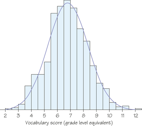
Figure 5.6 (page 192) is a histogram of the Iowa Test vocabulary scores of 947 seventh-grade students. Like most histograms from national standardized tests, the histogram is symmetric, is single-peaked, and has a distinctive bell shape. In Figure 5.19, we draw a smooth curve through the tops of the histogram bars to describe the shape. The curve is an idealized description of the distribution. It gives a compact picture of the overall pattern of the data but ignores minor irregularities as well as any outliers. The curve in Figure 5.19 is a normal curve. A distribution whose shape is described by a normal curve is a normal distribution.
210
EXAMPLE 15 From Histogram to Density Curve
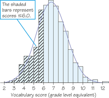
You can think of a normal curve as a smoothed-out histogram when there is symmetry and one mode. Our eyes respond to the areas of the bars in a histogram. The bar areas represent proportions of the observations. Figure 5.20a is a copy of Figure 5.19 with the leftmost bars shaded. The area of the shaded bars in Figure 5.20a represents the students with vocabulary scores of 6.0 or lower. This area reflects the proportion of Gary, Indiana, seventh graders, so 6.0 is the 30th percentile.
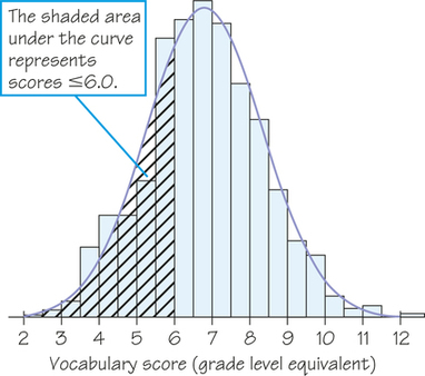
Now look at the curve drawn through the bars. In Figure 5.20b, the area under the curve to the left of 6.0 is shaded. We know that the areas of histogram bars represent proportions of all the observations, but we don’t worry about the actual total area. Note that all the bars together represent 100% of the students, so we treat the total area under the normal curve as 1 for 100%, which turns the curve into a normal density curve. Now, areas under the density curve actually are proportions of the observations. The shaded area under the normal density curve in Figure 5.20b is the proportion of students with scores of 6.0 or lower. This area turns out to be 0.293, only 0.010 away from the histogram result. You see that areas under the normal density curve give quite good approximations of areas given by the histogram.
211
Density Curve DEFINITION
A density curve is a curve that
- is always on or above the horizontal axis
- has an area under the curve that is exactly 1
A density curve summarizes the overall pattern of a distribution. The area under the curve above any interval is the proportion of all observations that fall in that interval.
Normal Distribution DEFINITION
The distribution of a variable tells us what values the variable takes and how often it takes these values. A normal distribution is described by a normal density curve, which has a bell-shaped graph.
As is illustrated in Example 15, if a variable’s distribution can be described by a normal curve, then the area under the normal density curve above any interval of values tells us what proportion of all values of the variable lie in that interval. We apply that idea in the next example.
EXAMPLE 16 Heights of American Women
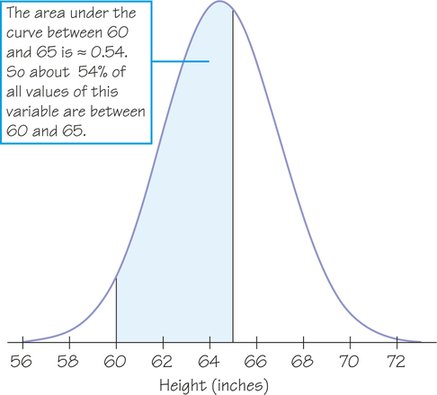
The normal curve is a good approximation of the real-life distribution for a variety of biological measures (height, weight, heart rate, blood pressure, and so on), when examined for a particular species and gender. Figure 5.21 shows the heights of American women between the ages of 18 and 24. The proportion of young women who are between 60 inches (5 feet) and 65 inches tall is given by the area under the density curve between 60 and 65. This area is about 0.54, so approximately 54% of these women are between 60 and 65 inches tall.
212
Self Check 10
Suppose that a smooth curve drawn over a histogram has the triangular shape shown at left. This distribution, called a triangular distribution, is different from a normal distribution.
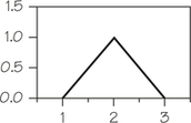
- Check that the area under this density curve is exactly 1.
Since this is a triangle, its area is half its base times its height: .
- What proportion of data from this distribution would fall below 1.5? Explain your calculations.
To calculate the proportion, we need to calculate the area of the triangular region under the density curve to the left of 1.5 as shown below.
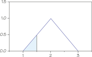
This is a triangular region with base 0.5 and height 0.5. It has area (1/2)(0.5)(0.5) = 0.125.
The everyday meaning of normal is "typical" or "natural," and there are certainly some natural phenomena (e.g., Example 16) that are approximated well by the normal distribution. The specific form of a normal distribution and the major role it plays in statistical theory, however, are very special, not ordinary. Normal curves can be specified exactly by an equation, but we will be content with pictures. All normal curves have the same general shape. They are symmetric and bell-shaped, with tails that fall down rapidly from a central peak. The center of the normal curve is the center of the distribution in more than one way:
- It is the mean (balance point) of the distribution.
- It is also the median because half the observations (half the area under the curve) lie on each side of the center.
What about the variability of a normal curve? Normal curves have the special property that their variability is determined completely by a single number, the standard deviation. We have learned how to calculate the standard deviation from a set of observations. For normal distributions, the standard deviation, like the mean, can be found directly from the curve. Here’s how: Imagine that you are skiing down a mountain that has the shape of a normal curve. At first, you descend at an ever-steeper angle as you go out from the peak.
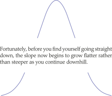
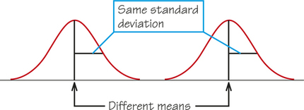
The points at which the change of curvature takes place are located 1 standard deviation from the mean on either side. You can feel the change as you run your finger along a normal curve, and in that way you can find the standard deviation. Try it on the two normal curves in Figure 5.22a, which have the same means but different standard deviations. Notice that the distribution with the larger standard deviation is more spread out and has a flatter normal curve.
213
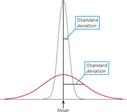
Normal curves with the same standard deviation have exactly the same shape. Changing the mean just moves the center of the curve to a new location, as Figure 5.22b shows, whereas changing the standard deviation changes the variability of the curve, as Figure 5.22a shows. A normal distribution is completely determined by two numbers: the mean and the standard deviation.
Mean and Standard Deviation of a Normal Distribution DEFINITION
The mean of a normal distribution is at the center of symmetry of the normal curve. The standard deviation of a normal distribution is the distance from the center to the change-of-curvature points on either side.
Self Check 11
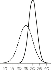
- Which of the normal density curves at right, the solid curve or the dashed curve, represents the distribution with the larger mean?
The solid curve represents the distribution with the larger mean since its center of symmetry is around 30 and the dashed curve’s center of symmetry is around 25.
- Which normal density curve represents a distribution with the larger standard deviation?
The dashed curve represents a distribution with the larger standard deviation since it is the flatter of the two density curves.
We have often used the quartiles to indicate the variability of a distribution. Because the standard deviation completely describes the variability of any normal distribution, it tells us where the quartiles are.
214
Quartiles of a Normal Distribution DEFINITION
The quartiles of a normal distribution are located about 0.67 (which is about 2/3) of a standard deviation away from the mean. In particular, the first quartile is located at 0.67 standard deviation below the mean, and, by symmetry, the third quartile is located at 0.67 standard deviation above the mean.
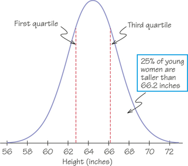
EXAMPLE 17 Heights of American Women: Finding the Quartiles
The distribution of heights of young American women (ages 18 to 24) is approximately normal, with a mean of 64.5 inches (that is, 5 feet 4.5 inches) and a standard deviation of 2.5 inches. Figure 5.23 shows this normal curve. The quartiles are 0.67 standard deviation, or inches away from the mean. The first quartile is , or 62.8 inches. The third quartile is , or 66.2 inches. The middle 50% of women’s heights lie approximately between 62.8 inches and 66.2 inches. These numbers are exact for the normal distribution with a mean of 64.5 inches and a standard deviation of 2.5 inches, but only approximately true for the actual heights of the women because real-life distributions of biological measurements such as heights are only approximately normal.
Why are normal distributions important in statistics? First, normal distributions are good models or approximations for some distributions of real data. Distributions that are often close to normal include scores on tests taken by many people (such as SAT exams and many psychological tests), repeated careful measurements of the same quantity, and characteristics of biological populations (such as heights of young women, yields of corn, and wingspans of a particular type of bird). Second, normal distributions are good approximations to the results of many kinds of chance outcomes, such as tossing a coin many times. We will return to normal curves when we study the mathematics of chance in Chapter 8.
215
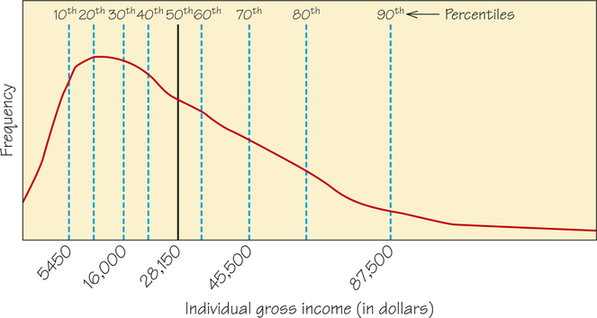
Don’t forget that many sets of data do not follow a normal distribution. Most income distributions, for example, are skewed to the right and thus are not normal. Take a look at Figure 5.24, which shows the distribution of the gross annual income in the United States for 2013. Notice that the deciles, the values that divide the distribution into ten groups of equal frequency, are marked on the graph. (The deciles are the 10th, 20th, 30th, ..., and 90th percentiles.) The increments between deciles become wider as you go out farther into the right tail of the distribution.
In Spotlight 5.4, we discuss another density curve, which has been fit to data using software.
Density Estimation Spotlight 5.4
Smooth curves that describe the overall pattern of distributions of data are called density curves. Normal curves are one type of density curve. There are many other types used for different purposes. Clever software for "density estimation" will calculate a density curve to describe any set of observations you give it.
Figure 5.25 shows a strongly skewed distribution, the survival times of 72 guinea pigs in a medical experiment. Two graphs of the distribution are overlaid: a histogram and a density curve produced by software from the data. The histogram and density curve agree on the overall shape and on the "bumps" in the long right tail.
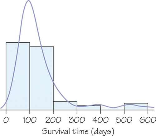
The density curve shows a higher single peak as a main feature of the distribution. The histogram divides the observations near the peak between two bars, thus reducing the height of the peak. Because density estimators don’t depend on dividing the data into classes as histograms do, many statisticians prefer them when they need a picture of a distribution.