6.5 6.4 Least-Squares Regression
In Example 4 (page 251), we used the straight line given by the equation
to predict BAC from the number of beers consumed. How did we get this particular equation? What makes it the equation of the “best-fitting” line for predicting BAC from beers consumed? Before we can answer the first question, we will first have to decide what we mean by the “best line.”
For a given scatterplot, different people might draw different summarizing lines by eye. For example, Figure 6.13 shows a scatterplot of the BAC-beer data along with three lines. Line 3 is the graph of the equation in the previous paragraph.
261
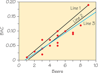
Line 1 was drawn through the points corresponding to the fewest and most beers consumed, (1, 0.01) and (9, 0.19). Line 2 was drawn through the points (3, 0.04) and (6, 0.10). So how do you determine which is the “best” line? If the criterion for the “best” line is the line passing through the most data points, Line 1 (which passes through three data points) would be the best, and Line 3 (which passes through one data point) the worst. However, Line 1 does a poor job of summarizing the overall pattern of these data. Only one data point lies above Line 1 and the rest lie on or below it. So picking a line that passes through the most data points is clearly a poor criterion for selecting a “best-fitting” line.
In looking for a new criterion for a “best” line, keep in mind that we will use this line to predict from . Thus, we want a line that is as close as possible to the points in the vertical dimension. That’s because the prediction errors that we make are errors in the -variable, which is the vertical dimension in the scatterplot.
Table 6.1 (page 243) shows that Student 12 drank 6 beers and was observed to have a BAC of 0.10. However, the regression-line equation in Example 4 showed that the predicted BAC for a student who drinks 6 beers is 0.095. These values are close, but not the same. Indeed, from Figure 6.6, we can see that the observed data point (6, 0.10) lies a bit above the line. The vertical deviation of this gap is the residual error (or simply residual), which is calculated as follows:
Residual DEFINITION
A residual (or residual error) is the difference between an observed value of the response variable and the value predicted by the regression line. In other words, a residual is the prediction error that remains after we have chosen the regression line:
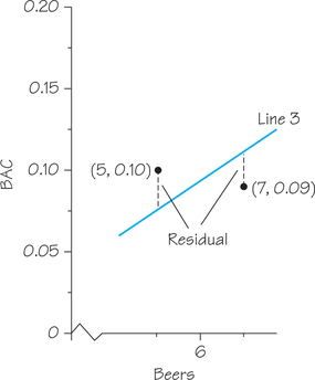
When the observed response lies above the line (e.g., the data point for Student 1, who had 5 beers and a BAC of 0.10, lies above Line 3 in Figure 6.13), the residual is positive. And when the response lies below the line (e.g., the data point for Student 14, who had 7 beers and a BAC of 0.09, lies below Line 3), the residual is negative. Figure 6.14 shows a graphical representation of these two residuals, the vertical gaps between these data points and the line.
262
Self Check 7
Using the regression-line equation from Example 4 (given at the start of this section), calculate the predicted BAC corresponding to 5 beers and 7 beers. Then calculate the residuals for the data values from Students 1 and 14 (these are the residuals represented graphically in Figure 6.14). Verify that one of these residuals is positive and the other negative.
Student 1: .
Student 14: .
Now, we return to the problem of picking a “best” line. The most common way to make the collection of residual errors for the entire dataset as small as possible is least-squares regression. Line 3 in Figure 6.13 is the least-squares regression line.
Least-Squares Regression Line DEFINITION
The least-squares regression line is the line that makes the sum of the squares of the residual errors, the vertical distances of the data points from the line, the least value possible.
So we now have a criterion for finding the “best-fitting” line—find the line that results in the smallest sum of the squares of the residual errors. Lines 2 and 3 in Figure 6.13 both appear to be good choices for this line. With a modest amount of algebra, we determined an equation for Line 2:
Using Excel, we then calculated the predicted values, residuals, and squares of the residuals, which are shown in Table 6.6. At the bottom of the last column of Table 6.6 is the sum of the squares of the residuals, which for Line 2 is 0.00625—a fairly small value. We then did the same calculations for Line 3: predicted , and found that the sum of the squares of the residuals was even smaller, 0.00585. So, based on the least-squares criterion, Line 3 is better than Line 2.
263
| Beers | BAC | Predicted BAC (Line 2) | Residuals | (Residuals)2 |
|---|---|---|---|---|
| 5 | 0.1 | 0.08 | 0.02 | 0.000400 |
| 2 | 0.03 | 0.02 | 0.01 | 0.000100 |
| 9 | 0.19 | 0.16 | 0.03 | 0.000900 |
| 8 | 0.12 | 0.14 | −0.02 | 0.000400 |
| 3 | 0.04 | 0.04 | 0 | 0.000000 |
| 7 | 0.095 | 0.12 | −0.025 | 0.000625 |
| 3 | 0.07 | 0.04 | 0.03 | 0.000900 |
| 5 | 0.06 | 0.08 | −0.02 | 0.000400 |
| 3 | 0.02 | 0.04 | −0.02 | 0.000400 |
| 5 | 0.05 | 0.08 | −0.03 | 0.000900 |
| 4 | 0.07 | 0.06 | 0.01 | 0.000100 |
| 6 | 0.1 | 0.1 | 0 | 0.000000 |
| 5 | 0.085 | 0.08 | 0.005 | 0.000025 |
| 7 | 0.09 | 0.12 | −0.03 | 0.000900 |
| 1 | 0.01 | 0 | 0.01 | 0.000100 |
| 4 | 0.05 | 0.06 | −0.01 | 0.000100 |
| 0.006250 |
We can use the least-squares criterion for deciding which of two lines fits the data better. However, we still need a solution to the following mathematical problem: Starting with observations on variables and , find the line that makes the sum of the squares of the vertical errors (the residuals) as small as possible. Here is the solution to this problem.
Finding the Least-Squares Regression Line PROCEDURE
- From our data on an explanatory variable and a response variable for individuals, calculate the means and the standard deviations and of the two variables (see Chapter 5, Spotlight 5.3, on page 206.).
- Calculate the correlation r (recall Spotlight 6.2, page 259).
- The regression line’s slope m is given by
- The regression line’s -intercept is given by
- If we call the predicted value of , then the equation of the least-squares regression line for predicting from (we also can say from “regressing on ") can now be stated:
264
This equation gives insight into the behavior of least-squares regression by showing that it is related to the means and standard deviations of the and observations and to the correlation between and . For example, it is clear that the slope always has the same sign as the correlation .
In practice, you don’t need to calculate the means, standard deviations, and correlation first. Statistical software, spreadsheet software, and many calculators can give the slope , intercept , and equation of the least-squares line from keyed-in values of the variables and (see Spotlight 6.5 on page 266).
EXAMPLE 8 Least-Squares Regression of BAC on Number of Beers
Go back to the BAC-beer data in Table 6.1 (page 243). Use your calculator or spreadsheet software to verify the following:
- The mean and standard deviation of , number of beers consumed, are and .
- The mean and standard deviation of , BAC, are and .
- The correlation between the number of beers and BAC is .
The least-squares regression line of BAC () on number of beers () has slope
and -intercept
The equation of the least-squares line is therefore
just as we claimed earlier.
When doing calculations like this by hand, you should carry extra decimal places in the intermediate calculations to get accurate values of the slope and intercept and not round until your final answer. Using software or a calculator with a regression function eliminates this worry.
Self Check 8
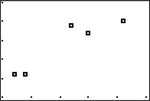
Return to the data in Table 6.5 (page 257) from Example 7.
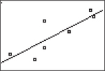
- Make a scatterplot of Critical Reading SAT, , against Math SAT, . Does the pattern of the dots appear roughly linear?
TI-84-created scatterplot of Critical Reading SAT against Math SAT:
- As was done for Example 8, use the formulas from the procedure to determine the equation of the least-squares regression line. (The means, standard deviations, and correlation were previously calculated in Example 7 on page 257.)
You now see that correlation and least-squares regression are connected closely. The expression for the slope says that along the regression line, a change of 1 standard deviation in corresponds to a change of standard deviations in . When the variables are correlated perfectly ( or ), the change in the predicted is the same (in standard deviation units) as the change in . Otherwise, because , the change in the predicted is less than the change in .
265
Now that we’ve covered both correlation and regression, check out Spotlight 6.4, which discusses how colleges might use regression and correlation in their admissions process.
Regression and Correlation in Action: College Success Spotlight 6.4
Can college success be predicted? Colleges with more applicants than spaces want to admit students who are most likely to succeed. There are many ways that we might define what success in college means, but admissions officers often focus on grades during the first year of college. There are also many choices of what variable might help admissions officers predict first-year grades: high school grade point average (GPA), number of advanced (e.g., AP) classes taken, scores on standardized tests (ACT or SAT), and so on. No one of these variables (or even all of them together) will generate a perfect prediction for an individual person because many other variables (such as work ethic or motivation) are not directly taken into account.
According to a 2013 report by the College Board, first-year college GPA has a correlation (corrected for having a range restricted by analyzing only admitted and enrolled students) of about 0.5 with any one of the three SAT section tests. (The correlations between first-year GPA and the SAT Critical Reasoning, Mathematics, and Writing tests were , , and , respectively.) This is a measure of (predictive) validity for the SAT, and it turns out that squaring this number yields the interpretation that the SAT alone explains about one-quarter of the variation of first-year college GPA. The correlation between first-year GPA and high school GPA is only slightly higher at 0.55.
Multiple regression extends regression to allow more than one explanatory variable to help explain a response variable. When the SAT and high school GPA are used together to try to predict first-year college GPA, the adjusted correlation jumps up to 0.63. The response variable of the associated regression equation can yield an “index” that admissions officers use to create a rough ordering of applicants.
Although the procedure box for calculating the equation of the least-squares regression line provides valuable insight about the line, it is extremely time consuming to compute that equation without the use of technology. Spotlight 6.5 gives instructions for using technology to calculate the regression equation.
Calculating the Equation of the Least-Squares Regression Line Spotlight 6.5
Finally, technology comes to the rescue!
If you have a scientific calculator, select the calculator mode to be able to do two-variable regression statistics, clear out any old data, and then enter your new - and -values. Once the data are entered, you can find the regression-line slope and -intercept by hitting the appropriate key(s). On the Internet, you can find websites that will help with the keystrokes for specific calculator models.
266
TI-83/841 Family and Other TI Graphing Calculators
You can use your graphing calculator to compute the coefficients of the least-squares regression line and the correlation, make a scatterplot of the data, and overlay a graph of the least-squares regression line. We use the data on midterm and final exam scores from Table 6.2 (page 244) as an example.
- Step 1. Preparation
- Turn off all STAT PLOTS: (for STAT PLOT) .
- Press and erase (or turn off) any functions stored in the .
- Turn on Diagnostics: (for CATALOG). Press (for D) to scroll to the Ds. Then use the down arrow key to scroll to DiagnosticOn. Press twice. (Your calculator should respond “Done.”)
- Press . Clear any data from lists L1 and L2.
Step 2. Determining the equation of the least-squares line and correlation
- You should still be in the lists from Step 1. Enter the data on the explanatory variable, midterm exam scores, in list L1, and the response variable, final exam scores, in list L2 (be sure not to interchange these lists).
- To calculate the coefficients of the least-squares regression line and the correlation:
- Press → CALC → LinReg(), and then .
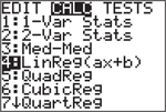
- Complete the command as follows: (for L1) VARS → Y-VARS → Function, and then press ].
- Press to store the equation as Y1 and then .
- Press → CALC → LinReg(), and then .
- Read off the coefficients of the line . (Notice that the slope is designated as and the -intercept as .) The correlation appears at the bottom of the screen.
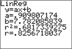
You can put the equation together by substituting the values for and to get .
- Step 3. Making a scatterplot and graphing the least- squares line
- Press (for STAT PLOT) to turn on STATPLOT 1.
- For TYPE, select the first scatterplot; L1 and L2 should be entered as the Xlist and Ylist, respectively; choose the mark to be used for the dots in the scatterplot.
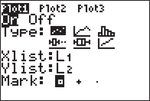
- Press ] (for ZoomStat).
- Step 4. After completing this problem, turn off all STAT PLOTS.
Keystrokes for other specific TI graphing calculators can be found online in the Texas Instruments guidebooks, which are downloadable from education.ti.com/calculators/downloads/US/#Guidebooks.
267
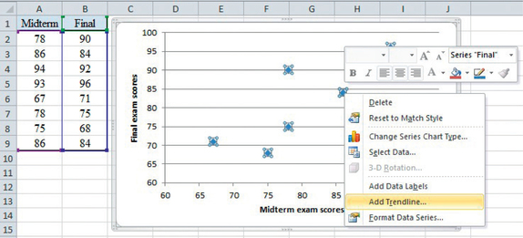
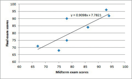
Excel
Again, we use the data from Table 6.2. The process will be to make a scatterplot of final exam scores against midterm exam scores and then to fit a line to the data.
- Enter the -data, midterm exam scores, in column A and the -data, final exam scores, in column B. (Don’t interchange the order of the columns.)
- Highlight your data by clicking at the top of column A, dragging over to the top of column B, and then down to the bottom of column B.
- Click the Insert tab and then the Scatter tab. Select the first scatterplot (Scatter with only Markers). You should now see a scatterplot of the data. Adjust the scaling for the axes so that the minimum for both the - and -axes is 60 (see Spotlight 6.1 on page 249).
- Next, right click on a dot in the scatterplot and select Add Trendline.
- Notice that Linear is selected by default. At the bottom, click the box opposite “Display Equation on chart.” Then click Close. A graph of the least- squares regression line along with its equation will be added to the scatterplot.