1 International Trade
This section begins our study of international economics by defining some important terms and summarizing the overall trends in world trade.
1. Objective: Define basic terms and identify overall trends
2. Basics
a. Explain what services are.
b. Define the trade balance, surpluses and deficits.
c. Distinguish between overall and bilateral deficits and surpluses.
d. In the trade chapters of the book, assume trade is balanced, for two reasons:
i. Overall deficits and surpluses are fundamentally macroeconomic phenomena, and will be treated in the macro part of the book
ii. Not clear how to interpret a bilateral deficit or surplus when there are imported intermediate inputs, a phenomenon that is more common now than in the past
The Basics of World Trade
Countries buy and sell goods and services from one another constantly. An export is a product sold from one country to another, and an import is a product bought by one country from another. We normally think of exports and imports as goods that are shipped between countries, but for services that is not necessarily the case. Construction services, for example, are performed on-site in the importing country rather than being shipped. Travel and tourism are large categories of service exports that also occur on-site: the money spent by a U.S. visitor to the Eiffel Tower is a service export of France, and a Chinese visitor to the Grand Canyon adds to U.S. service exports.
Find time series data on the trade balance and talk about how it has changed.
A country’s trade balance is the difference between its total value of exports and its total value of imports (usually including both goods and services). Countries that export more than they import, such as China in recent years, run a trade surplus, whereas countries that import more than they export, such as the United States, run a trade deficit. In addition to keeping track of the overall trade balance for a country with the rest of the world, we often see reported in the newspaper the bilateral trade balance, meaning the difference between exports and imports between two countries. The U.S. bilateral trade balance with China, for example, has been a trade deficit of more than $200 billion every year between 2005 and 2012.
4
In the models developed to understand international trade, we are not concerned with whether a country has a trade deficit or surplus but just assume that each country has balanced trade, with exports equal to imports. There are two reasons why we make this assumption. First, economists believe that an overall trade deficit or surplus arises from macroeconomic conditions, such as the overall levels of spending and savings in an economy—countries with high spending and low savings will run a trade deficit. (Macroeconomic conditions are studied in the second half of this book that deals with international macroeconomics.)
Second, the interpretation of a trade deficit or surplus is problematic when we focus on the bilateral trade balance between two countries, such as the United States and China. To see what the problem is, think about the U.S. import of a particular good from China, such as the iPhone (see Headlines: Sum of iPhone Parts: Trade Distortion).
In 2010, the iPhone 3GS was valued at about $179 when it was shipped from China to the United States, and it sold for about $500 in the United States. However only $6.50 of that amount reflects the value of Chinese labor used in the assembly.1 The rest of the $172.50 export value was actually imported into China from other countries, including: $60 for the flash memory, display module, and touch screen from Toshiba in Japan; $23 for the processor chip and memory from Samsung in Korea; $29 for the camera and transmitting and receiving devices from Infineon in Germany, and so on. Nevertheless, the entire $179 is counted as an export from China to the United States. This example shows that the bilateral trade deficit or surplus between countries is a slippery concept. It doesn’t really make sense to count the entire $179 iPhone as a Chinese export to the United States, as is done in official trade statistics, when only $6.50 is the value-added in China; that is, the difference between the value of the iPhone when it leaves China and the cost of parts and materials purchased in China and imported from other countries. That shortcoming of official statistics gives us a good reason to not focus on the bilateral trade deficit or surplus between countries, even though that number is often reported in the media.
This presents another opportunity to whet students' appetite for future policy debates.
The iPhone example illustrates how the manufacturing required for a single final product is often spread across many countries. That so many countries can be involved in manufacturing a final product and its components is a new phenomenon that illustrates the drop in transportation and communication costs in the modern world economy. In the past, trade occurred in more standardized goods (such as raw materials) that were shipped long distances, but were not shipped back-and-forth between countries during the manufacturing process. This new feature of world trade and production, often called offshoring, is discussed later in the book; here, we present the idea by looking at how trade patterns have changed over time.
5
Do exports of iPhones improve the U.S. trade balance? Not if imported parts used in producing it are counted. Growing debate about whether trade statistics should be based on country of origin or be adjusted for the value contributed products by different countries
Sum of iPhone Parts: Trade Distortion

Although the iPhone sold in the United States is assembled in China, most of its value comes from parts made in other countries. Counting its full value as a U.S. import from China therefore exaggerates the size of the U.S. trade deficit with China.
One widely touted solution for current U.S. economic woes is for America to come up with more of the high-tech gadgets that the rest of the world craves. Yet two academic researchers have found that Apple Inc.’s iPhone—one of the most iconic U.S. technology products—actually added $19 billion to the U.S. trade deficit with China last year. How is this possible?
…Though the iPhone is entirely designed and owned by a U.S. company, and is made largely of parts produced in other countries, it is physically assembled in China. Both countries’ trade statistics therefore consider the iPhone a Chinese export to the U.S. So a U.S. consumer who buys what is often considered an American product will add to the U.S. trade deficit with China. The result is that according to official statistics, “even high-tech products invented by U.S. companies will not increase U.S. exports,” …. This isn’t a problem with high-tech products, but with how exports and imports are measured …
The new research adds to a growing technical debate about traditional trade statistics that could have big real-world consequences. Conventional trade figures are the basis for political battles waging in Washington and Brussels over what to do about China’s currency policies and its allegedly unfair trading practices. But there is a growing belief that the practice of assuming every product shipped from one country is entirely produced by that country may need to be adjusted. “What we call ‘Made in China’ is indeed assembled in China, but what makes up the commercial value of the product comes from the numerous countries that preceded its assembly in China in the global value chain,” Pascal Lamy, the director-general of the World Trade Organization, said in a speech in October. “The concept of country of origin for manufactured goods has gradually become obsolete.” Mr. Lamy said that if trade statistics were adjusted to reflect the actual value contributed to a product by different countries, the size of the U.S. trade deficit with China—$226.88 billion, according to U.S. figures—would be cut in half. That means, he argued, that political tensions over trade deficits are probably larger than they should be.
Source: Excerpted from Andrew Batson, “Sum of iPhone Parts: Trade Distortion,” The Wall Street Journal, December 16, 2010, p. 3. Reprinted with permission of The Wall Street Journal, Copyright © 2010 Dow Jones & Company, Inc. All Rights Reserved Worldwide.
Answer: Yes, there is more of it, and the type of trade has changed.
a. U.S. trade has shifted from agriculture and raw materials towards manufactured goods.
b. Exports and imports of capital goods and consumer goods—which are likely to have part of their production abroad—have both increased.
Is Trade Today Different from the Past?
Is the type of trade today different from that in the past? The answer to this question is yes. Not only is there more international trade today than in the past, but the type of trade has also changed. We can see the changes in the type of trade by organizing imports and exports into four categories, depending on their use in the economy: (1) foods, feeds, and beverages; (2) industrial supplies and materials (raw materials like chemicals and petroleum and basic processed goods, such as steel, newsprint, and textiles); (3) capital goods (durable goods including aircraft, cars, computers, machinery, and so forth); (4) finished consumer goods (all finished household goods, except cars and computers, but including the iPhone). The percentage of U.S. imports and exports accounted for by these four categories from 1925 to 2010 is shown in Figure 1-1, with U.S. imports in panel (a) and exports in panel (b).

6
In Figure 1-1(a), we see that U.S. trade has shifted away from agriculture and raw materials and toward manufactured goods, as shown by the declining shares of foods, feeds, and beverages and industrial supplies and materials. Together, these two categories of traded goods accounted for 90% of imports in 1925 but only about 40% in 2010. Figure 1-1(b) shows that the export share of these same categories also fell from about 80% to 40% over that time.
7
Figure 1-1(a) also shows that the imports of capital goods plus consumer goods have increased from 10% in 1925 to 60% in 2010. In Figure 1-1(b), we see that the export of capital plus consumer goods has likewise increased from about 20% of exports in 1925 to about 60% of exports in 2010. Capital goods and consumer products (including the iPhone) are the types of goods that are most likely to have a portion of their production process sent overseas through offshoring. The fact that the share of trade in these products has increased shows that the type of trade today has changed greatly from the past.
Map of World Trade
Figure 1-2 is a neat picture. Let the students contemplate it in class, and try to draw their own conclusions.
3. Map of World Trade
a. Lots of trade between European countries.
b. Large trade flows between Europe and the U.S. Why do such similar economies trade so much? Sets the stage for New Trade Theory, in a later chapter.
c. Large trade flows between Canada and the U.S., between the U.S. and Latin America, and between Latin American countries—NAFTA, Trans-Pacific proposal
d. Large trade flows between Asia and the U.S. and Europe. Largest Asian trading partners for U.S. are China, Japan, South Korea, and Taiwan. There’s increasing importance of export of services.
Why does Asia trade so much? Factor endowments, setting the stage for Heckscher-Ohlin in a later chapter
e. Other regions:Exports of Middle Eastern, Russian, and Central Asian oil
Africa: Extensive trade with Europe, and with U.S., but little internal trade—an importance of trade for economic development.
To show the flow of exports and imports around the world, we use the map in Figure 1-2, which shows trade in billions of dollars for 2010. That year about $16.8 trillion in goods crossed international borders. (Because trade in services is harder to measure between countries, we do not include it in Figure 1-2.) The amount of trade in goods is illustrated by the width of the lines, with the largest trade flows having the heaviest lines and the smallest having dashed lines. For large trade flows, we usually draw two lines indicating the direction of each trade flow. For smaller amounts of trade, we draw a single dashed line, with the amount of the trade flows shown on each arrow. The trade flows within certain regions, such as Europe, are described by a circle, with the total amount of trade shown.

8
On the side of the board, keep a running list of interesting topics to address. (e.g., Why do countries impose tariffs and what are their economic consequences?)
European and U.S. Trade The largest amount of trade shown in Figure 1-2 is the flow of goods within Europe, which was $3.9 trillion in 2010, or almost one-quarter (23%) of world trade! This fact is shown in Table 1-1 as internal trade within Europe. The European countries trade a great deal with one another because there are so many countries located there and because it is easy to ship from one country to another. Furthermore, trade is high because import tariffs (taxes on international trade) are low. The European Union is a group of countries within Europe that have zero tariffs on imports from one another. That group of countries expanded from 15 to 25 members in 2004, with two more countries joining in 2007, so most of the European countries trade with each other at zero tariffs.2
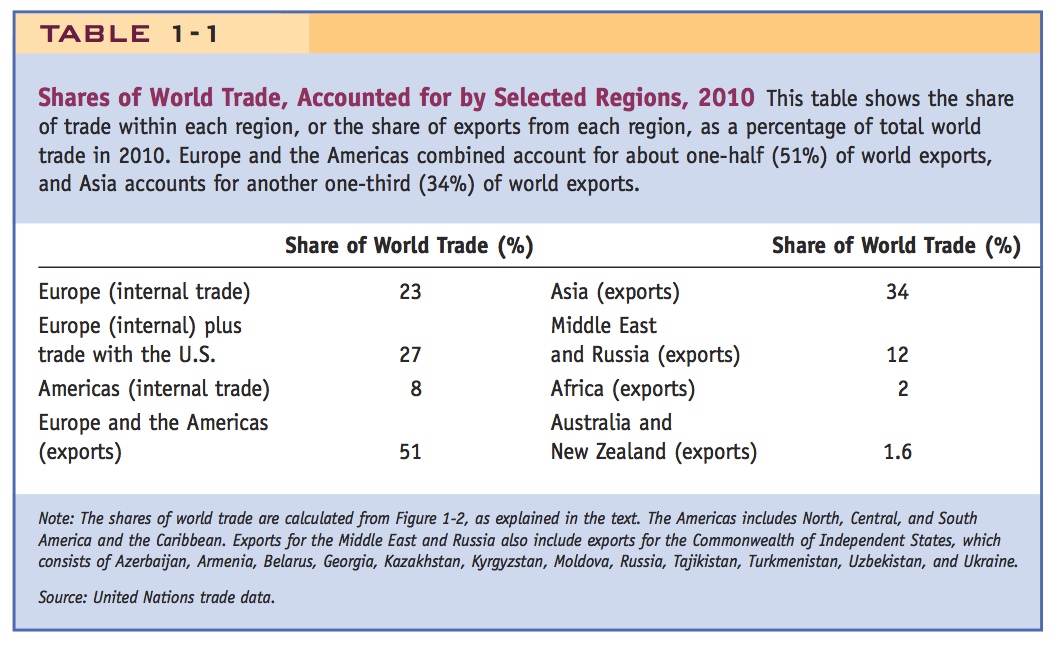
In addition to large trade flows among the European countries, there are also large trade flows between the United States and Europe. The United States exported $303 billion of goods to Europe in 2010 and imported $377 billion of goods from Europe. If we add those flows to the trade flow within Europe, we find that Europe and the United States account for about $4.6 trillion, or 27%, of the $16.8 trillion in world trade flows. This fact is also recorded in Table 1-1, and it shows that a large amount of world trade occurs between countries that are similar in their levels of advanced industrialization and great wealth. Why do these countries trade so much with one another?
9
Addressing these two topics constitutes a large part of the next few chapters. So go ahead and provide a taxonomy of them: (1) Classical (subdivided into Ricardian, fixed-factor, and Heckscher-Ohlin) and (2) New Trade Theory.
The many differences among European countries and between Europe and the United States explain, in part, the trade between them. The first model of trade we study in the next chapter, called the Ricardian model, was initially used to explain trade between England and Portugal based on their difference in climate. Despite such differences, however, industrialized countries like the United Kingdom and the United States have many similarities in their consumption patterns and in their ability to produce goods and services. Why, then, do “similar” countries trade so much with one another? We try to answer that question in a later chapter, by arguing that even similar countries have enough variety in the goods they produce (such as different models of cars or types of cheese) that it is natural for them to trade with one another.
Trade in the Americas There is also a large amount of trade recorded within the Americas; that is, between North America, Central America, South America, and the Caribbean. In 2010 the United States exported $248 billion to Canada and imported $289 billion from Canada. In addition, the United States exported $303 billion to Latin America (which consists of Mexico, Central and South America, and the Caribbean) and imported $378 billion from Latin America. If we add together these trade flows, plus the amounts that Canada trades with Latin America and Latin America trades internally, we get $1.4 trillion as the total trade in goods within the Americas in 2010, or another 8% of world trade.
So trade within the Americas is about one-third of trade within Europe, and the vast majority of that trade is within the North American Free Trade Area, consisting of Canada, the United States, and Mexico. There is a proposal to extend free trade with the United States to many of the other countries that border the Pacific Ocean in the Trans-Pacific Partnership. There is also a proposal for a free trade area between the United States and the European Union in the Trans-Atlantic Trade and Investment Partnership. We study the consequences of free trade areas for the countries included, and for the countries left out, in a later chapter.
If we add the trade flows within the Americas to those within Europe and also include all other exports of these two regions to the rest of the world, we find that these combined regions account for $8.5 trillion in exports, or about one-half (51%) of the $16.8 trillion in world trade. This finding is also recorded in Table 1-1.
Trade with Asia Very large trade flows are also shown in Figure 1-2 to and from Asia. For example, Europe exported $575 billion to the Asian countries in 2010 and imported $947 billion. The United States exported $69 billion to Japan and $301 billion to the rest of Asia and imported about twice as much from each of these regions.
If we break up Asian exports to the United States, the largest exporting country is China (selling $383 billion in 2010), followed by Japan ($124 billion), South Korea ($51 billion), and Taiwan ($37 billion). India, Indonesia, Thailand, Vietnam, and the other Asian countries export smaller amounts. The exports from all of Asia to the United States totaled $792 billion in 2010.
All the exports from Asia totaled about $5.7 trillion in 2010, or about one-third (34%) of world trade, as shown in Table 1-1. Remember that this total includes only trade in goods and omits trade in services, which is becoming increasingly important. India, for example, performs a wide range of services such as accounting, customer support, computer programming, and research and development tasks for firms in the United States and Europe. Because these services are performed for U.S. and European firms in another country, they are considered service exports from the country in which the services are performed. In the quote at the beginning of the chapter, Ben Bernanke, the chairman of the U.S. Federal Reserve, points out that the entrance of China, India, and the former Communist-bloc countries into the world economy has led to a level of globalization that exceeds anything we have seen in the past.
10
Why does Asia trade so much? There are many answers to this question. One answer is that wages in many Asian countries are much lower than in the industrialized world. China’s low wages allow it to produce goods cheaply and then export them. But why are Chinese wages so low? One explanation is that Chinese workers are less productive (the Ricardian model presented in the next chapter explains wages in that way). Low wages cannot explain why Japan exports so much, however. Japan’s wages are very high because its workers are very productive; its exports to Europe and the United States are large because its highly skilled workforce and large amount of capital (factories and machines) make it possible for Japan to produce high-quality goods in abundance. Conversely, its scarcity of raw materials explains why it imports those goods from resource-rich countries such as Australia, Canada, and the United States. Trade patterns based on the amounts of labor, capital, and natural resources found in each country are explained by the Heckscher-Ohlin trade model, the topic of a later chapter.
Other Regions The Middle East sells oil to many countries, earning $1.5 trillion in export revenues and spending $1.1 trillion on imports. Like the Middle East, Russia also has reserves of oil and natural gas, which countries in Europe rely on and that are an important source of export revenue for Russia. In 2010 Russia earned $534 billion in its export sales and spent $302 billion on imports. The exports of the Middle East and Russia combined (together with countries around Russia like Azerbaijan, Kazakhstan, Kyrgyzstan, Uzbekistan, Tajikistan, and Turkmenistan) total $2 trillion, or another 12% of world trade.
And then there is Africa. The European nations have the closest trade links with Africa, reflecting both their proximity and the former colonial status of some African countries. Europe exported $99 billion and imported $105 billion from Africa in 2010, as compared with African trade with the United States, which totaled $90 billion, mostly in U.S. imports. Internal trade within Africa is also small: only $71 billion in 2010. Adding up all its exports, the continent of Africa accounts for only 2% of world trade, a very small number given Africa’s huge land mass and population.
In the quote at the start of the chapter, Kofi Annan, former secretary general of the United Nations, expresses the view that Africa’s growth out of poverty will depend on its developing greater linkages with the world economy through trade. A thorough treatment of the difficulties faced by African and other least-developed countries is beyond the scope of this book, and we recommend that the interested reader consult a textbook on development economics. But the lessons we draw from our examination of international trade and trade policy will still hold for the African countries.
The export percentages shown in Table 1-1 add up to 100% (being careful not to add Europe and the Americas twice), once we include trade at the bottom of the world: Australia and New Zealand export $270 billion (accounting for 1.6% of world exports) and import $242 billion. You do not need to know all the specific percentages shown in Table 1-1, but an understanding of the broad picture (such as which regions trade the most) will be useful as we undertake our study of international trade.
11
Trade Compared with GDP
4. Trade Compared with GDP
Report trade as a ratio of GDP
a. Small, open economies like Hong Kong and Singapore rank high
b. Large economies, like the U.S., rank lower
Note this is rather small, given the hoopla about globalization. However, argue that trade in financial assets has become much more globalized.
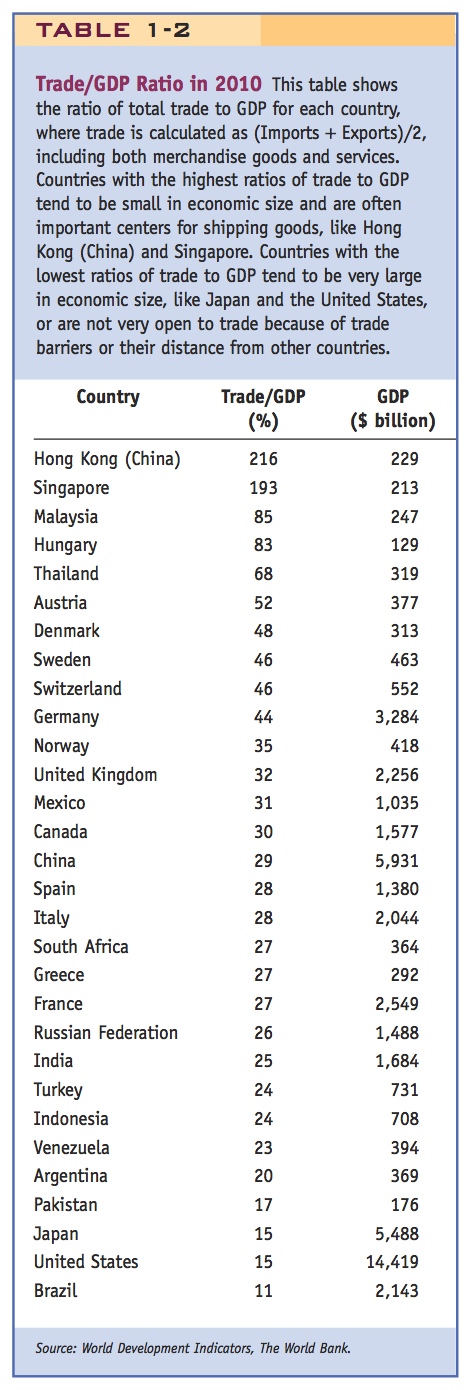
So far, we have discussed the value of trade crossing international borders. But there is a second way that trade is often reported, and that is as a ratio of trade to a country’s gross domestic product (GDP), the value of all final goods produced in a year. For the United States, the average value of imports and exports (for goods and services) expressed relative to GDP was 15% in 2010. Most other countries have a higher ratio of trade to GDP, as shown in Table 1-2.
At the top of the list are Hong Kong (China) and Singapore, where the amount of trade exceeds their GDP!3 These two countries are important shipping and processing centers, so they are importing goods, processing them, and then exporting the final product to other countries. As in our iPhone example, the value-added involved in the exports ($6.50 for each iPhone) can be much less than the total value of exports ($179). That explains why the total amount that countries trade can be greater than their GDP. At the bottom of the list are the United States and Japan, which are very large in economic size; Pakistan, which is only starting to engage in international trade; and Brazil and Argentina, which are far away from other importing countries.
So even though the United States is among the world’s largest exporters and importers, it is nearly the smallest trading nation of the countries shown in Table 1-2 when trade is measured as a percent of a country’s GDP. What is the reason for this inverse relationship? Very large countries tend to have a lot of trade among states or provinces within their borders, but that trade is not counted as part of international trade. Other countries that are not quite as large as the United States but are close to their major trading partners, such as Germany, the United Kingdom, Italy, and Spain, and Canada and Mexico, tend to appear in the middle of the list in Table 1-2. Smaller countries with close neighbors, such as Hong Kong, Singapore, Malaysia, and the smaller European nations, will have more trade spilling across their borders and have the highest ratios of trade to GDP.
12
Barriers to Trade
5. Barriers to Trade
Trade barriers: tariffs, transport costs, adverse events
Table 1-2 shows the differences across countries in the amount of trade relative to GDP, but this ratio changes over time. There are many reasons, aside from country size, for the amount of trade to change. Those reasons include import tariffs, taxes that countries charge on imported goods; transportation costs of shipping from one country to another; events, such as wars and natural disasters, that lead to reduced trade; and so on. The term trade barriers refers to all factors that influence the amount of goods and services shipped across international borders. To see how these trade barriers have changed over time, Figure 1-3 graphs the ratio of trade in goods and services to GDP for a selection of countries for which historical data are available: Australia, Canada, Japan, the United Kingdom, the United States, and an average of countries in continental Europe (Denmark, France, Germany, Italy, Norway, and Sweden).4

“First Golden Age” of Trade
A good reading for them on this is John Keynes' famous description in "The Economic Consequences of the Peace." It is short and pithy.
6. “First Golden Age of Trade” (1890 until WWI [1914-1918]): dramatic fall in transport costs—steamships, railroads—saw growth in trade
a. Interwar Period – Use of tariffs and quotas during Great Depression caused contraction of trade and exacerbated the Depression
The period from 1890 until World War I (1914–1918) is sometimes referred to as a “golden age” of international trade. Those years saw dramatic improvements in transportation, such as the steamship and the railroad, that allowed for a great increase in the amount of international trade. Figure 1-3 shows this increase in the ratio of trade to GDP between 1890 and World War I. The United Kingdom reached the highest ratio of trade to GDP (30%), while Australia, Canada, and the average of European countries all exceeded 20% at their peaks (shown in 1913 or 1920). Japan reached a ratio of trade to GDP of 15%, while the United States achieved 7.5%, which was low in comparison with other countries (as expected for a large country) but still high by the United States’ historical standards.
Interwar Period In the aftermath of World War I, the ratio of trade to GDP fell in all countries, a decline that was made worse by the Great Depression, which began in 1929, and World War II, which began in Europe in 1939. During the Great Depression, the United States adopted high tariffs called the Smoot-Hawley tariffs, named after Senator Reed Smoot from Utah and Representative Willis C. Hawley from Oregon. Signed into law in June 1930, the Smoot-Hawley Tariff Act raised tariffs to as high as 60% on many categories of imports.
Show them Charles Kindleberger's famous graph, from the World in Depression, showing the collapse of world trade.
These tariffs were applied by the United States to protect farmers and other industries, but they backfired by causing other countries to retaliate. Canada retaliated by applying high tariffs of its own against the United States; France used import quotas, a limitation on the quantity of an imported good allowed into a country, to restrict imports from the United States; Britain gave preferences to goods available from its former colonies; and other countries reacted, too. As reported by one economic historian:5
A groundswell of resentment spread around the world and quickly led to retaliation. Italy objected to duties on hats and bonnets of straw, wool-felt hats, and olive oil; Spain reacted sharply to increases on cork and onions; Canada took umbrage at increases on maple sugar and syrup, potatoes, cream, butter, butter milk, and skimmed milk. Switzerland was moved to boycott American type writers, fountain pens, motor cars, and films because of increased duties on watches, clocks, embroidery, cheese and shoes…. Retaliation was begun long before the [Smoot-Hawley] bill was enacted into law in June 1930.
13
The response of these countries, initially against the United States and then against one another, led to a dramatic increase in worldwide tariffs during the interwar period. The average worldwide tariff for 35 countries from 1860 to 2010 is shown in Figure 1-4. We see that the average tariff fluctuated around 15% from 1860 to 1914. After World War I, however, the average tariff rose because of the Smoot-Hawley Tariff Act and the reaction by other countries, reaching about 25% by 1933. The high tariffs led to a dramatic fall in world trade in the interwar period, with large costs to the United States and the world economy. These costs are one reason that the Allied countries met together after World War II to develop international agreements to keep tariffs low, such as the General Agreement on Tariffs and Trade, now known as the World Trade Organization. Later in this book, we study tariffs and other trade policies in more detail and the international institutions that govern their use. The lesson from the interwar period is that high tariffs reduce the amount of trade and impose large costs on the countries involved.

14
“Second Golden Age” of Trade
7. “Second Golden Age” (since 1950): tariff reductions, containerization, GATT, WTO
a. Fall in trade since the Great Recession
It took many years for the world economy to regain the same level of global integration that existed before World War I. From Figure 1-3, we can see that some countries (the United Kingdom, Europe, and Australia) began increasing trade immediately after the end of World War II in 1945, so their ratio of trade to GDP was much higher in 1950 than it was in 1940. Some countries did not show an increase until after 1950 and others not until after 1960. In addition to the end of World War II and tariff reductions under the General Agreement on Tariffs and Trade, improved transportation costs contributed to the growth in trade. The shipping container, invented in 1956, allowed goods to be moved by ship, rail, and truck more cheaply than before (see Headlines: A Sea Change in Shipping 50 Years Ago). As a result of all these factors, world trade grew steadily after 1950 in dollar terms and as a ratio to GDP. For this reason, the period after 1950 is called the “second golden age” of trade and globalization.
15
Containerization has profoundly changed trade in manufactured goods.
A Sea Change in Shipping 50 Years Ago
The following article discusses the invention of the shipping container 50 years ago, which allowed goods to be shipped between countries at a much lower cost.
Globalization is having an anniversary. It was 50 years ago that Malcom McLean, an entrepreneur from North Carolina, loaded a ship with 58 35-foot containers and sailed from Newark, N.J., to Houston. He wasn’t the only one to suggest that containers might make shipping more efficient. But he was the first to design a transportation system around the packaging of cargo in huge metal boxes that could be loaded and unloaded by cranes.
Container shipping eventually replaced the traditional “break-bulk” method of handling crates, barrels and bags, and stowing them loose in a ship’s hold, a system in use since the days of the Phoenicians. Replacing break-bulk with cargo containers dramatically reduced shipping costs, reinvigorating markets and fueling the world economy….
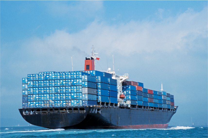
In 1959, according to Matson Research, the industry was loading and unloading 0.627 tons per man hour. By 1976, with container shipping well established, the figure was 4,234 tons per man hour. A ship’s time in port shrank from three weeks to 18 hours. In 1950, an average commercial vessel could carry 10,000 tons at a speed of 16 knots. With container shipping, the average commercial vessel carried 40,000 tons at a speed of 23 knots, Matson says. The numbers are even larger today. A vessel capable of carrying 6,600 20-foot containers can carry 77,000 tons at up to 24.8 knots.
“Containerization has transformed global trade in manufactured goods as dramatically as jet planes have changed the way we travel and the Internet has changed the way we communicate,” said Joseph Bonney, editor of the Journal of Commerce, the bible of the shipping industry. “The Asian economic miracle of the last two decades could not have happened without the efficient transportation that containerized shipping provides.”
Source: Excerpted from George Raine, “A Sea Change in Shipping: 50 Years Ago, Container Ships Altered the World,” San Francisco Chronicle, February 5, 2006, electronic edition.
Many of the countries shown in Figure 1-3 have substantially exceeded the peak levels of trade relative to GDP that prevailed just before or after World War I. Canada’s trade ratio grew from 24% in 1920 to 43% by 2000, and then back down to 30% in 2010 (due to reduced exports of natural gas). The average of European countries increased from 20% in 1913 to 39% in 2010. Likewise, the U.S. trade ratio grew from 7.5% in 1920 to 15% by 2010. A few countries, such as Australia and the United Kingdom, have only recently achieved the level of trade relative to GDP that they had prior to World War I and are now in a position to surpass that level. For the world as a whole, the ratio of trade to GDP in 2010 was about 30%, up from 20% in 1980 and 12% in 1970.
16
Near the end of the decade, in the years just before 2010, we see a fall in the ratios of trade to GDP for several countries in Figure 1-3. What happened to cause this slow-down in trade? In the fall of 2008 there was a financial crisis in the United States that quickly spread to other countries.6 The crisis had a substantial impact on the amount of international trade, because it sent many countries into recessions that led to a fall in both exports and imports. This fall in trade is illustrated in the final years shown in Figure 1-3, with signs of a recovery of trade in most countries by 2010. Still, it will take some years more for the world economy to again reach a level of trade, or ratio of trade to GDP, that is as high as that achieved before the financial crisis.