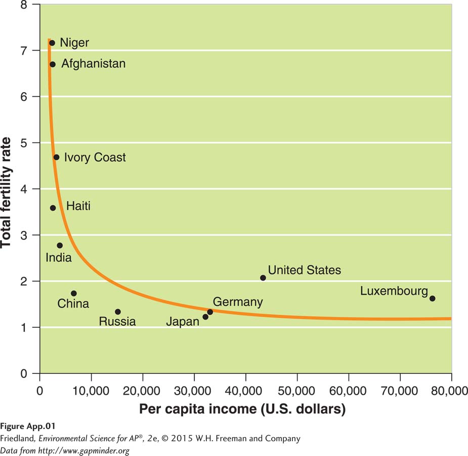
FIGURE A.1 (book FIGURE 23.2) Scatter plot graph. In this graph, we place data points that coincide with the income of different countries on the x axis and the corresponding fertility rate of each country on the y axis.
(Data from http://www.gapminder.org)