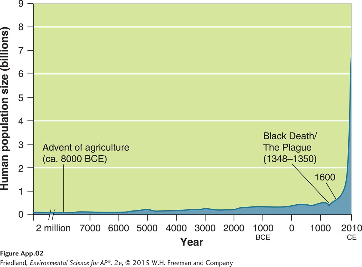
FIGURE A.2 (book FIGURE 22.1) Line graph. In this graph, a line is used to track the change in human population size over time. Note that this graph extends far back in time and there is only a small increase in population size from 2 million BCE to 7000 BCE, so a break in the x axis is used to allow a shorter axis. This allows us to focus on the period of rapid population growth that happened during the past 7,000 years.