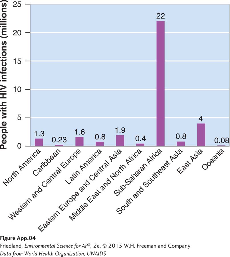
FIGURE A.4 (book FIGURE 22.7) Bar graph. When we have numerical values that come from different categories we can use a bar graph to plot data. In this example, we can plot the number of people infected with HIV in several countries around the world.
(Data from World Health Organization, UNAIDS)