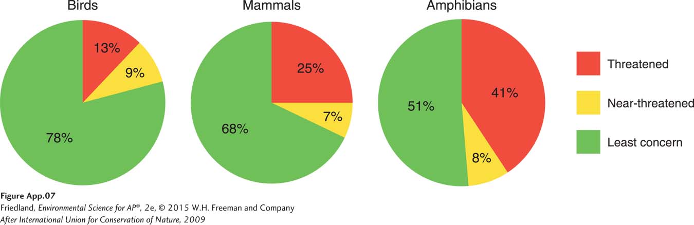
FIGURE A.7 (book FIGURE 59.4) Pie chart. Pie charts plot data that are percentages and collectively add up to 100 percent. These pie charts illustrate the percentages of birds, mammals, and amphibians of the world that are categorized as either threatened, near-
(After International Union for Conservation of Nature, 2009)