image
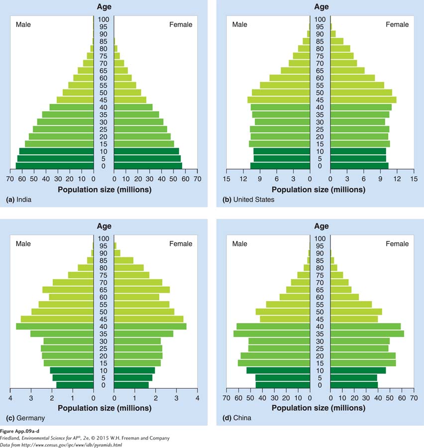
FIGURE A.9 (book FIGURE 22.8) Age-structure diagrams. These graphs allow us to understand the relative number of males and females in different age classes. In doing so, these graphs illustrate whether a population is likely to grow, stay stable, or shrink in future years.
(Data from http://www.census.gov/ipc/www/idb/pyramids.html)