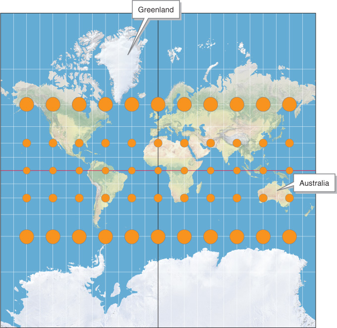
Mercator conformal projection. Even though they are of different sizes, all the orange areas on this map are perfect circles and cover the same amount of Earth’s surface. Compared with those in the tropics, the circles at high latitudes are larger because those areas have been stretched. Notice that Greenland appears far larger than Australia in this projection. Antarctica’s size is also greatly exaggerated. See the Mollweide projection in Figure A.3 to compare the relative areas of these landmasses.