2.4 Market Equilibrium
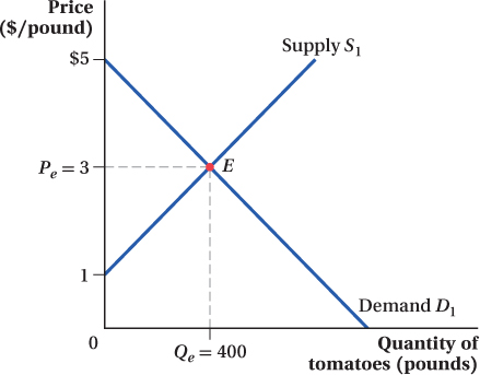
The true power of the supply and demand model emerges when we combine demand and supply curves. Both relate quantities and prices, so we can draw them on the same graph, with price on the vertical axis and quantity on the horizontal axis. Figure 2.5 overlays the original demand and supply demand curves for tomatoes at Seattle’s Pike Place Market. As a reminder, expressed as equations, the demand curve is Q = 1,000 – 200P (with an equivalent inverse demand curve P = 5 – 0.005Q), and the supply curve is Q = 200P – 200 (with an inverse supply curve of P = 1 + 0.005Q).
market equilibrium
The point at which the quantity demanded by consumers exactly equals the quantity supplied by producers.
equilibrium price
The only price at which quantity supplied equals quantity demanded.
The point where the demand and supply curves cross is the market equilibrium. The equilibrium is labeled as point E on Figure 2.5, and the price and quantity associated with this point are labeled Pe and Qe. The equilibrium price Pe is the only price at which quantity supplied equals quantity demanded.
The Mathematics of Equilibrium
So what is the market equilibrium for our Pike Place Market tomatoes example? We can read off Figure 2.5 that the equilibrium price Pe is $3 per pound, and the equilibrium quantity Qe is 400 pounds. But we can also determine these mathematically by using the equations for the demand and supply curves. Quantity demanded is given by QD = 1,000 – 200P (we’ve added the superscript “D” to quantity just to remind us that this equation is the demand curve), and quantity supplied is QS = 200P – 200 (again, we’ve added a superscript). We know that at market equilibrium, quantity demanded equals quantity supplied; that is, Qe = QD = QS. Using the equations above, we have
22
QD = QS
1,000 – 200P = 200P – 200
1,200 = 400P
Pe = 3
At a price P of $3 per pound, quantity demanded QD equals quantity supplied QS, so the equilibrium price Pe is $3, as we see in Figure 2.5. To find the equilibrium quantity Qe, we plug this value of Pe back into the equation for either the demand or supply curve, because both quantity demanded and quantity supplied will be the same at the equilibrium price:
Qe = 1,000 – 200Pe = 1,000 – 200(3) = 1,000 – 600 = 400
We just solved for the equilibrium price and quantity by using the fact that the quantity demanded equals the quantity supplied in equilibrium, and substituting the demand and supply curve equations into this equality. We could have obtained the same answer by instead using the fact that the price given by the inverse demand and supply curves is the same at the market equilibrium quantity. That is,
5 – 0.005Qe = 1 + 0.005Qe
Solving this equation gives Qe = 400 pounds, just as before. Plugging Qe = 400 back into either the inverse demand or supply equation indicates that the market price Pe is $3 per pound, as expected.
make the grade
Does quantity supplied equal quantity demanded in equilibrium?
Solving for the market equilibrium as we just did is one of the most common exam questions in intermediate microeconomics classes. The basic idea is always the same: Take the equations for the demand curve and the supply curve, solve for the equilibrium price, and then plug that equilibrium price back into either the supply curve or the demand curve (it does not matter which) to determine the equilibrium quantity. It is simple, but it is easy to make math errors under the time pressure of an exam, especially if the demand and supply curves take on more complicated forms than the basic examples we deal with here.
A simple trick will ensure that you have the right answer, and it takes only a few seconds. Take the equilibrium price that you obtain and plug it into both the demand and supply curves. If you don’t get the same answer when you substitute the equilibrium price into the supply and demand equations, you know you made a math error along the way because the quantity demanded must equal the quantity supplied in equilibrium.
Why Markets Move toward Equilibrium
When a market is in equilibrium, the quantity demanded by consumers and the quantity supplied by producers are equal at the current market price. To see why equilibrium is a stable situation, let’s look at what happens when price is at a nonequilibrium level. If the current price is higher than the equilibrium price, there will be excess supply. If the price is lower, there will be excess demand.
Excess Supply Suppose the price in a market were higher than the equilibrium price, say, at Phigh instead of Pe, as shown in Figure 2.6a. At that price, the quantity supplied,  , is greater than the quantity demanded,
  . Producers come out of the woodwork wanting to sell at this high price, but not all producers can find willing buyers at that price. The excess quantity for sale equals
–
, the horizontal distance between the demand and supply curves at Phigh. To eliminate this excess supply, producers need to attract more buyers, and to do this, sellers must lower their prices. As price falls, quantity demanded rises and quantity supplied falls until the market reaches equilibrium at point E.
. Producers come out of the woodwork wanting to sell at this high price, but not all producers can find willing buyers at that price. The excess quantity for sale equals
–
, the horizontal distance between the demand and supply curves at Phigh. To eliminate this excess supply, producers need to attract more buyers, and to do this, sellers must lower their prices. As price falls, quantity demanded rises and quantity supplied falls until the market reaches equilibrium at point E.
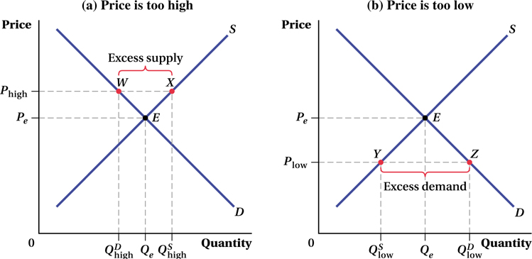 , while consumers demand only
. This results in an excess supply of the good, as represented by the distance between points W and X. Over time, price will fall and the market will move toward equilibrium at point E.
, while consumers demand only
. This results in an excess supply of the good, as represented by the distance between points W and X. Over time, price will fall and the market will move toward equilibrium at point E.
 , while consumers demand
  . This results in an excess demand for the good, as represented by the distance between points Y and Z. Over time, price will rise and the market will move toward equilibrium at point E.
23
Excess Demand The opposite situation exists in Figure 2.6b. At price Plow, consumers demand more of the good,
, than producers are willing to supply,
. Buyers want a lot of tomatoes if they are this cheap, but not many producers will deliver them at such a low price. To eliminate this excess demand, buyers who cannot find the good available for sale will bid up the price and enterprising producers will be more than willing to raise their prices. As price rises, quantity demanded falls and quantity supplied rises until the market reaches equilibrium at point E.7
Adjusting to Equilibrium It is important to note that in the real world, equilibrium is a bit mysterious. In our stylized model, we’re acting as if all the producers and consumers gather in one spot and report to a sort of auctioneer how much they want to produce or consume at each price. The auctioneer combines all this information, computes and announces the market-
24
 See the problem worked out using calculus
figure it out 2.1

For interactive, step-
Suppose that the demand and supply curves for a monthly cell phone plan with unlimited texts can be represented by
QD = 50 – 0.5P
QS = –25 + P
The current price of these plans in the market is $40 per month. Is this market in equilibrium? Would you expect the price to rise or fall? If so, by how much? Explain.
Solution:
There are two ways to solve the first question about whether the price will rise or fall. The first is to calculate the quantity demanded and quantity supplied at the current market price of $40 to see how they compare:
QD = 50 – 0.5P = 50 – 0.5(40) = 50 – 20 = 30
QS = –25 + P = –25 + 40 = 15
Because quantity demanded is greater than quantity supplied, we can tell that there is excess demand (a shortage) in the market. Many people are trying to get texting plans, but are finding them sold out because few suppliers want to sell at that price. Prices will rise to equalize quantity supplied and quantity demanded, moving the market to equilibrium.
Alternatively, we could start by solving for the market equilibrium price:
QD = QS
50 – 0.5P = –25 + P
1.5P = 75
P = $50
The current market price, $40, is below the market equilibrium price of $50. (This is why there is excess demand in the market.) Therefore, we would expect the price to rise by $10. When the market reaches equilibrium at a price of $50, all buyers can find sellers and all sellers can find buyers. The price will then remain at $50 unless the market changes and the demand curve or supply curve shifts.
The Effects of Demand Shifts
As we have learned, demand and supply curves hold constant everything else besides price that might affect quantities demanded and supplied. Therefore, the market equilibrium depicted in Figure 2.5 will hold only as long as none of these other factors change. If any other factor changes, there will be a new market equilibrium because either the demand or supply curve or both curves will have shifted.
Suppose the demand for tomatoes falls when, as in our previous example, a news story reports that tomatoes are suspected of being the source of a salmonella outbreak. The resulting change in consumer tastes causes the demand curve to shift in (i.e., to the left), as Figure 2.7 shows, from D1 to D2.
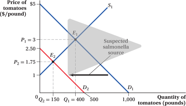
How does the market equilibrium change after this demand shift? The equilibrium price and quantity both fall. The equilibrium quantity falls from Q1 to Q2, and the equilibrium price drops from P1 to P2. The reason for these movements is that if prices stayed at P1 after the fall in demand, tomato farmers would be supplying a much greater quantity than consumers were demanding. The market price must fall to get farmers to rein in their quantity supplied until it matches the new, lower level of demand.
25
We can solve for the new equilibrium price and quantity using the same approach we used earlier, but using the equation for the new demand curve D2, which is Q = 500 – 200P. (The supply curve stays the same.)
QD = QS
500 – 200P2 = 200P2 – 200
400P2 = 700
P2 = 1.75
So the new equilibrium price is $1.75 per pound, compared to $3 per pound from before the demand shift. Plugging this into the new demand curve (or the supply curve) gives the new equilibrium quantity:
Q2 = 500 – 200(1.75) = 150
The new equilibrium quantity is 150 pounds, less than half of what it was before the demand shift.
We could have just as easily worked through an example in which demand increases and the demand curve shifts out. Perhaps tastes change and people want to drink their vegetables by downing several glasses of tomato juice a day or incomes rise or substitute produce items become more expensive. In the face of a stable supply curve, this increase in demand would shift the curve up to the right and cause both the equilibrium price and quantity to rise. At the previous market price, the new, postshift quantity demanded would be greater than sellers’ willingness to supply. The price would have to rise, causing a movement along the supply curve until the quantities supplied and demanded are equal.
26
Shifts in Curves versus Movement along a Curve This analysis highlights the importance of distinguishing between shifts in a demand or supply curve and movements along those curves. This distinction can sometimes seem confusing, but understanding it is critical to much of the analysis that follows in this book. We saw in Figure 2.7 what happens to a market when there is a change in consumers’ tastes that makes them view a product more negatively. That change in tastes made consumers want to buy less of the product at any given price—
See the problem worked out using calculus
figure it out 2.2
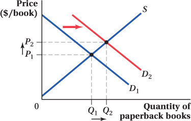
Draw a supply and demand diagram of the market for paperback books in a small coastal town.
Suppose that a hurricane knocks out electrical power for an extended period of time. Unable to watch television or use a computer, people must resort to reading books for entertainment. What will happen to the equilibrium price and quantity of paperback books?
Does this change reflect a change in demand or a change in quantity demanded?
Solution:
Books are a substitute good for television shows and computer entertainment. Because there is no power for televisions or computers (effectively raising the price of these substitutes), the demand for books will rise, and the demand curve will shift out to the right. As the figure shows, this shift will result in a higher equilibrium price and quantity of books purchased.
Because the hurricane changes the availability (and therefore the effective price) of substitute goods, this shifts the amount of books demanded at any given price. This is a change in the demand for paperback books.
The Effects of Supply Shifts
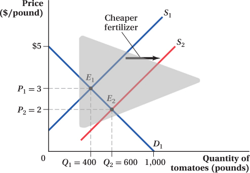
Now let’s think about what happens when the supply curve shifts, but the demand curve does not. Figure 2.8 shows the case in which the supply of tomatoes rises, shifting the supply curve out from S1 to S2. This shift implies that, at any given price, farmers are willing to sell a larger quantity of tomatoes than before. Such a shift would result from a reduction in farmers’ input costs—
27
Figure 2.8 shows how the equilibrium changes. The supply curve has shifted from its original position S1 (given by the equation Q = 200P – 200) to S2 (given by the equation Q = 200P + 200). If the price stayed at the original equilibrium price P1 after the supply shift, the amount of tomatoes that sellers would be willing to supply would exceed consumers’ quantity demanded. Therefore, the equilibrium price must fall, as seen in the figure. This drop in price causes an increase in quantity demanded along the demand curve. The price drops until the quantity demanded once again equals the quantity supplied. The new equilibrium price is P2, and the new equilibrium quantity is Q2.
We can solve for the new equilibrium price and quantity using the equations for the original demand curve and the new supply curve:
QD = QS
1,000 – 200P2 = 200P2 + 200
400P2 = 800
P2 = 2
The cost drop and the resulting increase in supply lead to a fall in the equilibrium price from $3 to $2 per pound. This is intuitive: Lower farmers’ costs end up being reflected in lower market prices. We can plug this price into either the demand or new supply equation to find the new equilibrium quantity:
Q2 = 1,000 – 200(2) = 600
Q2 = 200(2) + 200 = 600
The equilibrium quantity of tomatoes increases from 400 to 600 pounds in response to the increase in supply and the subsequent fall in the equilibrium price.
Again, we could go through the same steps for a decrease in supply. The supply curve would shift up to the left. This decline in supply would increase the equilibrium price and decrease the equilibrium quantity.
28
FREAKONOMICS
What Do President Obama and Taylor Swift Have in Common?
It’s not that often that you hear the names Barack Obama and Taylor Swift in the same sentence. One spends his days making decisions about war, health care, and the environment that will affect millions of people for years to come; the other wields her influence through catchy songs about lost love. So what do they have in common? Both have used clever economic thinking to thwart the prying paparazzi.
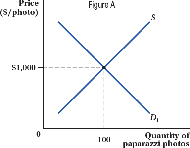
At the start of President Obama’s first term, the president was overwhelmed by the media attention and the toll it took on his daughters Sasha and Malia, so he asked his staff to come up with some solutions. White House staff recognized that the number of paparazzi photos represents a market equilibrium. Because of the public’s strong demand for pictures of the Obama family, media outlets are willing to fork over large sums of money for high-
One way to reduce the number of paparazzi taking photos would be to decrease the demand for the photos and shift the demand curve inward. If that were to happen, both the price and quantity of paparazzi photos would decline. How could the White House reduce the demand for paparazzi photos? One thing we know from economics is that if two goods are substitutes, the demand for one good will fall if the price for the other good decreases because consumers will shift away from buying the first good and toward buying the second, cheaper good. So the administration needed a substitute for paparazzi pictures. The answer? Staged photos taken by White House photographers, given to media outlets for free.
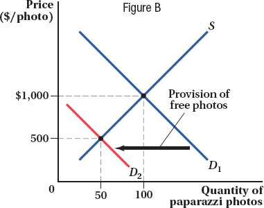
Each White House–
It turns out that Taylor Swift had the same flash of insight. For years Taylor Swift shielded her belly button from the public eye, leading to rumors that she might not even have a belly button. She justified her actions by claiming, “I don’t want people to know if I have one or not. I want that to be a mystery.” But in 2015, when Taylor Swift was scuba diving with friends in the middle of the ocean, paparazzi on a fishing boat found her and snapped a picture of her in a bikini. Recognizing that this picture would be worth many thousands of dollars since she had been hiding her belly button for so long, Taylor Swift immediately took her own (better) picture and posted it on Instagram. The availability of this free substitute again shifted the demand curve inward, depriving the stalkers of the chance to make big bucks off of their initial shot.
With millions of followers on Instagram, Taylor Swift has long appreciated the power of social media. The White House was a little slower to gain this insight, but after seeing the initial success of its anti-
29
figure it out 2.3
For interactive, step-
Suppose that the supply of lemonade is represented by QS = 40P, where Q is measured in pints and P is measured in cents per pint.
If the demand for lemonade is QD = 5,000 – 10P, what are the current equilibrium price and quantity?
Suppose that a severe frost in Florida raises the price of lemons and thus the cost of making lemonade. In response to the increase in cost, producers reduce the quantity supplied of lemonade by 400 pints at every price. What is the new equation for the supply of lemonade?
After the frost, what will the equilibrium price and quantity of lemonade be?
Solution:
To solve for the equilibrium price, we need to equate the quantity demanded and quantity supplied:
QD = QS
5,000 – 10P = 40P
50P = 5,000
P = 100 cents
To solve for the equilibrium quantity, we want to substitute the equilibrium price into either the demand curve or the supply curve (or both!):
QD = 5,000 – 10(100) = 5,000 – 1,000 = 4,000 pints
QS = 40(100) = 4,000 pints
If the quantity supplied of lemonade falls by 400 pints at every price, then the supply curve is shifting left (in a parallel fashion) by a quantity of 400 at each price:
 = QS – 400 = 40P – 400
The new supply curve can be represented by
= 40P – 400.To solve for the new equilibrium, we would set QD =
:QD =
5,000 – 10P2 = 40P2 – 400
50P2 = 5,400
P2 = 108 cents
Solving for equilibrium quantity can be done by substituting the equilibrium price into either the demand or supply equation:
QD = 5,000 – 10(108) = 5,000 – 1,080 = 3,920 pints
QS = 40(108) – 400 = 4,320 – 400 = 3,920 pints
As we would expect (see Table 2.2), the equilibrium price rises and the equilibrium quantity falls.
30
Summary of Effects
∂ This partial derivative symbol indicates that further insight into the topic using calculus is available in an end-
Table 2.2 summarizes the changes in equilibrium price and quantity that result when either the demand or supply curve shifts while the other curve remains in the same position. When the demand curve shifts, price and quantity move in the same direction. An increase in demand leads consumers to want to purchase more of the good than producers are willing to supply at the old equilibrium price. This will tend to drive up prices, which in turn induces producers to supply more of the good. The producers’ response is captured by movement along the supply curve.
∂ The online appendix describes the effect of changes in variables other than the good’s own price on a good’s equilibrium price and quantity.
When the supply curve shifts, price and quantity move in opposite directions. If supply increases, the supply curve shifts out, and producers want to sell more of the good at the old equilibrium price than consumers want to buy. This will force prices down, giving consumers an incentive to buy more of the good. Similarly, if supply shifts in, the equilibrium price has to rise to reduce the quantity demanded. These movements along the demand curve involve price and quantity changes in opposite directions because demand curves are downward-
Application: Supply Shifts and the Video Game Crash
People love video games. Over half of households in the United States have at least one video game console, and many of these have multiple consoles. Sales of video game consoles and software were around $15.4 billion in the United States in 2013. To put that number in perspective, it is almost 50% more than 2014’s total domestic box office haul of $10.4 billion.
Seeing these numbers, you’d never know that in the industry’s early days, there was a point when many people declared video games a passing fad and a business in which it was impossible to make a profit. Why did they say this? The problem wasn’t demand. Early video games, from Pong to Space Invaders and consoles like the Atari 2600, were a huge hit and cultural touchstones. The problem was supply—
31
Two primary factors led to the supply shift. Home video consoles, led by the Atari 2600 but also including popular machines from Mattel and Coleco, had taken off in the early 1980s. At this early point in the industry, console producers hadn’t yet learned the best way to handle licensing arrangements with third-

The leading console makers didn’t help themselves with their own game-
The sudden rush of producers to put product on the market created an outward shift in the supply curve—
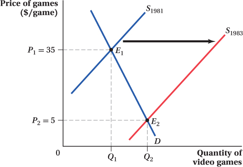
That’s exactly what happened in the video game industry. Price changes, in particular, were precipitous. Games that had been selling a year earlier at list prices of $35–
32
So, if you are wondering why, even today, Nintendo takes its time releasing games on the Wii U, now you know. 
See the problem worked out using calculus
figure it out 2.4
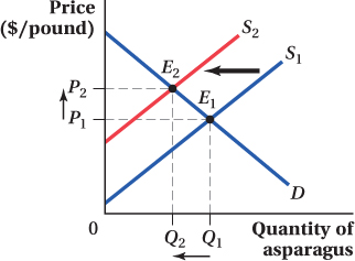
Last month, you noticed the price of asparagus rising, and you also noted that there was less asparagus being sold than in the prior month. What inferences can you draw about the behavior of the supply and demand for asparagus?
Solution:
We need to work backward to determine what could have happened to either supply or demand to lead to the change described in this question. Let’s start with the change in price. The equilibrium price of asparagus is rising. This must mean one of two things: Either the demand for asparagus rose or the supply of asparagus fell. (If you have trouble seeing this, draw a couple of quick figures.)
We also know that the equilibrium quantity of asparagus fell. A drop in the equilibrium quantity can only have two causes: either a decrease in the demand for asparagus or a fall in the supply of asparagus. (Again, you may want to draw these out to see such results.)
Which shift leads to both a rise in equilibrium price and a fall in equilibrium quantity? It must be a decrease in the supply of asparagus, as shown in the figure.
33
What Determines the Size of Price and Quantity Changes?
Thus far, the analysis in the chapter (summarized in Table 2.2) tells us about the direction in which equilibrium price and quantity move when demand and supply curves shift. But we don’t know the size of these changes. In this section, we discuss the factors that determine how large the price and quantity changes are.
Size of the Shift One obvious and direct influence on the sizes of the equilibrium price and quantity changes is the size of the demand or supply curve shift itself. The larger the shift, the larger the change in equilibrium price or quantity.
make the grade
Did the curve shift, or was it just a movement along the curve?
A common type of exam question on demand and supply will involve one or more “shocks” to a market—
If you follow a few simple steps, this type of question need not be too difficult.
Figure out what the shock is in any particular problem. It is the change that causes a shift in either the supply curve, the demand curve, or both. There is a nearly infinite variety of shocks. A pandemic could wipe out a large number of consumers, a new invention might make it cheaper to make a good, a different good that consumers like better might be introduced, or inclement weather may damage or kill off a large portion of a certain crop.
Importantly, though, a change in either the price or the quantity of the good in the market being studied cannot be the shock. The changes in price and quantity in this market are the result of the shock, not the shock itself. Be careful, however: Changes in prices or quantities in some other market can serve as a shock to this market. If the price of chunky peanut butter falls, for example, that could be a shock to the market for grape jelly or the market for creamy peanut butter.
Determine whether the shock shifts the demand or supply curve.
To figure out whether a shock shifts the demand curve and how it shifts it, ask yourself the following question: If the price of this good didn’t change, would consumers want to buy more, less, or the same amount of the good after the shock? If consumers want more of the good at the same price after the shock, then the shock increases the quantity demanded at every price and shifts the demand curve out (to the right). If consumers want less of the good at the same price after the shock, then the shock decreases demand and the demand curve shifts in. If consumers want the same amount of the good at the same price, then the demand curve doesn’t move at all, and it’s probably a supply shock.
Let’s go back to the grape jelly example. Our shock was a decline in the price of peanut butter. Do consumers want more or less grape jelly (holding the price constant) when peanut butter gets cheaper? The answer to this question is probably “more.” Cheap peanut butter means consumers will buy more peanut butter, and since people tend to eat peanut butter and jelly together, consumers will probably want more jelly even if the price of jelly stays the same. Therefore, the decline in peanut butter’s price shifts the demand for grape jelly out.
To figure out whether a shock shifts the supply curve and how it shifts it, ask yourself the following question: If the price of this good didn’t change, would suppliers want to produce more, less, or the same amount of the good after the shock? In the jelly example, a change in the price of peanut butter doesn’t affect the costs of making jelly—
it’s not an input into jelly production. So it’s not a supply shock. An increase in the price of grapes, however, would be a supply shock in the market for grape jelly.
Draw the market’s demand and supply curves before and after the shocks. In the jelly example, we would draw the original demand and supply curves, and then add the new demand curve (to the right of the initial demand curve) that results from the increase in the demand for jelly because of lower peanut butter prices. From this, it’s easy to execute the final step, interpreting what impact the shock has on equilibrium price and quantity. For grape jelly, the increase in demand will result in a higher equilibrium price and quantity for jelly because the demand shift creates movement up and to the right along the jelly supply curve.
Practice in following this recipe will make manipulating demand and supply curves second nature.
34
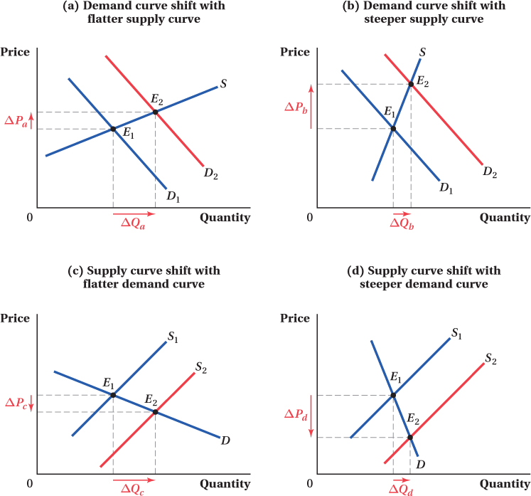
Slopes of the Curves Even for a fixed-
Figure 2.10 demonstrates this. Panels a and b show the same shift in the demand curve, from D1 to D2. In panel a, the supply curve is relatively flat, while in panel b, it’s relatively steep. When the demand curve shifts, if the supply curve is flat, the change in the equilibrium quantity (ΔQa) will be relatively large but the change in price (ΔPa) will be small. When the supply curve is steep (panel b), the price change (ΔPb) is large and the quantity change (ΔQb) is small. Similarly, panels c and d show the same supply curve shift, but with differently sloped demand curves. The same results hold for shifts in the supply curve—
35
This analysis raises an obvious question: What affects the slope of demand and supply curves? We discuss the economic forces that determine the steepness or flatness of demand and supply curves next.
Application: The Supply Curve of Housing and Housing Prices: A Tale of Two Cities
From panels a and b of Figure 2.10, we can see that, when the demand curve shifts, the slope of the supply curve determines the relative size of the change in equilibrium price and quantity. Data for housing prices provide a good application of this idea. Specifically, we can look at how urban housing prices respond to an increase in the demand for housing caused by population growth.

Consider housing in the cities of New York City and Houston. Because the metropolitan New York area is so densely built up, it is expensive for developers to construct additional housing. As a result, developers’ costs rise so quickly with the amount of housing they build, the quantity of housing supplied doesn’t respond much to price differences. There’s only so much the developers can do. This means the supply curve of housing in New York is steep—

Houston, on the other hand, is much less dense. It is surrounded by farm and ranch land, and there is still a lot of space to expand within the metro area. This means developers can build new housing without driving up their unit costs very much; they can just buy another farm and build housing on it if the price is right. For this reason, the quantity of housing supplied in Houston is quite responsive to changes in housing prices. That is, the housing supply curve in Houston is fairly flat.
Theory predicts that in response to an outward shift in the demand for housing in the two cities, New York (with its steep supply curve) should see a relatively large increase in the equilibrium price and a very small change in the equilibrium quantity of housing. Houston, on the other hand, with the flatter supply curve, should see a relatively small increase in price and a comparably large increase in quantity for an equal-
So let’s look at some data. Look first at Figure 2.11, which shows how the populations of the New York and Houston metro areas changed for the 36 years up to 2013. (The figure shows the population index for each metro area, giving the city’s population as a percentage of its starting value.) Population in both cities rose over these 36 years. The New York metro area’s population grew about 20%, while Houston’s population saw a far greater rise, more than doubling.
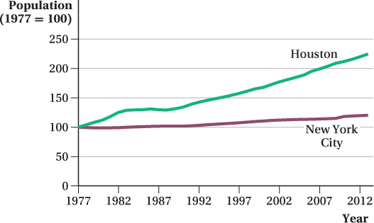
36
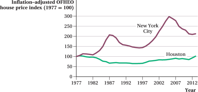
These population influxes resulted in an increased demand for housing and, thus, outward shifts in the demand curve for housing in each city. Again, the prediction of the supply and demand model is that the equilibrium price response to a given-
Looking at Figure 2.12, it’s clear this prediction holds. The figure shows inflation-
37
Changes in Market Equilibrium When Both Curves Shift
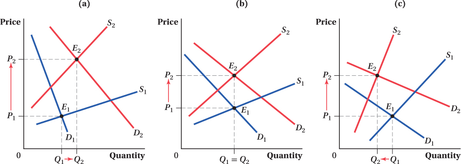
Sometimes, we are faced with situations in which demand and supply curves move simultaneously. For example, Figure 2.13 combines two shifts: decreases (inward shifts) in both supply and demand. Let’s return to the tomato market at Pike Place Market and suppose that there is a big increase in oil prices. This increase drives up the cost of production because harvesting and distribution costs rise for sellers. Increased oil prices also decrease the demand for tomatoes, because driving to the market gets more expensive for consumers and so there are fewer people buying at any given price. The original equilibrium occurred at the intersection of D1 and S1, point E1. The new equilibrium is at point E2, the intersection of D2 and S2.
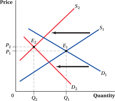
In this particular case, the simultaneous inward shifts in supply and demand have led to a substantial reduction in the equilibrium quantity and a slight increase in price. The reduction in quantity should be intuitive. The inward shift in the demand curve means that consumers want to buy less at any given price. The inward shift in the supply curve means that at any given price, producers want to supply less. Because both producers and consumers want less quantity, equilibrium quantity falls unambiguously, from Q1 to Q2.
The effect on equilibrium price is not as clear, however. An inward shift in demand with a fixed supply curve will tend to reduce prices, but an inward shift in supply with a fixed demand curve will tend to raise prices. Because both curves are moving simultaneously, it is unclear which effect will dominate, and therefore whether equilibrium price rises or falls. We have drawn the curves in Figure 2.13 so that equilibrium price rises slightly, from P1 to P2. But had the demand and supply curves shifted by different amounts (or had they been flatter or steeper), the dual inward shift might have led to a decrease in the equilibrium price, or no change in the price at all.
As a general rule, when both curves shift at the same time, we will know with certainty the direction of change of either the equilibrium price or quantity, but never both. This result can be seen by a closer inspection of Table 2.2. If the demand and supply curve shifts are both pushing price in the same direction, which would be the case if (1) the demand curve shifted out and the supply curve shifted in or (2) the demand curve shifted in and the supply curve shifted out, then the same shifts 1 or 2 will push quantities in opposite directions. Likewise, if the shifts in both curves serve to move quantity in the same direction—
38
This ambiguity is also apparent in the example in Figure 2.14. The directions of the shifts in the demand and supply curves are the same in each panel of the figure: Supply shifts inward from S1 to S2, and demand shifts outward from D1 to D2. Both of these shifts will lead to higher prices, and this is reflected in the change in the equilibrium (from point E1 to E2). But, whether the equilibrium quantity rises, falls, or stays the same depends on the relative size of the shifts and the slopes of the curves. The figure’s three panels show examples of each possible case. When examining a situation in which both supply and demand shift, you might find it helpful to draw each shift in isolation first, note the changes in equilibrium quantity and price implied by each shift, and then combine these pieces of information to obtain your answer.