4.2 Indifference Curves
indifferent
The special case in which a consumer derives the same utility level from each of two or more consumption bundles.
As we discussed in the previous section, the right way to think about utility is in relative terms; that is, in terms of whether one bundle of goods provides more or less utility to a consumer than another bundle. An especially good way of understanding utility is to take the special case in which a consumer is indifferent between bundles of goods; that is, each bundle provides the consumer with the same level of utility.
Consider a simple case in which there are only two goods to choose between, say, square feet in an apartment and the number of friends living in the same building. Michaela wants a large apartment, but also wants to be able to easily see her friends. First, Michaela looks at a 750-
∂ The online appendix explores the mathematics of monotonic transformations of utility functions.
110
Figure 4.1a graphs these three bundles. The square footage of the apartment is on the horizontal axis and the number of friends is on the vertical axis. These are not the only three bundles that give Michaela the same level of utility; there are many different bundles that accomplish that goal—
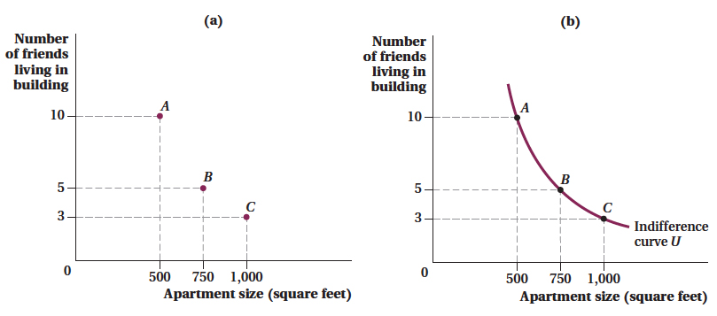
(b) An indifference curve connects all bundles of goods that provide a consumer with the same level of utility. Bundles A, B, and C provide the same satisfaction for Michaela. Thus, the indifference curve represents Michaela’s willingness to trade off between friends in her apartment building and the square footage of her apartment.
indifference curve
A mathematical representation of the combination of all the different consumption bundles that provide a consumer with the same utility.
The combination of all the different bundles of goods that give a consumer the same utility is called an indifference curve. In Figure 4.1b, we draw Michaela’s indifference curve, which includes the three points shown in Figure 4.1a. Notice that it contains not just the three bundles we discussed, but many other combinations of square footage and friends in the building. Also notice that it always slopes down: Every time we take away a friend from Michaela, she needs more square footage to remain indifferent. (Equivalently, we could say any apartment with less space would require more friends in the building to keep her equally well off.)
111
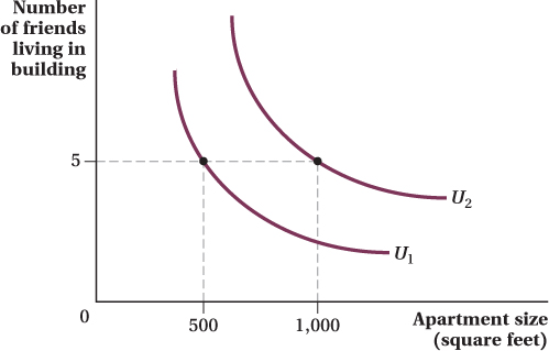
For each level of utility, there is a different indifference curve. Figure 4.2 shows two of Michaela’s indifference curves. Which corresponds to the higher level of utility? The easiest way to figure this out is to think like Michaela. One of the points on the indifference curve U1 represents the utility Michaela would get if she had 5 friends in her building and a 500-
Characteristics of Indifference Curves
Generally speaking, the positions and shapes of indifference curves can tell us a lot about a consumer’s behavior and decisions. However, our four assumptions about utility functions put some restrictions on the shapes that indifference curves can take.
We can always draw indifference curves. The first assumption, completeness and rankability, means that we can always draw indifference curves: All bundles have a utility level, and we can rank them.
We can figure out which indifference curves have higher utility levels and why they slope downward. The “more is better” assumption implies that we can look at a set of indifference curves and figure out which ones represent higher utility levels. This can be done by holding the quantity of one good fixed and seeing which curves have larger quantities of the other good. This is exactly what we did when we looked at Figure 4.2. The assumption also implies that indifference curves never slope up. If they did slope up, this would mean that a consumer would be indifferent between a particular bundle and another bundle with more of both goods. There’s no way this can be true if more is always better.
112
Indifference curves never cross. The transitivity property implies that indifference curves for a given consumer can never cross. To see why, suppose our apartment-
hunter Michaela’s hypothetical indifference curves intersect with each other, as shown in Figure 4.3. The “more is better” assumption implies she prefers bundle E to bundle D, because E offers both more square footage and more friends in her building than does D. Now, because E and F are on the same indifference curve U2, Michaela’s utility from consuming either bundle must be the same by definition. And because bundles F and D are on the same indifference curve U1, she must also be indifferent between those two bundles. But here’s the problem: Putting this all together means she’s indifferent between E and D because each makes her just as well off as F. We know that can’t be true. After all, she must like E more than D because it has more of both goods. Something has gone wrong. What went wrong is that we violated the transitivity property by allowing the indifference curves to cross. Intersecting indifference curves imply that the same bundle (the one located at the intersection) offers two different utility levels, which can’t be the case. 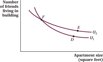 Figure 4.3: Figure 4.3 A Consumer’s Indifference Curves Cannot CrossFigure 4.3: Indifference curves cannot intersect. Here, Michaela would be indifferent between bundles D and F and also indifferent between bundles E and F. The transitivity property would therefore imply that she must also be indifferent between bundles D and E. But this can’t be true, because more is preferred to less, and bundle E contains more of both goods (more friends in her building and a larger apartment) than D.
Indifference curves are convex to the origin (i.e., they bend toward the origin in the middle). The fourth assumption of utility—
the more you have of a particular good, the less you are willing to give up of something else to get even more of that good— implies something about the way indifference curves are curved. Specifically, it implies they will be convex to the origin; that is, they will bend in toward the origin as if it is tugging on the indifference curve, trying to pull it in. To see what this curvature means in terms of a consumer’s behavior, let’s think about what the slope of an indifference curve means. Again, we’ll use Michaela as an example. If the indifference curve is steep, as it is at point A in Figure 4.4, Michaela is willing to give up a lot of friends to get just a few more square feet of apartment space. It isn’t just coincidence that she’s willing to make this tradeoff at a point where she already has a lot of friends in the building but a very small apartment. Because she already has a lot of one good (friends in the building), she is willing to give up quite a lot of it in order to gain more of the other good (apartment size) she doesn’t have much of. On the other hand, where the indifference curve is relatively flat, as it is at point B of Figure 4.4, the tradeoff between friends and apartment size is reversed. At B, the apartment is already big, but Michaela has few friends around, so she now needs to receive a great deal of extra space in return for a small reduction in friends to be left as well off.
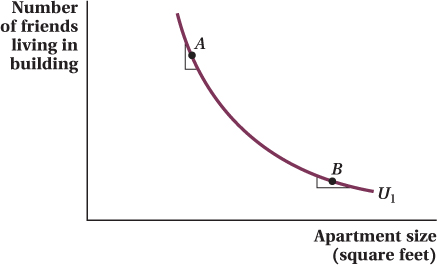 Figure 4.4: Figure 4.4 Tradeoffs along an Indifference CurveFigure 4.4: At point A, Michaela is willing to give up a lot of friends to get just a few more square feet, because she already has a lot of friends in the building but little space. At point B, Michaela has a large apartment but few friends around, so she now would require a large amount of space in return for a small reduction in friends to be left equally satisfied.
113
Because tradeoffs between goods generally depend on how much of each good a consumer would have in a bundle, indifference curves are convex to the origin. Except for some extreme cases where the indifference curves become completely flat lines or bend all the way into right angles (which we will discuss later in the chapter), all the indifference curves we draw will have this shape.
make the grade
Draw some indifference curves to really understand the concept
Indifference curves, like many abstract economic concepts, are often confusing to students when they are first introduced. But one nice thing about indifference curves is that preferences are the only thing necessary to draw your own indifference curves, and everybody has preferences! If you take just the few minutes of introspection necessary to draw your own indifference curves, the concept starts to make sense.
Start by selecting two goods that you like to consume—
The next step is to pick some bundle of these two goods that has a moderate amount of both goods, for instance, 12 pieces of candy and 3 slices of pizza. Put a dot at that point in your graph. Now carry out the following thought experiment. First, imagine taking a few pieces of candy out of the bundle and ask yourself how many additional slices of pizza you would need to leave you as well off as you are with 12 pieces of candy and 3 slices of pizza. Put a dot at that bundle. Then, suppose a couple of more candy pieces are taken away, and figure out how much more pizza you would need to be “made whole.” Put another dot there. Next, imagine taking away some pizza from the original 12-
Now try starting with a different initial bundle, say, one with twice as many of both goods as the first bundle you chose. Redo the same thought experiment of figuring out the tradeoffs of some of one good for a certain number of units of the other good, and you will have traced out a second indifference curve. You can start with still other bundles, either with more or less of both goods, figure out the same types of tradeoffs, and draw additional indifference curves.
There is no “right” answer as to exactly what your indifference curves will look like. It depends on your preferences. However, their shapes should have the basic properties that we have discussed: downward-
114
The Marginal Rate of Substitution
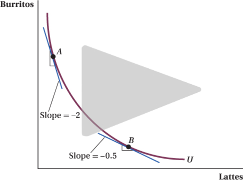
Indifference curves are all about tradeoffs: how much of one good a consumer will give up to get a little bit more of another good. The slope of the indifference curve captures this tradeoff idea exactly. Figure 4.5 shows two points on an indifference curve that reflects Sarah’s preferences for food in a month. She lives on lattes and burritos. At point A, the indifference curve is very steep, meaning Sarah will give up multiple burritos to get one more latte. The reverse is true at point B. At that point, Sarah will trade multiple lattes for one more burrito. As a result of this change in Sarah’s willingness to trade as we move along the indifference curve, the indifference curve is convex to the origin (the middle bends toward the origin).
This shift in the willingness to substitute one good for another along an indifference curve might seem confusing. You might be more familiar with thinking about the slope of a straight line (which is constant) than the slope of a curve (which varies at different points along the curve). Also, how can preferences differ along an indifference curve? After all, a consumer isn’t supposed to prefer one point on an indifference curve over another, but now we’re saying the consumer’s relative tradeoffs between the two goods change as one moves along the curve. Let’s address each of these issues in turn.
First, the slope of a curve, unlike a straight line, depends on where on the curve you are measuring the slope. To measure the slope of a curve at any point, draw a straight line that just touches the curve (but does not pass through it) at that point but nowhere else. This point where the line (called a tangent) touches the curve is called a tangency point. The slope of the line is the slope of the curve at the tangency point. The tangents that have points A and B as tangency points are shown in Figure 4.5. The slopes of those tangents are the slopes of the indifference curve at those points. At point A, the slope is –2, indicating that at this point Sarah would require 2 more burritos to forgo 1 latte. At point B, the slope is –0.5, indicating that at this point Sarah would require only half of a burrito to be willing to give up a latte. Second, although it’s true that a consumer is indifferent between any two points on an indifference curve, that doesn’t mean her relative preference for one good versus another is constant all along the line. As we discussed above, Sarah’s relative preference changes with the number of units of each good she already has.
115
*John R. Crooker and Aju J. Fenn, "Estimating Local Welfare Generated by an NFLTeam under Credible Threat of Relocation,” Southern Economic Journal 76, no. 1 (2009): 198–223.Southern Economic Journal
FREAKONOMICS
Do Minnesotans Bleed Purple?
People from Minnesota love their football team, the Minnesota Vikings. You can’t go anywhere in the state without seeing people dressed in purple and yellow, especially during football season. If there is ever a lull in a conversation with a Minnesotan, just bring up the Vikings and the conversation will spring to life. What are the Vikings “worth” to their fans? The answer to that question is obvious: The Vikings are priceless. Or are they?
There has often been discussion that the Vikings would leave the state because the owners were unhappy with their stadium. Two economists carried out a study to try to measure how much Minnesota residents cared about the Vikings.* The authors looked at the results of a survey that asked hundreds of Minnesotans how much their household would be willing to pay in extra taxes for a new stadium for the team. Every extra tax dollar for the stadium would be one less the household could spend on other goods, so the survey was in essence asking for the households’ marginal rate of substitution of all other goods (as a composite unit) for a new Vikings stadium. Because it was widely perceived that there was a realistic chance the Vikings would leave Minnesota if they didn’t get a taxpayer-

It turns out that fan loyalty does know some limits. The average household in Minnesota was willing to pay $571.60 to keep the Vikings in Minnesota. Multiplying that value by the roughly 1.3 million households in Minnesota gives a total marginal value of about $750 million. In other words, Minnesotans were estimated to be willing to give up $750 million of consumption of other goods in order to keep the Vikings. That’s a lot of money—
Alas, stadiums aren’t cheap. Officials estimate that a new stadium will cost about $1 billion. That might explain why a law passed by the state legislature in 2012 finally gave the Vikings the stadium they wanted but only agreed to provide $500 million of funding, with the team responsible for providing the remaining money. Construction began in 2014 and the new Vikings Stadium is scheduled to host the Super Bowl in 2018.
The Los Angeles Vikings? Don’t even bring up this possibility in conversation with a Minnesotan, unless, of course, you have a check for $571.60 that you’re ready to hand over.
*John R. Crooker and Aju J. Fenn, “Estimating Local Welfare Generated by an NFL Team under Credible Threat of Relocation,” Southern Economic Journal 76, no. 1 (2009): 198–
†An interesting feature of this study is that it measures consumers’ utility functions using data on hypothetical rather than actual purchases. That is, no Minnesotan had had to actually give up consuming something else to keep the Vikings around. They were only answering a question about how much they would pay if it came time to actually make that choice. While economists prefer to measure consumers’ preferences from their actual choices (believing actual choices to be a more reliable reflection of consumers’ preferences), prospective choices are sometimes the only way to measure preferences for certain goods. An example of this is when economists try to measure the value of abstract environmental goods, such as species diversity.
116
marginal rate of substitution of X for Y (MRSXY)
The rate at which a consumer is willing to trade off one good (the good on the horizontal axis X) for another (the good on the vertical axis Y) and still be left equally well off.
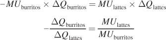
Economists have a particular name for the slope of an indifference curve: the marginal rate of substitution of X for Y (MRSXY). This is the rate at which a consumer is willing to trade off or substitute exactly 1 unit of good X (the good on the horizontal axis) for more of good Y (the good on the vertical axis) and feel equally well off:
(A technical note: We put a negative sign in front of the slope so that we can refer to MRSXY as a positive number. The slope of the indifference curve will be a negative number on its own because the curve slopes downward.) The word “marginal” indicates that we are talking about the tradeoffs associated with small changes in the composition of the bundle of goods—
Despite an intimidating name, the marginal rate of substitution makes sense. It tells us the relative value that a consumer places on obtaining one more unit of the good on the horizontal axis, in terms of the good on the vertical axis. You make this kind of decision all the time. Whenever you order off a menu at a restaurant, choose whether to fly or drive home for the holidays, or decide what brand of jeans to buy, you’re evaluating relative values. As we see later in this chapter, when prices are attached to goods, the consumer’s decision about what to consume boils down to a comparison of the relative value she places on two goods and the goods’ relative prices.
The Marginal Rate of Substitution and Marginal Utility
Consider point A in Figure 4.5. The marginal rate of substitution at point A equals 2 because the slope of the indifference curve at that point is –2:
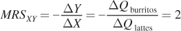
In words, this means that in return for 1 more latte, Sarah is willing to give up 2 burritos. At point B, the marginal rate of substitution is 0.5, which implies that Sarah would sacrifice only half of a burrito for 1 more latte (or equivalently, she would sacrifice 1 burrito for 2 lattes).
This change in the willingness to substitute between goods at the margin occurs because the benefit a consumer gets from another unit of a good tends to fall with the number of units she already has. If you have already amped up on caffeine by drinking all the lattes you can stand but haven’t eaten all day, you might be willing to forgo lots of lattes to get an extra burrito.
Another way to see all this is to think about the change in utility (ΔU) created by starting at some point on an indifference curve and moving just a little bit along it. Suppose we start at point A and then move just a bit down and to the right along the curve. We can write the change in utility created by that move as the marginal utility of lattes (the extra utility the consumer gets from a 1-
ΔU = MUlattes × ΔQlattes + MUburritos × ΔQburritos
where MUlattes and MUburritos are the marginal utilities of lattes and burritos at point A, respectively. Here’s the key: Because we’re moving along an indifference curve (so utility is constant at every point on it), the total change in utility from the move must be zero. If we set the equation equal to zero, we get
117
0 = ΔU = MUlattes × ΔQlattes + MUburritos × ΔQburritos
Rearranging the terms a bit will allow us to see an important relationship:
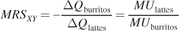
Notice that the left-
∂ The end-of-chapter appendix uses calculus to derive the relationship between the marginal rate of substitution and marginal utilities.
In more basic terms, MRSXY shows the point we emphasized from the beginning: You can tell how much people value something by their choices of what they would be willing to give up to get it. The rate at which they give things up tells you the marginal utility of the goods.
This equation gives us a key insight into understanding why indifference curves are convex to the origin. Let’s go back to the example above. At point A in Figure 4.5, MRSXY = 2. That means the marginal utility of lattes is twice as high as the marginal utility of burritos. That’s why Sarah is so willing to give up burritos for lattes at that point—
As we see throughout the rest of this chapter, the marginal rate of substitution and its link to the marginal utilities of the goods play a key role in driving consumer behavior.
The Steepness of Indifference Curves
We’ve now established the connection between a consumer’s preferences for two goods and the slope of her indifference curves (the MRSXY). They are the same thing. An indifference curve reveals a consumer’s willingness to trade one good for another, or each good’s relative marginal utility. We can flip this relationship on its head to see what the shapes of indifference curves tell us about consumers’ utility functions. In this section, we discuss two key characteristics of an indifference curve: how steep it is, and how curved it is.
Figure 4.6 presents two sets of indifference curves reflecting two different sets of preferences for concert tickets and MP3s. In panel a, the indifference curves are steep. In panel b, they are flat. (These two sets of indifference curves have the same degree of curvature so we don’t confuse steepness with curvature.)
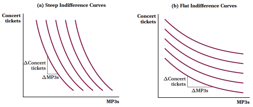
When indifference curves are steep, consumers are willing to give up a lot of the good on the vertical axis to get a small additional amount of the good on the horizontal axis. So a consumer with the preferences reflected in the steep indifference curve in panel a would part with many concert tickets for some more MP3s. The opposite is true in panel b, which shows flatter indifference curves. A consumer with such preferences would give up a lot of MP3s for one additional concert ticket. These relationships are just another way of restating the concept of the MRSXY that we introduced earlier.
118
 See the problem worked out using calculus
figure it out 4.1

For interactive, step-
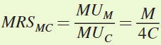
Ming consumes music downloads (M) and concert tickets (C). His utility function is given by U = 0.5M2 + 2C2, where MUM = M and MUC = 4C.
Write an equation for MRSMC.
Would bundles of (M = 4 and C = 1) and (M = 2 and C = 2) be on the same indifference curve? How do you know?
Calculate MRSMC when M = 4 and C = 1 and when M = 2 and C = 2.
Based on your answers to question b, are Ming’s indifference curves convex? (Hint: Does MRSMC fall as M rises?)
Solution:
We know that the marginal rate of substitution MRSMC equals MUM/MUC.
We are told that MUM = M and MUC = 4C. Thus,
For bundles to lie on the same indifference curve, they must provide the same level of utility to the consumer. Therefore, we need to calculate Ming’s level of utility for the bundles of (M = 4 and C = 1) and (M = 2 and C = 2):
When M = 4 and C = 1, U = 0.5(4)2 + 2(1)2 = 0.5(16) + 2(1) = 8 + 2 = 10
When M = 2 and C = 2, U = 0.5(2)2 + 2(2)2 = 0.5(4) + 2(4) = 2 + 8 = 10
Each bundle provides Ming with the same level of utility, so they must lie on the same indifference curve.
and d. To determine if Ming’s indifference curve is convex, we need to calculate MRSMC at both bundles. Then we can see if MRSMC falls as we move down along the indifference curve (i.e., as M increases and C decreases):
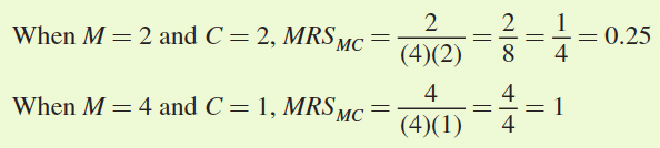
These calculations reveal that, holding utility constant, when music downloads rise from 2 to 4, the MRSMC rises from 0.25 to 1. This means that as Ming consumes more music downloads and fewer concert tickets, he actually becomes more willing to trade concert tickets for additional music downloads! Most consumers would not behave in this way. This means that the indifference curve becomes steeper as M rises, not flatter. In other words, this indifference curve will be concave to the origin rather than convex, violating the fourth characteristic of indifference curves listed above.
119
5Aviv Nevo, "Measuring Market Power in the Ready-to-Eat Cereal Industry," Econometrica 69, no. 2 (2001): 307 - 342.
Application: Indifference Curves for Breakfast Cereal
Many people can’t stand to start their mornings without a bowl of their favorite breakfast cereal. Surveys suggest that more than 90% of families in the United States bought breakfast cereal in 2012, the latest year of the data, and total sales are projected to exceed $10 billion by 2016. Hundreds of different kinds of cereals fill grocery store shelves throughout North America.
Some economists study the cereal market and analyze how people decide what cereal to buy. Their findings give us some direct estimates of indifference curves and how they vary across people for the same products.
In one such study, economist Aviv Nevo looked at 25 leading cereal brands in 65 cities.5 He gathered information on the characteristics of the cereals in terms of sugar, calories, fat, fiber, mushiness, and so on, and treated each cereal like a bundle of these characteristics. (An analysis of products using their attributes is called hedonic analysis, and economists have done hedonic analyses of cars, computers, houses, and many other kinds of products.)
5 Aviv Nevo, “Measuring Market Power in the Ready-
Nevo computed the implied marginal rates of substitution for these different product attributes by comparing the demand for different cereals at different prices. Let’s take his results on two of the “goods” people consume when buying cereal—
We can use Nevo’s results to compute a direct estimate of the MRS of fiber for sugar for different kinds of people. Holding everything else equal, Nevo found that a 50-
120
The MRS differs for other kinds of people, however. A 20-
We know that the MRS of fiber for sugar is the ratio of marginal utilities, MUfiber/MUsugar. Ricardo’s ratio is greater than David’s because he is willing to give up more sugar in exchange for fiber. Ricardo’s indifference curves (Figure 4.7a), when drawn with fiber on the horizontal axis and sugar on the vertical axis, are therefore steeper than David’s indifference curves (Figure 4.7b). Because they have different tastes in cereal, the marginal rates of substitution and, in turn, the slopes of the indifference curves look different for older adults and younger adults.
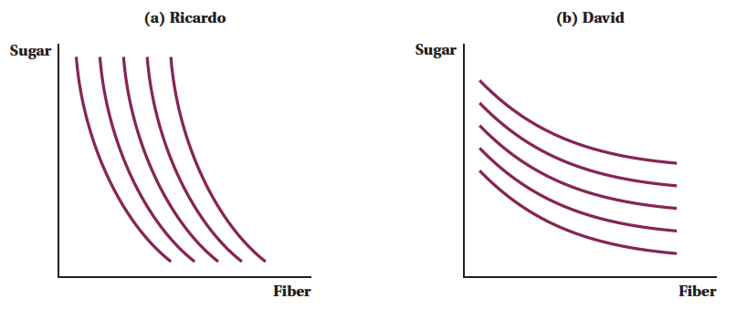

This result probably also explains why the people buying Kellogg’s Honey Smacks (with 20 grams of sugar and 1.3 grams of fiber per cup) likely aren’t the same people as those buying Kashi’s Go Lean (with 6 grams of sugar and 10 grams of fiber per cup). 
121
The Curvature of Indifference Curves: Substitutes and Complements
∂ The online appendix looks at the relationship between the utility function and the shape of indifference curves.
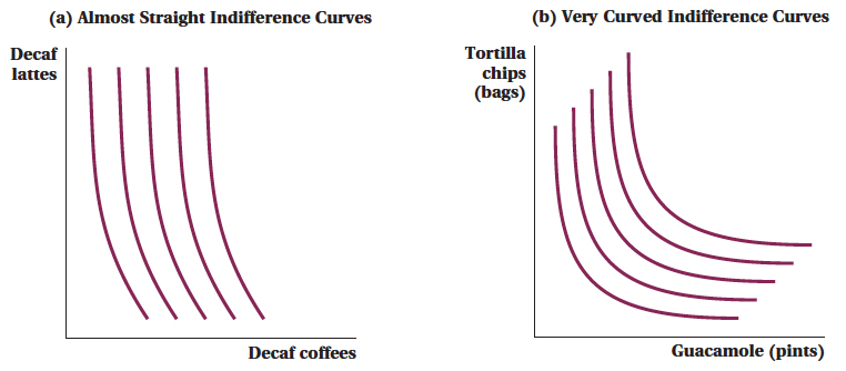
The steepness of an indifference curve tells us the rate at which a consumer is willing to trade one good for another. The curvature of an indifference curve also has a meaning. Suppose indifferences curves between two goods are almost straight, as in Figure 4.8a. In this case, a consumer (let’s call him Evan) is willing to trade about the same amount of the first good (here, decaf coffees) to get the same amount of the second good (decaf lattes), regardless of whether he has a lot of lattes relative to coffees or vice versa. Stated in terms of the marginal rates of substitution, the MRS of coffees for lattes doesn’t change much as we move along the indifference curve. In practical terms, it means that the two goods are close substitutes for each other in Evan’s utility function. That is, the relative value a consumer places on two substitute goods will typically not be very responsive to the amounts he has of one good versus the other. (It’s no coincidence that this example features two goods that many consumers would consider to be close substitutes for each other.)
122
On the other hand, for goods such as tortilla chips and guacamole that are poor substitutes (Figure 4.8b), the relative value of one more pint of guacamole will be much greater when you have a lot of chips and not much guacamole than if you have 10 pints of guacamole but no chips. In these types of cases, indifference curves are sharply curved, as shown. The MRS of guacamole for chips is very high on the far left part of the indifference curve (where the consumer does not have much guacamole) and very low on the far right (when the consumer is awash in guacamole).
perfect substitute
A good that a consumer can trade for another good, in fixed units, and receive the same level of utility.
perfect complement
A good from which the consumer receives utility dependent on its being used in a fixed proportion with another good.
Perfect Substitutes The intuition behind the meaning of the curvature of indifference curves may be easier to grasp if we focus on the most extreme cases, perfect substitutes and perfect complements. Figure 4.9 shows an example of two goods that might be perfect substitutes: 12-
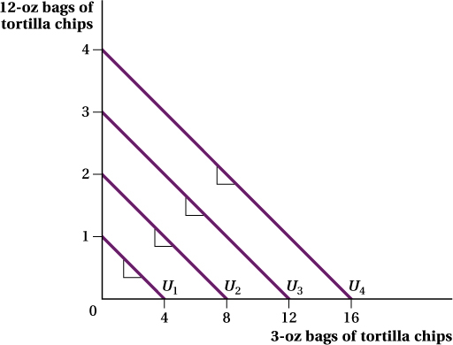
Different-
6 You could think of reasons why the different-
123
It is crucial to understand that two goods being perfect substitutes does not necessarily imply that the consumer is indifferent between single items of the goods. In our tortilla chip example above, for instance, the consumer likes a big bag a lot more than a small bag. That’s why she would have to be given 4 small bags, not just 1, to be willing to trade away 1 large bag. The idea behind perfect substitutes is only that the tradeoff the consumer is willing to make between the two goods—
Perfect Complements When the utility a consumer receives from a good depends on its being used in fixed proportion with another good, the two goods are perfect complements. Figure 4.10 shows indifference curves for right and left shoes, which are an example of perfect complements (or at least something very close to it). Compare point A (2 right shoes and 2 left shoes) and point B (3 right shoes and 2 left shoes). Although the consumer has one extra shoe at point B, there is no matching shoe for the other foot, so the extra shoe is useless to her. She is therefore indifferent between these two bundles, and the bundles are on the same indifference curve. Similarly, comparing points A and C in the figure, we see that an extra left-
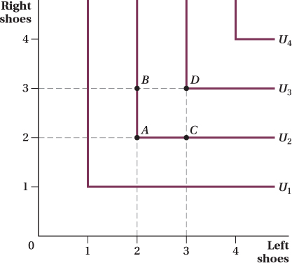
Perfect complements lead to distinctive L-
7 The proportion in which perfect complements are consumed need not be one-
124
This L-
Different Shapes for a Particular Consumer One final point to make about the curvature of indifference curves is that even for a particular consumer, indifference curves may take on a variety of shapes depending on the utility level. They don’t all have to look the same.
For instance, indifference curve UA in Figure 4.11 is almost a straight line. This means that at low levels of utility, this consumer considers bananas and strawberries almost perfect substitutes. Her marginal rate of substitution barely changes whether she starts with a relatively high number of bananas to strawberries, or a relatively small number. If all she is worried about is getting enough calories to survive (which might be the case at really low utility levels like that represented by UA), how something tastes won’t matter much to her. She’s not going to be picky about the mix of fruit she eats. This leads the indifference curve to be fairly straight, like UA.
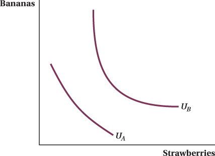
Indifference curve UB, on the other hand, is very sharply curved. This means that at higher utility levels, the two goods are closer to perfect complements. When this consumer has plenty of fruit, she is more concerned with enjoying variety when she eats. This leads her to prefer some of each fruit rather than a lot of one or the other. If she already has a lot of one good, she will be willing to give up quite a lot of that good in order to receive a unit of the good she has less of. This leads to the more curved indifference curve. Remember, however, that even as the shapes of a consumer’s indifference curves vary with her utility levels, the indifference curves will never intersect.
125
See the problem worked out using calculus
figure it out 4.2
Jasmine can watch hours of baseball (B) or hours of reality shows (R) on TV. Watching more baseball makes Jasmine happier, but she really doesn’t care about reality shows—
Solution:
The easiest way to diagram Jasmine’s preferences is to consider various bundles of reality shows and baseball, and determine whether they lie on the same or different indifference curves. For example, suppose she watches 1 hour of reality TV and 1 hour of baseball. Plot this in Figure A as point A. Now, suppose she watches 1 hour of reality TV and 2 hours of baseball. Plot this as point B. Because watching more hours of baseball makes Jasmine happier, point B must lie on a higher indifference curve than point A.
Now, try another point with 2 hours of reality TV and 1 hour of baseball. Call this point C. Compare point A with point C. Point C has the same number of hours of baseball as point A, but provides Jasmine with more reality TV. Jasmine neither likes nor dislikes reality TV, however, so her utility is unchanged by having more reality TV. Points A and C must therefore lie on the same indifference curve. This would also be true of points D and E. Economists often refer to a good that has no impact on utility as a “neutral good.”
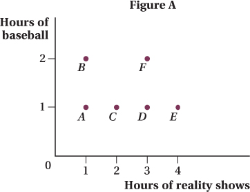
Looking at Figure A, we see that there will be an indifference curve that is a horizontal line going through points A, C, D, and E. Will all of the indifference curves be horizontal lines? Let’s consider another bundle to make sure. Suppose that Jasmine watches 3 hours of reality TV and 2 hours of baseball, as at point F. It is clear that Jasmine will prefer point F to point D because she gets more baseball. It should also be clear that Jasmine will be equally happy between points B and F; she has the same hours of baseball, and reality shows have no effect on her utility. As shown in Figure B, points B and F lie on the same indifference curve (U2) and provide a greater level of utility than the bundles on the indifference curve below (U1).
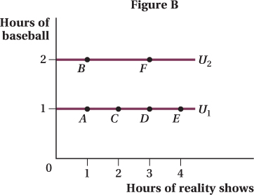
To calculate the marginal rate of substitution when Jasmine is consuming 1 unit of each good, we need to calculate the slope of U1 at point A. Because the indifference curve is a horizontal line, the slope is zero. Therefore, MRSRB is zero. This makes sense; Jasmine is not willing to give up any baseball to watch more reality TV because reality TV has no impact on her utility. Remember that MRSRB equals MUR/MUB. Because MUR is zero, MRSRB will also equal zero.
126
Application: Indifference Curves for “Bads”
bad
A good or service that provides a consumer with negative utility.
8Steven Levitt and Chad Syverson, "Market Distortions When Agents Are Better Informed: The Value of Information in Real Estate Transactions," Review of Economics and Statistics 90, no. 4 (2008): 599-611.
Let’s look at some real-
8 Steven Levitt and Chad Syverson, “Market Distortions When Agents Are Better Informed: The Value of Information in Real Estate Transactions,” Review of Economics and Statistics 90, no. 4 (2008): 599–
Using regression techniques to compare otherwise similar houses (e.g., those having the same architectural style, the same type of siding material, and even located on the same city block), Levitt and Syverson found that an extra bedroom adds about 5% to the sales price of a house. Central air-
But Levitt and Syverson also uncovered a characteristic that had a negative effect on a house’s price, at least up to a point: its age. Again, comparing otherwise similar houses, they found that a house between 6–
127
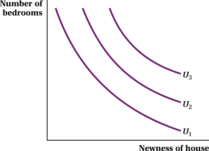
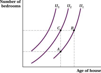
The indifference curves for bundles of age (a bad) and bedrooms (a good) are shown in Figure 4.12. We see that the indifference curves slope upward, not downward. Why? Let’s first consider bundles A and B, which lie on the same indifference curve, U1. A homebuyer who does not like old houses needs more bedrooms for the utility of bundle B (greater age, more bedrooms) to equal that of bundle A (younger age, fewer bedrooms). Bundle C has more space than bundle A but is the same age, so C must be preferred to A. Indifference curves that lie higher (more space) and to the left (not as old) indicate greater levels of utility.
Do bads violate our assumption that more is better? Not if we redefine the age factor as “newness,” the absence of age. Newness then becomes a good, and our indifference curves for newness versus bedrooms then slope downward. Graphing our homebuyer’s indifference curves in terms of how new a house is—