5.2 How Price Changes Affect Consumption Choices
In the previous section, we looked at how changes in income affect a consumer’s choices, holding prices and preferences constant. In this section, we see what happens when the price of a good changes, holding income, preferences, and the prices of all other goods constant. This analysis tells us exactly where a demand curve comes from.
At this point, it is useful to recall exactly what a demand curve is. We learned in Chapter 2 that although many factors influence the quantity a consumer demands of a good, the demand curve isolates how one particular factor, the good’s own price, affects the quantity demanded while holding everything else constant. Changes in any other factor that influences the quantity demanded (such as income, preferences, or the prices of other goods) shift the demand curve.
Up to this point, it always seemed that demand curves slope downward because diminishing marginal utility implies that consumers’ willingness to pay falls as quantities rise. That explanation is still correct as a summary, but it skips a step. A consumer’s demand curve actually comes straight from the consumer’s utility maximization. A demand curve answers the following question: As the price of a good changes (while holding all else constant), how does the quantity of that good in the utility-
Deriving a Demand Curve
To see how a consumer’s utility-
To build the demand curve, we start by figuring out the consumer’s utility-
The top half of Figure 5.7 shows Caroline’s utility-
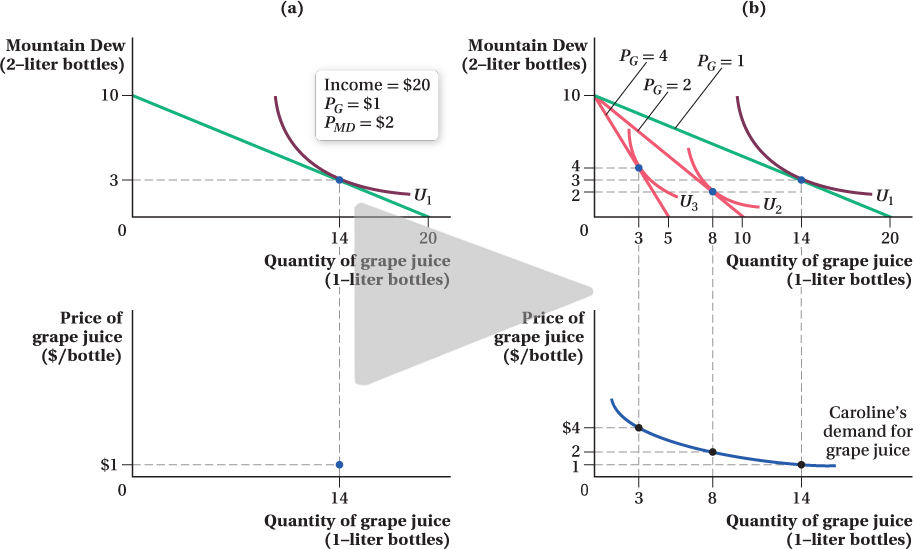
That is one point on Caroline’s demand curve for grape juice: At a price of $1 per liter, her quantity demanded is 14 bottles. The only problem is that the top panel of Figure 5.7a does not have the correct axes for a demand curve. Remember that a demand curve for a good is drawn with the good’s price on the vertical axis and its quantity demanded on the horizontal axis. When we graphically search for the tangency of indifference curves and budget constraints, however, we put the quantities of the two goods on the axes. So we’ll make a new figure, shown in the bottom panel of Figure 5.7a, that plots the same quantity of grape juice as the figure’s top panel, but with the price of grape juice on the vertical axis. Because the horizontal axis in the bottom panel is the same as that in the top—
165
To finish building the demand curve, we need to repeat the process described above again and again for many different grape juice prices. When the price changes, the budget constraint’s slope changes, which reflects the relative prices of the two goods. For each new budget constraint, we find the optimal consumption bundle by finding the indifference curve that is tangent to it. Preferences are constant, so the set of indifference curves corresponding to Caroline’s utility function remains the same. The particular indifference curve that is tangent to the budget constraint will depend on where the constraint is, however. Each time we determine the optimal quantity consumed at a given price of grape juice, we identify another point on the demand curve.
Figure 5.7b shows this exercise for grape juice prices of $1, $2, and $4 per bottle. As the price of grape juice rises (holding fixed the price of Mountain Dew and Caroline’s income), the budget constraint gets steeper, and the utility-
166
Shifts in the Demand Curve
We know that if a consumer’s preferences or income change, or the prices of other goods change, then the demand curve shifts. We can see how by tracing out the demand curve under these new conditions.
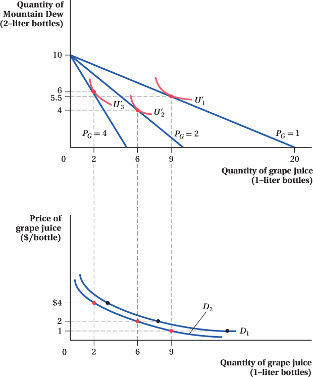
Let’s look at an example where preferences change. Suppose that Caroline meets a scientist at a party who argues that the purported health benefits of grape juice are overstated and that it stains your teeth red. This changes Caroline’s preferences toward grape juice, so that she finds it less desirable than before. This change shows up as a flattening of Caroline’s indifference curves, because now she has to be given more grape juice to be indifferent to a loss of Mountain Dew. Another way to think about it is that, because the marginal rate of substitution (MRS) equals –MUG/MUMD, this preference shift shrinks Caroline’s marginal utility of grape juice at any quantity, reducing her MRS—that is, flattening her indifference curves.
Figure 5.8 repeats the demand-
167
FREAKONOMICS
Even Animals Like Sales
If you think the laws of economics only apply to humans, think again. Monkeys, and even rats, behave in ways that would make you think they’ve taken intermediate micro.
Some of the most intensive testing of the economic behavior of animals was carried out by Yale economist Keith Chen and his co-
After about six exasperating months, these monkeys finally figured out that the washers had value. Chen observed that individual monkeys tended to have stable preferences: Some liked grapes the best, others were fans of Jell-
*Tim Harford, The Logic of Life: The Rational Economics of an Irrational World. (New York: Random House, 2008), pp. 18 – 21.
Next, Chen did what any good economist would do: He subjected the monkeys to price changes! Instead of getting three Jell-
* That wasn’t the only humanlike behavior these monkeys exhibited when exposed to money—
Perhaps it is not that surprising that monkeys, one of our closest relatives in the animal kingdom, would be sophisticated consumers. But there is no way rats understand supply and demand, is there? It seems they do. Economists Raymond Battalio and John Kagel equipped rats’ cages with two levers, each of which dispensed a different beverage.† One of these levers gave the rat a refreshing burst of root beer. Rats, it turns out, love root beer. The other lever released quinine water. Quinine is a bitter-
† A description of the work by Battalio and Kagel may be found in Tim Harford, The Logic of Life: The Rational Economics of an Irrational World (New York: Random House, 2008), pp. 18–
168
We can see that because Caroline’s preferences have changed, she now demands a smaller quantity of grape juice than before at every price. As a result, her demand curve for grape juice has shifted in from D1 to D2. This result demonstrates why and how preference changes shift the demand curve. Changes in Caroline’s income or in the price of Mountain Dew also shift her demand curve. (We saw earlier how income shifts affect quantity demanded, and we investigate the effects of price changes in other goods in Section 5.4.) Remember, however, that for any given value of these nonprice influences on demand, the change in the quantity demanded of a good in response to changes in its own price results in a movement along a demand curve, not a shift in the curve.
∂ The online appendix derives the demand curve directly from the utility function.
figure it out 5.2
Cooper allocates $200 of his weekly budget to entertainment. He spends all of this $200 on two goods: theater tickets (which cost $50 each) and movie tickets (which cost $10 each).
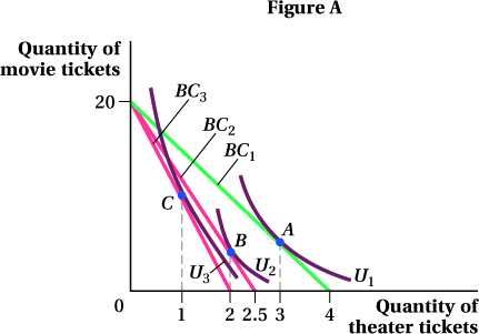
With theater tickets on the horizontal axis, draw Cooper’s budget constraint, making sure to indicate the horizontal and vertical intercepts. What is the slope of the budget constraint?
Suppose that Cooper currently purchases 3 theater tickets per week. Indicate this choice on the budget constraint and mark it as point A. Draw an indifference curve tangent to the budget constraint at point A. How many movie tickets does Cooper buy?
Suppose that the price of a theater ticket rises to $80, and Cooper lowers his purchases of theater tickets to 2. Draw Cooper’s new budget constraint, indicate his choice with a point B, and draw an indifference curve tangent to the new budget constraint at point B.
Once again, the price of a theater ticket rises to $100, and Cooper lowers his purchases of theater tickets to 1 per week. Draw his new budget constraint, show his choice on the budget constraint with a point C, and draw an indifference curve tangent to this new budget constraint at C.
Draw a new diagram below your indifference curve diagram. Use your answers to parts (b)–(d) to draw Cooper’s demand for theater tickets. Indicate his quantities demanded at $50, $80, and $100. Is there an inverse relationship between price and quantity demanded?
Solution:
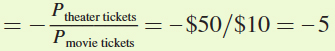
To start, we need to calculate the horizontal and vertical intercepts for Cooper’s budget constraint. The horizontal intercept is the point at which Cooper spends all of his income on theater tickets and purchases no movie tickets. This occurs when he buys $200/$50 = 4 theater tickets (Figure A). The vertical intercept is the point at which Cooper spends his entire income on movie tickets and buys no theater tickets. This means that he is buying $200/$10 = 20 movie tickets. The budget constraint connects these two intercepts. The slope of the budget constraint equals rise/run = –20/4 = –5.
Note that this slope is the negative of the ratio of the two prices
 .
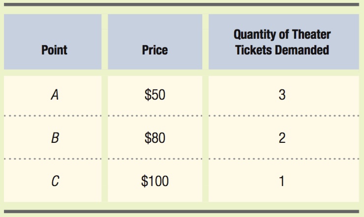
.Maximum utility occurs where the indifference curve is tangent to the budget constraint. Therefore, point A should be the point where this tangency takes place. If Cooper purchases 3 theater tickets a week, he will spend $50 × 3 = $150, leaving him $200 – $150 = $50 to spend on movie tickets. Since movie tickets cost $10 each, he purchases $50/$10 = 5 movie tickets.
Cooper’s budget constraint will rotate in a clockwise direction. The vertical intercept is not affected because neither Cooper’s income nor the price of movie tickets changes. However, the price of theater tickets has risen to $80, and now if Cooper were to allocate his entire budget to theater tickets, he could afford only $200/$80 = 2.5 of them. This is the new horizontal intercept. If Cooper chooses to buy 2 theater tickets, he will have an indifference curve tangent to this budget constraint at that point (B).
The budget constraint will again rotate clockwise and the vertical intercept will remain unchanged. The new horizontal intercept will be $200/$100 = 2. Point C will occur where Cooper’s indifference curve is tangent to his new budget constraint at a quantity of 1 theater ticket.
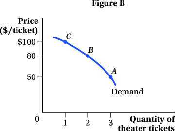
The demand curve shows the relationship between the price of theater tickets and Cooper’s quantity demanded. We can take the information from our indifference curve diagram to develop three points on Cooper’s demand curve:
We can then plot points A, B, and C on a diagram with the quantity of theater tickets on the horizontal axis and the price of theater tickets on the vertical axis (Figure B). Connecting these points gives us Cooper’s demand curve for theater tickets.
169