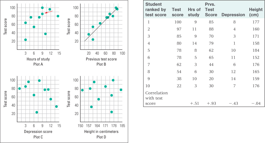
Figure 2.3: Examples of correlations, using made-up data The table above shows the most recent test score and four other measures for each of 10 students in a college course. At the bottom of each of the four right-hand columns is the correlation coefficient relating the data of that column to the test score. (The study is fictitious and the data were made up for illustrative purposes.) The four scatter plots depict, separately, the correlation between the test score and each of the four other measures. By comparing the plots, you can see the difference between weaker and stronger correlations and between positive and negative correlations.