image
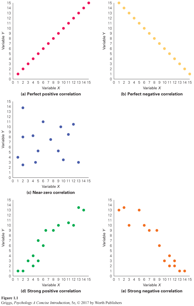
Figure 1.1 | Some Sample Scatterplots | (a) and (b) are examples of perfect correlations because there is no scatter—all of the data points in each plot fall on the same line. The correlation in (a) is positive because the data points show an increasing trend (go from bottom left to top right) and is negative in (b) because the data points show a decreasing trend (go from top left to bottom right). (c) is an example of a near-zero correlation because the data points are scattered all over and do not show a directional trend. (d) is an example of a strong positive correlation because there is not much scatter and the data points have an increasing trend. (e) is an example of a strong negative correlation because there is not much scatter and the data points show a decreasing trend.