Chapter 1. Working With Data 37.9
Working with Data: HOW DO WE KNOW? Fig. 37.9
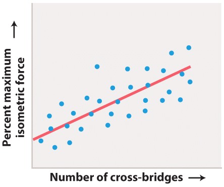
Figure 37.9 describes experiments that were conducted to determine how changes in the overlap of actin and myosin filaments within the sarcomeres of a muscle fiber affect muscle force. Answer the questions after the figure to practice interpreting data and understanding experimental design. These questions refer to concepts that are explained in the following three brief data analysis primers from a set of four available on LaunchPad.
- Experimental Design
- Data and Data Presentation
- Statistics
You can find these primers by clicking on the button labeled “Resources” in the menu at the upper right on your main LaunchPad page, then click on “Content by type.” Within the following questions, click on “Primer Section” to read the relevant section from these primers. Click on the button labeled “Key Terms” to see pop-up definitions of boldfaced terms.
HOW DO WE KNOW?
FIG. 37.9: How does filament overlap affect force generation in muscles?
BACKGROUND From the 1930s through the 1960s, British muscle physiologists studied the properties of striated frog muscle fibers. In the first set of experiments, A. V. Hill examined how a muscle’s shortening velocity affects its force production. In the second set of studies, British physiologists Andrew Gordon and Andrew Huxley, together with American physiologist Fred Julian, studied how a muscle’s contractile length affects its force-generating ability.

HYPOTHESIS They hypothesized that changes in overlap between myosin and actin affect the number of cross-bridges and thus the force the muscle can produce.
EXPERIMENT Gordon, Huxley, and Julian isolated a single muscle fiber and used optical microscopy to measure sarcomere length. They kept this length constant while the fiber was stimulated to produce force. Measurements of force were obtained at different sarcomere lengths.
RESULTS The top graph shows the data charted by Gordon, Huxley, and Julian, and the bottom graph reinterprets their data in terms of force and percent of muscle length. Their experiments showed that the muscle fiber produced maximal force at an intermediate sarcomere length (approximately 2.3 µm). At this length, the greatest number of cross-bridges were hypothesized to form, generating maximal force. As the sarcomere length was decreased or stretched, and then stimulated to contract, force declined. These results were consistent with a decrease in the number of cross-bridges that could form as a result of decreased actin–myosin overlap.
FOLLOW-UP WORK Other studies confirmed that changes in myosin cross-bridge formation are linked to changes in actin and myosin filament overlap at different sarcomere lengths, supporting the sliding filament model of muscle contraction.
SOURCE Gordon, A. M., A. F. Huxley, and F. J. Julian. 1966. “The Variation in Isometric Tension with Sarcomere Length in Vertebrate Muscle Fibres.” Journal of Physiology 184 :170–192.
Question
ZV2J1cJFL0RvpBJgsV2Tcnbm1iR973hcIrGmu4PhKcpljwCKcJgFYavM/c1IWfGIL8f8snga8xvzYEAdSqHzN3lggeITJ700lktZ9Q/2OcjJ0slhTWR1jqy1fQB84F86NhbP+I0b2Xvda8GajSM3taBZ+1GGRVJ6nje9hEZpE4hq7BOuhPxAjrPEwQOjkjpK6D2StQG+nPKux1BuOW80lZC0YHFkfF5pGyXpqfXTw3TnSgyP9eoBLXuzkdvUjB3oqb4JfAYzWu7UWhEJzFkpaQHavzlY8/9sB5AORW2gBhIPC12+pB0hfvykwyKQ9+69VOtIz8HbsCXV9cPCq4aE5nrK86Pftxyp3yUk6nV8LUoR822m7mhokc0yuS41n5COcMjh2IaUFTqCwX8YSIM1M8ZrEEXHKegXxaF8mPPzFIsS3UShjemkF64N2nAHMOHZLOjsQFpTkU5OFClmvwuIiJBLNQnjtrHqWiFh+3AvVdmFFayylh+4iNAM1K4qWaGf5Xhau76RzriV3KkvfnvGEPNPK6APKm5U2cspRl8XWEndk3JLGNETJQHsUYNWMaVmFdUAc250h9A/T6JQc7TfEOzS8UEGL3E66MuZKSRP4lQ7flMgxFBx1eYQfG7zrC0u2BSmlDbxUoTycPEjaebCcoqYvMjRZ/sseTvk72IVD6F8YpD6CZsEAV+D3RHG4rEATWorB+CIZ6N0PqULz5jSBNhmoKdRrhkNe6eI2vqHlOESKM01mO9uyADHYyx9mmcS5xLiLjBTs7I=| hypothesis | A tentative explanation for one or more observations that makes predictions that can be tested by experiments or additional observations. |
Experimental Design
Experiments provide one way to make sense of the world. There are many different kinds of experiments, some of which begin with observations. Charles Darwin began with all kinds of observations—the relationship between living organisms and fossils, the distribution of organisms on the Earth, species found on islands and nowhere else—and inferred an evolutionary process to explain what he saw. Other experiments begin with data collection. For example, genome studies begin by collecting vast amounts of data—the sequence of nucleotides in all of the DNA of an organism—and then ask questions about the patterns that are found.
Such observations can lead to questions – Why are organisms adapted to their environment? Why are there so many endemic species (organisms found in one place and nowhere else) on islands? Why does the human genome contain vast stretches of DNA that do not code for protein?
Types of Hypotheses
A hypothesis, as we saw in Chapter 1, is a tentative answer to the question, an expectation of what the results might be. This might at first seem counterintuitive. Science, after all, is supposed to be unbiased, so why should you expect any particular result at all? The answer is that it helps to organize the experimental setup and interpretation of the data.
Let’s consider a simple example. We design a new medicine and hypothesize that it can be used to treat headaches. This hypothesis is not just a hunch—it is based on previous observations or experiments. For example, we might observe that the chemical structure of the medicine is similar to other drugs that we already know are used to treat headaches. If we went into the experiment with no expectation at all, it would be unclear what to measure.
A hypothesis is considered tentative because we don’t know what the answer is. The answer has to wait until we conduct the experiment and look at the data. When an experiment predicts a specific effect, as in the case of the new medicine, it is typical to also state a null hypothesis, which predicts no effect. Hypotheses are never proven, but it is possible based on statistical analysis to reject a hypothesis. When a null hypothesis is rejected, the hypothesis gains support.
Sometimes, we formulate several alternative hypotheses to answer a single question. This may be the case when researchers consider different explanations of their data. Let’s say for example that we discover a protein that represses the expression of a gene. Our question might be: How does the protein repress the expression of the gene? In this case, we might come up with several models—the protein might block transcription, it might block translation, or it might interfere with the function of the protein product of the gene. Each of these models is an alternative hypothesis, one or more of which might be correct.
Question
5MTcuIkIXgnrbNgrau6v88Qr82xV3RpwdqMb2YDgLER9EoOinrgILAtEY7qNyuDRqJFTExO4huhX5xJ1vjY5R6RMjDrvPAwbFVVmwzAqpBTxeMwah5l50SYTfiadcbwhhPjUuL/2vY+rHuTVxt+gGpHxaggtwYLBX9RVbtvbs/VGkk3HwwPuBkI+GPxLWjJ62RAq1Zm4dGGlGlNoaQrTlAu04tvWRxhX/iG/HhlPsIUUyLrSS8G92MrxjkY3uRbHTaiNjm/VXonJKLqM++HXZl7+R3Z2Qmsr8SYVgW5p5gPhuAMvTJDTpRpu2A7xkttX4SXOrHg2IVDretRkzMWWIagWJPf1pMf9m3w82zFljHnMOOC5KthQiu300W+Lo/4E38NSJLOgx06uLC5Yx1+qjgbQEuekpXlpJUNXPs8FuThK3McWX8RC9VrJVr3brV/LL4uGGxt/6VAB+QA9nc6CaIAynIkWygvg9anxnG1VHFbN0kr8NX8UaBpiBedfUxCyZRqV5rrDU5c8VbyJhEX3Iw3gwPR7ZLMKHhb21oVRXcCRhGYQViWutDD2LNozhcuFb8+E/uN7IiSWiwR71pcwxsjtanD5vBP/W51LVYtFVOFcFeT7UJyY6tKcfq0fte1xF9/4cwXB6Ej5LfuBgG1ru5WpMq8=Question
WBqLPhLEJ0m71xxiuRQPwwaRCLuSnJvjlt8/GWfK0rRXxXkZ0NKW9nzom8Kxbchk1h6aoJyXvYPnu79QLZuz/WhhGhBydQeGnPwZ5V6Q0sV0hW1EfqR9S5g/tGudhM2GW+VhVI3vkekNYDwUcHyM40H6q5Mcz6fqJHDNfGqAyiEFKBbNuhyD1mdvknhmiE/yFLdHTpFlV3QdQb0kbuIgxX+oBLow/9oiFpMumOl2i1TRgReCO9MiT73rnTfzbaIFO8XlRBgukhejRuwtJYdtfo9lZjArBe6tBBiG/5NPUTUV8aJJiBe7Vdby4Sk=Question
oMFlA+8KGQ84MkYlAWe+cRZDzIR7fmXNp7x6FVTxo8E2dFNbYvOKOE4XO2sWBl7tzZh0kBEZW9xzNcvptlXPgHV2KFBdo2s6lBgxm3WjlGw8y5hfvKs+dste53TfiN65Zs8Qe1ne8awXKybr0Oa2ISjJIe7lA5LZp3toeZwxMVWUPD6Ea158WWvzZ8fCn1neu1QncSqr8qI1ah63FsidNcgOt776b2PXMNHwMLoQm5IBHEWRsJoyMfp1DG1/Z8txZc9t2TLEDPfJVFT2qpciW6WWOd/6i2rQruinWBEy10RzV+yNy1O4UlE2fE2N8H+6NBrE45CyJhYXLGk23y2OMxrPDVcTU0fmgvIBlhkmgo9QIRp96NhssZDvnwJHfnwDCune/fdr8w6bnWxlkPQNHvt/wIGVVwTqi025xQwl3X+Nzp27NDhW9VjI7OQ9gJsdV72WLw25QW09bKxTwCawptARMelr5fhKWlI5WB7SZUFvpjh4uq9Scwizh2SSaRBTh5Wwmr/Z7JKKvv9lo/OUyEyRuna2BaHxUlxQaiphGnGN9zeMwf1xwcSSV2uZmqMlkg3AvPjsayL4Xtj7PsXsafZP+P4l2SJ291yWMCKH3CVDMoUPI3NGd4I8lrRJcmz0N4HvTckjXym9eE6Yxfi83p9GA6T1CWY/kjPL7b/cTxqMTg1K7+fYNWtPT2TMmkuz/DtBGITXn08=| dependent variable | The effect that is being measured. |
| independent variable | The manipulation performed on the test group by the researchers. |
| regression line | A line drawn on a scatterplot that depicts how, on average, the variable y changes as a function of the variable x across the whole set of data. |
Experimental Design
Testing Hypotheses: Variables
When performing experiments, researchers manipulate the test group differently from the control groups. This difference is known as a variable. There are two types of variables. An independent variable is the manipulation performed on the test group by the researchers. It is considered “independent” because the researchers could choose any variable they wish. The dependent variable is the effect that is being measured. It is considered “dependent” because the expectation is that it depends on the variable that was changed. In our example of the headache medicine, the independent variable is the type of medicine (new medicine, no medicine, placebo, or medicine known to be effective). The dependent variable is the presence or absence of headache following treatment.
In designing experiments, there is an additional issue to consider: the size of each of our groups. In order to draw conclusions from our data, we need to make sure that our results are valid and reproducible, and not merely the result of chance. One way to minimize the effect of chance is to include a large number of patients in each group. How many? The sample size is the number of independent data points and is determined based on probability and statistics, the subject of the next primer.
From the Statistics primer
Correlation and Regression
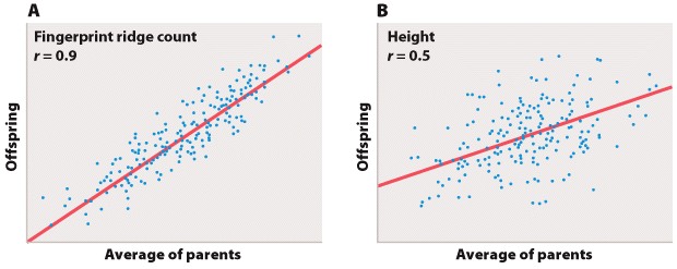
Biologists often are also interested in the relation between two different measurements, such as height and weight or number of species on an island versus the size of the island. Such data are often depicted as a scatter plot (Figure 5), in which the magnitude of one variable is plotted along the x-axis and the other along the y-axis, each point representing one paired observation.
Figures 5a and 5b
Figure 5A is the sort of data that would correspond to fingerprint ridge count (the number of raised skin ridges lying between two reference points in each fingerprint). While the data show some scatter, the overall trend is evident. There is a very strong association between the average fingerprint ridge count of parents and that of their offspring. The strength of association between two variables can be measured by the correlation coefficient, which theoretically ranges between +1 and –1. A correlation coefficient of +1 means a perfect positive relation (as one variable increases, the other increases proportionally), and a correlation coefficient of –1 implies a perfect negative relation (as one variable increases, the other decreases proportionally). Correlation coefficients of +1 or –1 are rarely observed in real data. In the case of fingerprint ridge count, the correlation coefficient is 0.9, which implies that the average fingerprint ridge count of offspring is almost (but not quite) equal to that of the parents. For a complex trait, this is a remarkably strong correlation.
Figure 5B represents data that would correspond to adult height. The data exhibit greater scatter than in Figure 5A; however, there is still a fairly strong resemblance between parents and offspring. The correlation coefficient in this case is 0.5. This value means that, on average, the offspring height is approximately halfway between that of the average of the parents and the average of the population as a whole.
The illustrations in Figure 5A and 5B also emphasize one limitation of the correlation coefficient. The correlation coefficient measures the strength of a straight-line (linear) relation. A nonlinear relation (one curving upward or downward) between two variables could be quite strong, but the data might still show a weak correlation.
Each of the straight lines in Figure 5 is a regression line or, more precisely, a regression line of y on x. Each line depicts how, on average, the variable y changes as a function of the variable x across the whole set of data. The slope of the line tells you how many units y changes, on average, for a unit change in x. A slope of +1 implies that a one-unit change in x results in a one-unit change in y, and a slope of 0 implies that the value of x has no effect on the value of y. The slope of a straight line relating values of y to those of x is known as the regression coefficient.
Question
Fm3Cx+2h7xyDL/U+bjsO4sketxDHnBztXojqwULZ2NRhE24q7qK65E0aziEiN8OUrsjTiVk3SVpV6ynKPL4W1PpYBCVBdzDleketkRlWXwxU1sscCVGAOyJ/CABRGBKQeZq7AWK+2/ALk6seIJlQbdU/DHWc8NFxn0gRituOIMROkv6jC1UGeS5LeRPjw+0w3TVg5JKfdmzOhrmvdVpcYN6UJ9krEYbS+106T9cK+CbLFkmVvFBJKiUF1TIpah5KKxYKsxuWwayacv0K9kysDLw9bfezsW2ro+EHhvnJ4JHifSWqToBZKUkefx5dlH+M+R7SGiMxAjr5f9f1TyrUMjzczeG0SlclGGKRNswX88jyNQYgxaz6/H7ImkodTG7vC8e+vxmK282qerhILbeJt+5VqiHplOx39A5z27TwXCpdR9MK8DNJQ4mwDr/gQEBnHoZOcOnNCRxh+X+lpBqO4+RS+YWl2LjcVXk6qRnfF5rsdUvmKYQO6wrF05ybp5gLeZOvaFIQzNA8dQO08qh/2oGr7YwHqdVI2xWLDBJUtmJm5DgFCVZPIpr9rFXzdnEj+QnEvhcoJRBbgLEYM5AdUqCFu3H15qVOzivKUiEBvNxyIf+u+MwEMxNsueDgpKW732q1w55/qmEabP+QcOXyZLHZLSjnHVClOKS/C8bnj+bnc9v4i5LnSmjwD57EtSJc3ILcQu0TSK9WdQaRw4TCqmEVw1s7lo1eztbuyx7h5GMVQaqzDWCIV8XW2V8uR2eKVwwW58+iGQUcZ5mLAKenp2EE+DR+rMxqFV+Vbw==| standard deviation | The extent to which most of the measurements are clustered near the mean. To obtain the standard deviation, you calculate the difference between each individual measurement and the mean, square the difference, add these squares across the entire sample, divide by n – 1, and take the square root of the result. |
Statistics
The Normal Distribution
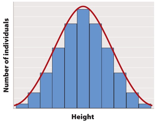
The first step in statistical analysis of data is usually to prepare some visual representation. In the case of height, this is easily done by grouping nearby heights together and plotting the result as a histogram like that shown in Figure 1. The smooth, bell-shaped curve approximating the histogram in Figure 1A is called the normal distribution. If you measured the height of more and more individuals, then you could make the width of each bar in the histogram narrower and narrower, and the shape of the histogram would gradually get closer and closer to the normal distribution.
The normal distribution does not arise by accident but is a consequence of a fundamental principle of statistics which states that when many independent factors act together to determine the magnitude of a trait, the resulting distribution of the trait is normal. Human height is one such trait because it results from the cumulative effect of many different genetic factors as well as environmental effects such as diet and exercise. The cumulative effect of the many independent factors affecting height results in a normal distribution.
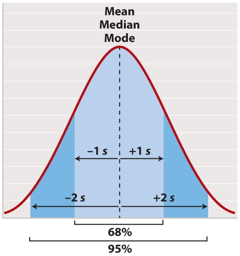
The normal distribution appears in countless applications in biology. Its shape is completely determined by two quantities. One is the mean, which tells you the location of the peak of the distribution along the x-axis (Figure 2). While we do not know the mean of the population as a whole, we do know the mean of the sample, which is equal to the arithmetic average of all the measurements—the value of all of the measurements added together and divided by the number of measurements.
In symbols, suppose we sample n individuals and let xi be the value of the ith measurement, where i can take on the values 1, 2, ..., n. Then the mean of the sample (often symbolized ) is given by
, where the symbol
means “sum” and
means x1 + x2 + ... + xn.
For a normal distribution, the mean coincides with another quantity called the median. The median is the value along the x-axis that divides the distribution exactly in two—half the measurements are smaller than the median, and half are larger than the median. The mean of a normal distribution coincides with yet another quantity called the mode. The mode is the value most frequently observed among all the measurements.
The second quantity that characterizes a normal distribution is its standard deviation (“s” in Figure 2), which measures the extent to which most of the measurements are clustered near the mean. A smaller standard deviation means a tighter clustering of the measurements around the mean. The true standard deviation of the entire population is unknown, but we can estimate it from the sample as
What this complicated-looking formula means is that we calculate the difference between each individual measurement and the mean, square the difference, add these squares across the entire sample, divide by n - 1, and take the square root of the result. The division by n - 1 (rather than n) may seem mysterious; however, it has the intuitive explanation that it prevents anyone from trying to estimate a standard deviation based on a single measurement (because in that case n - 1 = 0).
In a normal distribution, approximately 68% of the observations lie within one standard deviation on either side of the mean (Figure 2, light blue), and approximately 95% of the observations lie within two standard deviations on either side of the mean (Figure 2, light and darker blue together). You may recall political polls of likely voters that refer to the margin of error; this is the term that pollsters use for two times the standard deviation. It is the margin within which the pollster can state with 95% confidence the true percentage of likely voters favoring each candidate at the time the poll was conducted.
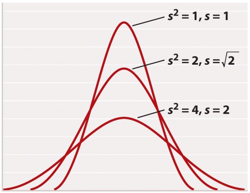
For reasons rooted in the history of statistics, the standard deviation is often stated in terms of s2 rather than s. The square of the standard deviation is called the variance of the distribution. Both the standard deviation and the variance are measures of how closely most data points are clustered around the mean. Not only is the standard deviation more easily interpreted than the variance (Figure 2), but also it is more intuitive in that standard deviation is expressed in the same units as the mean (for example, in the case of height, inches), whereas the variance is expressed in the square of the units (for example, inches2). On the other hand, the variance is the measure of dispersal around the mean that more often arises in statistical theory and the derivation of formulas. Figure 3 shows how increasing variance of a normal distribution corresponds to greater variation of individual values from the mean. Since all of the distributions in Figure 3 are normal, 68% of the values lie within one standard deviation of the mean, and 95% within two standard deviations of the mean.
Another measure of how much the numerical values in a sample are scattered is the range. As its name implies, the range is the difference between the largest and the smallest values in the sample. The range is a less widely used measure of scatter than the standard deviation.
Question
The percent maximum isometric force that a muscle fiber produces is plotted against the estimated number of myosin cross-bridges formed with actin.
| scatterplot | A way to present data graphically by depicting points on a plane according to x and y coordinates. The x and the y coordinates represent different variables. |
| negative correlation | An association between variables such that as one variable increases, the other decreases. |
| positive correlation | An association between variables such that as one variable increases, the other increases. |
| continuous data | Data that are measured and can take any value. |
| qualitative data | Descriptive data. |
Data and Data Presentation
Graphing Data
Now we can be confident that our numbers are reliable. The next challenge is to present the data. Typically we do this with a graph. Different kinds of data lend themselves to different kinds of graphs. Our mammal species data is discrete—we have clear categories: A, B, C, D, E, and F. For discrete data, either a pie chart or a bar graph would be appropriate. A pie chart divides a circle into “cake slices,” each representing the proportion of the total contributed by a particular category. In our trapping study, we have a total of 61 animals, so the slice representing species A will make an angle at the center of the pie of 17/61 x 360 = 100°. A bar graph represents the frequency of each species as a column whose height is proportional to frequency.
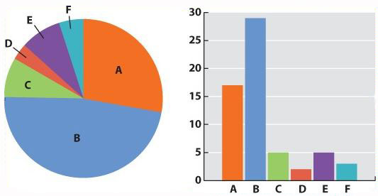
Fig. 1
What about continuous data? Imagine that the data we collected is the body lengths of the mammals we trapped. In this case, we might choose a histogram, which looks similar to a bar chart; only here we have to impose our own categories on a continuum of data. Because they were discrete categories—different species—the columns in the bar graph may have gaps between them. In the histogram, by contrast, there are no gaps between the columns because the end of one range (1–20cm) is continuous with the beginning of the next (20–40cm).
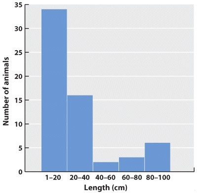
Fig. 2
Often we are plotting two variables against each other. If, for example, we record the time of day that each mammal is trapped, we can plot the total number of mammals trapped over the course of the 24-hour period.
| Midnight-2am | 2am-4am | 4am-6am | 6am-8am | 8am-10am | 10am-12am | 12am-2pm | 2pm-4pm | 4pm-6pm | 6pm-8pm | 8pm-10pm | 10pm-midnight | |
|---|---|---|---|---|---|---|---|---|---|---|---|---|
| Number trapped | 8 | 3 | 2 | 0 | 0 | 0 | 0 | 0 | 1 | 22 | 17 | 8 |
| Cumulative number | 8 | 11 | 13 | 13 | 13 | 13 | 13 | 13 | 14 | 36 | 53 | 61 |
Often one variable is independent—time, for example, will elapse regardless of the mammal count. We plot this on the x-axis, the horizontal axis of the graph. The dependent variable—the values that vary as a function of the independent variable (in this case, time of day)—is plotted on the y-axis, the vertical axis of the graph. If there is reason to believe that consecutive measurements are related to each other, points can be connected to each other by a line. Plotting our data on a graph using the values of the independent and dependent variables as coordinates gives us a line graph. This is a good way to identify trends and patterns in data. Here we can see that the mammals in our forest plot tend to be inactive (and therefore unlikely to be trapped) during daylight hours.
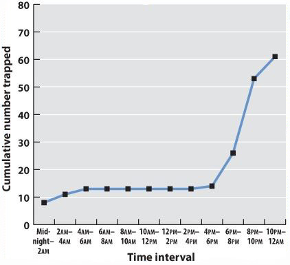
Fig. 3
In science, data are typically presented as a scatterplot, in which points are specified by their (x,y) coordinates. Points are not joined to each other by lines unless there are specified connections among them. Here, plotted in a way similar to the line graph (with the independent variable on the x-axis) is a scatterplot showing the time taken to drive from home to campus for a large number of students. The independent variable is the distance traveled; the dependent variable is travel time because the distances are fixed but travel times vary. Overall, there is a positive correlation between travel time and distance (the further you live from campus, the longer, on average, it will take you to get there), but there is plenty of variation as well. Look at the eight points representing the eight students who live five miles from campus. The variation we see in travel time (from 6 minutes to 30 minutes) is a reflection of differences in driving speed, traffic conditions, and route.
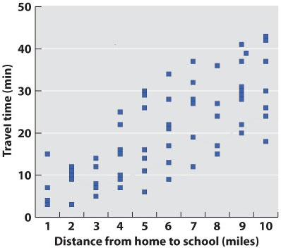
Fig. 4
What if there are more than two variables? Three-dimensional plots can be informative (but can also cause the reader headaches). A popular modern solution to this problem is a so-called temperature plot, in which the third dimension is represented in two dimensions through color: red (hot) for a strong effect in the third dimension and blue (cool) for a weak effect.
Graphs are the mainstay of scientific presentation, but you will see many other ways of presenting data in your textbook. For example, studies showing how different genes interact with each other in the course of development are often illustrated using network diagrams that give the reader a direct sense of the “connectedness” of a particular gene (or node). Evolutionary trees reveal the branching pattern of evolution with species that are closely related having a more recent common ancestor than those that are more distantly related.
Methods of presenting data in science are not limited, even in textbooks, by standard approaches. The popular press has developed many graphics-intense ways of presenting data. Think of an electoral map after an election. You can view information on a number of levels: whether the state is red or blue, the name of the election winner, the size of his or her majority, and so on. Scientists are learning that they too can package information in ways that are simultaneously informative and attractive.