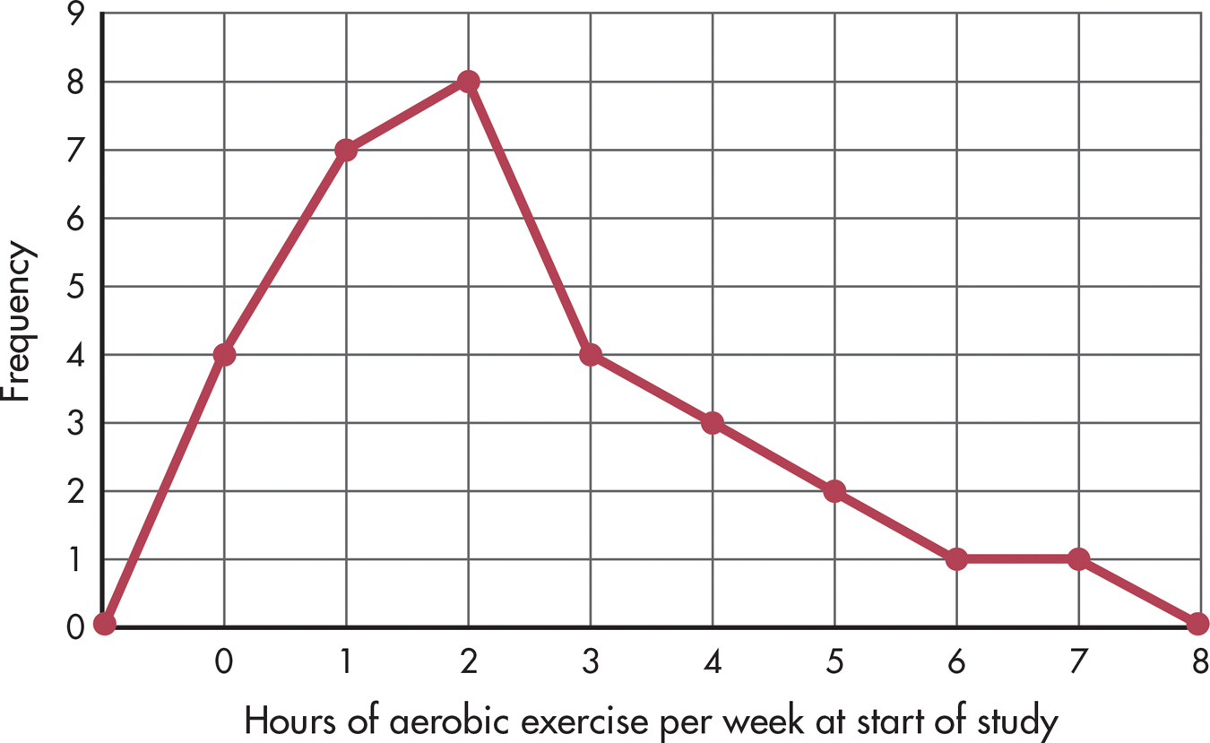
FIGURE A.2 A Frequency Polygon (Positive Skew) Like Table A.1 and Figure A.1, this frequency polygon shows at a glance that the number of hours of aerobic exercise performed weekly is not great for most people. The high points come at one and two hours, which doesn’t amount to much more than 10 or 15 minutes of exercise daily. An asymmetrical distribution like this one, which includes mostly low scores, is said to be positively skewed.