Designing Print and Online Documents
Chapter Opener
50
think visually
Designing Print and Online Documents
Much advice about good visual design is common sense: Of course, academic and professional documents should look uncluttered, consistent, and harmonious. But it is not always easy to translate principles into practice. Nor are any visual guidelines absolute. A balanced and consistent design is exactly what you want for research reports and government documents, but brochures or infographics may need more snap.

Science Source.
Understand the power of images. Most of us realize how powerful images can be, particularly when they perfectly capture a moment or make an argument that words alone struggle to express. The famous “Blue Marble” shot of the Earth taken by Apollo 17 in 1972 is one such image — conveying both the wonder and fragility of our planet hanging in space.
Visual texts can be important elements in your own work. Use photographs to tell arresting stories or use videos to underscore important points in an argument. In fact, you can craft the style of any page or screen — its colors, shapes, headings, type fonts, and so on — to make a text more visually appealing, focused, and accessible.
Be sure, though, to identify or caption any photos, videos, or audio files in your project. Captions, in particular, help readers appreciate the significance of the specific texts you have included. If you also number these items in longer papers (e.g., Fig. 1; Table 4), you can direct readers to them unambiguously.
Keep page designs simple and uncluttered. Simple doesn’t mean a design should be simplistic, only that you shouldn’t try to do more on a page than it (or your design skills) can handle. You want readers to find information they need, navigate your document without missteps, and grasp the structure of your project. Key information should stand out. If you make the basic design intuitive, you can present lots of information without a page feeling cluttered.
Consider, for example, how cleverly Anthro Technology Furniture uses design cues as simple as Step 1, Step 2, and Step 3 to guide consumers on a Web page through the complex process of configuring a workstation. Readers simply move left to right across a page, making specific choices. They don’t feel overwhelmed by the options, even though the material is detailed.
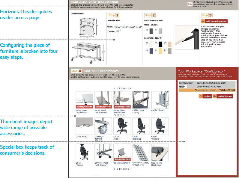
Courtesy of Anthro Corporation.
Keep the design logical and consistent. Readers should grasp the logic of a design quickly and then understand how its elements operate throughout a document — especially on Web sites, in PowerPoint presentations, and in long papers.
Look to successful Web sites for models of logical and consistent design. Many sites build their pages around distinct horizontal and vertical columns that help readers find information. A main menu generally appears near the top of the page, more detailed navigational links are usually located in a narrow side column, and featured stories often appear in wide columns in the center. To separate columns as well as individual items, the site designers use headlines, horizontal rules, images, or some combination of these devices. Handled well, pages are easy to navigate and thick with information, yet somehow they seem uncluttered.
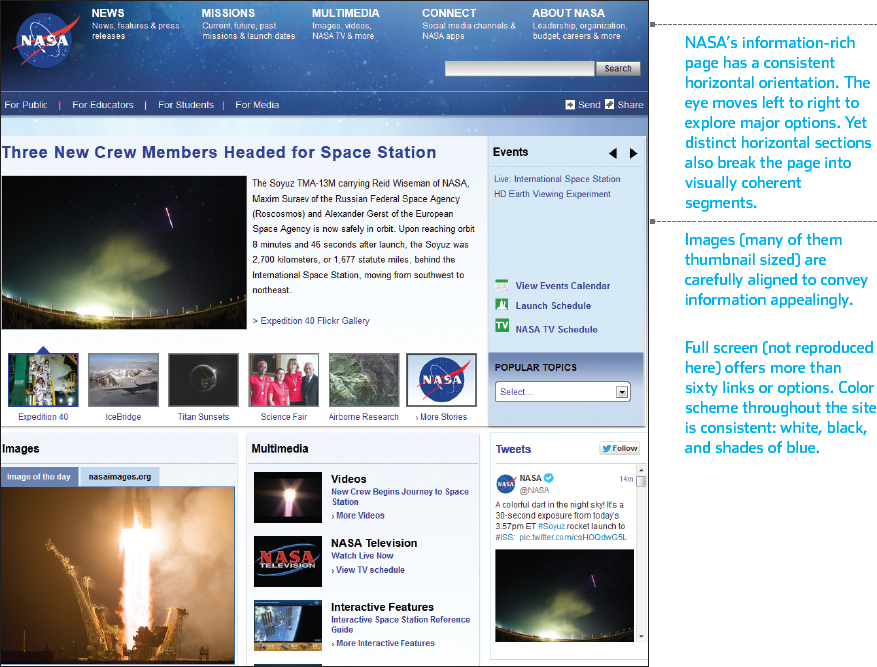
NASA home page. Courtesy NASA/JPL-
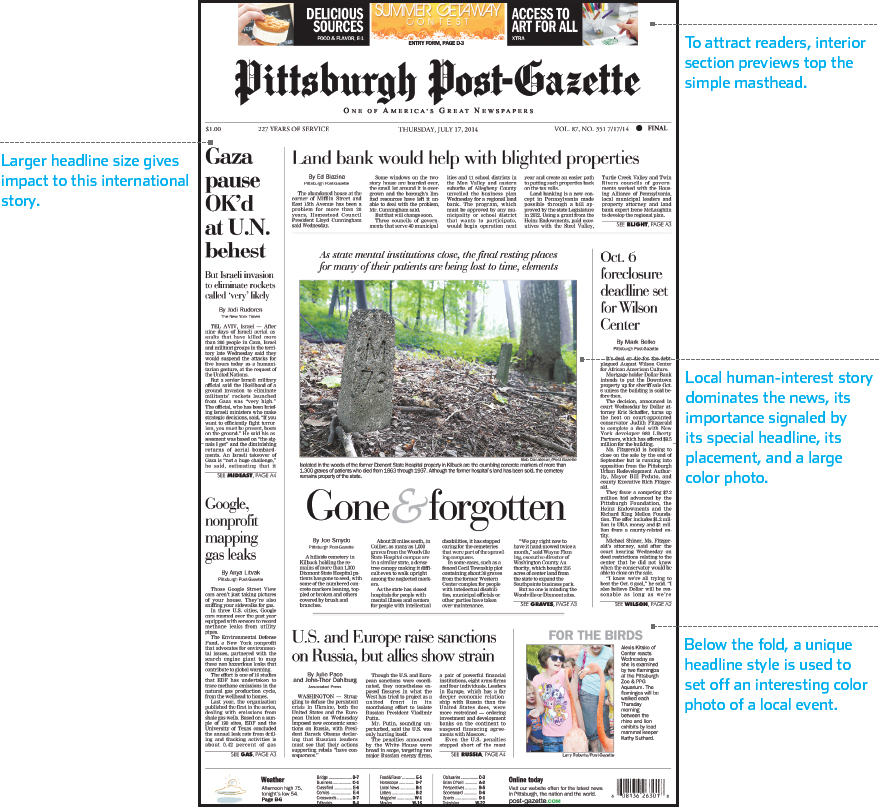
Home page of the Pittsburgh Post-
Copyright ©, Pittsburgh Post-
Keep the design balanced. Think of balance as an operative term — what you hope to achieve overall in a design. You probably don’t want many pages that, if split down the middle, would show mirror images. Strive instead for dynamic designs, in which, for example, a large photograph on one side of a document is offset on the other by blocks of print and maybe several smaller images. The overall effect achieved is rough symmetry, even though various page elements may all differ in size and shape.
You can see conventional design principles at work on the front pages of most newspapers (print or online), where editors try to come up with a look that gives impact to the news. They have many elements to work with, including their paper’s masthead, headlines of varying size, photographs and images, columns of copy, screened boxes, and much more. The pages of a newspaper can teach you a lot about design.
But you can learn, too, from the boundaries being pushed by designers of Web infographics (see Chapter 49), who use elaborate media effects to present information efficiently yet imaginatively. Unlike newspapers, magazines, or full Web sites, which must follow consistent specifications for page after page, a typical infographic focuses on a single theme or subject, and its creator chooses the media tools best suited to the topic, whether graphs, flowcharts, maps, images, diagrams, or cutaways.
Use templates sensibly. If you have the time and talent to design all your own documents, that’s terrific. But for many projects, you could do worse than to begin with the templates offered by many software products. The Project Gallery in Microsoft Office, for example, helps you create business letters, brochures, PowerPoint presentations, and more. It sets up a generic document, placing the document’s margins, aligning key elements and graphics, and offering an array of customizations. No two projects based on the same template need look alike.
If you resist borrowing such materials from software, not wanting yet another part of your life packaged by corporate types, know that it is tough to design documents from scratch. Even if you intend to design an item yourself, consider examining a template to figure out how to assemble a complex document. Take what you learn from the model and then strike out on your own.
Coordinate your colors. Your mother was right: Pay attention to shades and patterns when you dress and when you design color documents. To learn elementary principles of color coordination, try searching “color wheel” on the Web, but recognize that the subject is both complicated and more art than science. As an amateur, keep your design palettes relatively conventional and model your work on documents that you find particularly attractive.
For academic papers, the text is always black and the background is white. Color is fine in graphs and illustrations if the paper will be reviewed onscreen or printed in color. But be sure that no important elements are lost if the document is printed in black and white: A bar graph that relies on color to display differences might become unreadable. For Web sites and other projects, keep background shades light, if you use them at all, and maintain adequate contrast between text and background. Avoid either bright or pale fonts for passages of text.
Use headings if needed. Readers appreciate headings as pathways through a text. In academic work, they should be descriptive rather than clever. If you have prepared a good scratch or topic outline, the major points may provide you with almost ready-
A short paper (three to five pages) doesn’t require much more than a title. For longer papers (ten to twenty pages), it’s possible to use top-
Choose appropriate fonts. There are probably dozens or even hundreds of fonts to work with on your computer, but simple is generally best. Here is some basic information to help you choose an appropriate font for your needs.
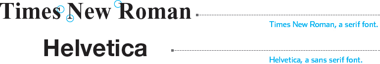
Serif fonts, such as Times New Roman, show thin flares and embellishments (called serifs; circled in the illustration on p. 565) at the tops and bottoms of their letters and characters. These fonts have a traditional look. In contrast, sans serif fonts, such as Helvetica, lack the decorations of serif fonts. They are smoother and more contemporary. On the sample newspaper front page (see below), serif fonts dominate, but sans serif fonts are used for several minor items.
Serif fonts are more readable than sans serif for extended passages of writing, such as papers. Headings in a sans serif font can offer welcome contrast in a document that uses a serif font for its text. Some designers prefer sans serif fonts for Web sites and PowerPoint presentations, especially for headings.
For typical academic projects, all text, headings, and other elements —including the title — are set in one font size, either 10 or 12 point. The standard font is Times New Roman. In professional or business projects, however, such as résumés, newsletters, or PowerPoint slides, you may want to vary fonts and type sizes in order to set off headings, captions, and headlines from other elements.
You can boldface words and phrases selectively to make them stand out clearly on a page. But boldfaced items or headings close together can make a page look heavy and cluttered. Such items should be rare. Never use boldface as the regular text throughout a project. If you want an emphatic font, find one that looks that way in its regular form.
Fonts described as display and decorative are designed to attract attention (see, for example the masthead of the Pittsburgh Post-
 For a tutorial on using Word and similar tools, see Tutorials > Digital Writing > Word Processing