INFOGRAPHIC
INFOGRAPHIC
INFOGRAPHIC
Infographics are visual reports designed to present data memorably and powerfully. If they do their job well, they can also make convincing arguments. So it should be no surprise that most of the infographics available on the official White House site carry partisan messages (see http:/
Reading the Genre
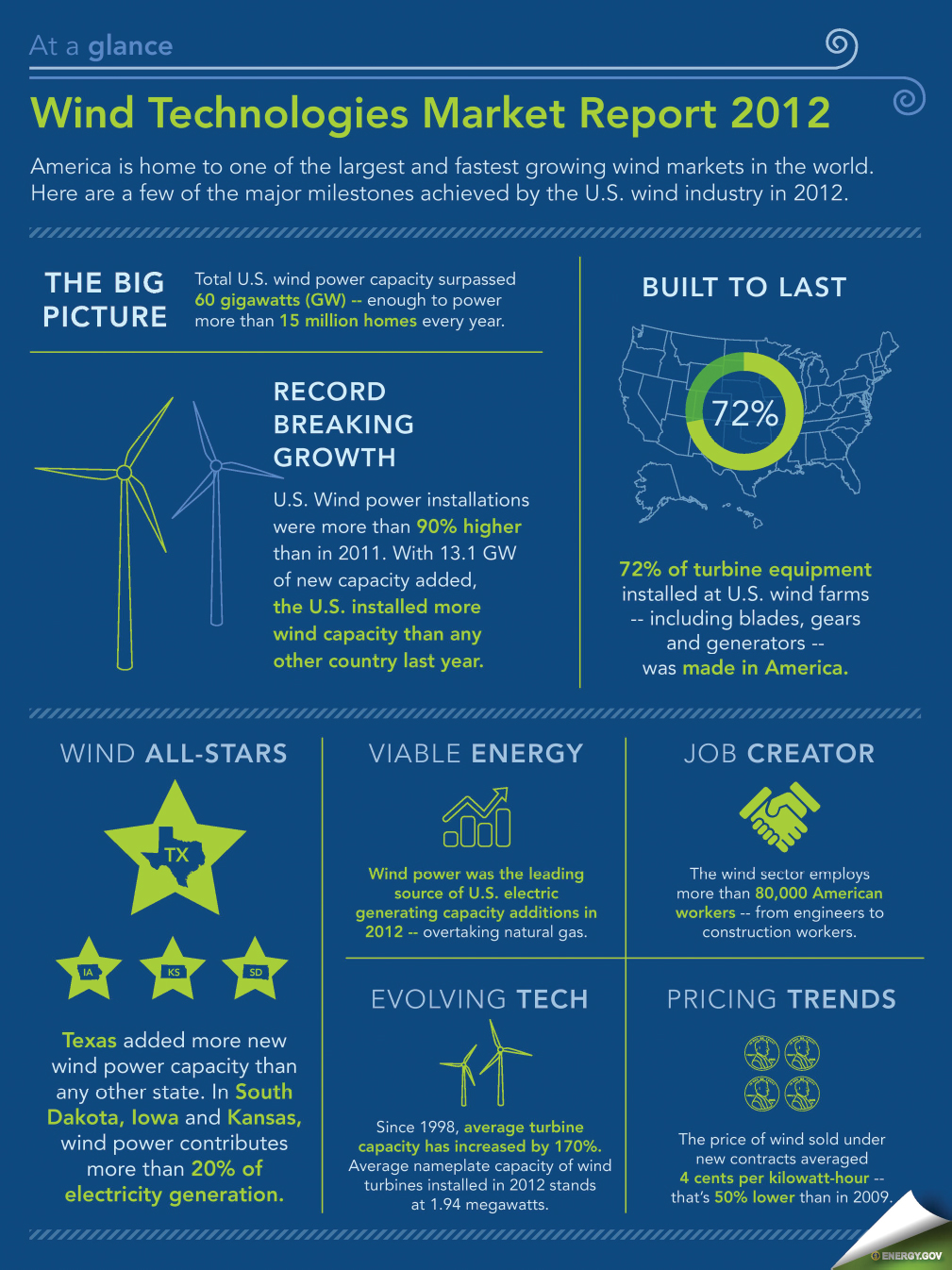
Study the infographic that follows, paying attention to the way it presents data about growth in the energy sector. Aside from presenting numbers and information, what messages do the designers of the relatively modest chart try to convey? What visual devices do its creators use to emphasize key points about wind energy? Why is it important that “Share on Facebook” and “Share on Twitter” buttons accompany this item when viewed online?