The number of new point mutations increases with father’s age
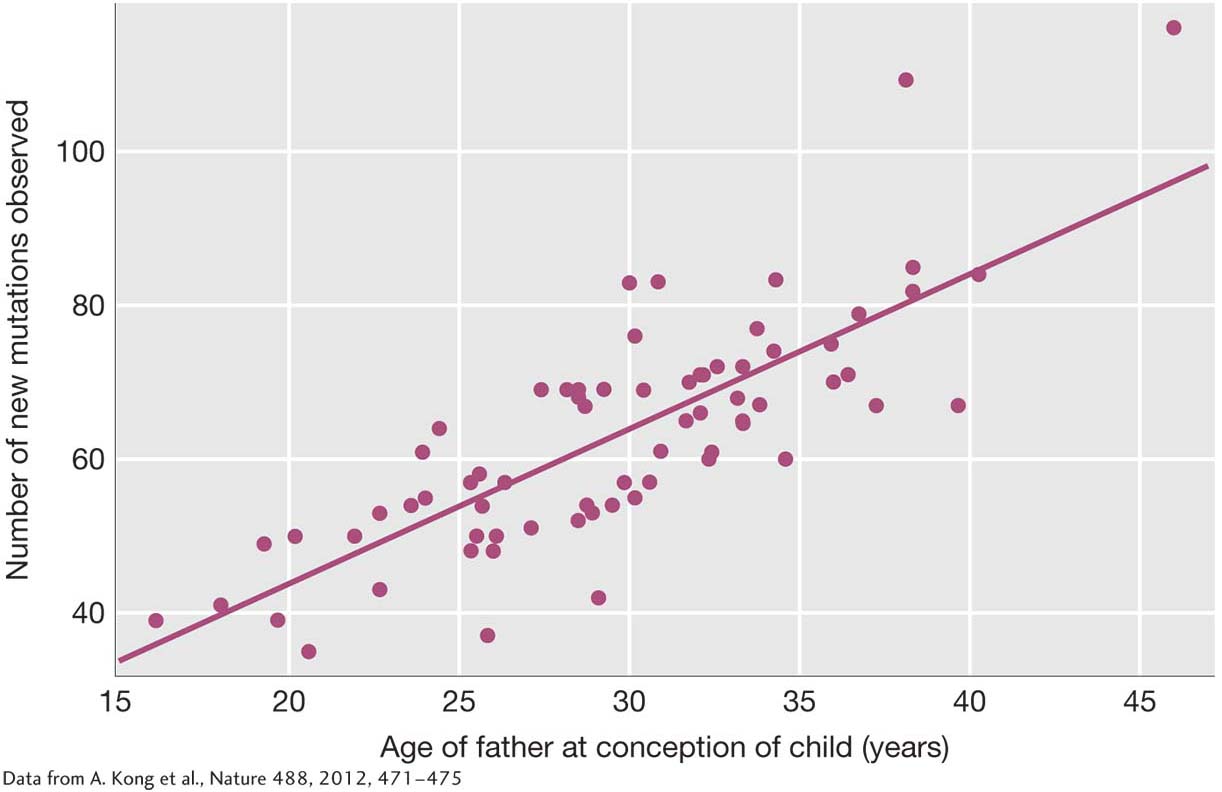
Plot of the number of new point mutations in each child (y-axis) by the age of the child’s father (x-axis). Each dot represents one of the 78 children studied. The diagonal line indicates the rate of increase in new mutations with the father’s age.
[Data from A. Kong et al., Nature 488, 2012, 471-475.]