19.2 A Simple Genetic Model for Quantitative Traits
A mathematical model is a simplified representation of a complex phenomenon. As an example, we could place a bucket under a flowing spigot and measure the volume of water in the bucket as a function of the amount of time the bucket is left under the spigot: volume = function(time). We could construct a more detailed model that includes the rate at which water comes out of the spigot: volume = function(rate × time). Models allow us to describe a phenomenon in terms of the variables that influence it and then to use the model to make predictions about the state of the phenomenon under different values for these variables. In this section, we will define the mathematical model used by quantitative geneticists to study complex traits.
Genetic and environmental deviations
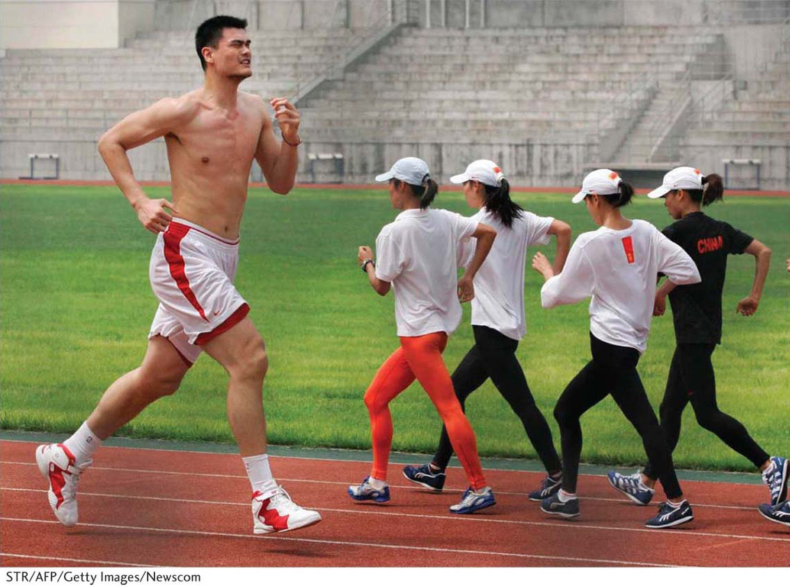
We will now examine how phenotypes can be decomposed into their genetic and environmental contributions, using as an example the height of Yao Ming, the former center for the Houston Rockets basketball team. Yao Ming stands out at 229 cm, or 7 feet, 6 inches (Figure 19-3). That’s right: Yao Ming is nearly two feet taller than the average man from Shanghai, which happens to be Yao Ming’s hometown. As for all of us, Yao Ming’s height is the combined result of his genotype and the environment in which he was raised. Let’s do an imaginary experiment and see how we can tease apart the genetic and environmental contributions to Yao Ming’s exceptional height.
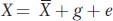
First, we will define a simple mathematical model that can be applied to any quantitative trait. The value for an individual for a trait (X) can be expressed in terms of the population mean and deviations from the mean due to genetic (g) and environmental (e) factors.
We are using lowercase g and e for the genetic and environmental deviations, just as we used a lowercase x for the deviation of X from the mean. Thus, in Yao Ming’s case, his height can be expressed as the mean value for men from Shanghai (170 cm) plus his specific genetic and environmental deviations (g + e = 59 cm). We can simplify the equation above by subtracting  from both sides to obtain
x = g + e
where x represents the individual’s phenotypic deviation. For Yao Ming, x = g + e = 59.
How can we determine the values of g and e for Yao Ming? One way would be if we had clones of Yao Ming (clones are genetically identical individuals). Let’s imagine that we cloned Yao Ming and distributed these clones (as newborns) to a set of randomly chosen households in Shanghai. Twenty-
229 = 170 + 42 + 17
723
We conclude that Yao Ming’s exceptional height is mostly due to exceptional genetics, but he also experienced an environment that boosted his height.
Although our imaginary experiment of cloning Yao Ming is far-
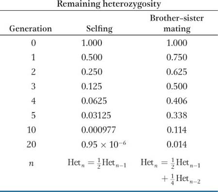
Inbred Lines
An inbred line is a specific strain of a plant or animal species that has been self- heterozygotes and
homozygotes (
heterozygotes and
homozygotes ( A/A plus
a/a). Of the ensemble of all heterozygous loci in the genome, then, after one generation of selfing, only 1/2 will still be heterozygous; after two generations, 1/4; after three generations, 1/8, and so forth. In the nth generation,
A/A plus
a/a). Of the ensemble of all heterozygous loci in the genome, then, after one generation of selfing, only 1/2 will still be heterozygous; after two generations, 1/4; after three generations, 1/8, and so forth. In the nth generation,

where Hetn is the proportion of heterozygous loci in the nth generation and Het0 is the proportion in the 0 generation.
When selfing is not possible, brother–
Inbred lines are enormously important not only in quantitative genetics but in genetics in general. Geneticists have developed many inbred strains for different model organisms, including Drosophila, mice, C. elegans, yeast, Arabidopsis, and maize. If one uses an inbred strain for an experiment, then one knows that individuals receiving different treatments are genetically identical. Therefore, any differences observed between treatments cannot be attributed to genetic differences among the individuals used in the experiment.
Table 19-2 (experiment I) shows simulated data for 10 inbred strains of maize that were grown in three different environments and scored for the number of days between planting and the time that the plants first shed pollen. The overall mean is 70 days. Let’s consider line A when grown in environment 1. The mean for all lines in environment 1 is 68, or 2 less than the overall mean, so e for environment 1 is −2. The mean line A over all three environments is 64, or 6 less than the overall mean, so g for line A is –6. Putting these two values together, we decompose the phenotype of line A when grown in environment 1 as
62 = 70 + (–6) + (−2)
724
We could do the same calculations for the other nine inbred lines, and then we’d have a complete description of all the phenotypes in each environment in terms of the extent to which their deviation from the overall mean is due to genetic and environmental factors.
|
Experiment I |
|||||||||||
|
Inbred lines |
A |
B |
C |
D |
E |
F |
G |
H |
I |
J |
Mean |
|
Environment 1 |
62 |
64 |
66 |
66 |
68 |
68 |
70 |
70 |
72 |
74 |
68 |
|
Environment 2 |
64 |
66 |
68 |
68 |
70 |
70 |
72 |
72 |
74 |
76 |
70 |
|
Environment 3 |
66 |
68 |
70 |
70 |
72 |
72 |
74 |
74 |
76 |
78 |
72 |
|
Mean |
64 |
66 |
68 |
68 |
70 |
70 |
72 |
72 |
74 |
76 |
70 |
|
Experiment II |
|||||||||||
|
Inbred lines |
A |
B |
C |
D |
E |
F |
G |
H |
I |
J |
Mean |
|
Environment 4 |
58 |
60 |
62 |
62 |
64 |
64 |
66 |
66 |
68 |
70 |
64 |
|
Environment 5 |
64 |
66 |
68 |
68 |
70 |
70 |
72 |
72 |
74 |
76 |
70 |
|
Environment 6 |
70 |
72 |
74 |
74 |
76 |
76 |
78 |
78 |
80 |
82 |
76 |
|
Mean |
64 |
66 |
68 |
68 |
70 |
70 |
72 |
72 |
74 |
76 |
70 |
Genetic and environmental variances
We can use the simple model x = g + e to think further about the variance of quantitative traits. Recall that the variance is a way to measure how much individuals deviate from the population mean. Under this model, the trait variance can be partitioned into the genetic and the environmental variances:
Vx = Vg + Ve
This simple equation tells us that the trait or phenotypic variation (VX) is the sum of two components—
Genetic and Environmental Variances
To better understand the basic equation VX = Vg + Ve, we need to introduce a new concept from statistics—
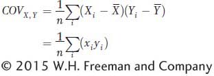
where x and y are the deviations of X and Y from their respective means as described in the main text. The term 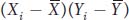 or (xi yi) is referred to as the cross product. The covariance is obtained by summing all the cross products together and dividing by n. The covariance is the average or expected value, E(xy), of the cross products. The covariance can vary from negative infinity to positive infinity. If large values of X are associated with large values of Y, then the covariance will be positive. If large values of X are associated with small values of Y, then the covariance will be negative. If there is no association between X and Y, then the covariance will be zero. For independent traits, the covariance will be zero.
In the main text, we saw that the variance is the expected value of the squared deviations:
Vx = E(x2)
Since the phenotypic deviation (x) is the sum of the genotypic (g) and environmental (e) deviations, we can substitute (g + e) for x and obtain
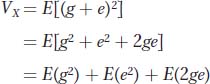
The first term [E(g2)] is the genetic variance, the middle term [E(e2)] is the environmental variance, and the last term is twice the covariance between genotype and environment.
In controlled experiments, different genotypes are placed into different environments at random. In other words, genotype and environment are independent. If genotype and environment are independent, then the covariance between genotype and environment E(ge) = 0, and the equation reduces to
Thus, the phenotypic variance is the sum of the variance due to the different genotypes in the population and the variance due to the different environments within which the organisms are reared.
We can use the data in Table 19-2 (experiment I) to explore the equation for variances. First, let’s use all 30 phenotypic values for the 10 lines in the three environments to calculate the variance. The result is VX = 14.67 days2. Now, to estimate Vg, we calculate the variance of the means among the 10 inbred lines. The result is Vg = 12.0 days2. Finally, to estimate Ve, we calculate the variance of the means among the three environments. The result is Ve = 2.67 days2. Thus, the phenotypic variance (14.67) is equal to the genetic variance (12.0) plus the environmental variance (2.67). The equation works for these data because genotype and environment are not correlated. All genotypes experience the same range of environments.
If we calculate the standard deviations for the data in Table 19-2 (experiment I), we’ll observe that the phenotypic standard deviation (3.83) is not the sum of the genetic (3.46) and environmental (1.63) standard deviations. Variances can be decomposed into difference sources. Standard deviations cannot be decomposed in this manner. Below, we will see how this property of the variance is helpful for quantifying the extent to which trait variation is heritable versus environmental.
725
Finally, let’s look at what would happen to the variances if genotype and environment are correlated. To do this, imagine that we knew the genetic deviations (g) for nine Thoroughbred horses for the time it takes them to run the Kentucky Derby. We also know the environmental deviations (e) that their trainers contribute to the time it takes each horse to run this race. We will suppose that besides training, there are no other sources of environmental variation. The population mean for this set of Thoroughbreds is 123 seconds to run the Derby. We assign the best horses to the best trainers and the worst horses to the worst trainers. By doing this, we have created a nonrandom relationship or correlation between horses (genotypes) and trainers (environments).
Table 19-3 shows the data for this imaginary experiment. You’ll notice that VX (6.67) is not equal to the sum of Vg (2.22) and Ve (1.33). Because genotype and environment are correlated, we violated the assumption of the equation that states VX = Vg + Ve. The equation only works when genotype and environment are uncorrelated.
|
Horse |
Population mean |
g |
Trainer |
e |
x |
X |
|---|---|---|---|---|---|---|
|
Secretariat |
123 |
−2 |
Lucien |
−2 |
−4 |
119 |
|
Decidedly |
123 |
−2 |
Horatio |
−1 |
−3 |
120 |
|
Barbaro |
123 |
−1 |
Mike |
−1 |
−2 |
121 |
|
Unbridled |
123 |
−1 |
Carl |
0 |
−1 |
122 |
|
Ferdinand |
123 |
0 |
Charlie |
0 |
0 |
123 |
|
Cavalcade |
123 |
1 |
Bob |
0 |
1 |
124 |
|
Meridian |
123 |
1 |
Albert |
1 |
2 |
125 |
|
Whiskery |
123 |
2 |
Fred |
1 |
3 |
126 |
|
Gallant Fox |
123 |
2 |
Jim |
2 |
4 |
127 |
|
Mean (sec) |
123 |
0 |
0 |
0 |
123 |
|
|
Variance (sec2) |
2.22 |
1.33 |
6.67 |
6.67 |
Correlation between variables
If genotype and environment are correlated, then the VX = Vg + Ve equation does not apply. Rather, for this equation to be appropriate, genotype and environment must be uncorrelated, or independent. Let’s look a little more closely at the concept of correlation, the existence of a relationship between two variables. This is a critical concept to quantitative genetics, as we will see throughout this chapter.
726
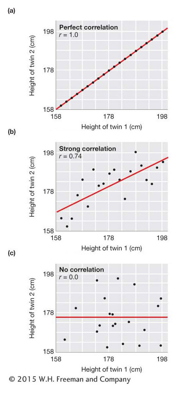
To visualize the degree of correlation between two variables, we can construct scatter plots, or scatter diagrams. Figure 19-4 shows the scatter plots that we would see under several different strengths of correlation between two variables. These plots use simulated data for the heights of imaginary sets of identical adult male twins. The top panel of the figure shows a perfect correlation, which is what we would see if the height of one twin was exactly the same as that of the other twin for all sets of twins. The middle panel shows a strong but not perfect correlation. Here, when one twin is short, the other also tends to be short, and when one is tall, the other tends to be tall. The bottom panel shows the relationship we would see if the height of one twin was uncorrelated with that of the other twin of the set. Here, the height of one twin of each set is random with respect to the other twin of the set. In the next section, we will see that the data for real twins would look something like the middle panel.
In statistics, there is a specific measure of correlation called the correlation coefficient, which is symbolized by a lowercase r. It is a measure of association between two variables. The correlation coefficient is related to the covariance, which was introduced in Box 19-2; however, it is scaled to vary between −1 and +1. If we symbolize one random variable by X and the other by Y, then the correlation coefficient between X and Y is
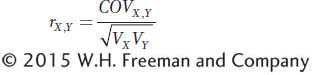
The term  is used to scale the covariance to vary between −1 and +1. The expanded equation for the correlation coefficient is
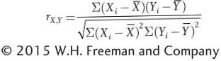
The equation is cumbersome, and in practice, the calculation of correlation coefficients is done with the aid of computers. For two variables that are perfectly correlated, r = +1.0 if as one variable gets larger, the other gets larger, or r = −1.0 if as one gets larger, the other gets smaller. For completely independent variables, r = 0.0.
727
In Figure 19-4, the correlation coefficient is shown on each panel. It is 1.0 in the top panel for a perfect positive correlation, 0.74 in the middle panel for a strong correlation, and 0.0 in the bottom panel for no correlation (independence of X and Y). The slope of the red line on each panel is equal to the correlation coefficient and provides a visual indicator of the strength of the correlation.
As an exercise, use the data in Table 19-3 to construct a scatter diagram and calculate the correlation coefficient. This would best be done with a computer and spreadsheet software. Use the genetic deviations (g) for the x-axis and the environmental deviations (e) for the y-
KEY CONCEPT
An individual’s phenotype for a trait can be expressed in terms of its deviation from the population mean. The phenotypic deviation (x) of an individual is composed of two parts—The phenotypic variation in a population for a trait (VX) can be decomposed into the genetic (Vg) and the environmental (Ve) variances. This decomposition assumes that the genotypes and environments are uncorrelated.