2.6 2.5 Cautions about Correlation and Regression
When you complete this section, you will be able to:
• Calculate the residuals for a set of data using the equation of the least-squares regression line and the observed values of the explanatory variable.
• Use a plot of the residuals versus the explanatory variable to assess the fit of a regression line.
• Identify outliers and influential observations by examining scatterplots and residual plots.
• Identify lurking variables that can influence the interpretation of relationships between two variables.
• Explain the difference between association and causality when interpreting the relationship between two variables.
Correlation and regression are among the most common statistical tools. They are used in more elaborate form to study relationships among many variables, a situation in which we cannot see the essentials by studying a single scatterplot. We need a firm grasp of the use and limitations of these tools, both now and as a foundation for more advanced statistics.
Residuals
A regression line describes the overall pattern of a linear relationship between an explanatory variable and a response variable. Deviations from the overall pattern are also important. In the regression setting, we see deviations by looking at the scatter of the data points about the regression line. The vertical distances from the points to the least-squares regression line are as small as possible in the sense that they have the smallest possible sum of squares. Because they represent “leftover” variation in the response after fitting the regression line, these distances are called residuals.
124
RESIDUALS
A residual is the difference between an observed value of the response variable and the value predicted by the regression line. That is,
EXAMPLE 2.26
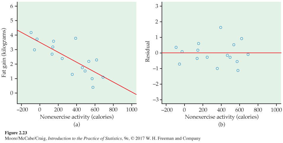
Residuals for fat gain. Example 2.19 (page 107) describes measurements on 16 young people who volunteered to overeat for eight weeks. Those whose nonexercise activity (NEA) spontaneously rose substantially gained less fat than others. Figure 2.23(a) is a scatterplot of these data. The pattern is linear. The least-squares line is
fat gain = 3.505 − (0.00344 × NEA increase)
One subject’s NEA rose by 135 calories. That subject gained 2.7 kilograms of fat. The predicted gain for 135 calories is
The residual for this subject is, therefore,
Most regression software will calculate and store residuals for you.
125
USE YOUR KNOWLEDGE
Question 2.92
2.92 Find the predicted value and the residual. Let’s say that we have an individual in the NEA data set who has NEA increase equal to 250 calories and fat gain equal to 2.4 kg. Find the predicted value of fat gain for this individual and then calculate the residual. Explain why this residual is negative.
Because the residuals show how far the data fall from our regression line, examining the residuals helps us assess how well the line describes the data. Although residuals can be calculated from any model fit to the data, the residuals from the least-squares line have a special property: the mean of the least-squares residuals is always zero.
USE YOUR KNOWLEDGE
Question 2.93
2.93 Find the sum of the residuals. Here are the 16 residuals for the NEA data rounded to two decimal places:
| 0.37 | −0.70 | 0.10 | −0.34 | 0.19 | 0.61 | −0.26 | −0.98 |
| 1.64 | −0.18 | −0.23 | 0.54 | −0.54 | −1.11 | 0.93 | −0.03 |
Find the sum of these residuals. Note that the sum is not exactly zero because of roundoff error.
You can see the residuals in the scatterplot of Figure 2.23(a) by looking at the vertical deviations of the points from the line. The residual plot in Figure 2.23(b) makes it easier to study the residuals by plotting them against the explanatory variable, increase in NEA.
RESIDUAL PLOTS
A residual plot is a scatterplot of the regression residuals against the explanatory variable. Residual plots help us assess the fit of a regression line.
Because the mean of the residuals is always zero, the horizontal line at zero in Figure 2.23(b) helps orient us. This line (residual = 0) corresponds to the fitted line in Figure 2.23(a). The residual plot magnifies the deviations from the line to make patterns easier to see. If the regression line catches the overall pattern of the data, there should be no pattern in the residuals. That is, the residual plot should show an unstructured horizontal band centered at zero. The residuals in Figure 2.23(b) do have this irregular scatter.
You can see the same thing in the scatterplot of Figure 2.23(a) and the residual plot of Figure 2.23(b). It’s just a bit easier in the residual plot. Deviations from an irregular horizontal pattern point out ways in which the regression line fails to catch the overall pattern. Here is an example.
126
EXAMPLE 2.27
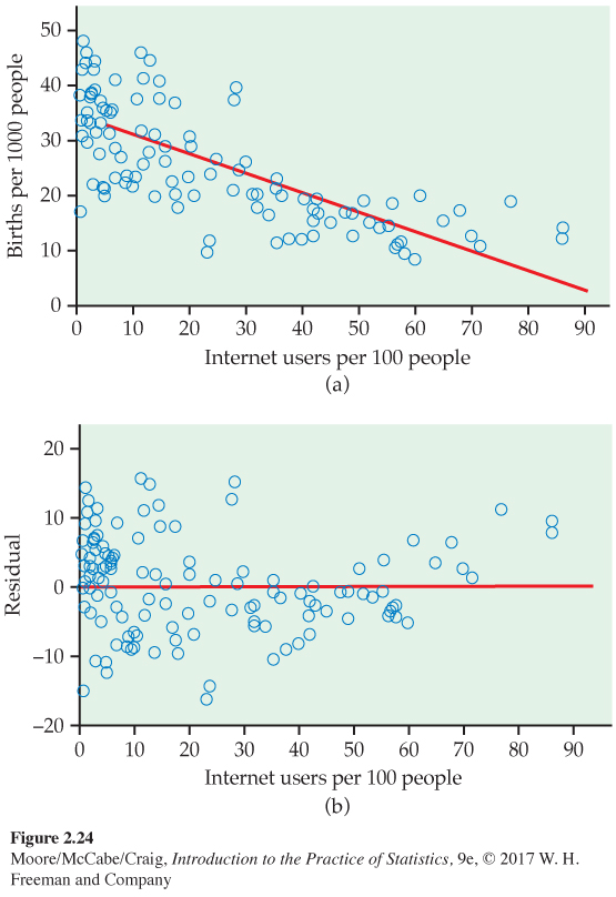
Patterns in birthrate and Internet user residuals. In Exercise 2.34 (page 99) we used a scatterplot to study the relationship between birthrate and Internet users for 106 countries. In this scatterplot, Figure 2.13, we see that there are many countries with low numbers of Internet users. In addition, the relationship between births and Internet users appears to be curved. For low values of Internet users, there is a clear relationship, while for higher values, the curve becomes relatively flat.
Figure 2.24(a) gives the data with the least-squares regression line, and Figure 2.24(b) plots the residuals. Look at the right part of Figure 2.24(b), where the values of Internet users are high. Here we see that the residuals tend to be positive.
![]()
The residual pattern in Figure 2.24(b) is characteristic of a simple curved relationship. There are many ways in which a relationship can deviate from a linear pattern. We now have an important tool for examining these deviations. Use it frequently and carefully when you study relationships.
127
| Subject | HbA1c (%) |
FPG (mg/ml) |
Subject | HbA1c (%) |
FPG (mg/ml) |
Subject | HbA1c (%) |
FPG (mg/ml) |
|---|---|---|---|---|---|---|---|---|
| 1 | 6.1 | 141 | 7 | 7.5 | 96 | 13 | 10.6 | 103 |
| 2 | 6.3 | 158 | 8 | 7.7 | 78 | 14 | 10.7 | 172 |
| 3 | 6.4 | 112 | 9 | 7.9 | 148 | 15 | 10.7 | 359 |
| 4 | 6.8 | 153 | 10 | 8.7 | 172 | 16 | 11.2 | 145 |
| 5 | 7.0 | 134 | 11 | 9.4 | 200 | 17 | 13.7 | 147 |
| 6 | 7.1 | 95 | 12 | 10.4 | 271 | 18 | 19.3 | 255 |
Outliers and influential observations
When you look at scatterplots and residual plots, look for striking individual points as well as for an overall pattern. Here is an example of data that contain some unusual cases.
EXAMPLE 2.28
Diabetes and blood sugar. People with diabetes must manage their blood sugar levels carefully. They measure their fasting plasma glucose (FPG) several times a day with a glucose meter. Another measurement, made at regular medical checkups, is called HbA1c. This is roughly the percent of red blood cells that have a glucose molecule attached. It measures average exposure to glucose over a period of several months.
This diagnostic test is becoming widely used and is sometimes called A1c by health care professionals. Table 2.2 gives data on both HbA1c and FPG for 18 diabetics five months after they completed a diabetes education class.21
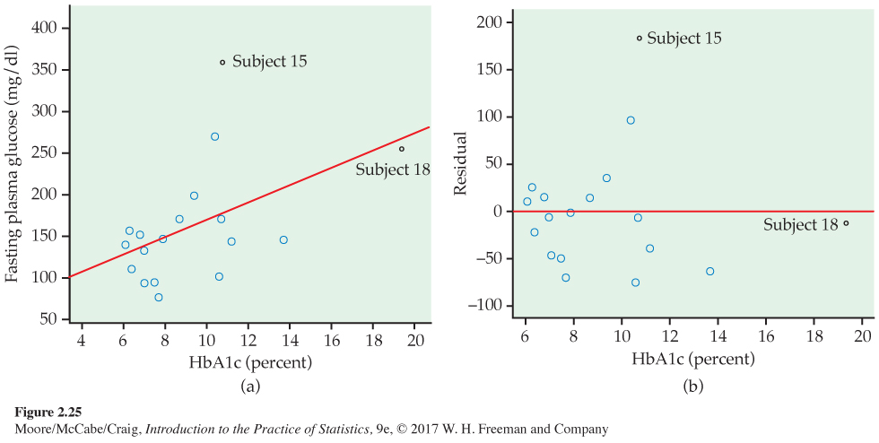
Because both FPG and HbA1c measure blood glucose, we expect a positive association. The scatterplot in Figure 2.25(a) shows a surprisingly weak relationship, with correlation r = 0.4819. The line on the plot is the least-squares regression line for predicting FPG from HbA1c. Its equation is
128
It appears that one-time measurements of FPG can vary quite a bit among people with similar long-term levels, as measured by HbA1c. This is why A1c is an important diagnostic test.
Two unusual cases are marked in Figure 2.25(a). Subjects 15 and 18 are unusual in different ways. Subject 15 has dangerously high FPG and lies far from the regression line in the y direction. Subject 18 is close to the line but far out in the x direction. The residual plot in Figure 2.25(b) confirms that Subject 15 has a large residual and that Subject 18 does not.
Points that are outliers in the x direction, like Subject 18, can have a strong influence on the position of the regression line. Least-squares lines make the sum of squares of the vertical distances to the points as small as possible. A point that is extreme in the x direction with no other points near it pulls the line toward itself.
OUTLIERS AND INFLUENTIAL OBSERVATIONS IN REGRESSION
An outlier is an observation that lies outside the overall pattern of the other observations. Points that are outliers in the y direction of a scatterplot have large regression residuals, but other outliers need not have large residuals.
An observation is influential for a statistical calculation if removing it would markedly change the result of the calculation. Points that are outliers in the x direction of a scatterplot are often influential for the least-squares regression line.
Influence is a matter of degree—how much does a calculation change when we remove an observation? It is difficult to assess influence on a regression line without actually doing the regression both with and without the suspicious observation. A point that is an outlier in x is often influential. But if the point happens to lie close to the regression line calculated from the other observations, then its presence will move the line only a little and the point will not be influential.
The influence of a point that is an outlier in y depends on whether there are many other points with similar values of x that hold the line in place. Figures 2.25(a) and (b) identify two unusual observations. How influential are they?
EXAMPLE 2.29
Influential observations. Subjects 15 and 18 both influence the correlation between FPG and HbA1c, in opposite directions. Subject 15 weakens the linear pattern; if we drop this point, the correlation increases from r = 0.4819 to r = 0.5684. Subject 18 extends the linear pattern; if we omit this subject, the correlation drops from r = 0.4819 to r = 0.3837.
129
To assess influence on the least-squares line, we recalculate the line leaving out a suspicious point. Figure 2.26 shows three least-squares lines. The solid line is the regression line of FPG on HbA1c based on all 18 subjects. This is the same line that appears in Figure 2.25(a). The dotted line is calculated from all subjects except Subject 18. You see that point 18 does pull the line down toward itself. But the influence of Subject 18 is not very large—the dotted and solid lines are close together for HbA1c values between 6 and 14, the range of all except Subject 18.
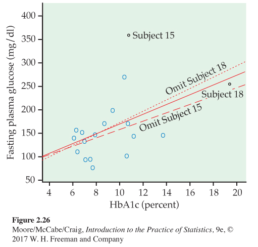
The dashed line omits Subject 15, the outlier in y. Comparing the solid and dashed lines, we see that Subject 15 pulls the regression line up. The influence is again not large, but it exceeds the influence of Subject 18.
We did not need the distinction between outliers and influential observations in Chapter 1. A single large salary that pulls up the mean salary for a group of workers is an outlier because it lies far above the other salaries. It is also influential because the mean changes when it is removed. In the regression setting, however, not all outliers are influential. Because influential observations draw the regression line toward themselves, we may not be able to spot them by looking for large residuals.
Beware of the lurking variable
Correlation and regression are powerful tools for measuring the association between two variables and for expressing the dependence of one variable on the other. These tools must be used with an awareness of their limitations. We have seen that
130
• Correlation measures only linear association, and fitting a straight line makes sense only when the overall pattern of the relationship is linear. Always plot your data before calculating.
• Extrapolation (using a fitted model far outside the range of the data that we used to fit it) often produces unreliable predictions.
• Correlation and least-squares regression are not resistant. Always plot your data and look for potentially influential points.
Another caution is even more important: the relationship between two variables can often be understood only by taking other variables into account. Lurking variables can make a correlation or regression misleading.
LURKING VARIABLE
A lurking variable is a variable that is not among the explanatory or response variables in a study and yet may influence the interpretation of relationships among those variables.
EXAMPLE 2.30
Discrimination in medical treatment? Studies show that men who complain of chest pain are more likely to get detailed tests and aggressive treatment such as bypass surgery than are women with similar complaints. Is this association between sex and treatment due to discrimination?
Perhaps not. Men and women develop heart problems at different ages—women are, on the average, between 10 and 15 years older than men. Aggressive treatments are more risky for older patients, so doctors may hesitate to recommend them. Lurking variables—the patient’s age and condition—may explain the relationship between sex and doctors’ decisions.
Here is an example of a different type of lurking variable.
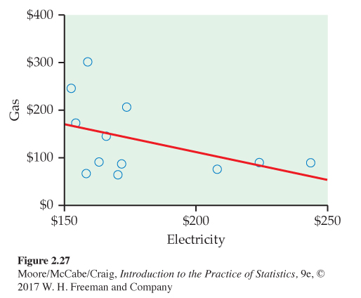
EXAMPLE 2.31
Gas and electricity bills. A single-family household receives bills for gas and electricity each month. The 12 observations for a recent year are plotted with the least-squares regression line in Figure 2.27. We have arbitrarily chosen to put the electricity bill on the x axis and the gas bill on the y axis. There is a clear negative association. Does this mean that a high electricity bill causes the gas bill to be low and vice versa?
To understand the association in this example, we need to know a little more about the two variables. In this household, heating is done by gas and cooling is done by electricity. Therefore, in the winter months the gas bill will be relatively high and the electricity bill will be relatively low. The pattern is reversed in the summer months. The association that we see in this example is due to a lurking variable: time of year.
131
Correlations that are due to lurking variables are sometimes called “nonsense correlations.” The correlation is real. What is nonsense is the suggestion that the variables are directly related so that changing one of the variables causes changes in the other. The question of causation is important enough to merit separate treatment in Section 2.7. For now, just remember that an association between two variables x and y can reflect many types of relationships among x, y, and one or more lurking variables.
![]()
ASSOCIATION DOES NOT IMPLY CAUSATION
An association between an explanatory variable x and a response variable y, even if it is very strong, is not by itself good evidence that changes in x actually cause changes in y.
![]()
Lurking variables sometimes create a correlation between x and y, as in Examples 2.30 and 2.31. When you observe an association between two variables, always ask yourself if the relationship that you see might be due to a lurking variable. As in Example 2.31, time is often a likely candidate.
Beware of correlations based on averaged data
Regression or correlation studies sometimes work with averages or other measures that combine information from many individuals. For example, if we plot the average height of young children against their age in months, we will see a very strong positive association with correlation near 1. But individual children of the same age vary a great deal in height. A plot of height against age for individual children will show much more scatter and lower correlation than the plot of average height against age.
![]()
A correlation based on averages over many individuals is usually higher than the correlation between the same variables based on data for individuals. This fact reminds us again of the importance of noting exactly what variables a statistical study involves.
132
Beware of restricted ranges
The range of values for the explanatory variable in a regression can have a large impact on the strength of the relationship. For example, if we use age as a predictor of reading ability for a sample of students in the third grade, we will probably see little or no relationship. However, if our sample includes students from grades 1 through 8, we would expect to see a relatively strong relationship. We call this phenomenon the restricted-range problemrestricted-range problem.
EXAMPLE 2.32
A test for job applicants. Your company gives a test of cognitive ability to job applicants before deciding whom to hire. Your boss has asked you to use company records to see if this test really helps predict the performance ratings of employees. The restricted-range problem may make it difficult to see a strong relationship between test scores and performance ratings. The current employees were selected by a mechanism that is likely to result in scores that tend to be higher than those of the entire pool of applicants.
BEYOND THE BASICS
Data Mining
Chapters 1 and 2 of this text are devoted to the important aspect of statistics called exploratory data analysis (EDA). We use graphs and numerical summaries to examine data, searching for patterns and paying attention to striking deviations from the patterns we find. In discussing regression, we advanced to using the pattern we find (in this case, a linear pattern) for prediction.
Suppose now that we have a truly enormous database, such as all purchases recorded by the cash register scanners of a national retail chain during the past week. Surely this treasure chest of data contains patterns that might guide business decisions. If we could see clearly the types of activewear preferred in large California cities and compare the preferences of small Midwest cities —right now, not at the end of the season—we might improve profits in both parts of the country by matching stock with demand. This sounds much like EDA, and indeed it is. Exploring really large databases in the hope of finding useful patterns is called data miningdata mining. Here are some distinctive features of data mining:
• When you have terrabytes of data, even straightforward calculations and graphics become very time-consuming. So efficient algorithms are very important.
• The structure of the database and the process of storing the data (the fashionable term is data warehousing), perhaps by unifying data scattered across many departments of a large corporation, require careful consideration.
• Data mining requires automated tools that work based on only vague queries by the user. The process is too complex to do step-by-step as we have done in EDA.
133
All these features point to the need for sophisticated computer science as a basis for data mining. Indeed, data mining is often viewed as a part of computer science. Yet many statistical ideas and tools—mostly tools for dealing with multidimensional data, not the sort of thing that appears in a first statistics course—are very helpful. Like many other modern developments, data mining crosses the boundaries of traditional fields of study.
Do remember that the perils we associate with blind use of correlation and regression are yet more perilous in data mining, where the fog of an immense database can prevent clear vision. Extrapolation, ignoring lurking variables, and confusing association with causation are traps for the unwary data miner.