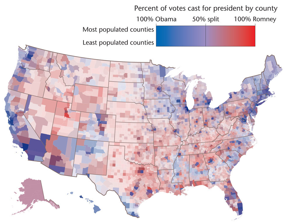
Figure 6.9: Purple America and the presidential election of 2012. Rather than using stark color contrasts to represent the 2012 presidential election results, this map uses color shading based on the popular vote for each county in the United States. Counties that voted heavily for President Obama are bluer, while those that voted more heavily for Governor Romney are redder. Counties that were close to evenly split are purple.