1.1 2.1 Scatterplots
Education Expenditures and Population: Benchmarking


We expect that states with larger populations would spend more on education than states with smaller populations.1 What is the nature of this relationship? Can we use this relationship to evaluate whether some states are spending more than we expect or less than we expect? This type of exercise is called benchmarking. The basic idea is to compare processes or procedures of an organization with those of similar organizations.
benchmarking
The data file EDSPEND gives
- the state name
- state spending on education ($ billion)
- local government spending on education ($ billion)
- spending (total of state and local) on education ($ billion)
- gross state product ($ billion)
- growth in gross state product (percent)
- population (million)
for each of the 50 states in the United States.
APPLY YOUR KNOWLEDGE
Question 1.3 Classify the variables
Use the EDSPEND data set for this exercise. Classify each variable as categorical or quantitative. Is there a label variable in the data set? If there is, identify it.
Question 1.4 Describe the variables
Refer to the previous exercise.
- Use graphical and numerical summaries to describe the distribution of spending.
- Do the same for population.
- Write a short paragraph summarizing your work in parts (a) and (b).
The most common way to display the relation between two quantitative variables is a scatterplot.
66
EXAMPLE 2.3: Spending and population
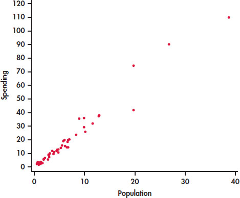
CASE 2.1 A state with a larger number of people needs to spend more money on education. Therefore, we think of population as an explanatory variable and spending on education as a response variable. We begin our study of this relationship with a graphical display of the two variables.
Figure 2.1 is a scatterplot that displays the relationship between the response variable, spending, and the explanatory variable, population. The data appear to cluster around a line with relatively small variation about this pattern. The relationship is positive: states with larger populations generally spend more on education than states with smaller populations. There are three or four states that are somewhat extreme in both population and spending on education, but their values still appear to be consistent with the overall pattern.
Scatterplot
A scatterplot shows the relationship between two quantitative variables measured on the same cases. The values of one variable appear on the horizontal axis, and the values of the other variable appear on the vertical axis. Each case in the data appears as the point in the plot fixed by the values of both variables for that case.
Always plot the explanatory variable, if there is one, on the horizontal axis (the x axis) of a scatterplot. As a reminder, we usually call the explanatory variable x and the response variable y. If there is no explanatory–response distinction, either variable can go on the horizontal axis. The time plots in Section 1.2 (page 19) are special scatterplots where the explanatory variable x is a measure of time.
APPLY YOUR KNOWLEDGE
Question 1.5 Make a scatterplot
- Make a scatterplot similar to Figure 2.1 for the education spending data.
- Label the four points with high population and high spending with the names of these states.
67
Question 1.6 Change the units
- Create a spreadsheet with the education spending data with education spending expressed in millions of dollars and population in thousands. In other words, multiply education spending by 1000 and multiply population by 1000.
- Make a scatterplot for the data coded in this way.
- Describe how this scatterplot differs from Figure 2.1.
Interpreting scatterplots
To interpret a scatterplot, apply the strategies of data analysis learned in Chapter 1.
REMINDER

examining a distribution, p. 18
Examining a Scatterplot
In any graph of data, look for the overall pattern and for striking deviations from that pattern.
You can describe the overall pattern of a scatterplot by the form, direction, and strength of the relationship.
An important kind of deviation is an outlier, an individual value that falls outside the overall pattern of the relationship.
The scatterplot in Figure 2.1 shows a clear form: the data lie in a roughly straight-line, or linear, pattern. To help us see this linear relationship, we can use software to put a straight line through the data. (We will show how this is done in Section 2.3.)
linear relationship
EXAMPLE 2.4: Scatterplot with a Straight Line
CASE 2.1 Figure 2.2 plots the education spending data along with a fitted straight line. This plot confirms our initial impression about these data. The overall pattern is approximately linear and there are a few states with relatively high values for both variables.
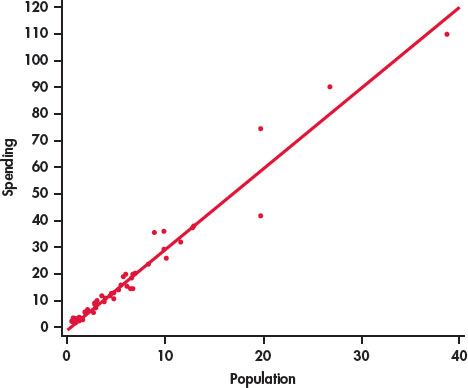
The relationship in Figure 2.2 also has a clear direction: states with higher populations spend more on education than states with smaller populations. This is a positive association between the two variables.
68
Positive Association, Negative Association
Two variables are positively associated when above-average values of one tend to accompany above-average values of the other, and below-average values also tend to occur together.
Two variables are negatively associated when above-average values of one tend to accompany below-average values of the other, and vice versa.
The strength of a relationship in a scatterplot is determined by how closely the points follow a clear form. The strength of the relationship in Figure 2.1 is fairly strong.
Software is a powerful tool that can help us to see the pattern in a set of data. Many statistical packages have procedures for fitting smooth curves to data measured on a pair of quantitative variables. Here is an example.
EXAMPLE 2.5: Smooth Relationship for Education Spending
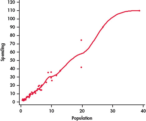
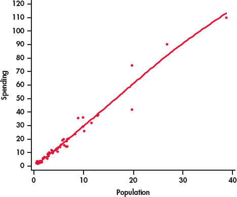
Figure 2.3 is a scatterplot of the population versus education spending for the 50 states in the United States with a smooth curve generated by software. The smooth curve follows the data very closely and is somewhat bumpy. We can adjust the extent to which the relationship is smoothed by changing the smoothing parameter. Figure 2.4 is the result. Here we see that the smooth curve is very close to our plot with the line in Figure 2.2. In this way, we have confirmed our view that we can summarize this relationship with a line.
smoothing parameter
The log transformation
In many business and economic studies, we deal with quantitative variables that take only positive values and are skewed toward high values. In Example 2.4 (page 67), you observed this situation for spending and population size in our education spending data set. One way to make skewed distributions more Normal looking is to transform the data in some way.
The most important transformation that we will use is the log transformation. This transformation can be used only for variables that have positive values. Occasionally, we use it when there are zeros, but, in this case, we first replace the zero values by some small value, often one-half of the smallest positive value in the data set.
log transformation
You have probably encountered logarithms in one of your high school mathematics courses as a way to do certain kinds of arithmetic. Usually, these are base 10 logarithms. Logarithms are a lot more fun when used in statistical analyses. For our statistical applications, we will use natural logarithms. Statistical software and statistical calculators generally provide easy ways to perform this transformation.
APPLY YOUR KNOWLEDGE
Question 1.7 Transform education spending and population
Refer to Exercise 2.4 (page 65). Transform the education spending and population variables using logs, and describe the distributions of the transformed variables. Compare these distributions with those described in Exercise 2.4.
In this chapter, we are concerned with relationships between pairs of quantitative variables. There is no requirement that either or both of these variables should be Normal. However, let’s examine the effect of the transformations on the relationship between education spending and population.
69
EXAMPLE 2.6: Education Spending and Population with Logarithms
Figure 2.5 is a scatterplot of the log of education spending versus the log of education for the 50 states in the United States. The line on the plot fits the data well, and we conclude that the relationship is linear in the transformed variables.
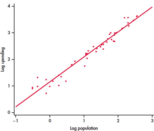
Notice how the data are more evenly spread throughout the range of the possible values. The three or four high values no longer appear to be extreme. We now see them as the high end of a distribution.
In Exercise 2.7, the transformations of the two quantitative variables maintained the linearity of the relationship. Sometimes we transform one of the variables to change a nonlinear relationship into a linear one.

The interpretation of scatterplots, including knowing to use transformations, is an art that requires judgment and knowledge about the variables that we are studying. Always ask yourself if the relationship that you see makes sense. If it does not, then additional analyses are needed to understand the data.
70
Many statistical procedures work very well with data that are Normal and relationships that are linear. However, there is no requirement that we must have Normal data and linear relationships for everything that we do. In fact, with advances in statistical software, we now have many statistical techniques that work well in a wide range of settings. See Chapters 16 and 17 for examples.
Adding categorical variables to scatterplots
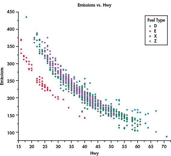
In Example 1.28 (page 38), we examined the fuel efficiency, measured as miles per gallon (MPG) for highway driving, for 1067 vehicles for the model year 2014. The data file (CANFUEL) that we used there also gives carbon dioxide (CO2) emissions and several other variables related to the type of vehicle. One of these is the type of fuel used. Four types are given:
- X, regular gasoline
- Z, premium gasoline
- D, diesel
- E, ethanol.
Although much of our focus in this chapter is on linear relationships, many interesting relationships are more complicated. Our fuel efficiency data provide us with an example.
EXAMPLE 2.7: Fuel Efficiency and CO_2 Emissions

Let’s look at the relationship between highway MPG and CO2 emissions, two quantitative variables, while also taking into account the type of fuel, a categorical variable. The JMP statistical software was used to produce the plot in Figure 2.6. We see that there is a negative relationship between the two quantitative variables. Better (higher) MPG is associated with lower CO2 emissions. The relationship is curved, however, not linear.
71
The legend on the right side of the figure identifies the colors used to plot the four types of fuel, our categorical variable. The vehicles that use regular gasoline (green) and premium gasoline (purple) appear to be mixed together. The diesel-burning vehicles (blue) are close to the the gasoline-burning vehicles, but they tend to have higher values for both MPG and emissions. On the other hand, the vehicles that burn ethanol (red) are clearly separated from the other vehicles.
Careful judgment is needed in applying this graphical method. Don’t be discouraged if your first attempt is not very successful. To discover interesting things in your data, you will often produce several plots before you find the one that is most effective in describing the data.2
SECTION 2.1: Summary
- To study relationships between variables, we must measure the variables on the same cases.
- If we think that a variable x may explain or even cause changes in another variable y, we call x an explanatory variable and y a response variable.
- A scatterplot displays the relationship between two quantitative variables measured on the same cases. Plot the data for each case as a point on the graph.
- Always plot the explanatory variable, if there is one, on the x axis of a scatterplot. Plot the response variable on the y axis.
- Plot points with different colors or symbols to see the effect of a categorical variable in a scatterplot.
- In examining a scatterplot, look for an overall pattern showing the form, direction, and strength of the relationship and then for outliers or other deviations from this pattern.
- Form: Linear relationships, where the points show a straight-line pattern, are an important form of relationship between two variables. Curved relationships and clusters are other forms to watch for.
- Direction: If the relationship has a clear direction, we speak of either positive association (high values of the two variables tend to occur together) or negative association (high values of one variable tend to occur with low values of the other variable).
- Strength: The strength of a relationship is determined by how close the points in the scatterplot lie to a clear form such as a line.
- A transformation uses a formula or some other method to replace the original values of a variable with other values for an analysis. The transformation is successful if it helps us to learn something about the data.
- The log transformation is frequently used in business applications of statistics. It tends to make skewed distributions more symmetric, and it can help us to better see relationships between variables in a scatterplot.
1.1.0.1 SECTION 2.1 Exercises
For Exercises 2.1 and 2.2, pages 64–65; for 2.3 and 2.4, see page 65; for 2.5 and 2.6, pages 66–67; and for 2.7, see page 68.
Question 1.8 What’s wrong?
Explain what is wrong with each of the following:
- If two variables are negatively associated, then low values of one variable are associated with low values of the other variable.
- A stemplot can be used to examine the relationship between two variables.
- In a scatterplot, we put the response variable on the x axis and the explanatory variable on the y axis.
Question 1.9 Make some sketches
For each of the following situations, make a scatterplot that illustrates the given relationship between two variables.
- No apparent relationship.
- A weak negative linear relationship.
- A strong positive relationship that is not linear.
- A more complicated relationship. Explain the relationship.
Question 1.10 Companies of the world
In Exercise 1.118 (page 61), you examined data collected by the World Bank on the numbers of companies that are incorporated and are listed in their country’s stock exchange at the end of the year for 2012. In Exercise 1.119, you did the same for the year 2002.3 In this exercise, you will examine the relationship between the numbers for these two years. 
- Which variable would you choose as the explanatory variable, and which would you choose as the response variable. Give reasons for your answers.
- Make a scatterplot of the data.
- Describe the form, the direction, and the strength of the relationship.
- Are there any outliers? If yes, identify them by name.
Question 1.11 Companies of the world
Refer to the previous exercise. Using the questions there as a guide, describe the relationship between the numbers for 2012 and 2002. Do you expect this relationship to be stronger or weaker than the one you described in the previous exercise? Give a reason for your answer.
Question 1.12 Brand-to-brand variation in a product
Beer100.com advertises itself as “Your Place for All Things Beer.” One of their “things” is a list of 175 domestic beer brands with the percent alcohol, calories per 12 ounces, and carbohydrates (in grams).4 In Exercises 1.56 through 1.58 (page 36), you examined the distribution of alcohol content and the distribution of calories for these beers. 
- Give a brief summary of what you learned about these variables in those exercises. (If you did not do them when you studied Chapter 1, do them now.)
- Make a scatterplot of calories versus percent alcohol.
- Describe the form, direction, and strength of the relationship.
- Are there any outliers? If yes, identify them by name.
73
Question 1.13 More beer
Refer to the previous exercise. Repeat the exercise for the relationship between carbohydrates and percent alcohol. Be sure to include summaries of the distributions of the two variables you are studying.
Question 1.14 Marketing in Canada
Many consumer items are marketed to particular age groups in a population. To plan such marketing strategies, it is helpful to know the demographic profile for different areas. Statistics Canada provides a great deal of demographic data organized in different ways.5 
- Make a scatterplot of the percent of the population over 65 versus the percent of the population under 15.
- Describe the form, direction, and strength of the relationship.
Question 1.15 Compare the provinces with the territories
Refer to the previous exercise. The three Canadian territories are the Northwest Territories, Nunavut, and the Yukon Territories. All of the other entries in the data set are provinces.
- Generate a scatterplot of the Canadian demographic data similar to the one that you made in the previous exercise but with the points labeled “P” for provinces and “T” for territories (or some other way if that is easier to do with your software.)
- Use your new scatterplot to write a new summary of the demographics for the 13 Canadian provinces and territories.
Question 1.16 Sales and time spent on web pages
You have collected data on 1000 customers who visited the web pages of your company last week. For each customer, you recorded the time spent on your pages and the total amount of their purchases during the visit. You want to explore the relationship between these two variables.
- What is the explanatory variable? What is the response variable? Explain your answers.
- Are these variables categorical or quantitative?
- Do you expect a positive or negative association between these variables? Why?
- How strong do you expect the relationship to be? Give reasons for your answer.
Question 1.17 A product for lab experiments
Barium-137m is a radioactive form of the element barium that decays very rapidly. It is easy and safe to use for lab experiments in schools and colleges.6 In a typical experiment, the radioactivity of a sample of barium-137m is measured for one minute. It is then measured for three additional one-minute periods, separated by two minutes. So data are recorded at one, three, five, and seven minutes after the start of the first counting period. The measurement units are counts. Here are the data for one of these experiments:7 
| Time | 1 | 3 | 5 | 7 |
| Count | 578 | 317 | 203 | 118 |
- Make a scatterplot of the data. Give reasons for the choice of which variables to use on the x and y axes.
- Describe the overall pattern in the scatterplot.
- Describe the form, direction, and strength of the relationship.
- Identify any outliers.
- Is the relationship approximately linear? Explain your answer.
Question 1.18 Use a log for the radioactive decay
Refer to the previous exercise. Transform the counts using a log transformation. Then repeat parts (a) through (e) for the transformed data, and compare your results with those from the previous exercise.
Question 1.19 Time to start a business
Case 1.2 (page 23) uses the World Bank data on the time required to start a business in different countries. For Example 1.21 and several other examples that follow we used data for a subset of the countries for 2013. Data are also available for times to start in 2008. Let’s look at the data for all 189 countries to examine the relationship between the times to start in 2013 and the times to start in 2008. 
- Why should you use the time for 2008 as the explanatory variable and the time for 2013 as the response variable?
- Make a scatterplot of the two variables.
- How many points are in your plot? Explain why there are not 189 points.
- Describe the form, direction, and strength of the relationship.
- Identify any outliers.
- Is the relationship approximately linear? Explain your answer.
Question 1.20 Use 2003 to predict 2013
Refer to the previous exercise. The data set also has times for 2003. Use the 2003 times as the explanatory variable and the 2013 times as the response variable.
- Answer the questions in the previous exercise for this setting.
- Compare the strength of this relationship (between the 2013 times and the 2003 times) with the strength of the relationship in the previous exercise (between the 2013 times and the 2008 times). Interpret this finding.
74
Question 1.21 Fuel efficiency and CO_2 emissions
Refer to Example 2.7 (pages 70–71), where we examined the relationship between CO2 emissions and highway MPG for 1067 vehicles for the model year 2014. In that example, we used MPG as the explanatory variable and CO2 as the response variable. Let’s see if the relationship differs if we change our measure of fuel efficiency from highway MPG to city MPG. Make a scatterplot of the fuel efficiency for city driving, city MPG, versus CO2 emissions. Write a summary describing the relationship between these two variables. Compare your summary with what we found in Example 2.7.
Question 1.22 Add the type of fuel to the plot
Refer to the previous exercise. As we did in Figure 2.6 (page 71), add the categorical variable, type of fuel, to your plot. (If your software does not have this capability, make separate plots for each fuel type. Use the same range of values for the y axis and for the x axis to make the plots easier to compare.) Summarize what you have found in this exercise, and compare your results with what we found in Example 2.7 (pages 70–71).
1.1.0.2 SECTION 2.2 Correlation
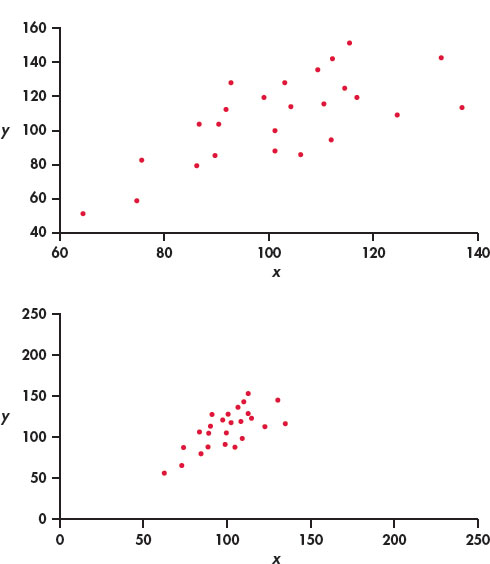
A scatterplot displays the form, direction, and strength of the relationship between two quantitative variables. Linear relationships are particularly important because a straight line is a simple pattern that is quite common. We say a linear relationship is strong if the points lie close to a straight line and weak if they are widely scattered about a line. Our eyes are not good judges of how strong a linear relationship is.
The two scatterplots in Figure 2.7 depict exactly the same data, but the lower plot is drawn smaller in a large field. The lower plot seems to show a stronger linear relationship. Our eyes are often fooled by changing the plotting scales or the amount of white space around the cloud of points in a scatterplot.8 We need to follow our strategy for data analysis by using a numerical measure to supplement the graph. Correlation is the measure we use.
The correlation r
Correlation
The correlation measures the direction and strength of the linear relationship between two quantitative variables. Correlation is usually written as r.
Suppose that we have data on variables x and y for n cases. The values for the first case are x1 and y1, the values for the second case are x2 and y2, and so on. The means and standard deviations of the two variables are and sx for the x-values, and and sy for the y-values. The correlation r between x and y is
As always, the summation sign Σ means “add these terms for all cases.” The formula for the correlation r is a bit complex. It helps us to see what correlation is, but in practice you should use software or a calculator that finds r from keyed-in values of two variables x and y.
The formula for r begins by standardizing the data. Suppose, for example, that x is height in centimeters and y is weight in kilograms and that we have height and weight measurements for n people. Then and sx are the mean and standard deviation of the n heights, both in centimeters. The value
is the standardized height of the ith person. The standardized height says how many standard deviations above or below the mean a person’s height lies. Standardized values have no units—in this example, they are no longer measured in centimeters. Similarly, the standardized weights obtained by subtracting and dividing by sy are no longer measured in kilograms. The correlation r is an average of the products of the standardized height and the standardized weight for the n people.
REMINDER
standardizing, p. 45
APPLY YOUR KNOWLEDGE
Question 1.23 Spending on education
CASE 2.1 In Example 2.3 (page 66), we examined the relationship between spending on education and population for the 50 states in the United States. Compute the correlation between these two variables.
Question 1.24 Change the units
CASE 2.1 Refer to Exercise 2.6 (page 67), where you changed the units to millions of dollars for education spending and to thousands for population.
- Find the correlation between spending on education and population using the new units.
- Compare this correlation with the one that you computed in the previous exercise.
- Generally speaking, what effect, if any, did changing the units in this way have on the correlation?
Facts about correlation
The formula for correlation helps us see that r is positive when there is a positive association between the variables. Height and weight, fors example, have a positive association. People who are above average in height tend to be above average in weight. Both the standardized height and the standardized weight are positive. People who are below average in height tend to have below-average weight. Then both standardized height and standardized weight are negative. In both cases, the products in the formula for r are mostly positive, so r is positive. In the same way, we can see that r is negative when the association between x and y is negative. More detailed study of the formula gives more detailed properties of r. Here is what you need to know to interpret correlation.
- Correlation makes no distinction between explanatory and response variables. It makes no difference which variable you call x and which you call y in calculating the correlation.
- Correlation requires that both variables be quantitative, so it makes sense to do the arithmetic indicated by the formula for r. We cannot calculate a correlation between the incomes of a group of people and what city they live in because city is a categorical variable.
- Because r uses the standardized values of the data, r does not change when we change the units of measurement of x, y, or both. Measuring height in inches rather than centimeters and weight in pounds rather than kilograms does not change the correlation between height and weight. The correlation r itself has no unit of measurement; it is just a number.
- Positive r indicates positive association between the variables, and negative r indicates negative association.
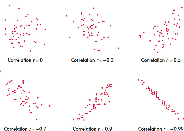
- The correlation r is always a number between −1 and 1. Values of r near 0 indicate a very weak linear relationship. The strength of the linear relationship increases as r moves away from 0 toward either −1 or 1. Values of r close to −1 or 1 indicate that the points in a scatterplot lie close to a straight line. The extreme values r = −1 and r = 1 occur only in the case of a perfect linear relationship, when the points lie exactly along a straight line.
- Correlation measures the strength of only a linear relationship between two variables. Correlation does not describe curved relationships between variables, no matter how strong they are.
- Like the mean and standard deviation, the correlation is not resistant: r is strongly affected by a few outlying observations. Use r with caution when outliers appear in the scatterplot.
REMINDER
resistant, p. 25
The scatterplots in Figure 2.8 illustrate how values of r closer to 1 or −1 correspond to stronger linear relationships. To make the meaning of r clearer, the standard deviations of both variables in these plots are equal, and the horizontal and vertical scales are the same. In general, it is not so easy to guess the value of r from the appearance of a scatterplot. Remember that changing the plotting scales in a scatterplot may mislead our eyes, but it does not change the correlation.
77
Remember that correlation is not a complete description of two-variable data, even when the relationship between the variables is linear. You should give the means and standard deviations of both x and y along with the correlation. (Because the formula for correlation uses the means and standard deviations, these measures are the proper choice to accompany a correlation.) Conclusions based on correlations alone may require rethinking in the light of a more complete description of the data.
EXAMPLE 2.8: Forecasting Earnings
Stock analysts regularly forecast the earnings per share (EPS) of companies they follow. EPS is calculated by dividing a company’s net income for a given time period by the number of common stock shares outstanding. We have two analysts’ EPS forecasts for a computer manufacturer for the next six quarters. How well do the two forecasts agree? The correlation between them is r = 0.9, but the mean of the first analyst’s forecasts is $3 per share lower than the second analyst’s mean.
These facts do not contradict each other. They are simply different kinds of information. The means show that the first analyst predicts lower EPS than the second. But because the first analyst’s EPS predictions are about $3 per share lower than the second analyst’s for every quarter, the correlation remains high. Adding or subtracting the same number to all values of either x or y does not change the correlation. The two analysts agree on which quarters will see higher EPS values. The high r shows this agreement, despite the fact that the actual predicted values differ by $3 per share.
APPLY YOUR KNOWLEDGE
Question 1.25 Strong association but no correlation

Here is a data set that illustrates an important point about correlation:
| x | 20 | 30 | 40 | 50 | 60 |
| y | 10 | 30 | 50 | 30 | 10 |
- Make a scatterplot of y versus x.
- Describe the relationship between y and x. Is it weak or strong? Is it linear?
- Find the correlation between y and x.
- What important point about correlation does this exercise illustrate?
78
Question 1.26 Brand names and generic products
- If a store always prices its generic “store brand” products at exactly 90% of the brand name products’ prices, what would be the correlation between these two prices? (Hint: Draw a scatterplot for several prices.)
- If the store always prices its generic products $1 less than the corresponding brand name products, then what would be the correlation between the prices of the brand name products and the store brand products?
1.1.0.3 SECTION 2.2: Summary
- The correlation r measures the strength and direction of the linear association between two quantitative variables x and y. Although you can calculate a correlation for any scatterplot, r measures only straight-line relationships.
- Correlation indicates the direction of a linear relationship by its sign: r > 0 for a positive association and r < 0 for a negative association.
- Correlation always satisfies −1 ≤ r ≤ 1 and indicates the strength of a relationship by how close it is to −1 or 1. Perfect correlation, r = ±1, occurs only when the points on a scatterplot lie exactly on a straight line.
- Correlation ignores the distinction between explanatory and response variables. The value of r is not affected by changes in the unit of measurement of either variable. Correlation is not resistant, so outliers can greatly change the value of r.
1.1.0.4 SECTION 2.2: Exercises
For Exercises 2.23 and 2.24, see page 75; and for 2.25 and 2.26, see pages 77–78.
Question 1.27 Companies of the world
Refer to Exercise 1.118 (page 61), where we examined data collected by the World Bank on the numbers of companies that are incorporated and are listed on their country’s stock exchange at the end of the year. In Exercise 2.10 (page 72), you examined the relationship between these numbers for 2012 and 2002.
- Find the correlation between these two variables.
- Do you think that the correlation you computed gives a good numerical summary of the strength of the relationship between these two variables? Explain your answer.
Question 1.28 Companies of the world
Refer to the previous exercise and to Exercise 2.11 (page 72). Answer parts (a) and (b) for 2012 and 1992. Compare the correlation you found in the previous exercise with the one you found in this exercise. Why do they differ in this way?
Question 1.29 A product for lab experiments
In Exercise 2.17 (page 73), you described the relationship between time and count for an experiment examining the decay of barium.
- Is the relationship between these two variables strong? Explain your answer.
- Find the correlation.
- Do you think that the correlation you computed gives a good numerical summary of the strength of the relationship between these two variables? Explain your answer.
Question 1.30 Use a log for the radioactive decay
Refer to the previous exercise and to Exercise 2.18 (page 73), where you transformed the counts with a logarithm.
- Is the relationship between time and the log of the counts strong? Explain your answer.
- Find the correlation between time and the log of the counts.
- Do you think that the correlation you computed gives a good numerical summary of the strength of the relationship between these two variables? Explain your answer.
- Compare your results here with those you found in the previous exercise. Was the correlation useful in explaining the relationship before the transformation? After? Explain your answers.
- Using your answer in part (d), write a short explanation of what these analyses show about the use of a correlation to explain the strength of a relationship.
79
Question 1.31 Brand-to-brand variation in a product
In Exercise 2.12 (page 73), you examined the relationship between percent alcohol and calories per 12 ounces for 175 domestic brands of beer.
- Compute the correlation between these two variables.
- Do you think that the correlation you computed gives a good numerical summary of the strength of the relationship between these two variables? Explain your answer.
Question 1.32 Alcohol and carbohydrates in beer revisited
Refer to the previous exercise. Delete any outliers that you identified in Exercise 2.12.
- Recompute the correlation without the outliers.
- Write a short paragraph about the possible effects of outliers on the correlation, using this example to illustrate your ideas.
Question 1.33 Marketing in Canada
In Exercise 2.14 (page 73), you examined the relationship between the percent of the population over 65 and the percent under 15 for the 13 Canadian provinces and territories.
- Make a scatterplot of the two variables if you do not have your work from Exercise 2.14.
- Find the value of the correlation r.
- Does this numerical summary give a good indication of the strength of the relationship between these two variables? Explain your answer.
Question 1.34 Nunavut
Refer to the previous exercise.
- Do you think that Nunavut is an outlier? Explain your answer.
- Find the correlation without Nunavut. Using your work from the previous exercise, summarize the effect of Nunavut on the correlation.
Question 1.35 Education spending and population with logs
In Example 2.3 (page 66), we examined the relationship between spending on education and population, and in Exercise 2.23 (page 75), you found the correlation between these two variables. In Example 2.6 (page 69), we examined the relationship between the variables transformed by logs.
- Compute the correlation between the variables expressed as logs.
- How does this correlation compare with the one you computed in Exercise 2.23? Discuss this result.
Question 1.36 Are they outliers?
Refer to the previous exercise. Delete the four states with high values.
- Find the correlation between spending on education and population for the remaining 46 states.
- Do the same for these variables expressed as logs.
- Compare your results in parts (a) and (b) with the correlations that you computed with the full data set in Exercise 2.23 and in the previous exercise. Discuss these results.
Question 1.37 Fuel efficiency and CO_2 emissions
In Example 2.7 (pages 70–71), we examined the relationship between highway MPG and CO2 emissions for 1067 vehicles for the model year 2014. Let’s examine the relationship between the two measures of fuel efficiency in the data set, highway MPG and city MPG.
- Make a scatterplot with city MPG on the x axis and highway MPG on the y axis.
- Describe the relationship.
- Calculate the correlation.
- Does this numerical summary give a good indication of the strength of the relationship between these two variables? Explain your answer.
Question 1.38 Consider the fuel type
Refer to the previous exercise and to Figure 2.6 (page 71), where different colors are used to distinguish four different types of fuels used by these vehicles.
- Make a figure similar to Figure 2.6 that allows us to see the categorical variable, type of fuel, in the scatterplot. If your software does not have this capability, make different scatterplots for each fuel type.
- Discuss the relationship between highway MPG and city MPG, taking into account the type of fuel. Compare this view with what you found in the previous exercise where you did not make this distinction.
- Find the correlation between highway MPG and city MPG for each type of fuel. Write a short summary of what you have found.
Question 1.39 Match the correlation
The Correlation and Regression applet at the text website allows you to create a scatterplot by clicking and dragging with the mouse. The applet calculates and displays the correlation as you change the plot. You will use this applet to make scatterplots with 10 points that have correlation close to 0.7. The lesson is that many patterns can have the same correlation. Always plot your data before you trust a correlation.
- Stop after adding the first two points. What is the value of the correlation? Why does it have this value?
- Make a lower-left to upper-right pattern of 10 points with correlation about r = 0.7. (You can drag points up or down to adjust r after you have 10 points.) Make a rough sketch of your scatterplot.
- Make another scatterplot with nine points in a vertical stack at the right of the plot. Add one point far to the left and move it until the correlation is close to 0.7. Make a rough sketch of your scatterplot.
- Make yet another scatterplot with 10 points in a curved pattern that starts at the lower left, rises to the right, then falls again at the far right. Adjust the points up or down until you have a quite smooth curve with correlation close to 0.7. Make a rough sketch of this scatterplot also.
80
Question 1.40 Stretching a scatterplot
Changing the units of measurement can greatly alter the appearance of a scatterplot. Consider the following data: 
| x | −4 | −4 | −3 | 3 | 4 | 4 |
| y | 0.5 | −0.6 | −0.5 | 0.5 | 0.5 | −0.6 |
- Draw x and y axes each extending from −6 to 6. Plot the data on these axes.
- Calculate the values of new variables x* = x/10 and y* = 10y, starting from the values of x and y. Plot y* against x* on the same axes using a different plotting symbol. The two plots are very different in appearance.
- Find the correlation between x and y. Then find the correlation between x* and y*. How are the two correlations related? Explain why this isn’t surprising.
Question 1.41 CEO compensation and stock market performance
An academic study concludes, “The evidence indicates that the correlation between the compensation of corporate CEOs and the performance of their company’s stock is close to zero.” A business magazine reports this as “A new study shows that companies that pay their CEOs highly tend to perform poorly in the stock market, and vice versa.” Explain why the magazine’s report is wrong. Write a statement in plain language (don’t use the word “correlation”) to explain the study’s conclusion.
Question 1.42 Investment reports and correlations
Investment reports often include correlations. Following a table of correlations among mutual funds, a report adds, “Two funds can have perfect correlation, yet different levels of risk. For example, Fund A and Fund B may be perfectly correlated, yet Fund A moves 20% whenever Fund B moves 10%.” Write a brief explanation, for someone who does not know statistics, of how this can happen. Include a sketch to illustrate your explanation.
Question 1.43 Sloppy writing about correlation
Each of the following statements contains a blunder. Explain in each case what is wrong.
- “The correlation between y and x is r = 0.5 but the correlation between x and y is r = −0.5.”
- “There is a high correlation between the color of a smartphone and the age of its owner.”
- “There is a very high correlation (r = 1.2) between the premium you would pay for a standard automobile insurance policy and the number of accidents you have had in the last three years.”